
This is a website which showcases a series of episodes and articles, compiled by the Boeing Company, the largest aerospace company in the world. The information on this website chronicles the past 100 years in aviation history.
In lieu of static header images, this website uses dynamic gray-scale videos to draw its users into the deep-rooted history of aviation. The bold, white text used for the hero header and navigation bar contours the old-school imagery of the videos, while providing a sharp modern edge to the overall aesthetic. These nods to modernism are further carried out by the sticky hamburger navigation menu, located at the top left corner of the page, and the social media thumbnails at the bottom right. Keeping these details clean and one-dimensional helps minimize clutter and ensures the videos are the central focus of the page.

The black, gray, white, and sky blue color palette is an ode to the aerospace imagery of the past—just think: the good old steel bullet shooting through bluebird skies. Gray-scale menu buttons, contained within a vertical navigation bar, are quickly replaced with bright blue filters to highlight hover activity and increase interactivity.
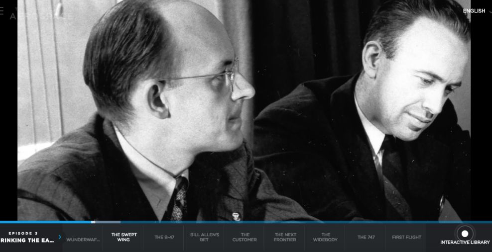
Once the user selects an episode to watch from the navbar, a new page opens and the same color and hover elements are displayed, now on a horizontal navigation bar at the bottom of the screen. This navbar retains the same minimalistic elements of the homepage, so that the video remains the center focal point. To the far right of the horizontal navbar, there is a subtle ripple animation which highlights the interactive library button.
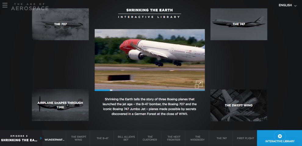
Once the interactive library button is clicked, the video continues playing and keeps its central location on the page, but it’s no longer fullscreen. Five new thumbnails slide out and stake a claim next to the video. Once clicked, the thumbnails activate a new video, which then slides to the lower left corner of the screen.
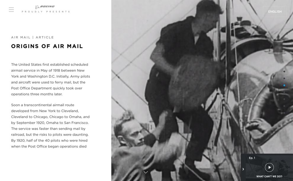
Now there’s a vertical split screen. One side of the screen displays a solid white background with gray text, creating dynamic tension with the opposing imagery and video. As the user scrolls, this tension and contrast continues. Interactivity oozes from the page with zoom buttons, deep scrolls, and animations. But at the heart of this successful UI campaign rests an incredible use of moving imagery. With this site, Boeing shows the world that it can do animation—much like aviation—right.
The Age of Aerospace is a great website design in the Aerospace industry.


