Team Behind the Design
- Agency: Electric Circus
- Client: Gatwick Airport
- Category: Website Design
- Location: United Kingdom
- Project Brief: Design and build an interactive digital platform that visualizes career pathways across Gatwick Airport, helping employees explore roles, identify growth opportunities, and map skill development through an intuitive, evolving interface.
Looking at Gatwick’s career pathways platform, I saw UX doing what it does best: reflecting human motivation back to the user.
Electric Circus mapped the airport like a living ecosystem of opportunity, turning corporate structure into career storytelling. The result feels less like software and more like personalized guidance.
Web Design Analysis
Most career sites are transactional. You fill in a title, a department, and maybe click a few vague filters. What Electric Circus built feels more like a digital environment than a database.
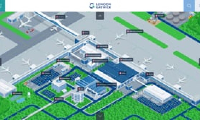
Phase 1 starts by anchoring the experience around a detailed isometric map of the airport. This approach to the design reframes internal growth as exploration. Every interaction connects back to something tangible: the place people work, the teams they know, the ambitions they might have ignored.
Phase 2 takes that foundation further, moving from visual exploration to skill intelligence. Employees now track, compare, and close their skill gaps in real time. It’s what happens when design stops at “user-friendly” and starts at “career-defining.”
Outstanding Design Features
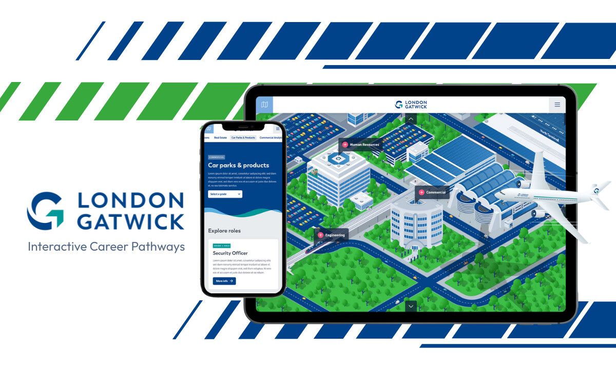
- A Map That Feels Familiar and Aspirational: The isometric map of Gatwick is a metaphor for mobility. Each terminal, office, and runway doubles as a navigation point into roles and teams.It’s clever design psychology: when people can locate themselves within a system, they’re more likely to engage with it. Impact: The interface became a centerpiece of Gatwick’s internal communications, with every user reporting positive engagement at launch.
Guided Role Exploration With Depth and Context: Each role page moves beyond titles. It breaks down the role’s purpose, responsibilities, and progression paths, while linking to similar or adjacent roles.
This content model turns static job descriptions into dynamic career pathways, helping employees understand both the requirements and the possibilities tied to each position.
Impact: Average session times reached six minutes, indicating genuine engagement rather than passive browsing.
Seamless Integration Between Phases of the Journey: Electric Circus designed Phase 1 as a visual foundation and Phase 2 as a personalized evolution.
In the second stage, employees can log in, create profiles, and input their current roles.
The system then analyzes their skills, compares them to other positions, and highlights gaps through an interactive dashboard. It’s a clever progression from exploration to development and moves users from curiosity to action.
Skills Gap Analysis and Personalized Dashboard: Phase 2 introduces one of the most advanced internal mobility tools I’ve seen. Users can compare their competencies against target roles through a visual “skills match” interface, displaying percentages, skill bars, and growth insights.
It’s gamified without being gimmicky. The clean UI keeps data approachable, with simple sliders and clear visual indicators instead of overwhelming metrics.
Impact: Early data shows employees actively revisiting the platform to track progress, signaling a behavioral shift toward continuous learning.
What Agencies Can Learn from Electric Circus

"Together with Electric Circus, we’ve made sure that the map is visually engaging, simple to explore and more importantly for us – simple to maintain and keep up to date!
- Head of People, Gatwick
1. Design for Behavior, Not Just Aesthetics
Electric Circus understood that internal tools need to inspire use, not just exist. Every visual and interaction serves a behavioral goal — awareness, curiosity, and eventually, development.
2. Visualization Can Simplify Complexity
By mapping the airport’s layout, the team turned an HR database into a relatable, story-driven experience. The takeaway: when users can see a system, they’re more likely to engage with it.
3. Build for Evolution, Not Launch
The project’s phased approach shows strategic foresight. Instead of cramming every feature into one release, Electric Circus allowed the system to mature, adding personalization and data insights when users were ready.
4. Humanize Data Through Design
Skill analysis could easily feel mechanical, but visualizing it with friendly UI patterns and accessible graphics turns analytics into empowerment. It’s a reminder that data design isn’t about numbers; it’s about motivation.
Impact & Results
The platform transformed Gatwick’s approach to employee growth and retention.
About DesignRush Featured Designs
At DesignRush, we spotlight digital projects that pair problem-solving with a deeper sense of purpose and clarity.
Electric Circus’ work for Gatwick proves that internal tools can be as engaging as public-facing platforms. It’s a model for how thoughtful UX, storytelling, and data design can create cultures of growth, not just systems of information.
Organizations in infrastructure and professional services can draw inspiration from these curated collections showcasing clarity-driven layouts, intuitive navigation, and design systems built for scale and trust:
- Best Website Designs
- Best App Designs
- Best Logo Designs
- Best Print Designs
- Best Packaging Designs
- Best Video Designs
For more vetted design partners and enterprise-focused services, visit our Agency Directory.


-preview.jpg)
