Standout Features:
- Immersive visuals
- User-friendly, structured categorization
- Minimalist and elegant typography
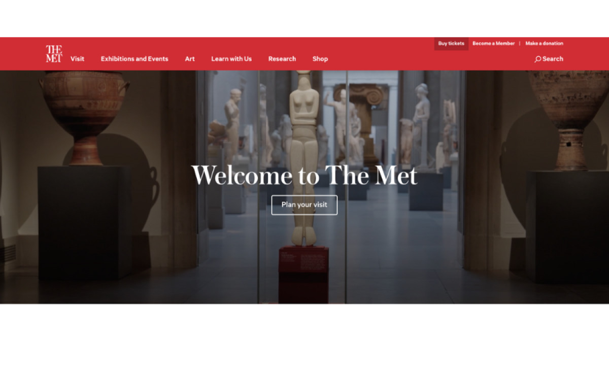
The Metropolitan Museum of Art, one of the world’s largest and most renowned art museums, faced a critical task: creating a website that does justice to its vast collection. The new platform focuses on accessibility, engagement, and visual storytelling, making it easy for visitors to explore the museum's rich history and connect with every masterpiece.
The site echoes the richness and diversity of the museum’s collection. High-resolution images of art pieces, sculptures, and exhibitions dominate the layout, creating a sense of immersion. These visuals enhance storytelling and serve as a digital extension of The Met's galleries, virtually encapsulating the museum’s experience.
The layout prioritizes a clean, user-friendly navigation system that simplifies the process of exploring the museum’s vast collection. Categories such as “Exhibitions and Events,” “Art,” and “Learn with Us” are clearly organized, allowing users to browse through the site intuitively. For a museum with an extensive collection, having a streamlined experience is critical to keeping users engaged without overwhelming them.
Lastly, the clean typography and neutral color palette spotlight every art piece. The elegant fonts mirror the sophistication of The Met’s branding while maintaining readability and accessibility. Meanwhile, its subtle gray, black, and white color scheme keeps the design timeless and unobtrusive.