The Garden of the Phoenix incorporates animation and art to create an interactive timeline that recounts the 160-year long relationship between Japan and the United States.
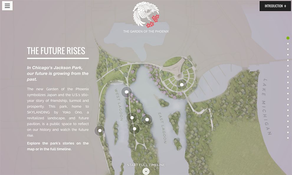
The home page uses a light-to-mid gray background that pulls the graphics and typography forward. The page is asymmetrical which allows users to spend a short time reading the content on the left side of the page.
At the right of the page, users will see an interactive map of the gardens. When they click on the white indicators, the right side of the screen will use a slide-in to show the them information about the area they’ve selected.
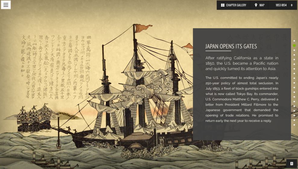
Every page of this website is a testament to the program’s inventiveness. Throughout the site, some of the backdrops are animated. For example, the page entitled, “Japan Opens Its Gates”, uses parallax-inspired animation to move the water up and down, while the boat moves back and forth. This gives the illusion that the ship is sailing across the ocean.
At the top right corner is a small menu bar that allows users to navigate the website. The text boxes on the right of the screen aren’t always the same color. However, the color always matches the backdrop.

The gallery page's dark background and panel boxes draw attention to the photos. Users can click through images and be directed to a page that further explains the timeline.
The Garden of the Phoenix website is imaginative and interactive by vivid colors, innovative Javascript and CSS programming. The site boldly uses UI and UX interface, making history come alive in the form of digital design.
Garden of The Pheonix is a beautiful website design in the Education and Non-Profit industries.