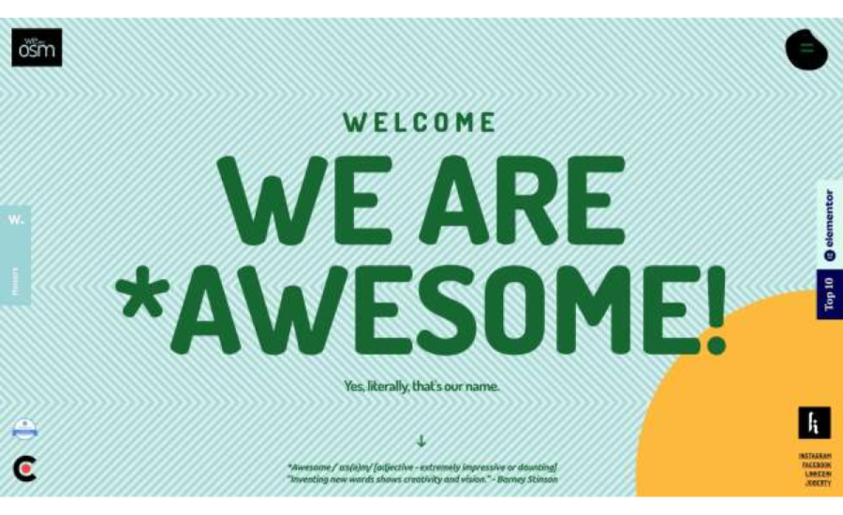
Standout Features:
- Playful messaging
- Large, engaging typeface
- Seamless fusion of colors and patterns
OSM, a Belgrade-based development, design and marketing company, is a pack of creative, analytical and highly organized individuals working together to craft the best possible solutions for their clients.
Although counterintuitive at first sight, their website reflects the two defining traits of the brand: lighthearted nature and meticulous organization.
Visually, the website’s story begins with a consistent fusion of color, pattern and playful character. The prevailing design is filled with bold, saturated tones and graphically detailed ornamentation.
It transcends the eye-pleasing as each combination is designed to differentiate singular OSM service (and menu option) with its own color concept, while still complementing all the others. The palettes going from dark to light create unlikely combinations that are dynamic and intertwined but are able to retain discernible contrast.
The typography and resulting jolly messaging are an integral part of the OSM brand identity. Each piece of written content is on-point and legible, especially having mobile devices in mind. The body text uses an Ubuntu font, a sans-serif typeface, most commonly associated with the software sharing its namesake.


-preview.jpg)