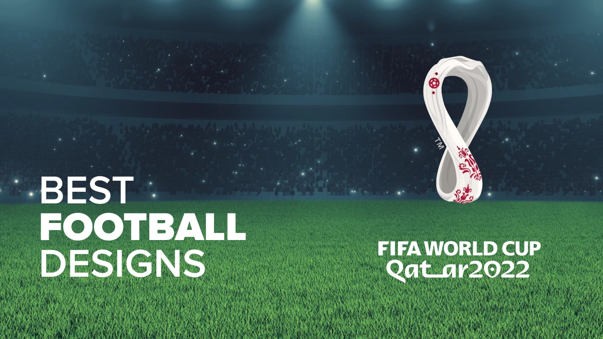
The FIFA World Cup - Qatar 2022 has officially started!
A competition that unites the world every four years broke all records in Russia’s 2018 edition, with 3.5 billion people watching and cheering for their favorites. And now, four and a half years later, the 22nd edition of the World Cup is live!
And let us tell you – the hype is real! Football fans worldwide gather to celebrate the biggest sports event in the world. The passion for this sport extends to the best design agencies producing football-inspired work.
From balls and playful illustrations to total rebrands for clubs and academies, here are some amazing football visuals that depict the love for the game:
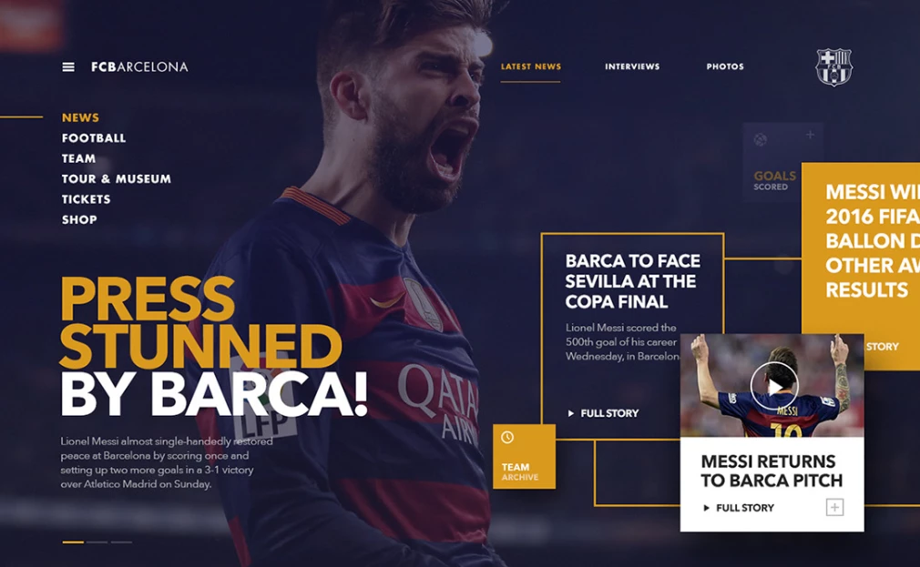
1. FC Barcelona by Fred Nerby
Standout Features:
- Futuristic design
- Interactive
- Game-like interface
FC Barcelona is a name familiar to any football fan. The club is a double UEFA Champions League winner and the home of the best player to grace the sport – Lionel Messi. Building on the glorious past, Fred Nerby developed a concept for the club’s website that lets the viewer personally be part of FC Barcelona.
On a mission to provide a more contemporary online identity, Nerby designed a futuristic solution with a wide range of options. Football is a team sport, so boosting interactivity on the website provides an almost real-life feeling to browsing. It’s as if you’re there with your favorite players.
The interactive elements let the fans get that blast from the past and relive some of the most iconic moments by allowing them to follow memorable match timelines. The timeline is marked by clickable points that automatically load the replay of the goal scored in a particular minute.
The design features an in-depth profile page for individual players, team news, game schedules, and more. And all that with a game-like interface, enhancing the storytelling potential and the narrative that you’re one with your favorite club.
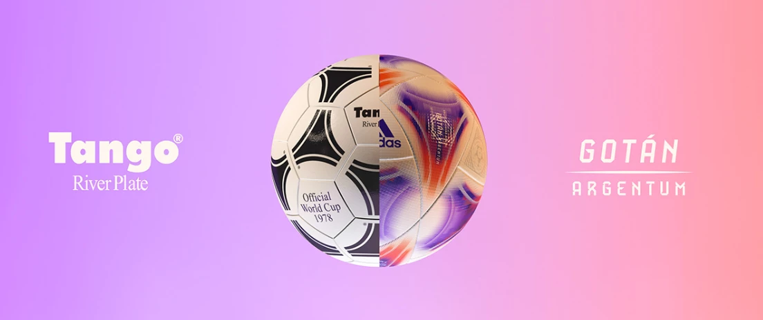
2. Gotán // AFA OMB // Adidas by Luis Callegari
Standout Features:
- Paying homage in a modern way
- Symbolism
- Combining the old and the new
Argentina is one of the countries that has gifted the world with many incredible players. However, this nation’s historical ties with the sport don’t end there. This is a story of a ball that was conceived in 1978 and is still used by many today.
Football fans are passionately in love with every element of the sport, including the playing balls. So much so that each World Cup has one, and each ball has its name. Gotán Argentum is a ball inspired by the popular Tango ball used in the 1978 World Cup, hosted by Argentina. However, it also reflects the features of this year’s official ball – Al Rihla.
To make this exciting bit happen, Luis Callegari took the traditional Tango ball print and recoded it to comply with the Al Rihla motion-inspiring design. The design also features Al Rihla’s font family for the typography, but this one is italic.
Each of the triangular blocks is meant to be a storyteller. One features the original tango ball emblem in a modern visual environment to enhance the connection with the 1978 design. Another has a print of the Mayan sun, forming a bond with the country of origin.
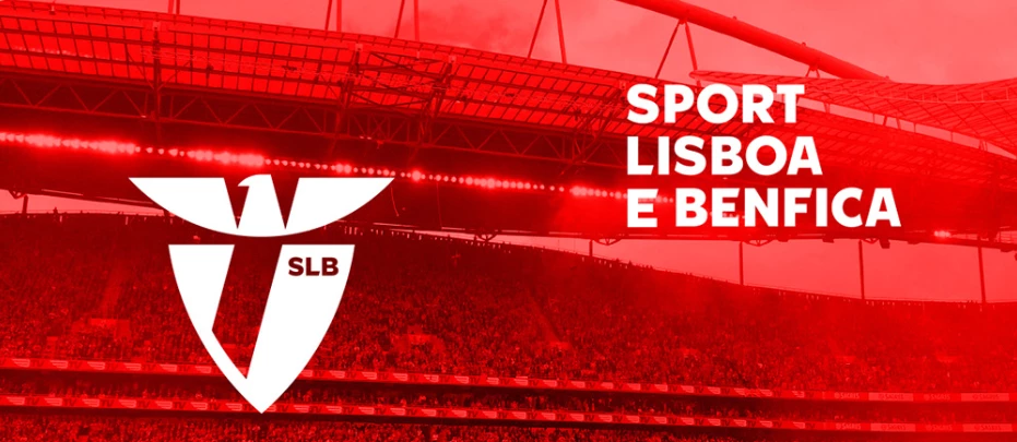
3. Benfica by UMA
Standout Features:
- Minimalistic
- Red-and-white
- Universal approach
Another giant with a legacy of producing excellent results for over a century is the Portuguese Benfica. For the club’s 115th birthday, UMA did something special and created a renewed brand for Benfica. The theme was omitting everything else and focusing on the club’s colors: red and white.
The proposed logo redesign consists of two elements. The red shield, with a diagonal stripe and a superscripted “SLB” (Sport Lisboa e Benfica), painted white in the top right corner of the shield, and the clean, new red eagle hovering above it.
The pattern was expanded to everything else, giving it a sense of unity and strength. Whether it’s merchandise (jerseys, hoodies, caps, flags) or even the club’s bus(es) and the seasonal club passes for the most loyal fans, everything complies with the new minimalistic, modern brand.
4. Academia Rafa Márquez by Copo
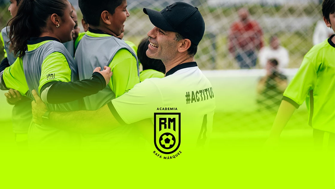
Standout Features:
- Neon green
- Sans Serif typography
- Symbolism in the logo design
Copo developed a complete rebrand for the Mexican football academy Rafa Márquez. Discipline, responsibility, respect, and teamwork are core values behind the academy and Copo’s design reflects that in full color.
Neon green is the dominant color in this rebranding. It’s a bright and powerful choice that reflects the youthful energy that is meant to shine through hard work.
The logo design encapsulates neon green in a minimalistic shield-like shape. Inside it, there’s an old-school spotted football in the bottom half and the academy’s initials capitalized and bolded in the upper half. While the word "academy" is printed above the shield, its name is right under it, inspiring the youth to think outside the box in their training.
The font choice complements the creative but serious atmosphere. Agenda from the Sans Serif family helps convey that good football doesn’t have to be complicated; it needs to be simple and direct.
5. Fifa World Cup 2022 – Qatar by RAPHA RIOS
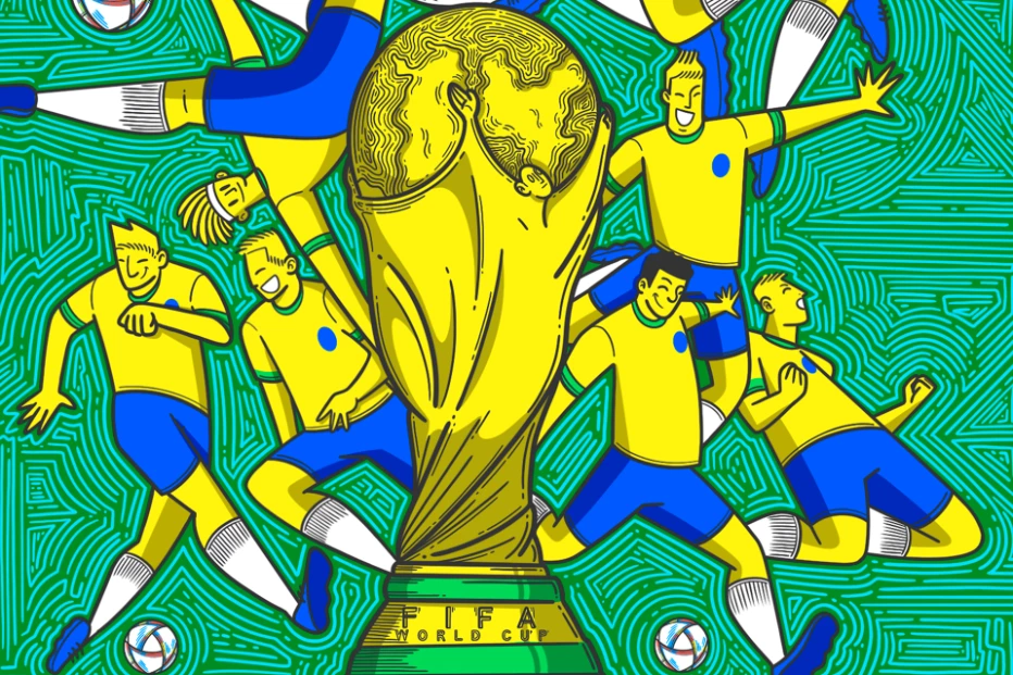
Standout Features:
- Witty illustrations
- Motion
- Joyful visuals
The ongoing World Cup marks the 22nd edition, and Brazil has won five times over the years! “Joga bonito” was born here, and indeed Brazilians have been the faithful missionaries of the beauty in football. Now they’re the favorites to win the sixth one, and Rapha Rios created a series of illustrations reflecting the Brazilian team’s euphoria in this tournament.
The drawings feature the well-known World Cup Trophy in the front and eleven players surrounding it, each with a smile, portraying motion seen on the pitch. The players are all dressed in the famous blue-yellow jersey kits on either a blue or green background. The background features a hatching technique to further emphasize the joy and motion we all associate with this beautiful game.
There’s also a witty rendition of the illustration that resembles a ticket for the World Cup games or a Brazilian ticket for yet another historic championship journey. Rapha cleverly added a perforation line and a blank part beneath it, with the logo of the contemporary World Cup and a barcode. So, it’s an invitation to join them in their conquest!
6. Optibet A League by TRENDO SPORTS
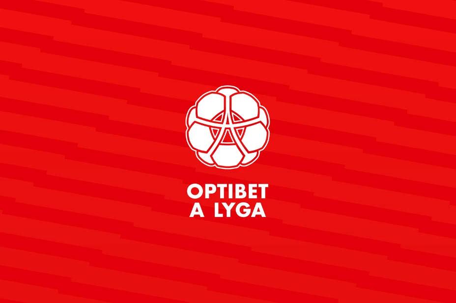
Standout features:
- A Ball with an “A” in the logo
- White-and-red color palette
- Expressive typography
Optibet A is the top-tier Lithuanian Football League. The football league approached TRENDO SPORTS to help them develop a modern, contemporary look for their brand.
The rebranding encompassed a new logo, a fresh color palette, and a new display font for game broadcasts, banners, and relevant collaterals.
The new logo features a white-red ball centered around the letter "A" to portray the league’s name. This red-white ball conveys a message of unity in the league. The "A" is stretched across the ball, keeping the ball intact.
The new font choice was Draft B, and the expressive typography suits the red background perfectly. As for the background, it consists of an interchangeable darker and lighter red that plays nicely in conveying the typical two-color jersey kit and the motion associated with the sport.
7. Fan Rating Football Fantasy by Groovy Web
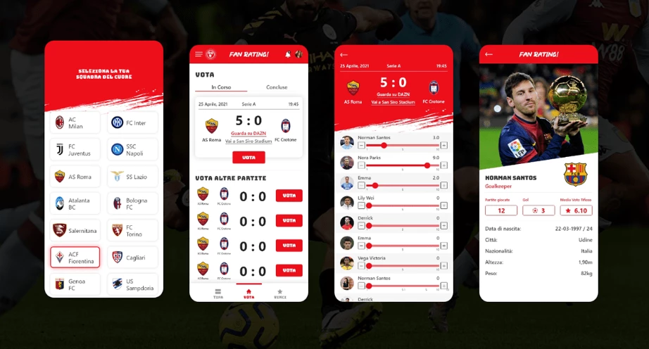
Standout features:
- User-friendly interface
- Fans as central figures
- Interactive experience
It's said that football is all about the fans! Fan Rating Football Fantasy wanted to take that statement to another level and upgrade its user experience. They collaborated with Groovy Web for a new development path, helping the fans enjoy their app even more. The solution provides a new user-friendly interface.
Fan Rating Football Fantasy now offers the fans a variety of options, including a community chat box to connect, ratings for the matches and individual player performances, rewards for the players at the top of the ladder, and even a merchandise shop.
The platform provides an interactive experience for the fans, a sort of competition for the football enthusiasts with lots of voting, communicating, and team rooms to create custom groups - it's a remote pub for hardcore football fans!
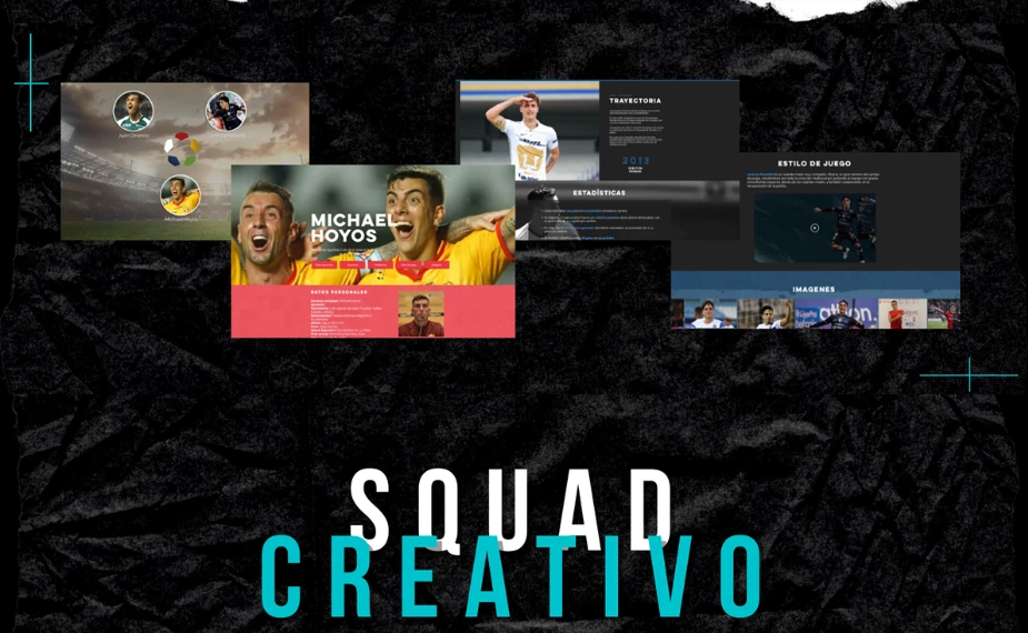
8. Diseno WEB - Football Data Agency by Squad Creativo
Standout features:
- Storytelling, historical layout
- Data-driven
- Iconic moments gallery
Statistics is another part football fans are interested in. That’s why plenty of platforms deal with this aspect in particular. Diseno WEB – Football Data Agency is one of those platforms. They asked Squad Creativo to help them make a logical and intuitive web design to ensure they stand out from their competitors. The result? A storytelling layout that forms both historic and historical ambient for the viewer, educating the audience about the player or a team and reliving the main aspects of the journey they’ve gone through.
The landing page features a portrait of the player in action with five shortcut cards helping the browser quickly navigate to vital data. First, you get access to the basic information about the player, then you can ‘time-travel' through their professional career path. The data stream then fluctuates from personal to statistical while using logos to illustrate where the player’s left their mark so far.
The final touch lets you know more about their playstyle and showcases the gallery of their precious career highlights through real-life photography.
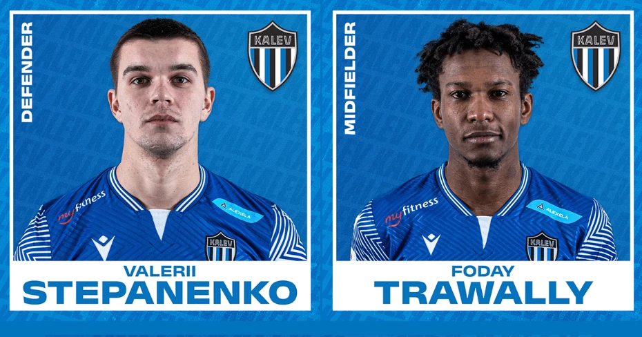
9. Kalev Tallinn 2022 by Kevin Riedel Design
Standout features:
- Name in the background
- Shield-like logo
- Blue-white color code
JK Talinna Kalev is an Estonian football club competing with the best Estonian teams in the national Premium Liiga. They asked Kevin Riedel Design to help this club with its online presence, so he designed the templates for their social media.
All the individual player cards feature a blue background with black prints of the club’s name. The top right corner features the club’s logo, and the top left corner contains the data on the player’s position written in white. The player’s real-life photo is centered in between.
The blue square has a white outline, extending at the bottom, where you can find the player’s name written in blue. So as a whole, the design reflects the balance of the blue-white color palette – the club colors.
The posters, tickets, and club announcements follow the same pattern as the player cards, with some elements shifted. For example, the tickets feature a horizontal midline separator that shows who’s the host and the guest for an upcoming match day. The bottom of the ticket highlights the list of partners, team sponsors, and the league through logo placement.
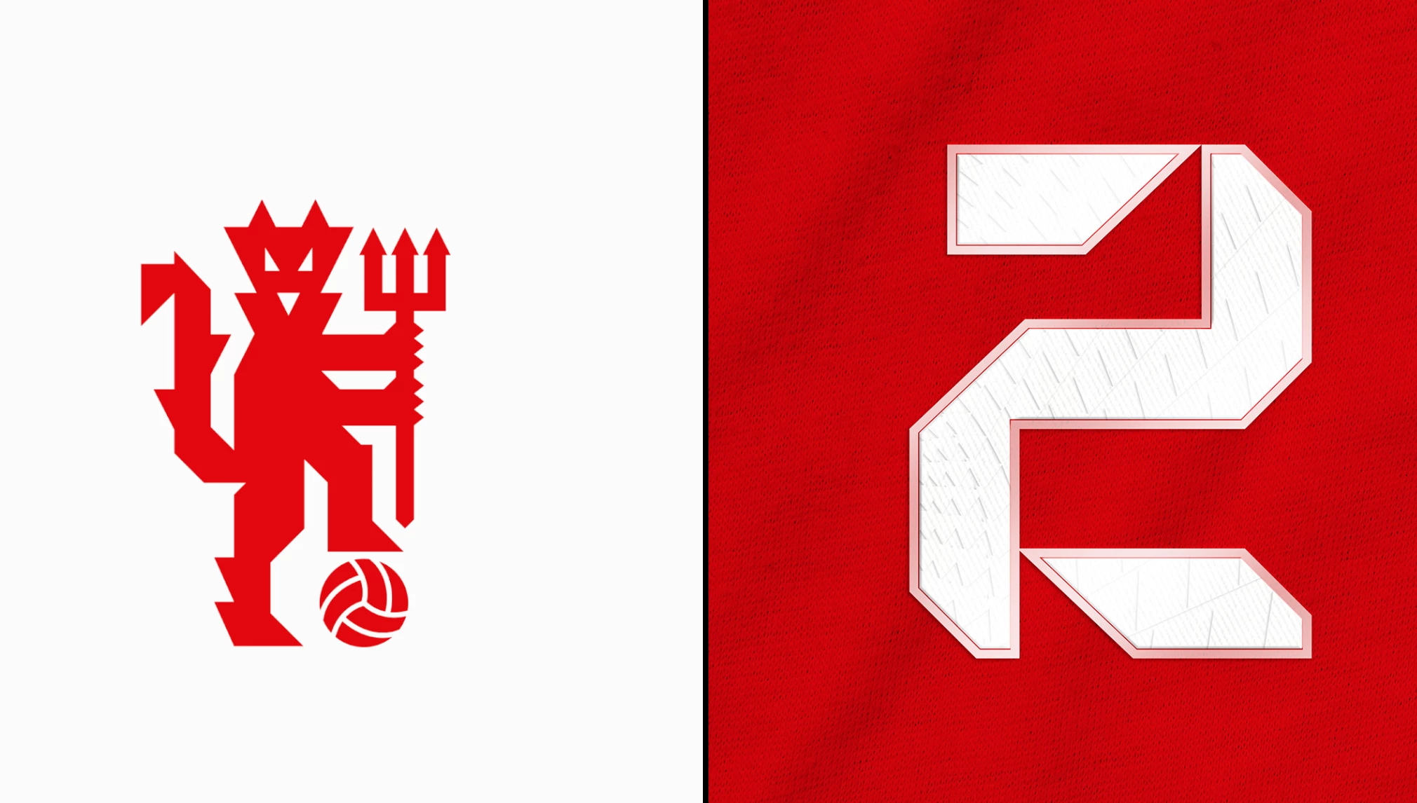
10. Manchester United by Ryan Panchal
Standout features:
- Sharp Geometry
- Triangle-led
- Modern and straightforward
Manchester United might be one of the biggest brands in club football worldwide. The most recent evaluations indicate that the brand now has over one billion fans who are inspired to follow in the footsteps of this great football club.
To pay homage to his affection for Manchester United, Ryan Panchal wanted to make something special for his beloved club – he designed a fully reimagined concept revolving around Man U.
The popular Red Devils got their name based on the club’s logo, featuring a depiction of one. Ryan created a new graphic identity for the red devil: the devil shifted from being blobby to edgy.
By implementing sharp geometry, the new figure now appears more dangerous and powerful. Even the facial features have shifted to three triangles positioned in a way that gives the devil a playful yet mischievous look. The only round addition is the ball at his feet.
The jersey kits now feature t-shirts with triangular gradients, stylized with a certain opacity. The concept, overall, features an omission of everything rounded – the devil figure, player numbers, and t-shirts all feature sharp edges.
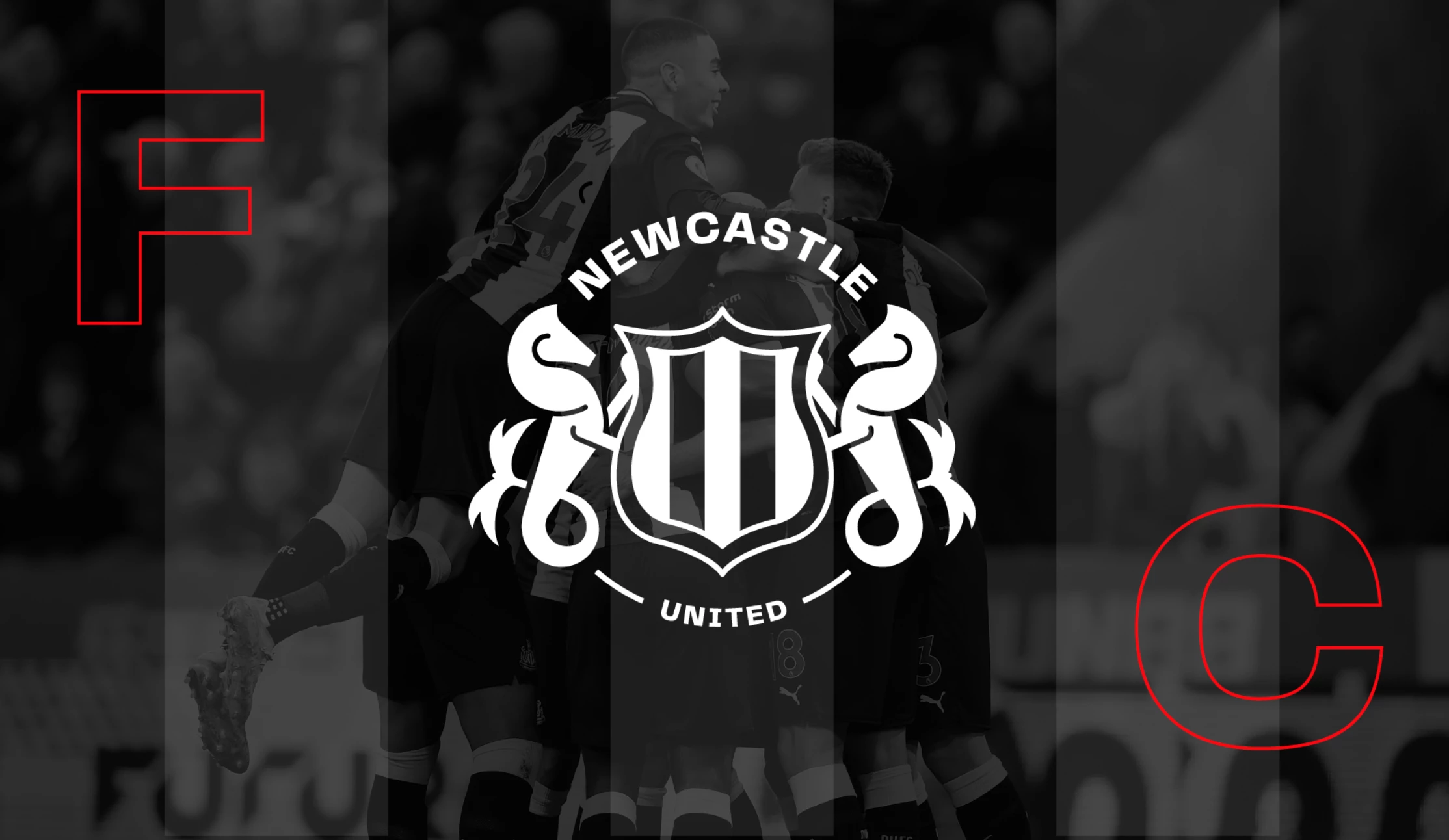
11. Newcastle United FC by Cognitive Creators
Standout features:
- Streamlined designed
- Famous black & white palette
- Flexible
One glance at Newcastle United's kelpies tells of the club's long history. It was founded as a merger of two minor football clubs, Newcastle East End and Newcastle West End. As of the second half of the 19th century, the club had a great history, filled both with failures and moments of glory, war, and peace, but always escorted by the power of community and its intrinsic duality.
The team’s badge is as iconic as their famous black and white stripes and as unique as the silhouette of St. James’ Park. Back in 1969, the club adopted the city’s Coat of Arms as its first official emblem. Over time, the emblem underwent minor modifications and strong typography. Currently, it is perhaps one of the most recognizable football crests.
Today, in the age of digitalization, even legends mustn't pass the opportunity to follow current trends to stay competitive, on the pitch or otherwise. For this reason, Cognitive Creators brushed up the old logo, streamlining it to perfection.
Less sometimes is truly more. The new emblem is simple, clear, and timeless. Simultaneously, it retains the main motives such as the mythical seahorses, the shield, and the iconic black and white stripes.
12. AE Prat by Marc Blanes Studio
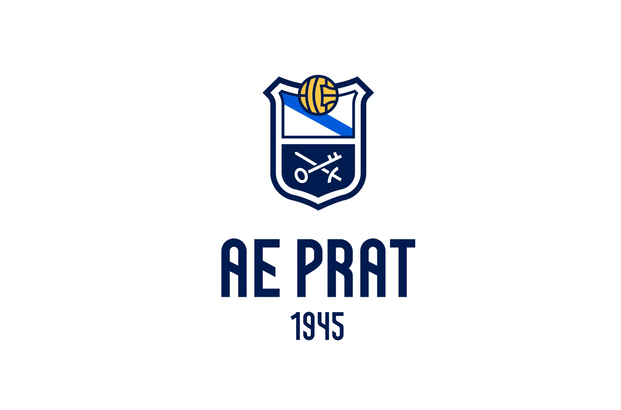
Standout features:
- Strong typography
- Balance of elements
- Three-color palette
Associació Esportiva Prat, founded in 1945, is a renowned Spanish Segunda División football club based in El Prat de Llobregat in Catalonia. Starting a new sports project to lift up its image and grow, the club invited Marc Blanes Studio to refurbish its iconic symbols.
The studio introduced exclusive, semi-angular typography based on the Llobregat river that crosses the city diagonally (which can also be seen on the shield).
This concept is the basis of the club's revised visual identity which, aligned with its new vision, wants to take a step forward in growth and professionalism. With success, if we may add. Primera watch out!
13. Catania SSD by LiuzzoDesign
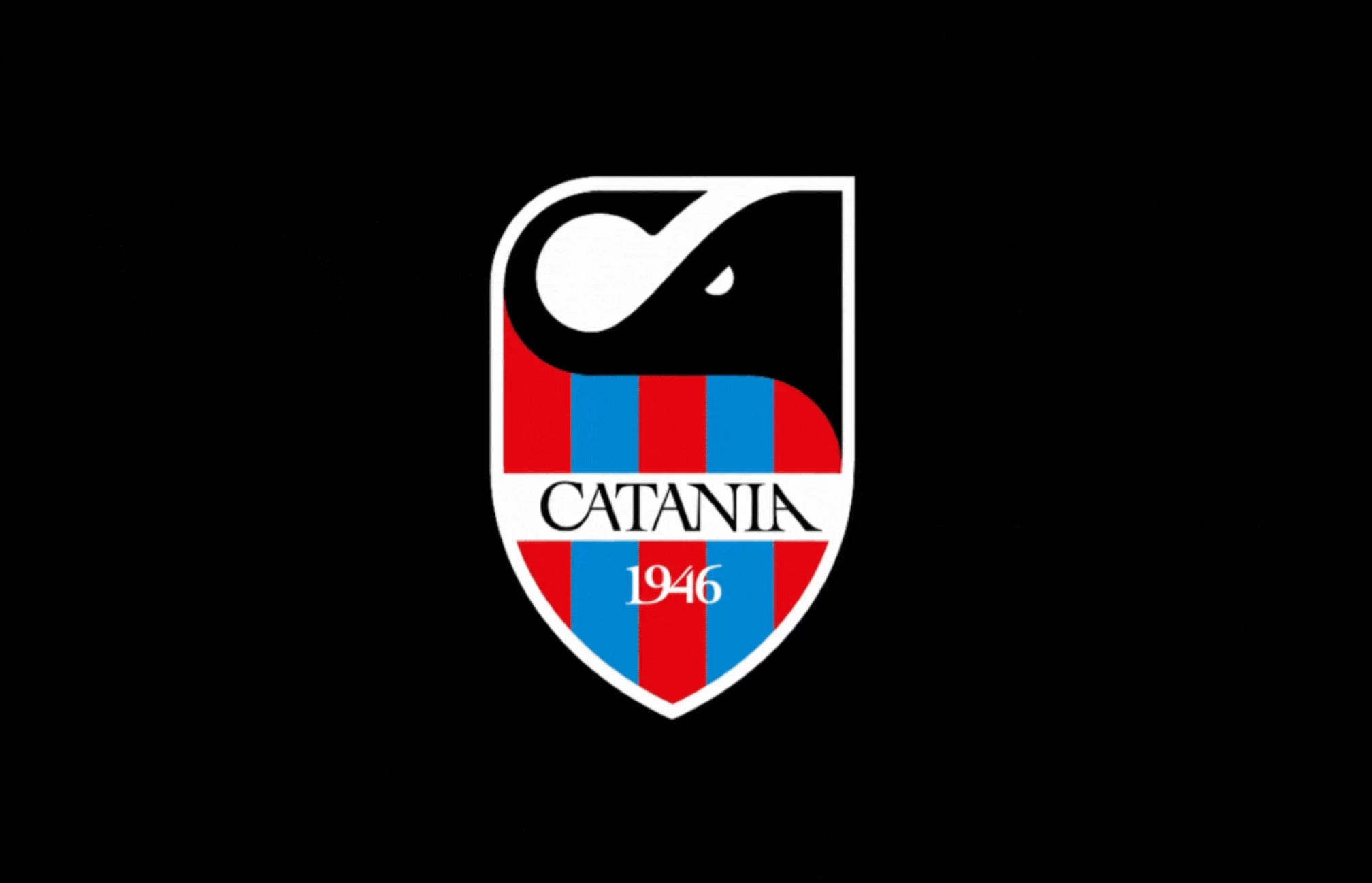
Standout features:
- Evocative design
- Seamless merge of symbols
- Timeless typography
Catania SSD club is and has always been one of the main pillars of the local Sicilian culture. So much so that it is often perceived as an integral part of the island's territorial identity. The club's crest has gone through many iterations but only now, with the help of LiuzzoDesign did it truly and boldly step into a 21. century, retaining all of its quintessential elements.
The design of the new Catania SSD emblem was born as a branding system project to support the strong bond and connection between the city, its inhabitants, and the team.
As a link with the rich history, the iconic red and blue stripes, as well as the obsidian elephant were fundamental elements to be maintained and carefully nurtured throughout the redesign.
The black elephant ("liotru") made of volcanic rock, the symbol of the city of Catania, was designed so that its trunk resembles the letter "C". It acts as the header for a system that exploits the shape of the shield to "speak".
Needless to say, fans heard its tale so the crest of Catania SSD's rebirth became a focal point both on their banners and in their hearts.
14. W1N by Blonde and Giant
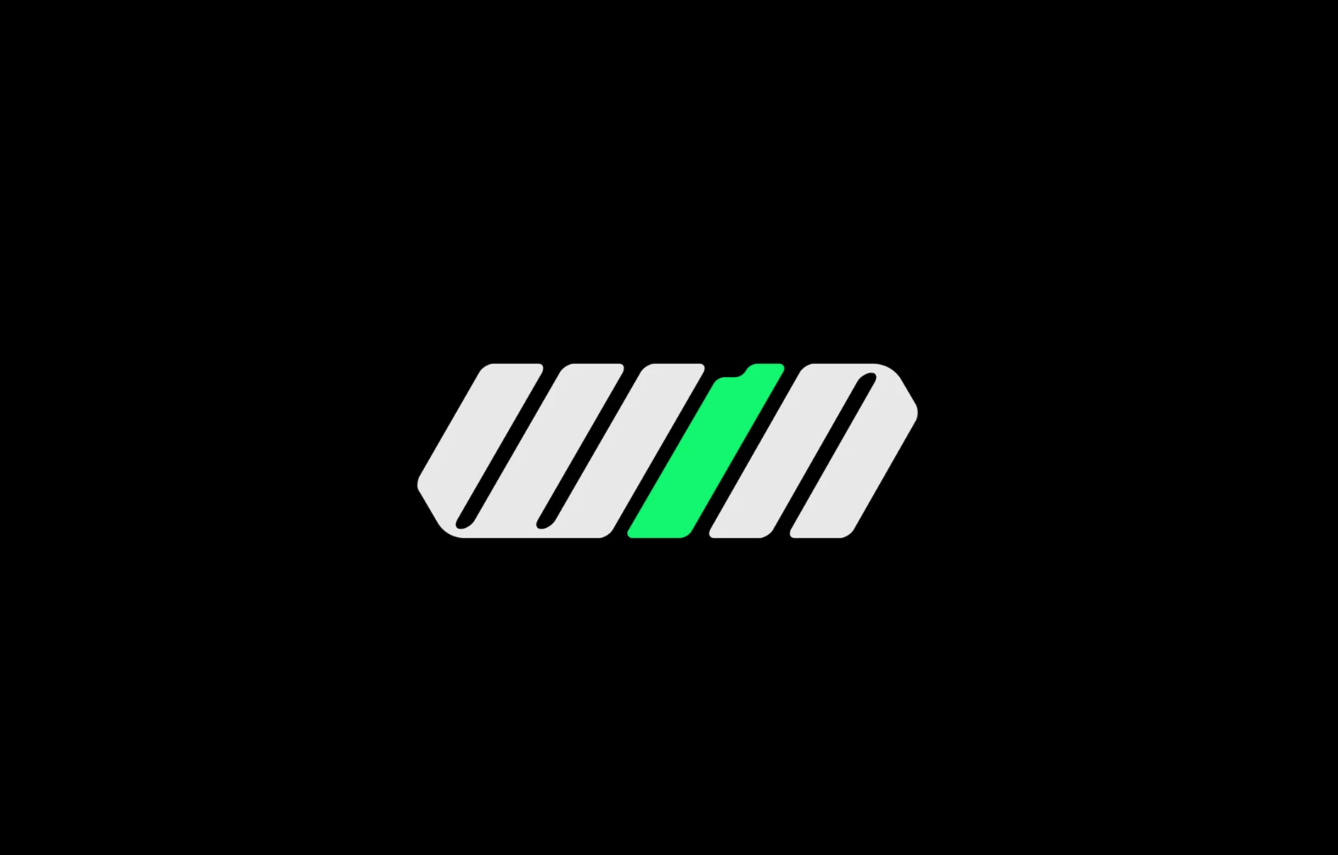
Standout features:
- Neon color scheme
- Winner mentality embodied
- Adaptive branding
W1N is the latest, start-up sports brand built on the foundation of fair play, respect, solidarity, a winning mentality, and above all else - product quality!
W1N offers ultimate goalkeeper gloves and gear but what truly makes it stand out from the more famous, traditional competitors is that part of every single purchase goes to the HOCT (Help One Child Thrive) foundation, a charity taking care of orphans and needy children in Uganda.
Their branding, however, courtesy of Blonde and Giant, is, for lack of better words, winning personified. With a radical, angular, typographic logo and an ultra-functional "1", the brand literally screams top performance and ultimate reliability.
When paired with bright, neon green, the typeface offers a slew of creative branding possibilities across platforms and marketing efforts.
15. Football Federation of the Kyrgyz Republic by VONK Agency
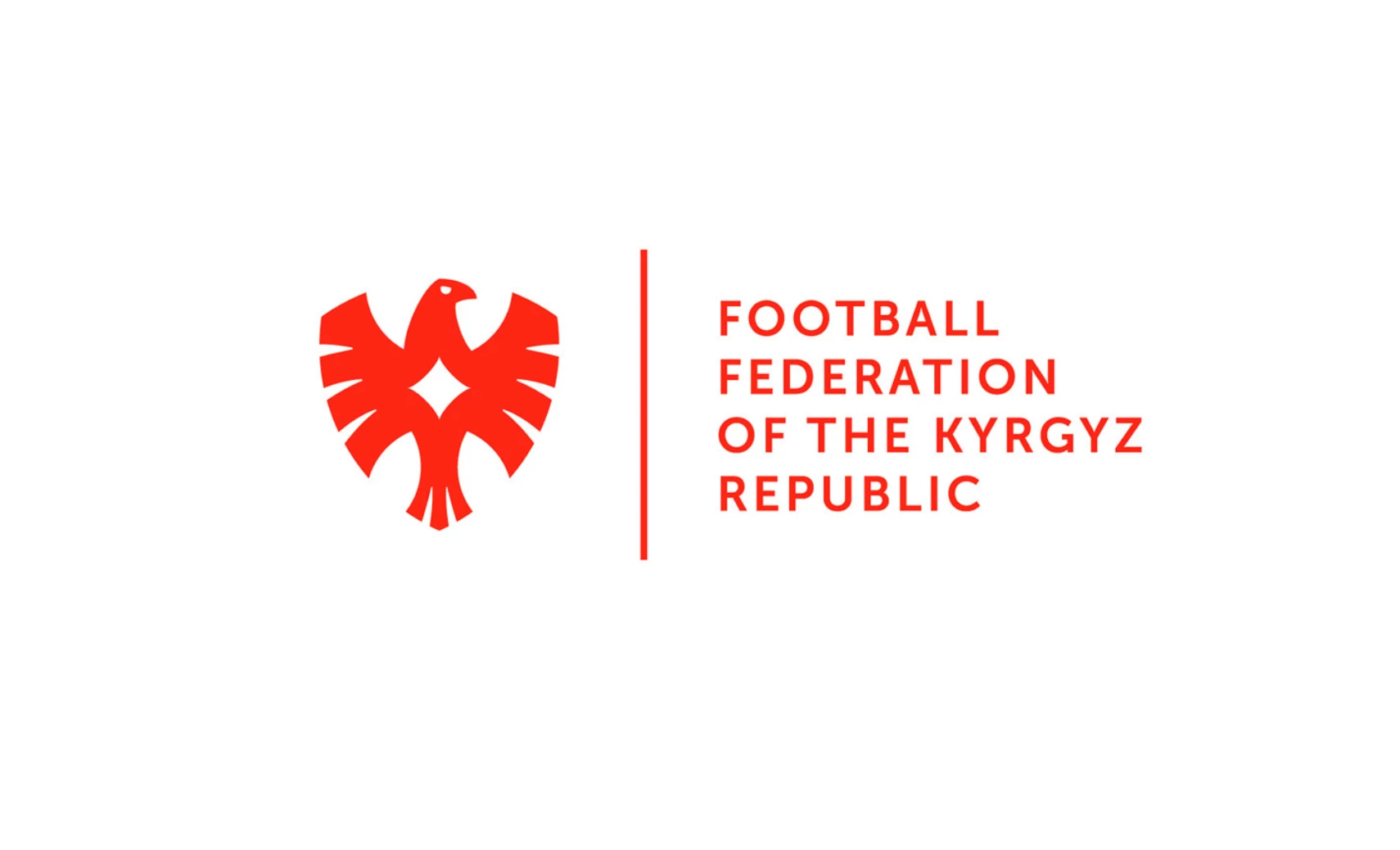
Standout features:
- Bright and bold
- Simplistic and streamlined
- Powerful red color
VONK agency developed a robust rebranding concept for the Football Federation of Kyrgyz Republic that relies on bright and bold elements to capture attention, especially those of younger generations.
As a branding foundation, the agency took the picture of a golden eagle traditionally used in Kyrgyz culture and seamlessly integrated it as the rebranding focus point. As a brave and strong bird of prey, it doesn't hesitate - it acts! And that is exactly the spirit of a team that strives to succeed in competitions ahead.
16. Mitr Phol FC by Nightshift Nest
Standout features:
- Evocative shape
- Modern and minimal approach
- Traditional symbol
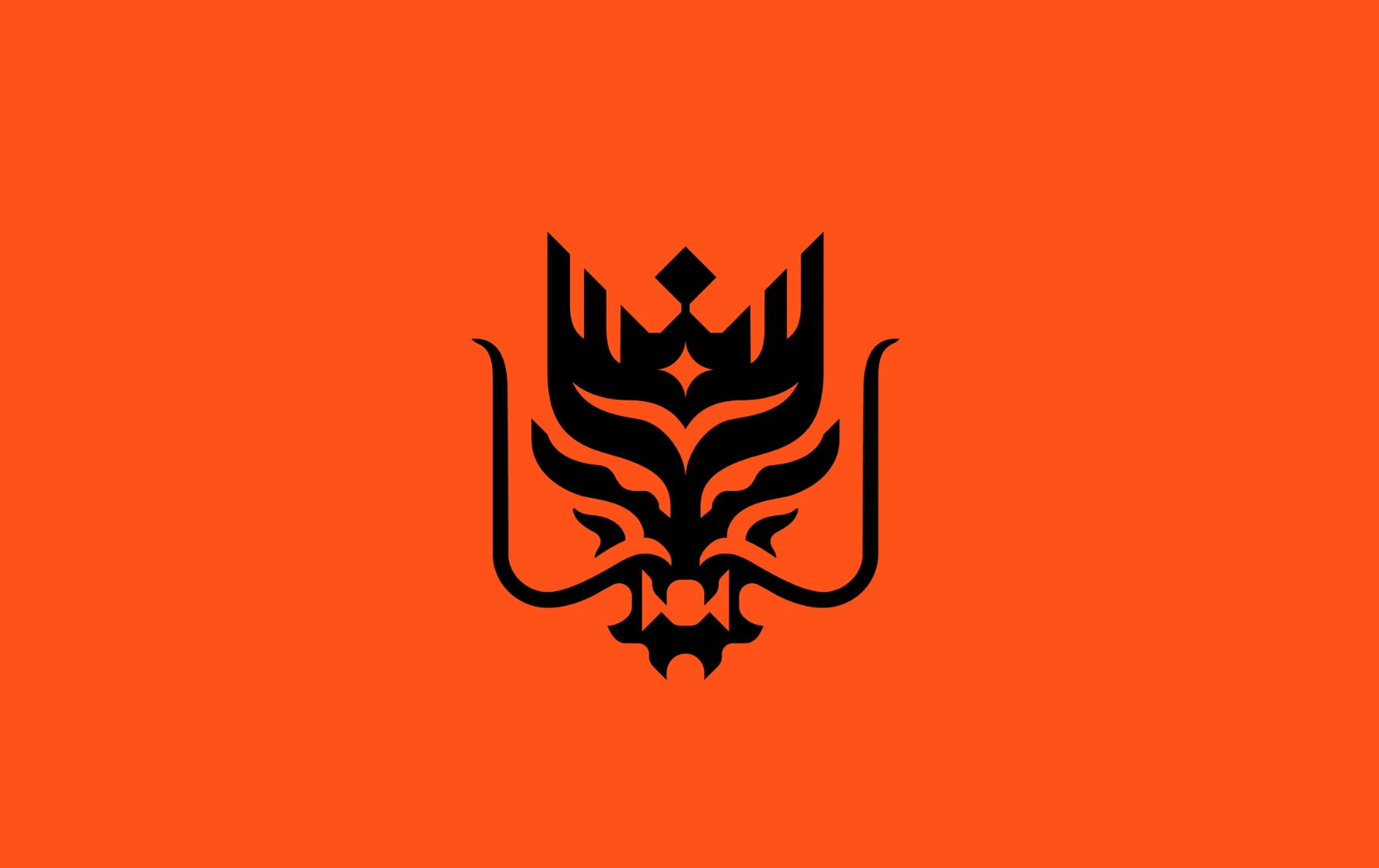
RBMFC is a professional football club in T1 (Thai Premier League) based in Ratchaburi Province. The club's nickname, "The Dragon" can be seen in the team's official crest.
Nightshift Nest's primary idea when rebranding RBMFC is the club's aspiration of ditching the traditional football logo badge to form a modern minimal design that effortlessly catches the eye of their fans.
The agency came up with the idea of a dragon that faces straight forward which links the club with the idea of moving forward to be in the Top 5 of the Thai League.

Our design experts recognize the most innovative and creative designs from across the globe. Visit Design Awards to see the:
- Best Logo Designs
- Best Website Designs
- Best Video Designs
- Best Print Designs
- Best Packaging Designs
- Best App Designs
Our team also ranks agencies worldwide to help you find a qualified agency partner. Visit our Agency Directory for the top Logo Design Companies, as well as:
- Top Web Design Agencies
- Top Video Production Companies
- Top Print Design Companies
- Top Packaging Design Companies
- Top Mobile App Development Companies


-preview-webp.webp)