
Jewelry is more than just a pretty accessory – it's a way for people to express their style and make a statement about who they are.
However, creating a successful jewelry brand goes beyond just making beautiful pieces. It also requires a strong branding strategy. And who better to hone one than one of the best branding agencies currently working in the industry?
To create a memorable jewelry brand, your messages and visuals must convey your unique selling proposition, identity, and story – the elements that set you apart from other sparkling pieces.
Take Tiffany & Co., for example. This iconic brand is synonymous with luxury and elegance, and its branding reflects that. From their iconic blue box to their classic font and elegant design, everything about Tiffany & Co. exudes a sense of refinement.
That’s the way to do it!
Let’s look at some more great examples of jewelry brands that have nailed their branding – from exquisite logos and creative visuals to sophisticated packaging designs.
Table of Contents
- Blue Adalia by Odd Creative
- VALCCI by Yago Bispo
- Juliana Brasileiro - Design de Joias by Juliana Rodrigues Design
- Sonia Sartre by Wildfield Studio
- Desiree Qelaj by Soona Studio
- Sologlow Jewelry Brand by Digilite
- Ocean Jewellery by Laia Creative
- Adorna Luxury Jewelry by Saikai
- PFJ Insignia by Studio Raw
- Brudany Semijoias by Catia Duarte
- HUE.S by aether3
- The Lilac Collective by OneTen The Studio
- Minerva Choices by Yikki Lam
- Tribal by dear:from studio
- Larema Joias by Matheus Paschoalini
- Belsi's Jewelry by WildHive Studio
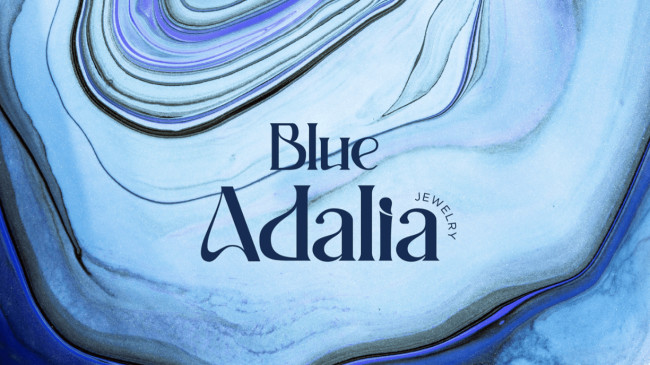
1. Blue Adalia by Odd Creative
Standout Features:
- Modern rebranding aesthetic
- Refreshing color palette
- Classic and artistic font pairing
Blue Adalia is a jewelry brand that speaks to consumers who want high quality and affordability. However, their fine pieces were starting to get lost in the mix of jewelry options – until Odd Creative stepped in to give their brand a fresh new look.
The new color palette is refreshing, but it’s still got that hint of that high-end character. Mixing light and dark shades reflects the brand’s personalities: creative, modern, and elegant.
The wavy, marble-like logo brings out the creative aspect, the outlined sparkling icons scream modernity, and the sans serif typography oozes class and elegance.
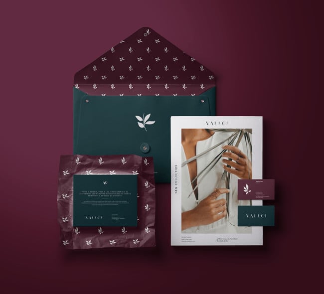
2. VALCCI by Yago Bispo
Standout Features:
- Minimalist logo and brand pattern
- Opulent packaging design
- Rich color story
VALCCI’s jewelry takes inspiration from nature’s most fascinating elements: geometric shapes, flowers, and architecture. Brand designer Yago Bispo successfully translated these elements into a timeless, elegant, romantic branding strategy.
The logo’s delicate leaf icon perfectly represents the brand’s tropical identity. The typography’s geometric styling cuts through the simplicity and brings a sense of refinement, resembling the strength and architecture of the crystals.
Incorporating these visuals into a simple yet luxurious packaging design elevated the brand’s aesthetic. The logo pattern doesn’t just fill up the negative space; it also adds an extra high-end touch.
Lastly, the deep, rich shade of burgundy paired with dark green evokes a feeling of romance and sophistication.
3. Juliana Brasileiro - Design de Joias by Juliana Rodrigues Design

Standout Features:
- Strong feminine brand identity
- Light and earthy color story
- Outlined visuals and typography
Juliana Brasilieiro’s brand speaks to consumers looking for fine pieces that empower women and embody modernity, exclusivity, and minimalism.
Tapping the design expertise of Juliana Rodrigues, the brand’s visual language makes every accessory stand out.
The logo’s intertwined design and wide linear font represent feminine power, but its delicate styling and circular framing also capture the brand’s positive character. The image makes a big statement as it sits on a clean, light packaging design.
This complexity in character is also reflected in the combination of bold colors and light, vibrant shades. Using an earthy color palette highlights the brand’s sustainable value as a company that lessens its environmental footprint.
4. Sonia Sartre by Wildfield Studio

Standout Features:
- Clean, simple and timeless visuals
- Monochromatic palette
- Dainty product photography
Sonia Sartre is an alluring luxury jewelry brand, and we’re totally bewitched by how Wildfield Studio gave it a classic and minimalist touch.
Its visual language speaks to the modern and sophisticated ladies – starting with the simple and timeless logo design that features an elegant typeface with an outlined brandmark.
On a bed of monochromatic palette, this logo looks regal and stunning!
The neutral shades of white, black, and beige also complemented the brand’s delicate photos that showcase the beauty of the accessories. The close-up shots bring out the details in every piece of jewelry, while the dainty styling carries an aura of calmness and sophistication.
5. Desiree Qelaj by Soona Studio

Standout Features:
- Contemporary and luxurious branding
- Sophisticated jewelry lookbook
- A pairing of bold and bright colors
Desiree Qelaj aims to empower women through her majestic creations – a value proposition that Soona Studio beautifully translated in this branding output.
The visual characteristics perfectly suit the brand’s modern and elegant identity. The elegant sans-serif typography and dainty icons are perfect for establishing exclusivity, modernity, and refinement.
And who would’ve thought pink would go so well with green? The soft pink shade represents femininity and joy, while the emerald green captures the brand’s premium quality and power.
A lookbook is also a plus factor, especially for fashion and accessories brands. Customers will get inspired browsing through various creations and be more enticed to check them out.
6. Sologlow Jewelry Brand by Digilite

Standout Features:
- Sharp and edgy typography
- Dark and light themes
- Recognizable brandmark
Newly-established businesses need to make a mark to compete with established players in the market. To get ahead of the jewelry game, Sologlow linked up with Digilite to create a brand that stands out – and it’s a total success!
The logo is enough to get consumers hooked on this brand. We particularly love the bold and elegant logotype adorned with a geometric O symbol resembling a ring.
The industrial quality of the typography with sharp and edgy styling highlights the brand’s contemporary character. Royal blue also makes the brand pop; it’s a sure beauty in a sea of muted shades and visuals!
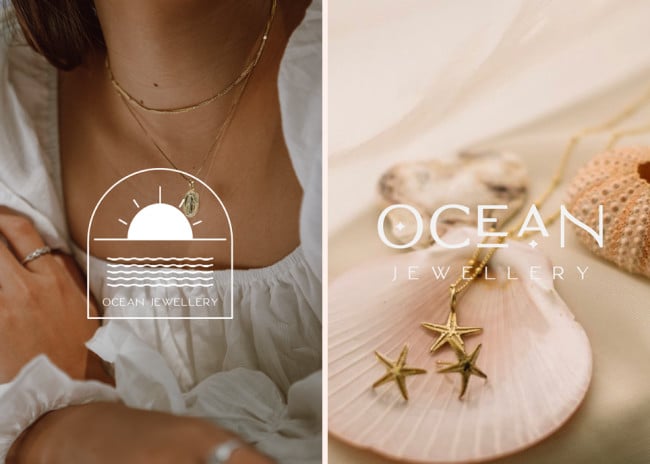
7. Ocean Jewellery by Laia Creative
Standout Features:
- Distinct brand icon
- Oceanic themes and illustrations
- Sparkly packaging design
Like looking at the sea’s most precious treasures, Ocean Jewellery’s branding design by Laia Creative is enchanting.
The oceanic themes are on point, from the aquatic logo design to the outlined sun and sea illustrations.
The stylized letter O, designed to look like a piece of jewel, also creates a distinct image for the brand. This icon doubles as a vital illustration for several branding assets, which is fantastic for establishing brand recall!
The shimmery material in the brand’s packaging design not only captures attention; it also gives a premium feel to the boxes. It’s also very much on brand – like when the sun hits the ocean and casts a sparkling light on the waters.
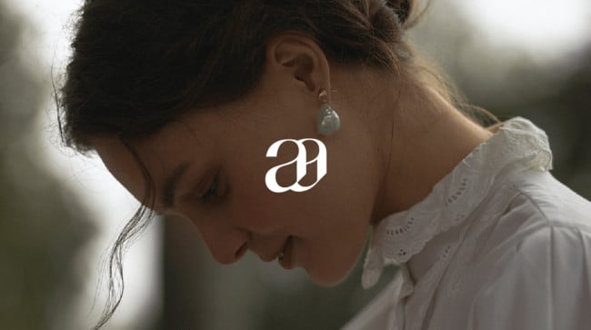
8. Adorna Luxury Jewelry by Saikai
Standout Features:
- Remarkable logo symbol
- Well-designed eCommerce website
- A stylish yet neutral color story
As the name hints, the online brand Adorna Luxury Jewelry offers exclusivity through innovative, sustainable, and hand-processed accessories.
Saikai created a branding strategy that made the company sparkle just as much as its fine pieces.
The logo’s brandmark, an intertwined letter "A" resembling a jewelry piece, is simple, classy, and memorable. The designers mostly used light shades of white, cream, and beige to create a luxurious visual character and drive the focus into the product images.
The eCommerce website is designed to turn visitors into paying customers – thanks to the gorgeous product shots, neat layout, and well-categorized selections.
9. PFJ Insignia by Studio Raw

Standout Features:
- Linear visuals and fonts
- Flowy logo design
- Delicate color story
PFJ Insignia is known for its minimalist gold pieces, and Studio Raw matched that character very well with its clean and elegant design.
Creating the brand’s identity from scratch, the design studio went for a more stripped-back visual language with just the bare essentials.
The combination of cream and gold as the brand theme is simple yet leaves a lasting impact. The visual layouts are adorned with clean and bold lines, giving the brand a modern look in a traditional niche.
To add a bit of complexity, the logo’s flowy illustration connects each letter in the brand name – the perfect juxtaposition to the sharpness of the linear design.
10. Brudany Semijoias by Catia Duarte

Standout Features:
- Elegant and confident visual language
- Personalized packaging design
- Eye-catching brand stamps
Colors are exceptional indicators of a brand’s identity. They help convey its unique characteristics, like how the colors in Brudany Semijoias’ brand express the true beauty in femininity.
Brand designer Catia Duerte created the perfect color story for this brand; blue for confidence, pink for refinement, and white for elegance. It goes so well with the brand’s balance between simplicity and sophistication!
The outlined gem icon featured in the logo clearly signifies the brand’s niche, while its integrated brand initials enrich the icon’s visual quality.
Packaging is an essential element, especially when we’re talking about the fashion industry. The designer did a great job adding personalized touches to the package and adorning it with stamps that make the brand more memorable.
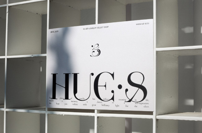
11. HUE.S by aether3
Standout Features:
- Elegant cursive and sans serif font pairing
- Monochromatic color palette
- Bold letters with straightforward messaging
HUE.S is a Taiwanese jewelry brand that sports an edgy identity with its stunning, sharp silver pieces. Let's discuss what incredible things Creative studio aether3 did to its branding.
The logo’s flowy design with a continuous curve styling evokes fluidity – much like the malleability of silver. This aesthetic is incorporated into several layouts for a more cohesive and exotic look.
Pairing this style with a classic sans-serif font adds elegance to the visual language. The key messages are straightforward and bold to match the brand identity.
With big texts, edgy photos, and sharp product shots, neutral shades of white and black added an extra premium feel to the brand and made the visuals look clean and streamlined.
12. The Lilac Collective by OneTen The Studio

Standout Features:
- Elegantly intertwined logo symbol
- Light-themed color palette
- Soft and dainty typography
The Lilac Collective’s branding design by OneTen The Studio captures the true essence of the color; delicate, rare, graceful, and chic.
The brand’s key symbol, an intertwined illustration of the brand’s initials, resembles a ribbon – and it is simply captivating. Creating a pattern out of this distinct image made the brand more distinguishable.
The light shades of cream, grey, lilac, and white create a fresh image for the jewelry brand. It’s also the perfect canvas for making every piece in the collection shine.
The accompanying logotype is a soft and dainty font that adds another layer of elegance and sophistication to the overall look.
13. Minerva Choices by Yikki Lam

Standout Features:
- Mythology-inspired visuals
- Arc-style illustrations
- Royalty symbols and images
Nothing screams royalty better than the iconic images from our illustrious history. To establish Minerva Choices as the home of celestial accessories, designer Yikki Lam took inspiration from the ancient times when gods and goddesses ruled the land.
Using sculptures, pedestals, and pillars as imagery, the brand instantly elicits luxury with its visuals.
The ancient font style, linear typography, and arc-style illustrations also match that specific era, making the whole visual language on-theme.
The flat, miniature icons of on-brand symbols like sparkles and celestial bodies give the brand a modern and streamlined touch.
14. Tribal by dear:from studio

Standout Features:
- Textured logo design
- Bold and bright colors
- Edgy silhouettes and sharp close-ups
Bangkok-based jewelry brand Tribal makes statement pieces for women that are fashion-forward yet still very casual and wearable. Picking up on this identity, dear:from studio designed a brand that’s both edgy and approachable.
The metallic textured logotype design captures the brand’s modern aesthetic very well. That little diamond icon is an excellent little detail on the brand name!
The slogans on the brand’s social media art cards establish the brand’s positioning. Plus, they make a huge statement!
The silhouette figures and sharp close-up shots of the brand’s imagery also add an edgy element to the designs. Using bold and bright colors like red, blue, and beige against a pitch-black background makes the visuals pop.
15. Larema Joias by Matheus Paschoalini
[Source: Matheus Paschoalini]
Standout Features:
- Sharp, modern logo
- Vibrant and distinct brand color
- Sophisticated design
The partnership between Matheus Paschoalini and Larema Joias delivers something unique and exciting in the world of jewelry branding.
We find cues that perfectly complement its products' modern yet elegant aesthetics. The typography and sharp logo icons blend perfectly, presenting an avant-garde and visually attractive packaging design. The one-of-a-kind red hue also complements the white and gold brand logos.
One of the notable characteristics of the Larema Joias branding design is its clean execution. Despite several elements rarely encountered in this space, Matheus Paschoalini ensured the design would stand out in the market.
The logo is enough to get anyone's attention. If it's your first time coming across this brand, it's easy to notice the elegant and contemporary features that make it blend well with modern times.
And in the end, this design conceived an edge over the established brands in the industry.
16. Belsi's Jewelry by WildHive Studio
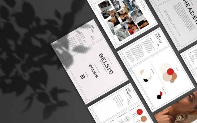
Standout Features:
- Evocative
- Traditional palette
- Classy and elegant typography
Starting as two sisters' unrelenting dream back in 2010, Belsi's Jewelry shines bright, bridging the gap between affordable and authentic IndoWestern jewelry. Coming from a big family of five sisters, jewelry always played a significant role in their lives - it was love, pride, and heritage embodied.
In addition to said attributes, their passion and dedication were the reason why WildHive Studio started to buzz around to form timeless and classy branding that aims to elevate sisters' dreams to new heights.
WHS' branding solution emanates from Belsi's unique origin and personality effortlessly. Belsi's jewelry is for the explorers and adventurers of the world, travelers and socialites. It's for bold, ambitious women who use their clothing and accessories as a form of self-expression.
The new, modern color palette, fonts, and photography direction reflect all that and more. Colors pay homage to the Indian roots while still appealing to Western women. Clean, strong fonts showcase the brand's direction that focuses on the jewelry in a way that allows the viewer to imagine themselves in the model's place.
Our design experts recognize the most innovative and creative designs from across the globe. Visit Design Awards to see the:
- Best Logo Designs
- Best Website Designs
- Best Video Designs
- Best Print Designs
- Best Packaging Designs
- Best App Designs
Our team also ranks agencies worldwide to help you find a qualified agency partner. Visit our Agency Directory for the top Logo Design Companies, as well as:
- Top Web Design Agencies
- Top Video Production Companies
- Top Print Design Companies
- Top Packaging Design Companies
- Top Mobile App Development Companies


