


-account-photo_listing.jpg)
-account-photo_listing.jpg)


Our Jury has worked with Prada, Nike, Chanel, Google, and Apple.
Best Brand Logo Designs
4,200+ Submitted Designs- Advertising
- Agriculture
- AI
- Airline
- Alcohol
- App Company Logo
- Architecture
- Arts & Recreation
- Automotive
- Banking & Finance
- Beer
- Church
- Clothing Brand
- Coffee
- Content & News
- Distribution
- E-Commerce & Retail
- Education
- Engineering
- Entertainment
- eSports
- Farm
- Fashion & Beauty
- Food & Beverage
- Government
- Health & Wellness
- Hospitality
- Legal & Insurance
- Luxury
- Manufacturing
- Non-Profit
- Photography
- Professional Services
- Real Estate
- Restaurant
- Restuarants
- SEO Agencies
- Shoe Brand
- Small Business
- Software
- Sports & Leisure
- Startup
- Technology
- Travel
- Video Companies
- Weed/Cannabis
- Abstract
- Animated
- Artistic
- Bakery
- Black
- Black & Yellow
- Blue
- Bold Logo
- Brand
- British
- Business
- Circle
- Creative Name
- Dental Office
- Done by Freelancers
- Emblem
- Floral
- Geometric
- Glow
- Gradient
- Gym
- Icon
- Illustration
- Lettermark
- Logo symbols
- Makeup Brand
- Marathon
- Minimal
- Modern
- Monogram
- Multicolored
- Nature
- Negative Space
- Rebranding
- Red
- Redesign
- Simple
- Starting With the Letter S
- Successful
- Sunshine
- Trendy
- TV Channel
- Typography
- Unisex Salon
- Vintage
- Water
- Watercolor
- Wordmark
View Design
Roblox Logo Design Analysis
View Design
Animula
View Design
Lali Chic
-preview.jpg)
View Design
Momenta
View Design
Signal Labs
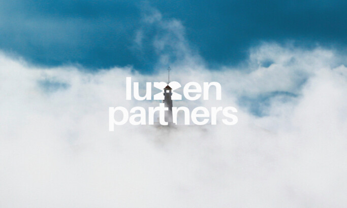
View Design
Lumen Partners

View Design
Youtube

View Design
Palomar Health
Get Connected
With The Right Agency Partner
& Receive Proposals For FREE

View Design
Newton Stores
byUBlac

View Design
Eaxtron

View Design
Softaccel Solutions

View Design
Ahava Doula Services

View Design
ADAPTNXT
byImajine

View Design
Shril

View Design
Bildi
byMoohii
Ready to elevate your designs?