Wine isn't all about the taste, as anyone who has browsed a liquor store's shelves can confirm. There’s something unique and special to the experience of having it – from the bottled patience of treating the vineyards to the type of glass you sip it from. But other than its origin and taste, the best champagne is always followed by a good branding campaign.
Let's face it, most people choose their wine based on the label on the bottle, which may surprise you if you're a skilled oenophile. Because of this, top branding agencies adorn the bottles with labels that are both eye-pleasing but they also accurately capture the essence of your winery. A wine label should provide all the information you require about the wine, including the variety, the intended consumer, the country of origin, and the price range.
Here are some impeccable examples of champagne branding done right:
1. Taste Of Victory by Skogtroll Design
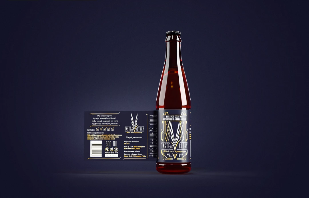
Standout Features:
- A barley motif
- Art deco style
- Golden “checkmark”
Taste of Victory is a high-end champagne beer created by the Polish brewery, The Order of Yoni. As this is not an ordinary beer, but one for those who are celebrating a grand achievement, they contracted Skogtroll Design to help them with branding.
The tone was set with a unique logo design that leverages the Art Deco style. It resembles the poster for the movie The Great Gatsby, and it symbolizes everything related to this universe: the splendor, prestige, and luxury you want to feel as you enjoy your Taste of Victory.
The logo contains a series of capital Vs on top of each other, reminiscent of barley – one of the crucial elements of every exceptional beer. The bottom V is golden and looks like a checkmark that represents two things: your success and cause for celebration, and the brand’s verified quality.
2. QUI-ME-RA by MD3 STUDIO
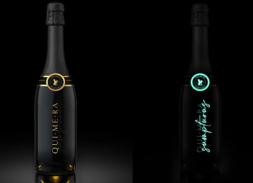
Standout Features:
- A premium design
- Night-and-day version
- Gold and glowing cyan color palettes
QUI-ME-RA is a champagne with no name or logo. What it did have was an excellent aroma. MD3 STUDIO was the one that ‘christened’ the brand and designed its visual identity, making it instantly recognizable.
Chimera is frequently used as a symbol of a lush imagination, and it implies the champagne’s ability to let you explore your imagination and travel to an adventurous world as you sip it.
The advantage of this champagne branding, other than relying on associating it with a sense of luxury, is the ability to present it as a predominantly evening beverage. As for its visual identity, this premium design plays around with the day’s transformation into the night.
The logo places the golden depiction of the mythical creature at the forefront and the metamorphosis is emphasized by creating two versions – a day and a night one. Both have a circular label around the neck of the bottle and the logotype is printed vertically. However, what differentiates them is the colors used – the day version is covered in gold, and the night one glows in cyan.
3. L'Hommage by Desiree von Canal
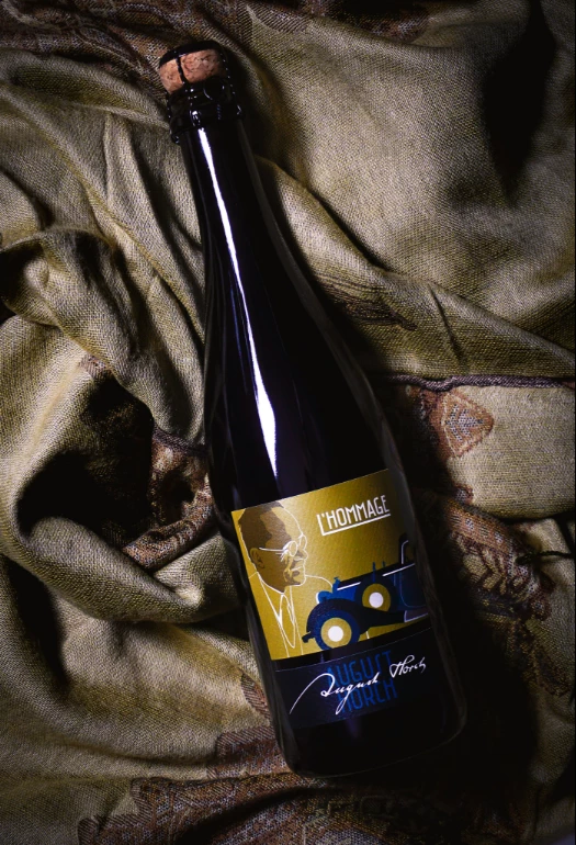
Standout Features:
- Retro aesthetics
- Ochre and a mix of blue colors
- Automotive imagery
L’Hommage is a special, jubilee selection branded by von Canal and Heike Müller, the granddaughter of August Hoch, the founder of the Horch and Audi companies. Desiree von Canal created an identity revolving around this great historical figure.
To emphasize the brand name, the visual appearance is heavily inspired by retro European aesthetics from the first half of the 20th century. The color palette explored a combination of ochre yellow and various tones of blue.
The left side of the label features Hoch’s outlined portrait and he appears to be looking at his creation, a colorful illustration of an old-fashioned automobile. Above the car, the top right corner of the label features the brand name wordmark written in white bold custom font and the beginning L extends to underline the whole word. Below the yellow label is a navy-blue etiquette with “August Horch” spelled out across it.
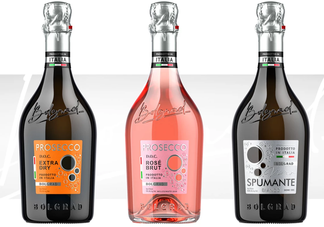
4. ITALIAN SPARKLING by Shumi Love Design
Standout Features:
- Embossed elements
- The Italian flag
- Product-showing bubbles
Part of the recently extended Bolgrad portfolio is its new line of classic Italian sparkling wines. The ITALIAN SPARKLING wines were branded by Shumi Love Design and the agency took great care in translating the Italian wine-making culture into the new product.
So, apart from the style of its production, Shumi Love Design aimed to set a tone, an atmosphere, and the sensation of enjoying this drink through the design. Each bottle is decorated with a small, rectangular label, color-coded to differentiate the delicate nuances in taste. Apart from the vital information, the label has cut-out bubbles that bring attention to the wine inside in an intelligent and intuitive way.
Minimalistic representations of the Italian flag can be found on the outline of the labels and on the neck of the bottle, emphasizing that the wine is produced in shipped from Italy. Both above and below the labels, there’s an embossed brand logotype – the one on top written in cursive style and the bottom one bolded out.
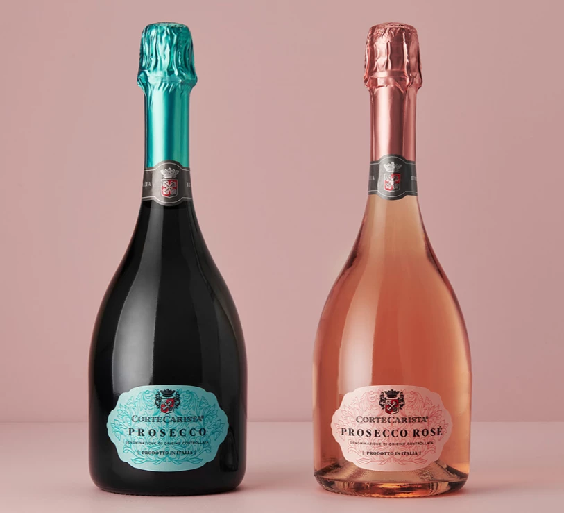
5. Corte Carista Prosecco by Harcus Design
Standout Features:
- Embossed dense flowers
- Family crest insignia logo
- Royalty symbolism
Corte Carista Prosecco is a brand meant to tickle the palates of the most exquisite wine lovers. The premium quality is presented best through the addition of plenty of royalty references to the branding, courtesy of Harcus Design.
The neck of every bottle is covered with foil painted in a color that complements the product inside. The front side features a logo designed to resemble tradition and royalty – a family crest insignia.
The body is decorated with a label of the same color, full of dense, embossed flower illustrations. On the flowers, there’s the logo positioned above the brandmark and the typography explaining the details about the product.
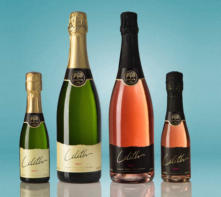
6. Lilith by 303 Design
Standout Features:
- Feminine and empowering
- Rebellious
- Personal
Lilith is the pioneering product of the Portuguese vineyards, Casa Barrios. The brand name is far from the only female quality it relies on. In fact, the whole branding process by 303 Design ensures that you know that this wine is for the calm and the crazy – it's for a woman who enjoys exploring uncharted territories.
The logo resembles a hand-written signature in a custom cursive style, reinforcing the individuality and authenticity of the brand and those who enjoy it. It found its spot on the label center of every bottle, but also on linen shopping bags and every social media publication or ad.
The feminine traits continue through empowering, usually black-and-white photography depicting women in various times and settings. According to Talmud, Lilith is the first woman in the world. As such, she is the one who makes her own rules. And this champagne aims to remind women that they have the power to do remarkable things.
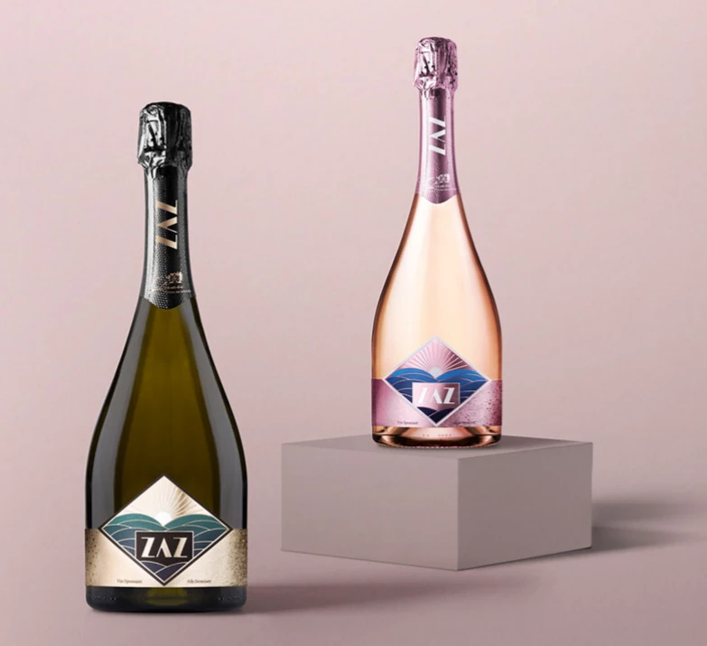
7. ZAZ by 441 Design Studio
Standout Features:
- Classy and elegant
- Youthful
- Bright and sunny
ZAZ is a special wine brand designated for the young. The Cotnari Wine House collaborated with 441 Design Studio to turn ZAZ into the cheque, modern brand it is today.
The label colors reflect the color of the product, the sparkling wine. Each label encompasses a square depicting a vineyard field on a sunny day in a minimalistic illustration. Among the vineyards that appear to portray various altitudes, there’s the brand logotype written in a cool, modern custom font. The square is outlined by a thick border and the label continues to extend to a subtle limited varnishing effect on both sides.
The branding presents the product in a fun, lenient, youthful way, all the while maintaining its prestige and glamour.


-preview-webp.webp)