Dark theme websites have become increasingly popular for their sleek aesthetics, energy efficiency, and eye-friendly contrast.
These designs offer a visually immersive experience, making them an excellent choice for creative portfolios, tech brands, and luxury industries. Below, we explore some of the best dark mode websites that set the standard for innovative web design.
1. Imotion Factory by ClefDev Design Studio

Standout Features:
- Bold, decorative typography
- Innovative work previews on the homepage
- Smooth, hypnotic transitions
First impressions matter. And Imotion Factory nails it. The first thing that grabs your attention? The logo. A simple red dot: subtle, yet unmistakably film-inspired. Film enthusiasts will immediately recognize the red dot beside the brand name as a subtle yet brilliant nod to its full-service video production expertise.
Then, there’s the homepage. No clutter, no distractions — just big, bold type on a black background. Clean. Minimalist. Effective. Navigation? Stripped down to just two options: Contact and Menu. There’s even a small circular loading indicator in the lower right corner, reinforcing the cinematic feel without overcomplicating things.
But here’s where it gets really interesting. Instead of embedding videos like every other production site, Imotion Factory takes a different route. Their homepage features diagonal stills that melt as you scroll, like liquid dissolving on screen. Each preview comes with a play button and a clear Call to Action (CTA) leading to project details. It’s a simple but genius move; unexpected, immersive, and, most importantly, memorable.
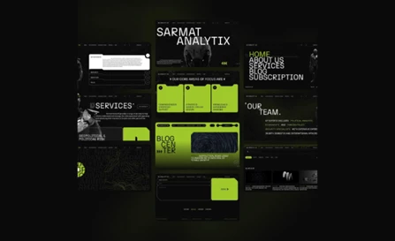
2. Sarmat by Obriy Design Buro
Standout Features
- Bold, brutalist typography with a contemporary edge
- Fluid scrolling effects that enhance engagement
- Minimalist layout with a high-impact aesthetic
Sarmat, a geopolitical risk consulting firm, needed a digital presence that matched its expertise in advanced risk assessment. They partnered with Ukraine-based Obriy Design Buro to develop a website that reflects the firm’s technological sophistication while maintaining clarity and accessibility.
The design leans heavily into a futuristic, high-tech aesthetic, blending science fiction elements with real-world military and robotics influences. The sleek robotic visuals and abstract technological motifs reinforce Sarmat’s authority in geopolitical intelligence, creating an immersive experience for users.
A bold, dark-themed UI with neon highlights immediately captures attention. The interplay of deep blacks and electric greens creates a striking contrast, ensuring key elements (such as CTAs and navigational cues) stand out. This design choice also enhances readability.
The user-friendly layout ensures that Sarmat’s core focus areas, services, and team insights are clearly defined, allowing visitors to quickly access relevant information without friction. Each section is purposefully spaced, preventing cognitive overload and maintaining engagement.
3. Avocado Systems by PopArt Studio

Standout Features
- Dynamic, mechanical illustrations
- Colorful icons
- Uniform page layouts
Avocado Systems, a cybersecurity brand with a playful name, takes an unexpected yet highly effective approach to its website design. Created by PopArt Studio, the site balances technical sophistication with a fun, engaging aesthetic — proving that even security-focused brands can stand out with bold design choices.
The use of dynamic, mechanical-style illustrations brings Avocado Systems’ core services to life. These interactive elements break down complex cybersecurity concepts into digestible visuals, making the technology feel more accessible while reinforcing the brand’s expertise.
A vibrant color palette injects energy into the design, counteracting the traditionally heavy feel of dark-themed websites. Electric blues, purples, and warm yellows pop against deep black and green backdrops, creating a striking contrast that enhances readability and draws attention to key content.
Beyond aesthetics, the uniform page layouts ensure a seamless user experience. Each section is structured for clarity, allowing users to navigate them effortlessly. The balance of visuals, text, and whitespace keeps the interface clean while maintaining engagement.
With its mix of creativity, functionality, and a strong brand presence, Avocado Systems’ website is a standout, proving that even technical industries can embrace fun and engaging visuals.
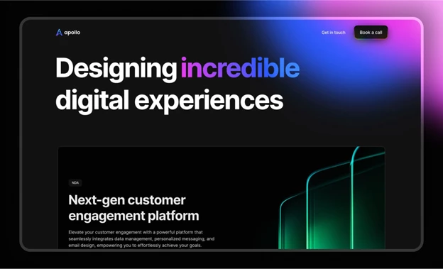
4. Apollo by Apollo Studio
Standout Features:
- Intuitive and structured navigation
- Dynamic interactive elements
- Bold colors in a dark-themed UI
Apollo Studio, a Siberia-based digital agency, needed a website that reflected its global reach and user-focused design philosophy. The result is a sleek, high-impact interface that seamlessly blends functionality with visual storytelling.
The intuitive and structured navigation ensures a frictionless user experience. Each section is neatly arranged with clear content blocks, making it easy for visitors to explore Apollo Studio’s offerings, from mobile apps to web and product design. The layout is carefully designed to guide users naturally through the site.
Hover states and user-controlled components add movement and engagement, transforming static visuals into dynamic interactions. These subtle yet effective details create an immersive experience, keeping users engaged while reinforcing Apollo Studio’s modern sensibilities.
The bold color accents against a dark-themed UI enhance both aesthetics and readability. The black background serves as a sleek canvas, allowing vibrant colors and animated elements to stand out. This contrast not only makes key content more digestible but also establishes a polished and professional brand identity.
Explore the boldest black web designs pushing digital boundaries and see what sets them apart.
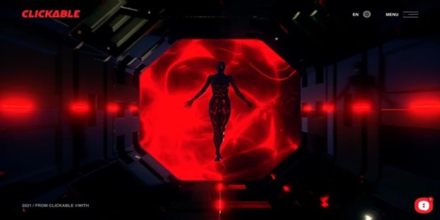
5. Clickable by Clickable
Standout Features
- Immersive animations and motion effects
- Seamless navigation
- Dark-themed UI with bold color contrasts
Clickable, an Odessa-based digital agency specializing in branding, web design, and development, took a bold step in rebranding itself with a website that embodies its name — designed to captivate and engage users with every interaction. The agency leveraged its expertise to craft a highly visual and interactive digital experience that seamlessly blends aesthetics with functionality.
From the moment users land on the homepage, immersive animations and motion effects take center stage. The dynamic visuals create a near three-dimensional effect, guiding users through the agency’s services. Parallax scrolling and cyberpunk-inspired imagery add depth and movement, ensuring the site feels fluid rather than static. The hover effects also turn simple interactions into an exploration of the brand’s expertise.
On the other hand, the sticky hamburger menu integrates effortlessly into the design, offering quick access to essential sections. Clicking on a menu item instantly transitions users to the relevant section; no unnecessary animations nor lag. This logical flow ensures visitors stay engaged, moving effortlessly from one section to the next.
The dark-themed UI with bold color contrasts aligns with modern digital trends, leveraging a deep black background with crisp white typography and striking red highlights. This high-contrast enhances readability and reinforces Clickable’s brand identity: bold, confident, and high-tech. The red accents serve as visual cues, subtly guiding users’ attention to key points throughout the site.
By combining interactive storytelling, fluid navigation, and a striking visual identity, Clickable delivers an experience that stands out in the digital landscape. Its sleek execution and user-centered approach proves that functionality and aesthetics can work in perfect harmony.
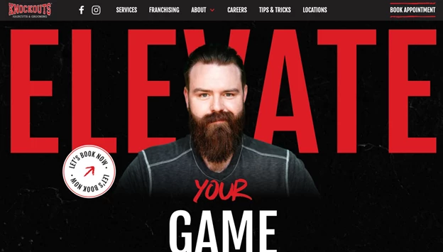
6. Knockouts Haircuts & Grooming by Digital Silk
Standout Features:
- High-impact visuals and engaging animations
- Streamlined UX for effortless navigation
- Confident, brand-driven copywriting
Partnering with Digital Silk, Knockouts Haircuts & Grooming overhauled its outdated website, introducing dynamic visuals, a frictionless booking process, and an immersive user journey. The revamped site is designed to convert casual visitors into loyal customers — and potential franchisees into serious investors.
High-impact visuals and engaging animations define Knockouts’ new digital presence. A bold red-and-black color scheme reinforces strength and confidence, perfectly targeting men looking to refine their style.
A striking hero animation (showing a transformation from rugged to polished) sets the brand’s tone, while smooth transitions and microinteractions in key CTAs, like "Get Knocked Out" and "Book Appointment," enhance engagement and responsiveness.
A standout feature is the interactive salon locator, allowing users to quickly find Knockouts locations. With the ongoing integration of a third-party booking system, customers will soon be able to schedule appointments with just a few clicks, reducing friction and increasing conversions.
Brand-driven copywriting then strengthens Knockouts' messaging. Short, punchy slogans like "Punch Up Your Style" reinforce its energetic persona, positioning the brand as more than just a grooming service — it’s a destination for transformation and confidence. This strategic messaging not only enhances the customer experience but also makes Knockouts more compelling for potential franchisees.
Experience movement with purpose and explore the more animated websites that bring design to life.
7. Tigers by Wise People

Standout Features:
- Vertical accents
- Puzzle cut-inspired images
- Subtle CTAs
Wise People decided to combine two strong color shades in one website design and it came out exactly what it aims to be — dominant.
This dark theme website example boasts many top-tier qualities. One, its black theme with a touch of red in a slightly lighter hue gives off the right amount of intensity that Tigers offers its clients. The tagline “We will show you the right way” loses its intended impact with colors other than its current black and red.
Also, the images showcased through the website are creatively presented. They’re not in squares or rectangles but in puzzle-like shapes. Along with the vertical lines (in gray and red) in the background, these puzzle-like pieces add depth and dimension to the design.
Lastly, when you scroll down just above their footer section (homepage), you’ll see a space dedicated to their past clients. Unlike other web designs that simply display all logos at once, row by row, Wise People added the previous and next functions to keep the logos organized and uncluttered.
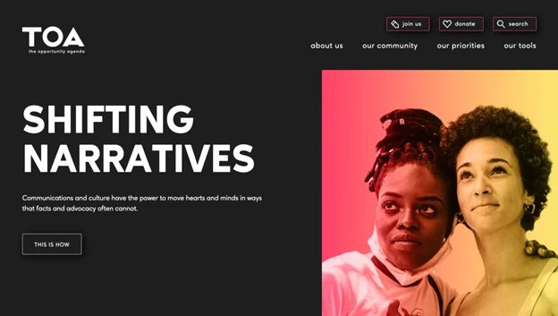
8. TOA by Outright
Standout Features:
- Minimalist design with bold typography
- Immersive dark mode with strategic color accents
- Seamless navigation with clear CTAs
The Opportunity Agenda (TOA) has long been a vital resource for progressive organizations, helping them sharpen their messaging and advocacy efforts. With a renewed focus on combating systemic injustices, TOA needed a digital presence that reflected its evolving mission. Outright took on the challenge of designing a website that seamlessly blends powerful storytelling with modern, user-friendly design.
TOA’s minimalist design with bold typography ensures that every message lands with impact. The site directs attention to key statements and educational content, making information more digestible. Large, sans-serif fonts amplify TOA’s core messaging, reinforcing the organization’s voice with visual strength. This approach enhances readability while maintaining a clean, modern aesthetic.
The dark mode website interface, complemented by rich color accents, adds depth and visual intrigue. Gradients and strategically placed hues highlight essential elements, creating a balance between sophistication and accessibility. This immersive approach not only aligns with contemporary web design trends but also enhances content focus while reducing eye strain — a crucial factor for engagement and retention.
Navigation is intuitive and action-driven, ensuring users can find relevant information with minimal effort. Clear, unmissable CTAs guide visitors toward key actions—whether exploring resources, engaging in advocacy, or learning more about TOA’s mission. Thoughtful microinteractions, like subtle hover effects, also enhance the design.
9. Will Ventures by Butter Studio

Standout Features:
- Minimalist dark-themed design
- Hidden yet intuitive navigation
- Bold, engaging welcome message
Butter Studio crafted a sleek and purpose-driven website for Will Ventures, a venture capital firm that thrives on bold decision-making. The site embraces a minimalist dark theme with strategic design choices that ensure clarity, engagement, and a seamless user experience.
The minimalist dark-themed design creates a sharp contrast between the deep black background and bold white uppercase text. This stripped-down approach allows visitors to focus on Will Ventures’ core messaging. Each section is thoughtfully structured, guiding users through the firm’s mission, services, and past investments with effortless clarity.
A hidden yet intuitive navigation system keeps the interface clean. Instead of overwhelming users with multiple menu options upfront, the design subtly integrates navigation within the experience. Calls to action are strategically placed, including an eye-catching tagline, “Know Nothing of the Impossible,” in the lower-left corner — doubling as both branding and an engaging entry point for visitors.
Subtle touches of yellow add contrast to the dark aesthetic, highlighting CTAs and interactive elements. These accents not only enhance usability but also reinforce the brand’s identity, ensuring that key actions stand out without disrupting the minimalist design. Hover effects on clickable text further refine the interactive experience, making the site feel dynamic yet refined.
10. Uptec by Miew Creative Studio

Standout Features:
- Interactive and dynamic submission form
- Bold and hollow typography contrast
- Persistent news ticker for updates
Miew Creative Studio’s design for Uptec challenges convention with a bold, high-contrast aesthetic that merges structured geometry with fluid movement. This dark-themed website leans into a monochromatic palette, creating a visually striking experience that is both experimental and functional.
Instead of a traditional form, the "Apply" button appears as an oversized, illusion-like element that dominates the screen, making it nearly impossible to miss. This approach not only captures attention but also enhances user engagement by encouraging interaction in an unconventional way.
On the other hand, instead of relying on color to highlight key messages, the design alternates between solid and hollowed-out text, creating a layered effect that adds visual depth while maintaining readability. This typographic approach reinforces the brand’s identity without overcomplicating the interface.
A persistent news ticker runs across all pages, ensuring visitors stay updated on Uptec’s latest announcements. Positioned at the bottom of the screen, this scrolling element mimics a breaking news banner, subtly reinforcing urgency and keeping users informed without disrupting the overall layout.
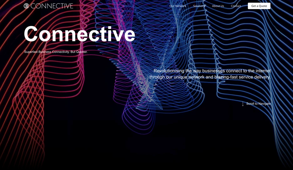
11. Connective by Lincoln Collective
Standout Features:
- Dynamic and fluid design elements
- Vibrant, high-contrast color accents
- Sleek black background for visual depth
Connective, a provider of high-speed internet solutions across the UK, needed a website that matched its brand’s speed and efficiency. Lincoln Collective took on the challenge, crafting a sleek, high-energy digital experience that balances functionality with striking visuals.
The dynamic design elements create a sense of movement and flow, reinforcing Connective’s brand identity as a provider of seamless, uninterrupted connectivity. Animated graphics subtly guide users through the site, while carefully placed transitions add an interactive feel without overwhelming the interface.
Bright, high-contrast color accents bring energy to the site. Vibrant lines in teal, orange, and purple cut through the dark background, preventing visual monotony while directing users' attention to key areas. Teal, in particular, is used strategically to highlight navigation paths and important CTAs.
A sleek black background enhances contrast and readability, allowing text and interactive elements to stand out. This design choice not only reinforces a modern, tech-driven aesthetic but also ensures an intuitive user experience by maintaining clarity across all sections.
By combining motion, bold contrast, and a streamlined layout, Connective’s website exemplifies how smart design can enhance user engagement.
First impressions matter. Discover the best welcome page designs that instantly capture attention.
12. Afundi by Afundi
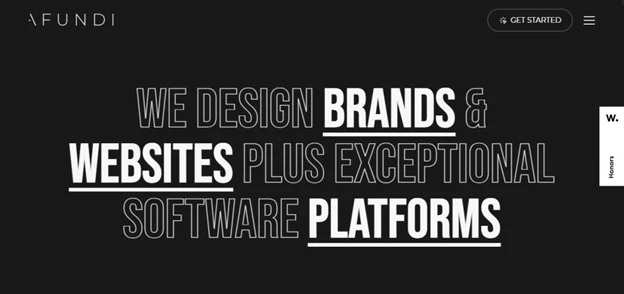
Standout Features:
- Bold, conversion-focused homepage design
- Dynamic portfolio showcase for engagement
- Interactive microinteractions for a seamless experience
Afundi, a creative agency specializing in brand development, website design, and software platforms, needed a digital presence that reflected its expertise and ability to convert visitors into clients. Its website delivers an immersive experience through high-impact visuals, interactive elements, and a strategic layout that highlights the agency’s capabilities.
The all-black hero section sets a dramatic tone, complemented by striking typography and a clear value proposition. As users scroll, a widescreen brand video seamlessly introduces Afundi’s diverse skillset, showcasing its approach to branding, digital design, and platform development. Every section aligns with the goal of converting visitors into clients.
A dynamic portfolio showcase brings Afundi’s work to life. The homepage video not only highlights past projects but also gives users an overview of the agency’s services in an engaging, digestible format. As users explore further, in-depth case studies provide detailed insights into the agency’s capabilities, ensuring that potential clients see the breadth and depth of Afundi’s expertise.
Additionally, hovering over bold, underlined keywords in the hero section reveals snippets of featured projects, while a custom cursor creates a circular magnifying effect. Scrolling through the project list triggers dynamic previews that shift and expand, keeping users engaged while maintaining a clean, structured interface.
13. Poppr by Poppr
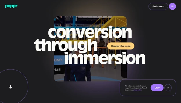
Standout Features:
- Bold color accents on a dark background
- Smooth animations and interactive transitions
- Striking typography for enhanced readability
Belgium-based Poppr specializes in crafting immersive digital experiences, and its own website is a testament to this expertise. Designed to captivate and convert, the site blends sleek animations, vibrant visuals, and compelling messaging to engage visitors from the first click.
Gold, purple, and shades of teal punctuate the deep black background, creating a balance between exclusivity and playfulness. These accents highlight key elements, such as navigation and CTAs, while smooth transitions from purple to yellow add depth and motion, ensuring a dynamic flow throughout the site.
Seamless animations and interactive transitions further enhance engagement. Subtle parallax effects, hover-triggered movements, and buttery-smooth scrolling keep the experience fluid and intuitive. The full-screen sliding menu maintains accessibility, ensuring users can explore without friction.
Additionally, striking typography makes the content digestible and visually appealing. The customized Ravenna Serial font strikes a balance between professionalism and approachability.
Bold, benefit-driven copy is strategically placed, ensuring clarity while maintaining a light, engaging tone. Clearly visible CTA buttons guide users seamlessly through the site, reinforcing Poppr’s unique value proposition. By combining high-impact visuals, dynamic movement, and thoughtful typography, Poppr delivers a website that is both immersive and conversion-focused.
14. Wanted For Nothing by Wanted For Nothing
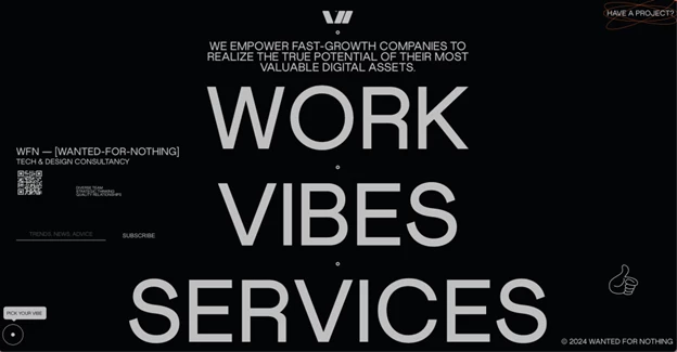
Standout Features:
- Expressive typography for maximum readability
- Dynamic animations enhance engagement
- Unconventional layout reflecting brand personality
Wanted For Nothing, a creative agency known for its bold approach, needed a website that mirrored its distinct identity. The result is a visually striking platform that blends high-contrast typography, interactive elements, and an unconventional layout to create a uniquely immersive experience.
The site’s expressive typography ensures effortless readability while making a strong visual statement. White and orange text set against a black background provides high contrast, drawing attention to key messages. Uppercase lettering and bold typefaces amplify its impact. This careful typographic selection enhances the user experience while reinforcing the brand’s confident, modern aesthetic.
Dynamic animations add an engaging layer to the browsing experience. From the interactive “Collaborate” button with its concentric orange rings to the subtle movements highlighting the letter “O” like sun rays, these elements create a sense of fluidity. Scrolling further reveals animated service lists and playful text transitions that respond to cursor movements, keeping the experience fresh and interactive.
The unconventional layout sets Wanted For Nothing apart. The hero section functions as both an interactive menu and a storytelling element, guiding users through featured projects, a curated client list, and prominent CTA buttons. The “Vibes” page further showcases the agency’s personality, using dynamic content blocks and playful team bios with emoji-based “superpowers” that humanize the brand.
15. UBUNZO by Ubunzo Studio
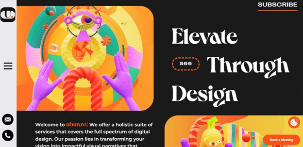
Standout Features:
- Bold and vibrant visual layout
- Sticky side navigation for seamless browsing
- Engaging portfolio with immersive visuals
UBUNZO’s website is a digital showcase of contemporary creativity, designed to captivate users through bold colors, dynamic visuals, and an intuitive layout. Every element is carefully crafted to reflect the agency’s artistic vision while maintaining a fluid and engaging user experience.
The hero section features two animated visuals with striking colors and abstract art, creating an energetic first impression. This color-forward approach extends throughout the site, using bold typography and contrasting hues to guide users through content while reinforcing UBUNZO’s unique brand identity.
A sticky side navigation menu ensures effortless browsing. Positioned on the left, this intuitive menu remains visible as users scroll, allowing for quick access to key sections. The design is enhanced with a clean white background and playful orange star icons, keeping it both functional and stylistically cohesive with the site’s dynamic aesthetic.
The immersive portfolio showcase is designed for engagement. Projects are presented through a horizontal scrolling menu, each featuring a prominent image with a text overlay. Clicking on a case study reveals a detailed project breakdown, complete with work-in-progress images that provide insight into UBUNZO’s creative process.
Why Consider Dark-Themed Websites?
Dark-themed websites go beyond aesthetics; they offer practical benefits that enhance both user experience and brand perception. Whether you're designing for a creative portfolio, a cutting-edge tech company, or a luxury brand, a dark UI can give your website a sleek, modern edge while improving usability. Here’s why you should consider it:
1. Reduced Eye Strain & Improved Readability
Dark themes reduce glare, making screens easier on the eyes — especially in low-light environments. By using dark grays instead of pure black and pairing them with properly contrasted text, designers create a comfortable reading experience that minimizes fatigue during prolonged use.
2. Battery Efficiency on OLED & AMOLED Screens
For mobile users, a well-executed dark mode can extend battery life. OLED and AMOLED screens consume less power when displaying dark pixels, making dark-themed websites an energy-efficient option — especially for brands with a strong mobile presence.
3. Stronger Visual Hierarchy & Focus
Dark backgrounds naturally push bright elements forward, drawing attention to key CTAs, headlines, and interactive components. When paired with strategic accent colors (such as neon blues, vibrant reds, or metallic golds), dark themes can guide users’ focus and improve engagement.
4. Modern, High-End Brand Perception
Dark mode carries an inherent sense of sophistication and exclusivity. Luxury brands, high-tech companies, and entertainment platforms frequently use dark themes to create an immersive, premium experience. A well-designed dark UI can instantly elevate a brand’s identity and make it feel more polished and forward-thinking.
5. Enhanced Accessibility & Personalization
Many users prefer dark mode for comfort and accessibility. Offering a dark theme (or a toggle between light and dark modes) allows visitors to customize their experience, catering to different preferences and lighting conditions. This not only improves usability but also demonstrates a commitment to user-centric design.
Best Practices for Dark Theme Websites
Implementing a dark theme website requires more than technical expertise, it also requires a thoughtful balance of aesthetics, usability, and accessibility. While dark modes can create a sleek, modern look, they must also enhance the user experience. Below are best practices to ensure a visually appealing and functional dark-themed website.
1. Ensure Sufficient Contrast
A common mistake in dark theme design is using pure black (#000000) as a background. While it may seem like an intuitive choice, pure black can create excessive contrast, leading to eye strain and readability issues.
Instead, use dark grays (#121212, #1A1A1A) or deep blues as a base to soften the visual experience. Text and interactive elements should have a high enough contrast ratio to meet WCAG accessibility guidelines, ensuring that all users, including those with visual impairments, can navigate the site comfortably.
2. Use Vibrant Accents for Emphasis
Dark-themed websites should not be monochromatic. To prevent the design from feeling dull or flat, use vibrant accents such as neon blues, electric purples, or pastel hues to highlight key UI elements like buttons, CTAs, and links.
These colors should not only create a visual pop but also serve a functional purpose by guiding users' attention toward important areas of the site.
3. Optimize Readability with Proper Typography
Text legibility is crucial in dark mode design. Here’s how to ensure readable typography:
Avoid pure white text (#FFFFFF) on a dark background — it creates harsh contrast and causes eye fatigue. Instead, use light gray text (#E0E0E0 or #CCCCCC) for a softer, more comfortable reading experience.
Choose clean, sans-serif fonts for better readability. Fonts like Inter, Roboto, and Poppins work well for dark-themed interfaces.
Maintain a sufficient line height (1.5x the font size) to improve readability in long-form content.
4. Maintain Brand Consistency
A dark theme should not be an afterthought. It must align with your brand identity. Consider how the dark color scheme reflects your industry, audience, and message.
Luxury brands may use a dark theme for sophistication, while gaming and tech companies may use it for futuristic appeal. The transition from a light to dark mode should feel seamless and not disrupt the overall brand experience.
5. Consider Accessibility and User Preference
A well-designed dark theme website should be user-friendly for all audiences. Implement these accessibility measures:
- Provide a toggle option between light and dark mode to accommodate user preferences. Many users switch modes depending on lighting conditions or personal comfort.
- Ensure text, buttons, and interactive elements are distinguishable in dark mode by testing color contrast ratios (aim for at least 4.5:1 for normal text and 3:1 for large text).
- Use icons and visual indicators to reinforce navigation elements, ensuring clarity even when colors alone may not suffice.
Dark Themed Websites: The Bottom Line
Dark theme websites have long surpassed being a passing trend. Today, they’re a powerful design choice that enhances user experience, reduces eye strain, and delivers a bold, modern aesthetic.
For creative portfolios, it whispers sophistication. For high-tech brands, it screams innovation. For luxury markets, it radiates exclusivity. A well-built dark theme doesn’t just support a website; it becomes the experience.
But here’s the catch: dark mode rewards the careful and punishes the lazy. Too much contrast, and users flee. Too little, and they strain their eyes. Get it wrong, and your sleek, modern look collapses into a dimly lit disaster. Get it right, and users stay longer, engage deeper, and remember more.
The difference between the two? Execution. Thoughtful contrast, deliberate accents, and smart accessibility choices turn a dark theme from a gimmick into a game-changer. When done well, it doesn’t just work — it wins.
Dark Themed Websites: FAQs
1. Why are dark mode websites popular?
Dark mode websites reduce eye strain, improve battery life on OLED screens, and create a modern, immersive look that appeals to many users. Dark mode websites examples include those that prioritize content with light text on a dark background, often employing shades of gray and muted colors to maintain readability and visual comfort.
2. What industries benefit most from dark theme websites?
Industries such as technology, gaming, entertainment, and luxury brands often use dark themes to enhance aesthetics and user engagement.