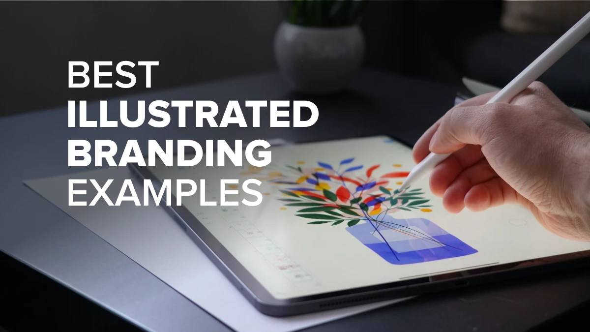
Illustrations have the power to tell compelling stories that go beyond words, creating an emotional connection with audiences. Whether whimsical, minimalist, or bold, the right illustration style can evoke specific feelings and align seamlessly with a brand’s identity.
Let’s explore 15 brand illustration examples that showcase how diverse styles and techniques can emotionally resonate with audiences, driving engagement and inspiring your own branding strategy.
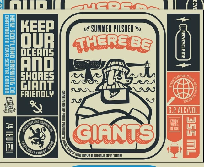
1. There Be Giants by Bend Industries
Standout features:
- Vintage-themed imagery
- Excellent typography
- Pleasing concept execution
There Be Giants encourages people to enjoy life’s best moments with their line of beverages. They believe you shouldn't spend money buying overpriced bottles and cans of drinks that often end up polluting the ocean.
Designed by Bend Industries, this stunning illustrative branding example focuses on environmental awareness and having a good time. Its vintage choice of visual elements concocts a fun scenario for viewers: that they’re here to have the best time. The font choices are intelligent and easy to read, which is a must for effective branding.
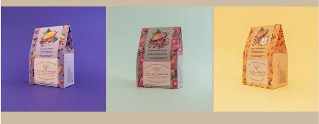
2. Luisa Abram Chocolates by Maria Paula
Standout features:
- Pleasing color story
- Vibrant image choices
- On-brand design concept
What better way to promote and brand your Latin American products than to give them a Latin flair? Designed by Maria Paula, this illustrative branding for food has captured the essence of authentic Latin American flavors without being too overpowering.
The images of the cacao fruits, leaves, and seeds decorating the whole package are simply marvelous. The color story is vibrant and bright, allowing the chocolates to take center stage. The illustrations demonstrate that these cacao beans from the Amazonian rainforest bring the hidden flavors of Latin America to your table.
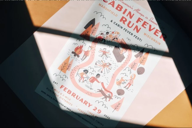
3. Cabin Fever Run by Super Creative
Standout features:
- Fun visual elements
- Autumn-themed design
- Comforting color palette
Illustrative branding can be used on various promotional assets, such as event posters. This is what Cabin Fever Run has done in advertising its cabin fun run to its patrons. The poster is fun, quirky, and relatable, thanks to Super Creative’s wit and creativity.
The designers capitalized on the fact that autumn is one of the most comforting seasons for many people and included various drawings of fun fall activities. This is a great way to show friendship and harmony during one of the busiest seasons of the year. The use of autumn colors like red, brown, and orange pulled everything together into a theme.
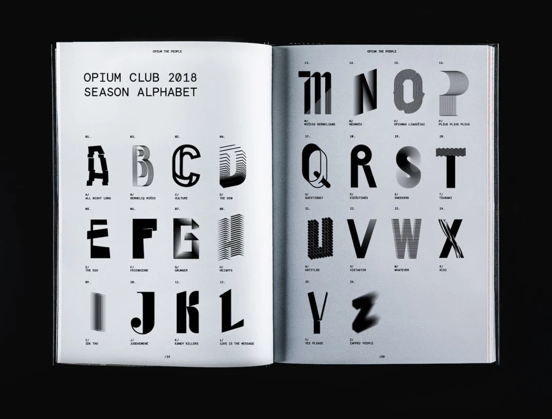
4. OPIUM CLUB by andstudio
Standout features:
Unique typography
Flexible design system
Club-like vibe
This is another excellent example of illustration-based branding, created for a music venue. andstudio crafted a dynamic visual identity for OPIUM CLUB, a premier electronic music venue. The design features are rooted in a custom alphabet, so each event gained a unique symbol reflecting its character and energy.
Bold, confident, and fluid, the new identity transformed the club into a cultural movement and revitalized its connection with the community. The new design system reinforced brand cohesion while empowering event organizers with adaptable tools that are sure to stand out.
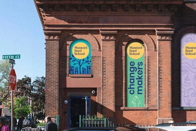
5. Mustard Seed School by BLVR®
Standout features:
- Simple, clean design
- Engaging style for kids
- Bold color palette
For Mustard Seed School, a Christian-arts-infused institution, BLVR® developed progressive and empowering brand elements to engage millennial parents. Inspired by its artistic curriculum, the creative agency created a vibrant, modern visual identity with a bold color palette and simple illustrations that engage students and parents alike.
The abstract face masks and the large tree growing around buildings evoke a sense of wonder, encouraging kids to embrace imagination and exploration. They also help children associate school with positivity and excitement. The new brand identity and gorgeous illustrations revitalized the school’s appeal and reinforced its mission to nurture creativity and purpose.
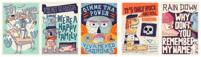
6. Winter Illustrations by Kien Studio
Standout features:
- Expressive imagery
- Latin-themed concept design
- A variety of personalities
Illustrative branding examples also work great in multiple marketing assets with one unified message. Winter Illustrations by Kien Studio provides a tour around the world with the help of enthusiastic, artistic, and provocative drawings.
The artists gave each illustration its own personality that coheres with the other posters when presented as a group. The Latin flair of the drawings is quite evident even though it depicts other places like Russia and the Wild West. This is one great example of visual elements that harmonize so well, even though each component stands well on its own at first glance.
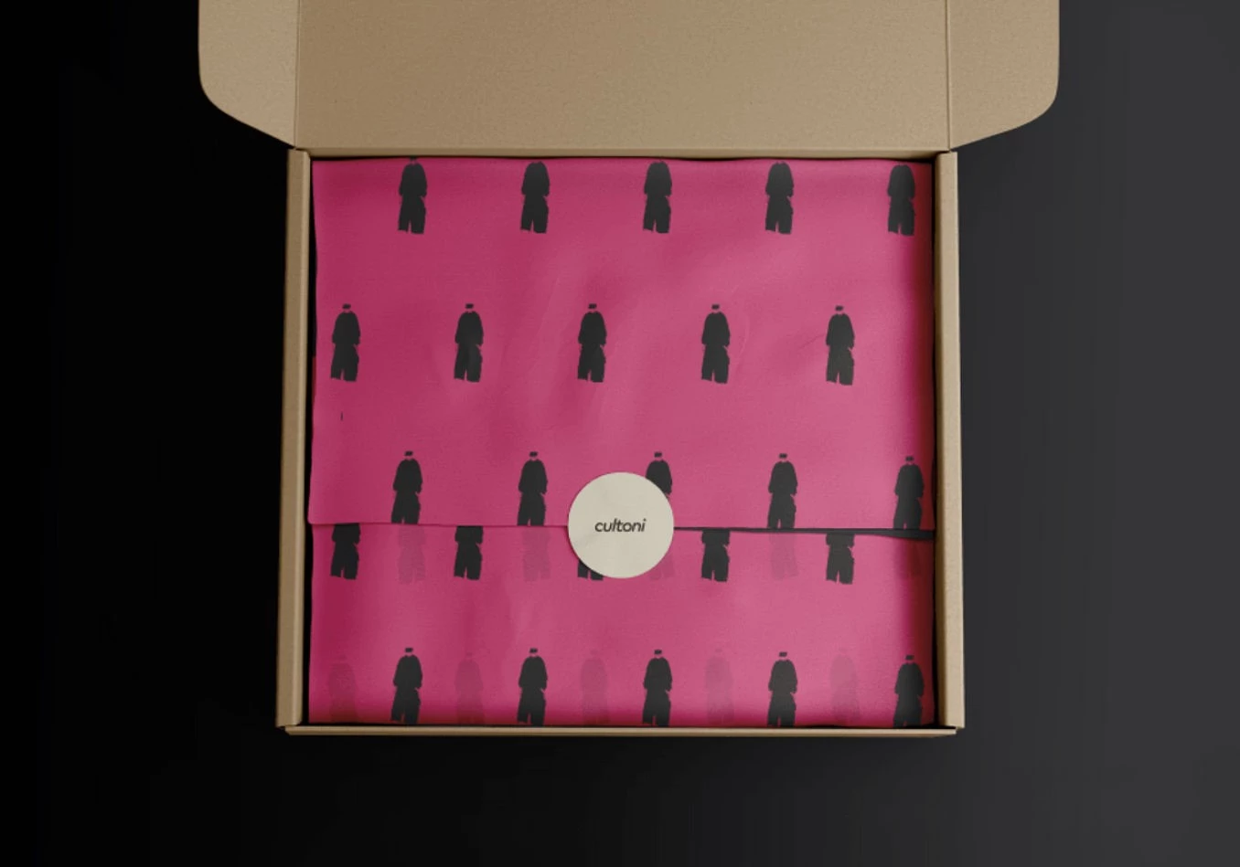
7. Cultoni by SOLV.
Standout features:
- Minimalist vectors
- Bold pink color
- Versatile design
Vector designs in urban fashion brands deliver sleek and high-impact visuals. SOLV.’s work with Cultoni is a great example of how designs remain crisp and vibrant on physical and digital platforms. The dark silhouette creates a modern, polished aesthetic that aligns with the brand’s trend-forward vibe.
On the packaging, the vector illustration adds a premium feel, making the products stand out and resonate with a style-conscious audience. This minimalist yet impactful style of brand illustration is definitely a standout.
8.Grubbage by LLT Group
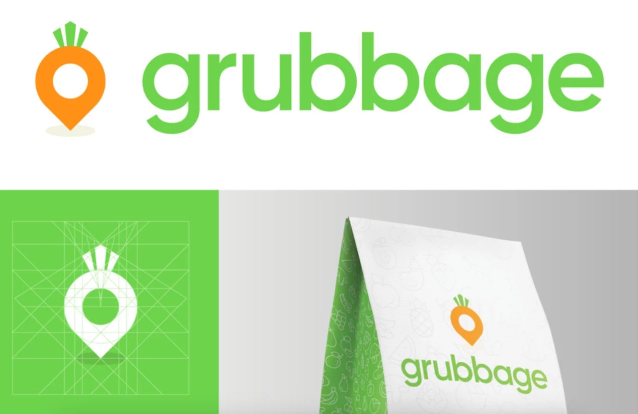
Standout features:
- Custom iconography
- Vibrant colors
- Design based on natural elements
Even simple line illustrations can make a big impact on branding — their simplicity enhances visual clarity and makes key brand elements instantly recognizable and memorable. For Grubbage, a food delivery service provider, LLT Group created custom line icons that evoke a friendly and approachable vibe.
Along with the unique logo combining a location pin and carrot symbolizing healthy delivery and rigid leaves subtly evoking a city skyline, this cohesive visual identity effectively conveyed the brand’s mission. This streamlined approach looks professional yet relatable, aligning with customer expectations for fast and reliable service.
9. Great Surprise by Pixenite
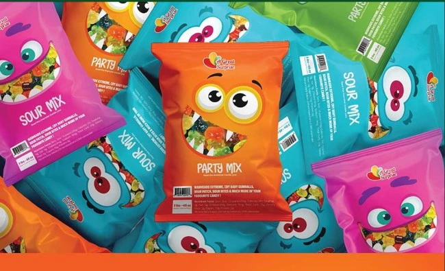
Standout features:
- Childlike visuals
- Vibrant color story
- Harmony between various visual elements
Seeing a packet of Great Surprise gummy bears brings the popular Pixar film Monsters Inc. to mind. Pixenite made the packaging as appealing to children as possible: the colors are vivid yet not too striking, enough to catch attention when kids go to the supermarket with their parents.
The fun and quirky animated faces showing the gummies are also cute and pleasing, and it’s as if you can already taste the flavors inside. These illustrations capture the imagination, turning packaging into a whimsical experience and creating a memorable narrative. This makes candy more than a treat — it’s part of an enchanting world.
10. F*CKOFFEE Coffee Roaster by Willo Designs
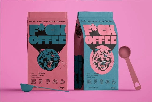
Standout features:
- Tongue-in-cheek design interpretation
- Pastel color palette
- A creative take on ordinary holders
The coffee roaster’s carefree, bad-ass personality is appreciated by many caffeine lovers, and its illustrative branding in this packaging has taken it up several notches. Willo Designs created bags that proudly proclaim the brand name and represent its true personality.
The pastel colors balance out the design and mediate the imposing brand name, like creamer on black coffee. The stylized animal illustration as the primary element also shows that the brand has a soft side to contrast the dark and bold exterior.
11. Element by Fishfinger
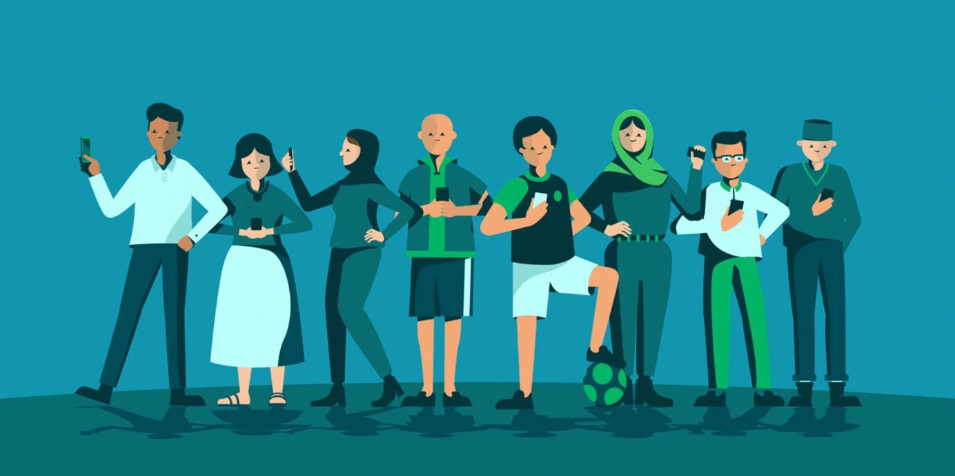
Standout features:
- Character-based illustrations
- 3D vector animations
- Storytelling elements
Human characters can foster trust and emotional connections with target audiences. In the form of 3D animations, they add depth, dynamism, and innovation to branding. This is exactly what Fishfinger delivered to Element, a modern AI company aiming to connect populations with essential services. Its collection of illustrated people going about their daily lives blends visually engaging storytelling with practical applications.
These character-based illustrations and animations turn abstract concepts into relatable, humanized forms. They build familiarity with audiences, making them powerful tools for engagement and brand loyalty.
12. Garden Flowers by Studio Tabarelli
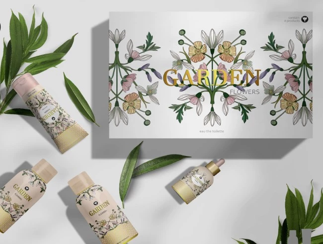
Standout features:
- Unique floral pattern
- Merger of opulence and minimalism
- Neutral tones
Studio Tabarelli painted beautiful illustrations that combine a set of vintage flowers to create a delicate flower garden, creating a stunning arrangement of organic shapes and colors. These vintage drawings create a distinct and memorable pattern that’s ideal for repetition and can be used for various branding purposes.
Vintage floral designs evoke a sense of elegance, nostalgia, and natural beauty, so they’re ideal for skincare branding. They suggest purity and harmony with nature, aligning with the brand’s promise of gentle, natural care.
13. Treasure Chest by Natalia Gubanova
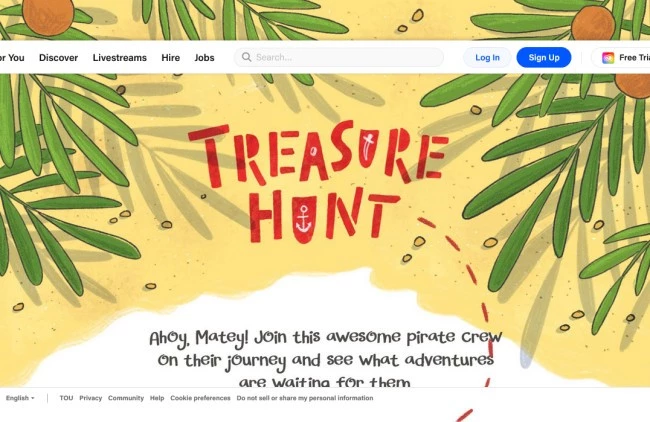
Standout features:
- Pirate treasure-themed concept
- The bright and on-brand color story
- Typography with personality
Who doesn’t love treasure games? Treasure Chest has leveraged its audience’s enthusiasm for puzzle-solving and reaping fun prizes and includes its fun personality in the mix. Designed by Natalia Gubanova, this poster is inspired by treasure maps, particularly the ones used by pirates. The bright color story of yellows, greens, and reds is very engaging and simply pops onscreen.
The font choices are also well-thought-out and on-brand. The words are easy to read, and the styles set the mood of the whole event. Overall, the typography adds a cool identity to this creative promotional asset.
14. Crazy Shawarma by Tribal Duck
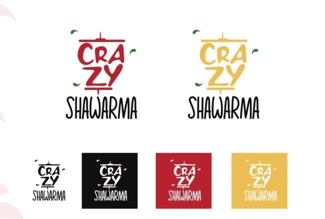
Standout features:
- Adaptive branding
- Energetic
- Evocative logo design
Established by a man with a crazy love for food and a dream to share it with the world, Crazy Shawarma offers a refreshing take on traditional Middle Eastern cuisine. This concept of "crazy" refers to serving a fulfilling experience with an amazing menu that targets consumers' playful side.
Original ideas shine bright, which is why Tribal Duck translated it into zany branding illustrations that evoke the sensation of tasting Crazy Shawarma. The distinct typographic logo and jolly illustrations evoke warmth, authenticity, and a sense of heritage, immersing customers in the cuisine’s essence.
15. Tiger Beer by Publicis Brazil
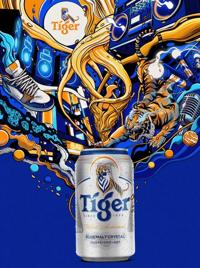
Standout Features:
- Vibrant color palette
- Typography encourages brand identity
- On-brand characters
Tiger Beer’s design blends vibrant orange and black to immediately catch the eye. The Tiger logotype is in a blue or orange font that separates it from the graphic imagery. It’s a bold design and incorporates everything you want to see in liquor-focused branding. The sleek and modern design elements are combined with old-school and street styles.
These designs create a memorable identity, aligning the brand with bold experiences and modern social connections. Overall, the illustrations are visually appealing and effectively communicate the brand’s identity, making this beer hard to miss.
Brand Illustrations: Key Takeaways
Illustrations bring a brand’s personality, values, and vision to life. The examples highlighted here showcase the transformative power of unique, thoughtful designs in creating memorable identities. As you craft your own branding strategy, let these examples guide you toward leveraging illustrations to stand out and leave a lasting impact.
![]()
Our team ranks agencies worldwide to help you find a qualified partner. Visit our Agency Directory for the Top Branding Agencies, as well as:
- Top Illustration Agencies
- Top Brand Strategy Agencies
- Top Brand Positioning Firms
- Top B2B Branding Agencies
- Top Cincinnati Branding Agencies
And don’t miss our Awards section, where we showcase the top agencies recognized for exceptional creativity and impact.