-account-photo_listing.jpg)
-account-photo_listing.jpg)


Our Jury has worked with Prada, Nike, Chanel, Google, and Apple.
Best Beer Packaging Designs of 2026
View the Top Beer Packaging Designs Below
Best Beer Packaging Designs of 2026
4,200+ Submitted Designs
- Advertising
- Arts & Recreation
- Automotive
- Bread
- Chocolate
- Condiment
- Condom
- Dairy Product
- E-Commerce & Retail
- Eco and Sustainable
- Entertainment
- Fashion & Beauty
- Food & Beverage
- Frozen Food
- Health & Wellness
- Honey
- Hospitality
- Jewelry
- Luxury
- Manufacturing
- Medical & Pharmacy
- Medicine
- Olive Oil
- Pet Food
- Skincare
- Soap
- Spirit
- Sports & Leisure
- Technology
- Toys and Games
- Travel
- Watch Branding
- Wine
View Design
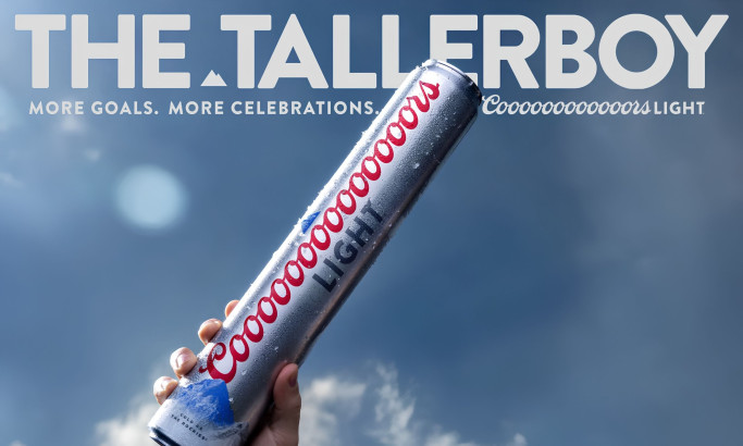
Coors Light Tallerboy Packaging Design
byDroga5
View Design
ELLE 80
View Design
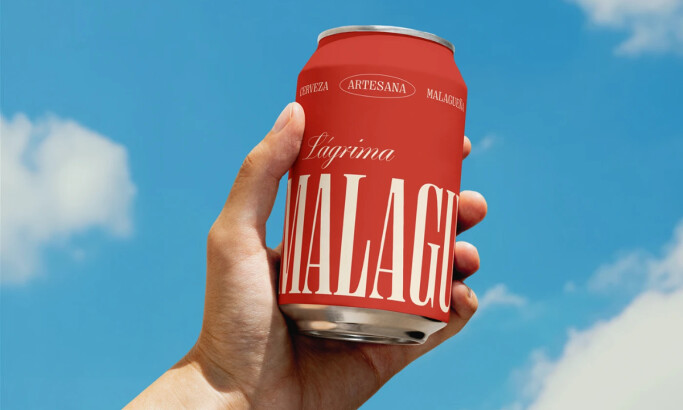
La Malagueña
View Design
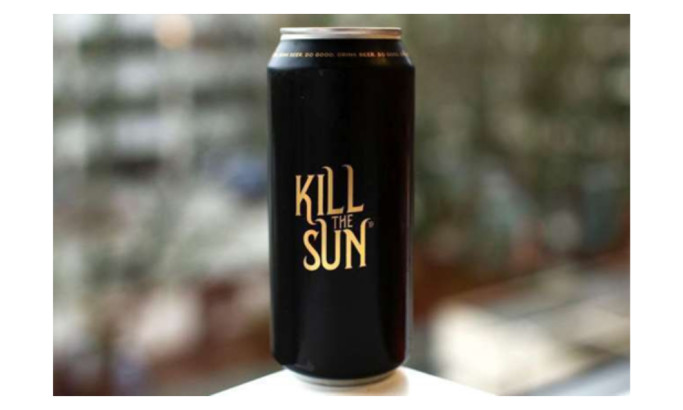
Kill The Sun Ale
View Design
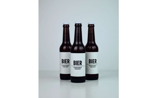
Bier Bier
View Design
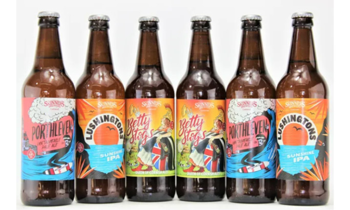
Skinner’s Ales
View Design
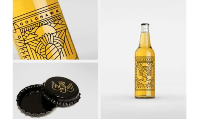
Goldhawk Ale

View Design
Clockwork Lemon

View Design
Alchime
Get Connected
With The Right Agency Partner
& Receive Proposals For FREE

View Design
Greene King
View Design
The Keeper
byJuice3D

View Design
Cerveza Caleya
View Design
Humpbacked Horse
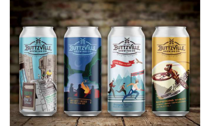
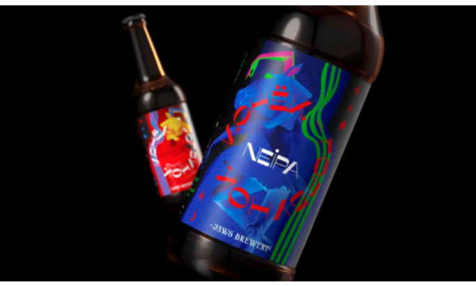
View Design
ButtzVille
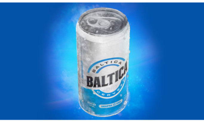
View Design
Baltica Beer

View Design
Rotulo do Velhaco

View Design
Molina
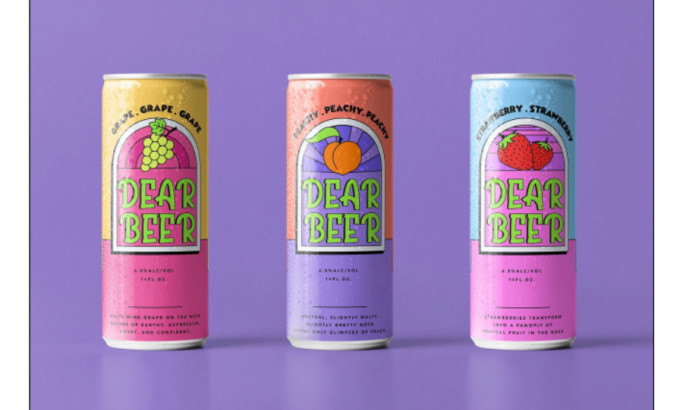
View Design
Dear Beer
Ready to elevate your designs?