Let’s be honest: most of us wouldn’t get through the day without that first cup of coffee. Coffee provides us not only with daily fuel to go about our daily routine, but a renewed spirit to keep at it. While great branding doesn’t always guarantee great coffee, the best coffee brands tend to get both right.
With the help of our experts, we’ve rounded up 13 of the best coffee branding designs that master both design and taste.
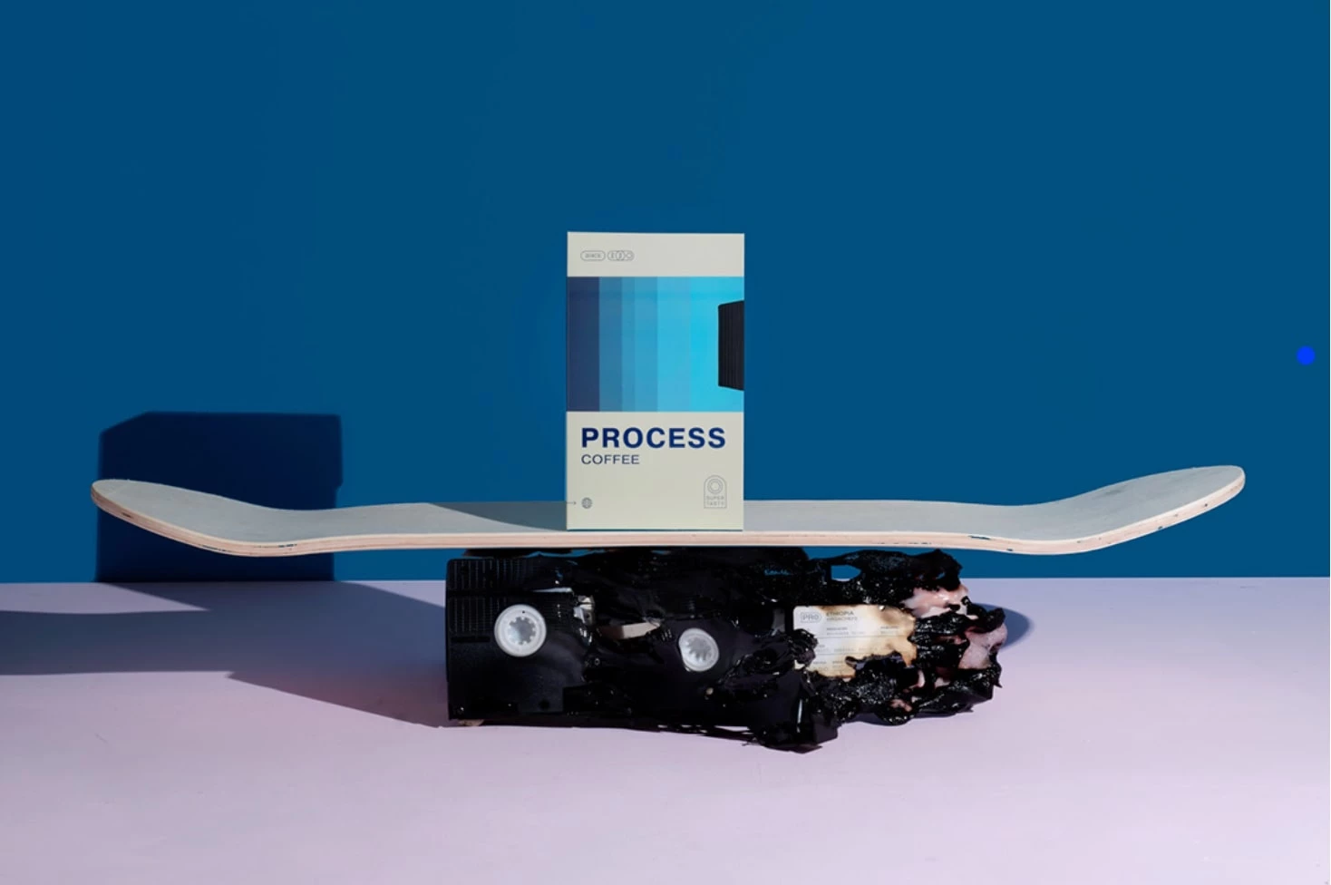
1. Process Coffee by Angel & Anchor
Standout Features:
- Ultra-minimal
- Influenced by 90’ street culture
- Unconventional color palette
Process Coffee branding by Angel & Anchor pushes against the conventions and expectations of your typical coffee brand. Rather than opting for a color scheme that is traditionally associated with the beverage (i.e., warm, earthy colors signaling the hot coffee), Process Coffee takes a bold, unconventional approach that grabs attention with sheer originality.
Leaning into its “bold” identity, the brand draws heavy inspiration from the ’90s skateboard culture, creating an approachable, energetic, and personal take on specialty coffee. Its visual language speaks directly to a niche audience that values authenticity, self-expression, and countercultural aesthetics — making it feel more like a community-driven movement than a corporate brand.
After establishing the core identity, Angel & Anchor dove deeper into ’90s nostalgia, drawing inspiration from skateboarding videos and VHS tapes to shape the packaging concept. With different paper finishes, debossed details, and a nostalgic design, each coffee drinker is immersed in the experience — from the sleeve to the cassette-inspired inner bag.
Why This Branding Works
- Nostalgia marketing: The VHS-inspired packaging taps into consumer nostalgia, creating an emotional connection that makes the product more memorable.
- Industry disruption: The bold aesthetic breaks away from the polished, sophisticated look of premium coffee brands, positioning Process Coffee as a rebellious alternative.
- Street culture Influence: By aligning with '90s skateboard culture, the brand resonates with a younger, design-savvy audience that values creativity and cultural relevance as much as quality.
- Community-driven appeal: The branding fosters a sense of belonging, making it feel less like a corporate brand and more like a movement for those who embrace individuality.
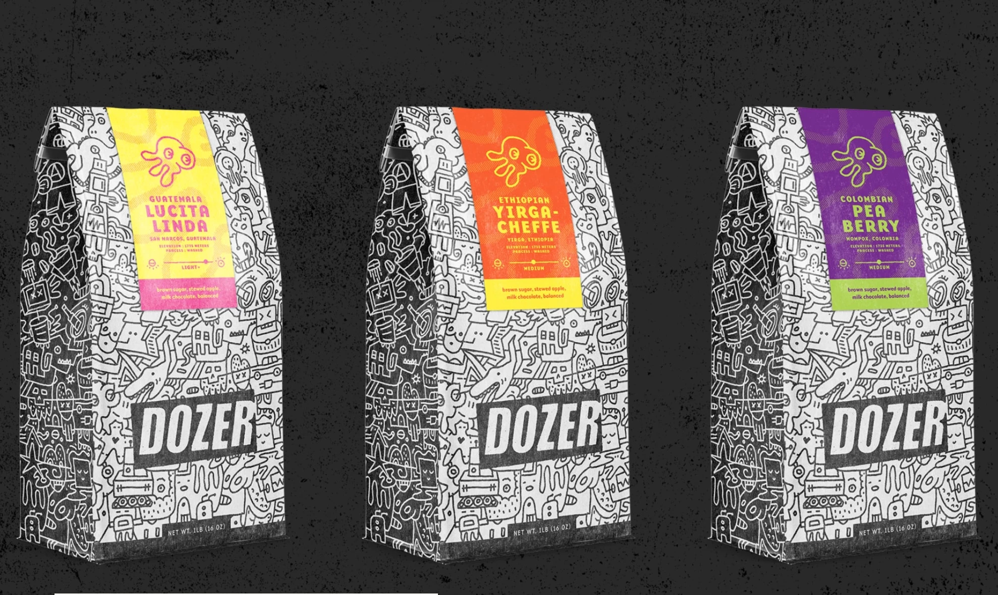
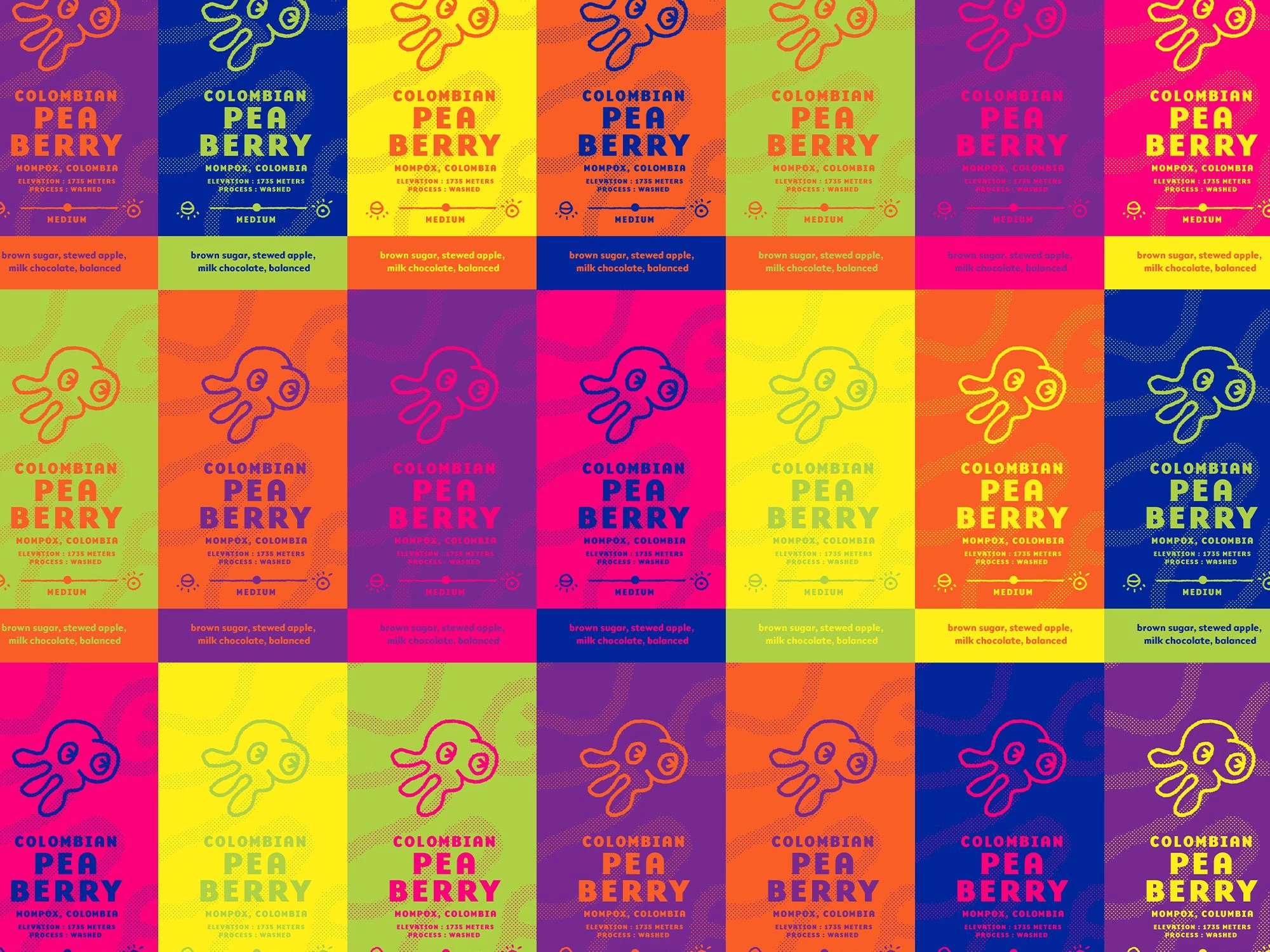
2. Dozer Coffee by Skidmore Studio
Standout Features:
- Punky and playful
- Color-coded
- Bold, stamp-like logo
“Armed with ingenuity and small-biz agility, beverage company Troobado is no stranger to taking on the Goliath-sized established players in the industry.”
Nowhere is this more evident than in their latest launch, which leverages years of hospitality experience to redefine the café experience. With Skidmore Studio’s brand-building expertise, Dozer Coffee — part roaster, part café, part lounge, and the daytime counterpart to the beloved HOMES brewpub — was set up for success.
For its debut, Dozer needed a bold visual identity — one that captured the energy of early mornings while seamlessly fitting within its family of brands. Strong punk rock aesthetics define the brand’s overall visual identity, featuring custom zany illustrations packed with sci-fi Easter eggs. These elements create a gritty, ‘street’ look while also capturing a sense of rebellious youthfulness.
Why This Branding Works
- Countercultural appeal: The punk rock and street art-inspired visuals challenge conventional coffee branding, attracting consumers who see coffee as part of their rebellious identity.
- Youthful individuality: By rejecting minimalist or rustic aesthetics, the brand resonates with younger, alternative consumers who crave bold self-expression.
- Tactile engagement: The stamp-like logo and interactive design elements enhance brand connection, making the experience feel raw and hands-on.
- Movement-driven identity: Dozer Coffee is more than a beverage — it cultivates a cultural movement for those who see coffee as an extension of their creativity and independent spirit.
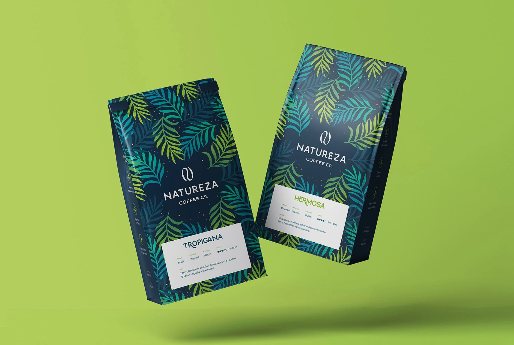
3. Natureza by Insigniada
Standout Features:
- Green = sustainability
- Classy logo and typography
- Original colors, traditional packaging shape
Natureza (“Nature”) is a Brazilian-based coffee company that specializes in both roastery and cafes brews. Primarily, it focuses on developing more consciousness around coffee and its daily sustainable production and usage.
When developing the Natureza brand and accompanying packaging design, the Insigniada agency aimed to reflect this sustainability message in a way that would seamlessly “pour” out of the brand and its products.
The collaboration’s main goal was to create fully organic and sustainable packaging for pouches, cups, and boxes. Beyond choosing recyclable materials while maintaining high quality, Insigniada needed a design that effectively conveyed Natureza’s mission. The agency transformed Natureza’s core values — love, peace, open-mindedness, and respect for Mother Earth — into memorable taglines and a nature-inspired pattern.
Why This Branding Works
- Sustainability-first identity: The green color palette taps into color psychology, reinforcing Natureza’s commitment to eco-conscious values.
- Premium authenticity: The refined typography and structured packaging design elevate the brand, appealing to high-end coffee consumers while maintaining a natural, ethical aesthetic.
- Material-driven differentiation: By using sustainable packaging and messaging, Natureza separates itself from brands that only claim to be eco-friendly, fostering trust through action.
- Lifestyle branding: Natureza doesn’t just sell coffee — it promotes a mindful, environmentally responsible way of life, deepening emotional engagement with its audience.
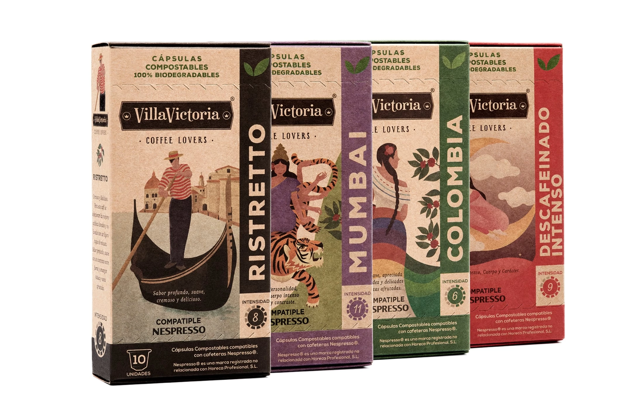
4. VillaVictoria by Al Margen Branding & Packaging
Standout Features:
- Natural colors
- Biodegradable packaging
- Beautiful illustrations
Grupo Horeca launched VillaVictoria, a premium coffee line featuring 100% biodegradable, compostable capsules, designed to unite coffee enthusiasts with a commitment to sustainability.
With the so-called “green heart” sustainability message, Al Margen Branding & Packaging conceptualized a brand and packaging concept that resonates with environmentally conscious coffee growers — those who maintain a “green” attitude and embrace a down-to-earth lifestyle.
The packaging’s graphic design stands out with custom, hand-drawn illustrations, created exclusively for this coffee range. Each design highlights the origin of the coffee brew through a modern-meets-vintage linking stamp, blending contemporary style with a ’50s-inspired touch. Additionally, the color palette brings somewhat of an exotic feel, while the four distinct illustrations strengthen the packaging’s visual appeal.
Why This Branding Works
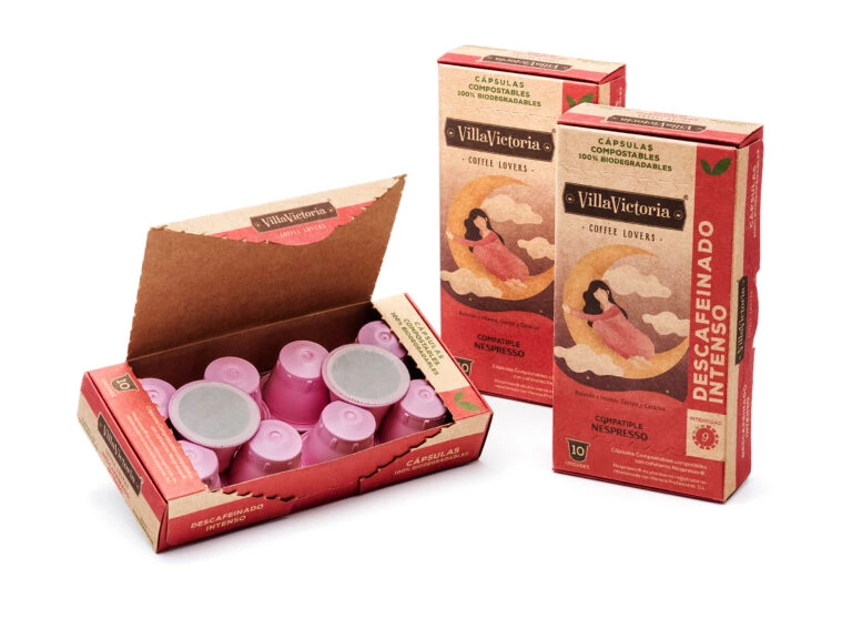
- Sustainable innovation: The biodegradable capsules cater to growing consumer demand for eco-friendly alternatives, positioning VillaVictoria as a forward-thinking brand.
- Artisanal craftsmanship: Hand-drawn illustrations set the brand apart from mass-produced competitors, reinforcing its authenticity and exclusivity.
- Sustainability as identity: Every design choice, from materials to visuals, integrates sustainability as a core value rather than a marketing tactic.
- Emotional connection: By prioritizing ethical consumption and artisanal quality, VillaVictoria builds stronger loyalty among conscious consumers seeking both taste and responsibility.
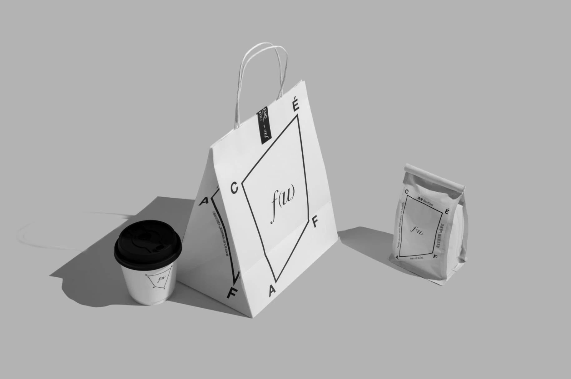
5. Formula Café by By Enjoy
Standout Features:
- Monochromatic
- Infinite possibilities formula
- Distinctive
Formula Café redefines coffee branding by integrating a mathematical approach into its identity, emphasizing precision and endless possibilities. Created by By Enjoy agency, the branding revolves around the concept of “f(u) = formula café,” a symbolic representation of a systematic yet fluid approach to crafting unique coffee experiences.
At its core, the brand’s design language is built upon a quadrilateral symbol, “f(u),” signifying limitless potential. The visual identity expands upon this by deconstructing the letters of “CAFÉ” into various graphical forms, breaking conventional brand image constraints and reinforcing the theme of experimentation.
The bold, monochromatic aesthetic removes any distractions, making the brand instantly recognizable and reinforcing its modern, almost scientific approach to coffee.
Why This Branding Works
- Intellectual appeal: The branding leverages mathematical precision to connect with coffee enthusiasts who see brewing as both an art and a science.
- Calculated creativity: The structured design reflects methodical craftsmanship while allowing for limitless innovation, balancing logic with artistic expression.
- Distinct positioning: By embracing a scientific approach, Formula Café stands out from traditional warm-toned brands, appealing to an audience that values precision and quality.
- Experiential branding: The fusion of structure and creativity transforms coffee drinking into an immersive, thought-provoking experience beyond the beverage itself.
6. Leap Coffee by Cubic Orange
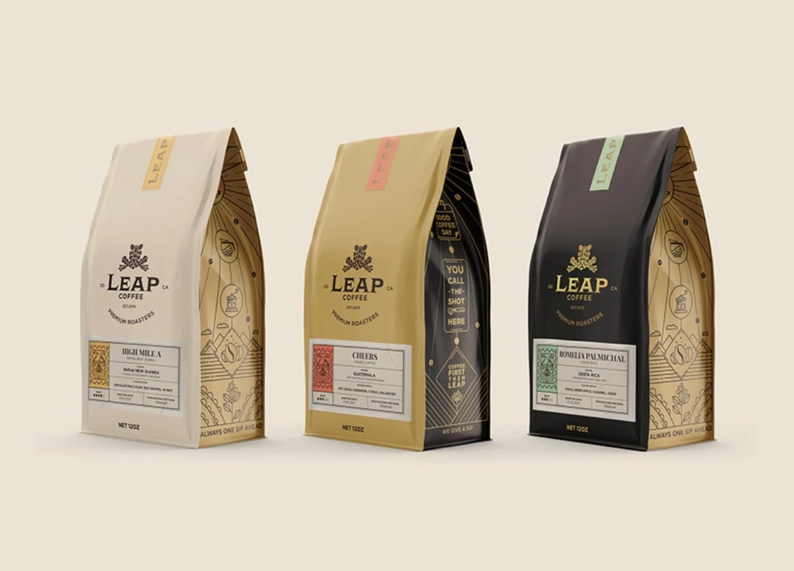
Standout Features:
- Traditional design paired with modern trends
- Bold typography
- Minimal illustrations
Leap Coffee’s branding masterfully balances tradition and modernity, reflecting its core values of quality, community, and craftsmanship. Designed by Cubic Orange, the identity pays homage to classic coffee aesthetics while incorporating contemporary elements, making the brand feel both familiar and fresh. This fusion effectively positions Leap Coffee as a premium yet approachable roaster, catering to seasoned coffee connoisseurs and casual drinkers alike.
The use of bold typography reinforces the brand’s strong presence, ensuring clarity and recognition in a crowded market. Meanwhile, minimal illustrations keep the design clean and refined, allowing the product itself to take center stage. This visual simplicity mirrors Leap Coffee’s philosophy — stripping away unnecessary complexities to focus on delivering a consistently excellent cup of coffee.
Why This Branding Works
- Balanced identity: Leap Coffee blends artisanal authenticity with modern aesthetics, making the brand feel premium yet approachable.
- Understated elegance: The minimalist design prevents over-commercialization while reinforcing expertise and trustworthiness.
- Differentiated aesthetic: By steering clear of overly rustic or hyper-modern trends, Leap Coffee carves out a unique niche in the specialty coffee space.
- Heritage meets innovation: The brand respects coffee’s rich history while evolving to meet contemporary consumer expectations, ensuring long-term relevance.
7. Ambassador Coffee Service by Bradbury Brand + Design Experts
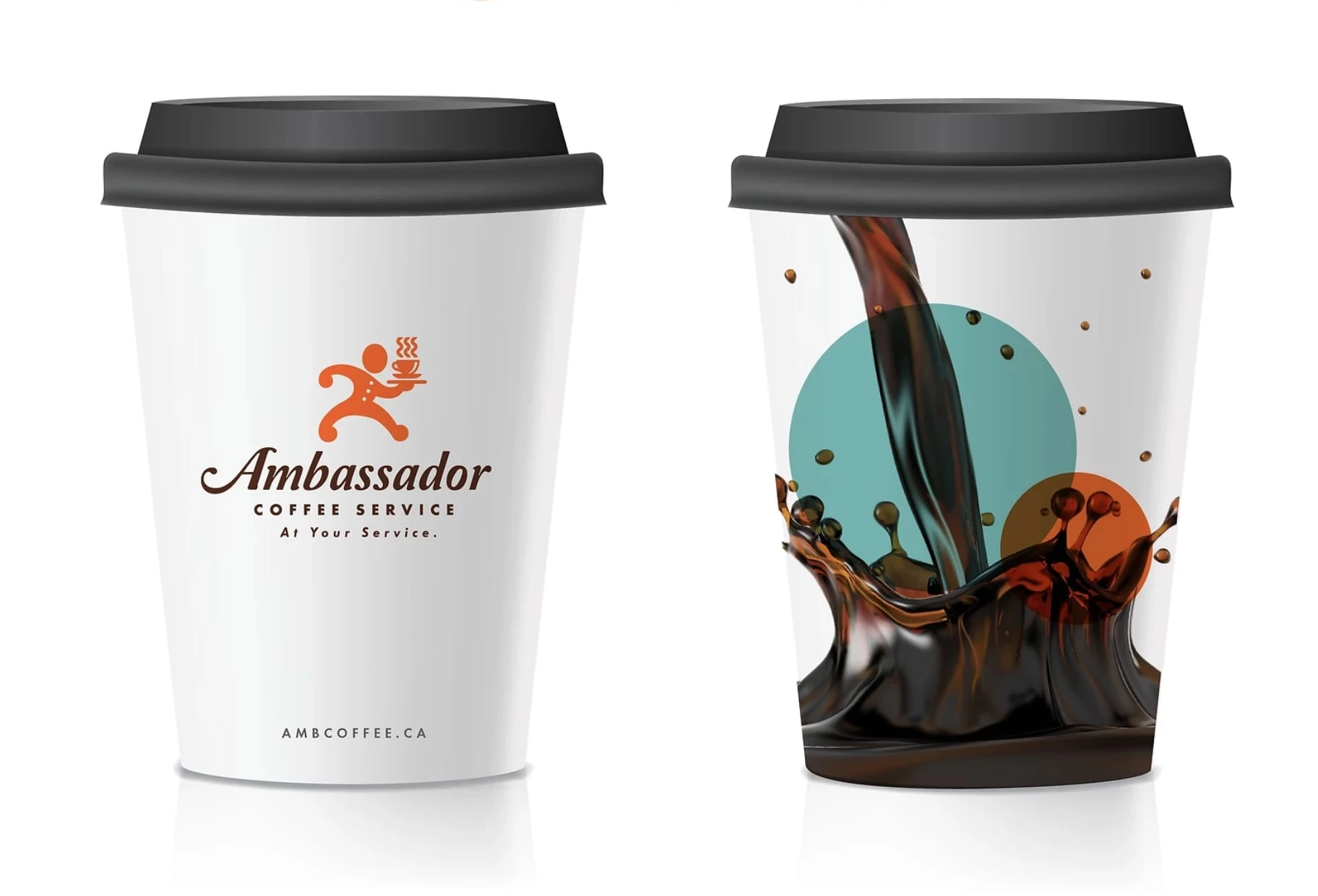
Standout Features:
- Fun logo
- Customer-centric tagline
- Stylish typography
Ambassador Coffee Service aims to deliver the absolute best coffee and modern coffee-making equipment, blending it seamlessly with old-school customer service and a personal touch. This union, brought to life by Bradbury Brand + Design Experts, goes beyond being customer-centric — it also fosters a happier workplace.
The playful yet refined logo and the tagline “At Your Service” embody the brand’s commitment to customer satisfaction, making it feel both professional and inviting. Stylish typography adds a touch of sophistication, appealing to workplaces that value both quality and a human-centered experience.
The brand, however, is far more than its symbols. Bradbury Brand + Design Experts guided Ambassador through the Customer Experience revision process. By working closely with staff and gathering valuable customer feedback, they identified pain points and moments of delight, offering insights and recommendations to improve how staff engage and serve customers.
Why This Branding Works

- Service-first positioning: The branding distinguishes a service-based coffee provider from retail competitors by emphasizing exceptional customer experience.
- Personalized engagement: By integrating insights from staff and clients, the brand creates a personable, human-centered identity that builds trust.
- Strategic differentiation: A data-driven approach ensures the brand is not only visually appealing but also aligned with industry needs and workplace culture.
- Relationship-driven branding: Ambassador Coffee Service positions itself as a trusted partner, enhancing workplace coffee experiences through quality and connection.
8. Wild Thyme by Studio Unbound
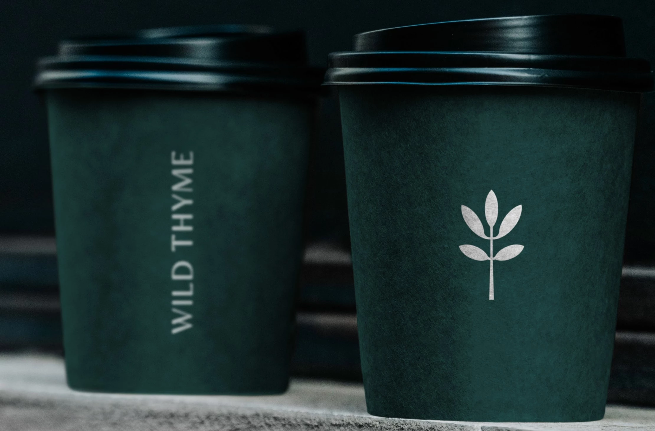
Standout Features:
- Minimal plant-inspired logo
- Green marble color
- Classy typography
Wild Thyme is a charming artisan café nestled in the heart of London. Since its opening, it has quickly become a local favorite and a vibrant community hub.
In late 2021, the cafe’s owners approached Studio Unbound to refresh the brand’s look and feel, ensuring it matched the quality of their products. The goal was to create a sophisticated yet inviting identity while preserving the café’s strong community spirit.
The plant-inspired logo, designed as a sprig of thyme, reinforces the café’s organic roots and instantly connects to nature. This subtle yet meaningful design appeals to customers who appreciate fresh, natural ingredients and a welcoming atmosphere.
Why This Branding Works
- Atmospheric design: Deep greens evoke a sense of calm and freshness, turning the café into a tranquil urban retreat.
- Authenticity meets luxury: The branding balances a premium feel with a welcoming charm, making Wild Thyme appealing to both loyal locals and new visitors.
- Community-centered identity: By differentiating from generic coffee chains, the brand fosters a sense of belonging, strengthening customer loyalty.
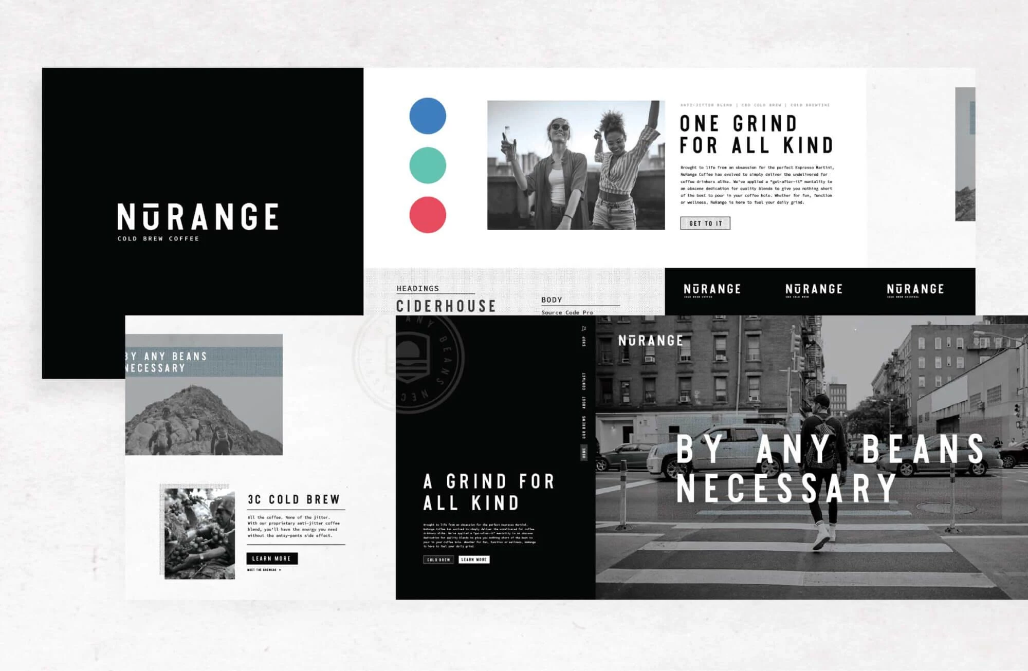
9. NuRange Cold Brew by FlowState Branding
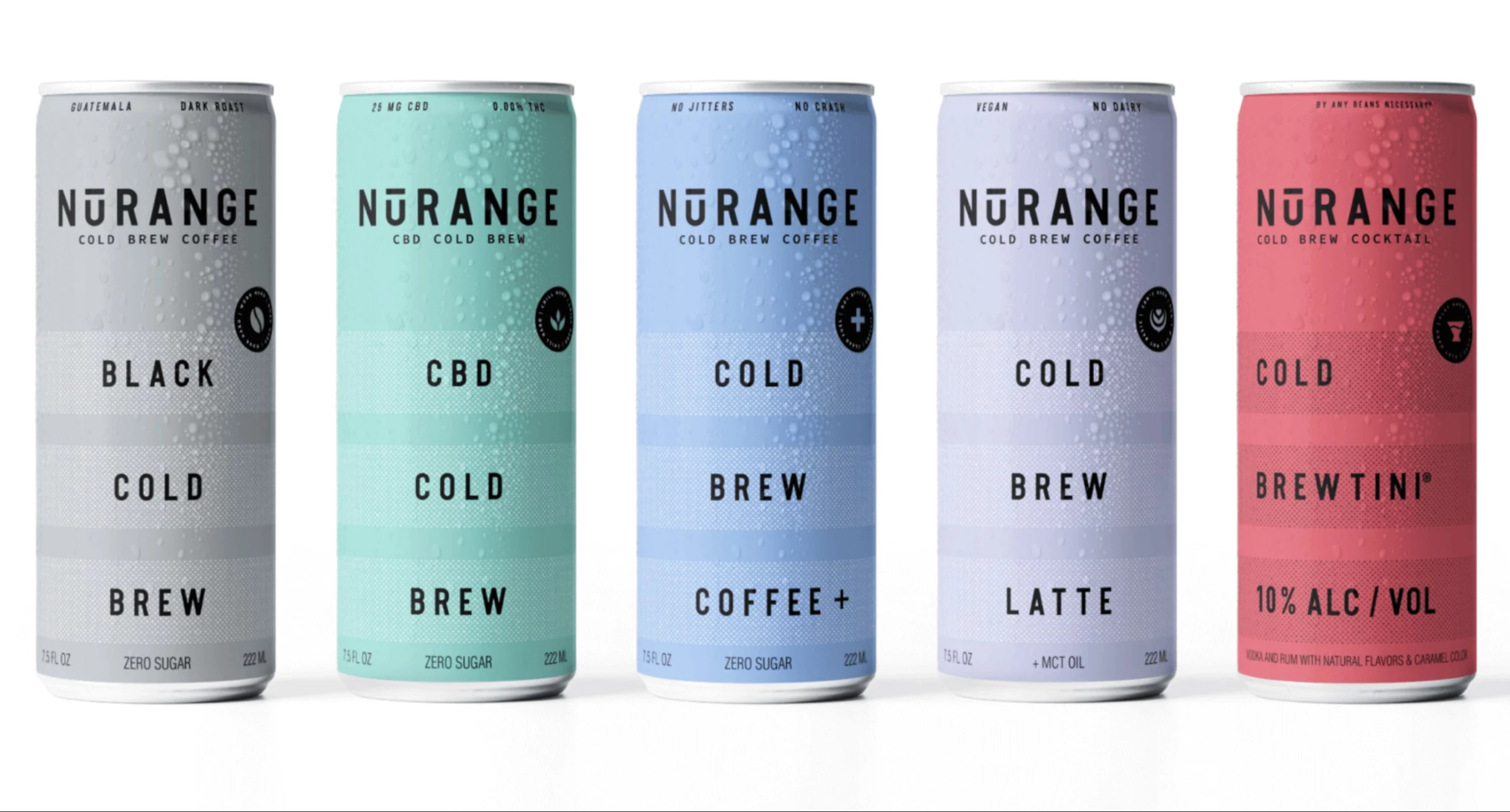
Standout Features:
- Minimalistic
- Pastel color palette
- Modern, sleek typography
Aptly named, Three Beans, LLC partnered with FlowState Branding to craft the identity for their latest product. Born from an obsession with the perfect Espresso Martini, NuRange Coffee exists to “deliver the undelivered” to coffee enthusiasts “by any beans necessary.” FlowState infused this relentless, get-after-it mentality and fanatic dedication to quality into every branding element.
The minimalistic design serves a dual purpose: reflecting the product’s ‘undelivered’ promise while keeping the messaging clear and uncluttered. The pastel color palette, often linked to calm and modernity, contrasts with the bold, action-driven messaging of "Grind Hard," "Coffee Companion," and "Daily Revolution."
Why This Branding Works
- Shelf standout: Pastel colors and clean aesthetics create a fresh, minimalist look that contrasts with traditional, heavily branded competitors.
- Clarity and simplicity: The visual identity ensures instant recognition, making it easy for consumers to associate NuRange with quality and reliability.
- Lifestyle alignment: By emphasizing a sleek and straightforward presentation, NuRange Cold Brew positions itself as a go-to brand for minimalist design lovers and coffee enthusiasts alike.
10. Acashia by Nitid Studio
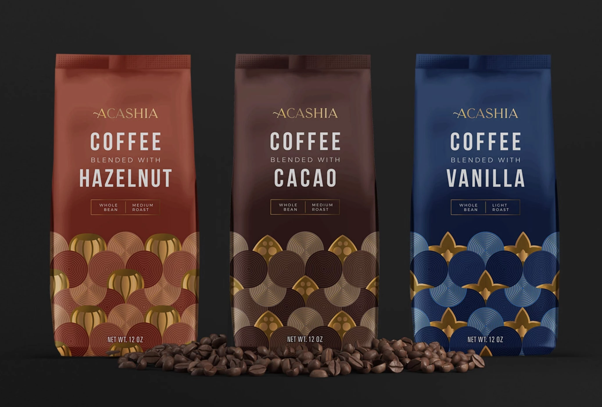
Standout Features:
- Premium appeal
- Gold accents
- Color-coded
Acashia was founded in the midst of 2020’s global turmoil by two young coffee lovers. Confident in their premium-quality product, the founders partnered with Nitid Studio to translate that feeling into the packaging.
While the design reflects a premium appeal, it was important that it not feel unattainable or overly pretentious. Instead, the goal was to capture the attention of younger demographics — those who may not be deeply familiar with the world of coffee but are eager to explore new flavors and willing to invest in quality.
What sets this coffee apart is its blend of non-traditional ingredients, making it essential to clearly differentiate each flavor. The result is a strong, recognizable brand identity. With this solid foundation, using individual colors to separate flavors was a natural choice. A touch of gold further enhances the packaging, emphasizing its high-end quality.
Why This Branding Works
- Premium accessibility: The use of gold conveys indulgence, while bright, clear colors add a youthful and approachable energy.
- Minimalist refinement: A clean, modern design makes the product visually striking and easy to understand at a glance.
- Consumer connection: By merging luxury with vibrancy, Acashia appeals to young coffee lovers looking for a brand that feels both aspirational and relatable.
11. Metropolis Coffee by EightySeven
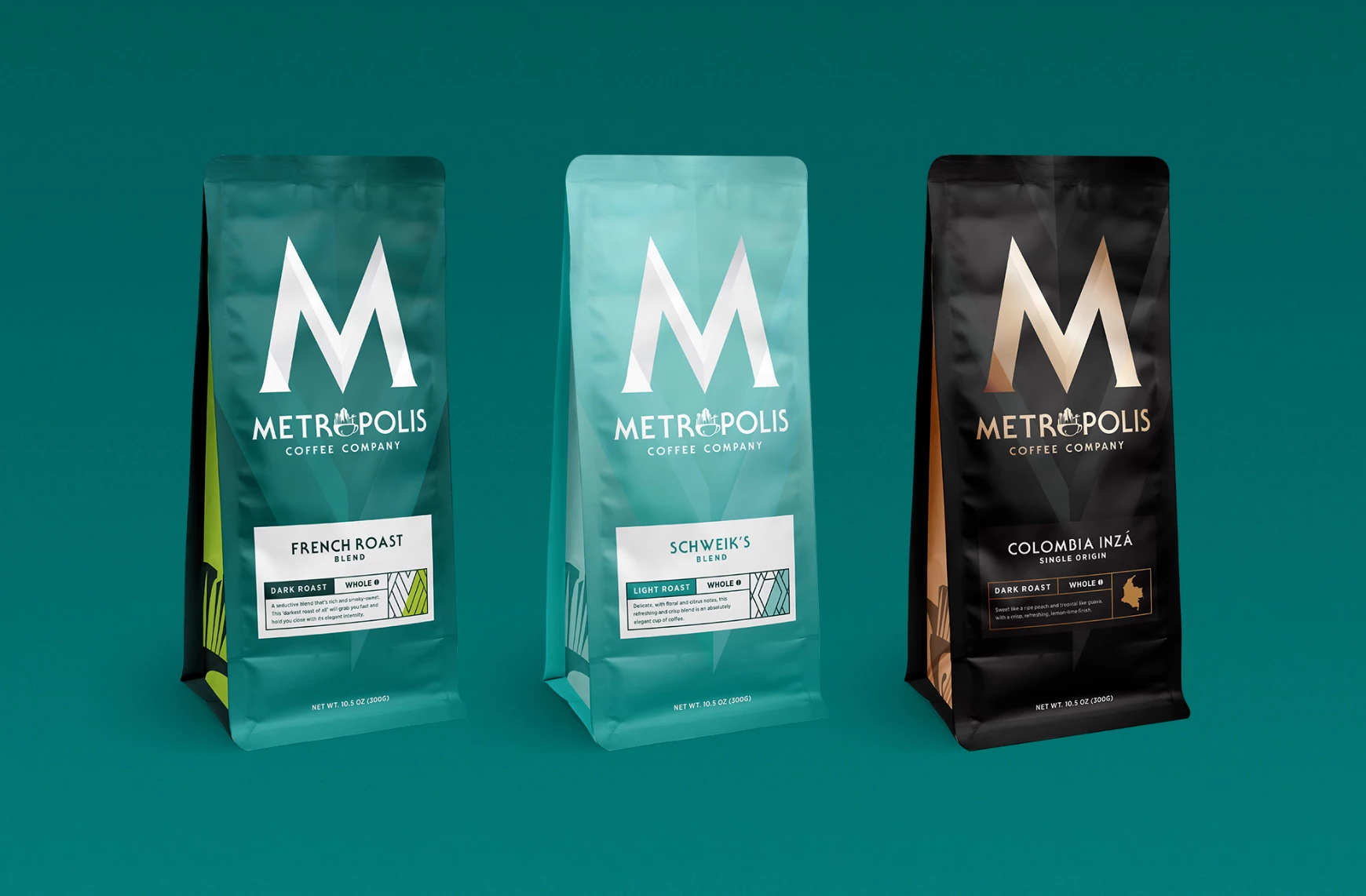
Standout features:
- Clever illustration
- Teal color scheme
- Metro sign-inspired
Metropolis Coffee Company started as a family-brewed passion project. From a small Seattle café, they grew into an established craft coffee brand with nationwide distribution. To reimagine its story for a broader audience, Metropolis partnered with EightySeven to refine its brand identity while staying true to its core values.
EightySeven refreshed the packaging and visual identity, crafting a look that not only shares Metropolis’s journey with coffee enthusiasts across the country but also highlights the premium quality the brand is known for.
For the rebrand, EightySeven went back to basics — defining what a metropolis truly is: a vibrant hub where people on the go come together to connect. The redesigned "M" serves as a guiding symbol, leading people to something else guaranteed to "take them places" — Metropolis Coffee.
Why This Branding Works
- Urban identity: The streamlined, modern design reflects the brand’s roots while reinforcing its national expansion and high-quality reputation.
- Minimalist impact: A focus on the “M” symbol creates a strong, recognizable brand mark that embodies both city life and premium coffee culture.
- Relatable yet refined: The branding ensures Metropolis remains accessible to a broad demographic while maintaining its craft coffee credentials.
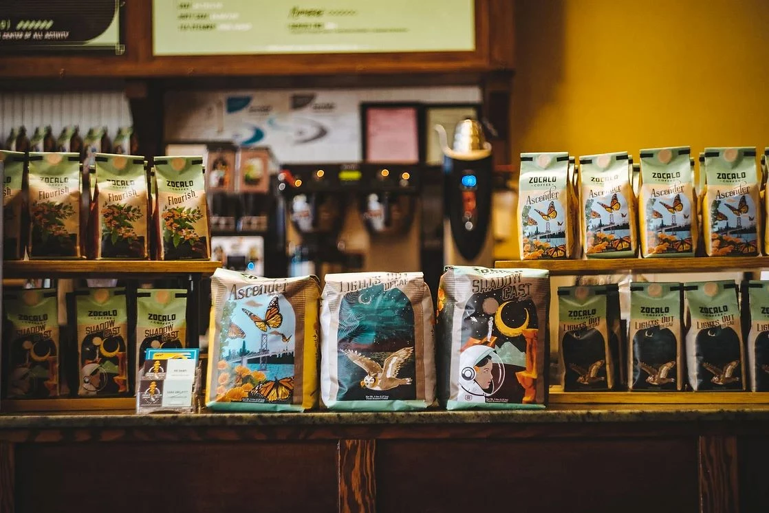
12. Zocalo Coffee by Norlo Design
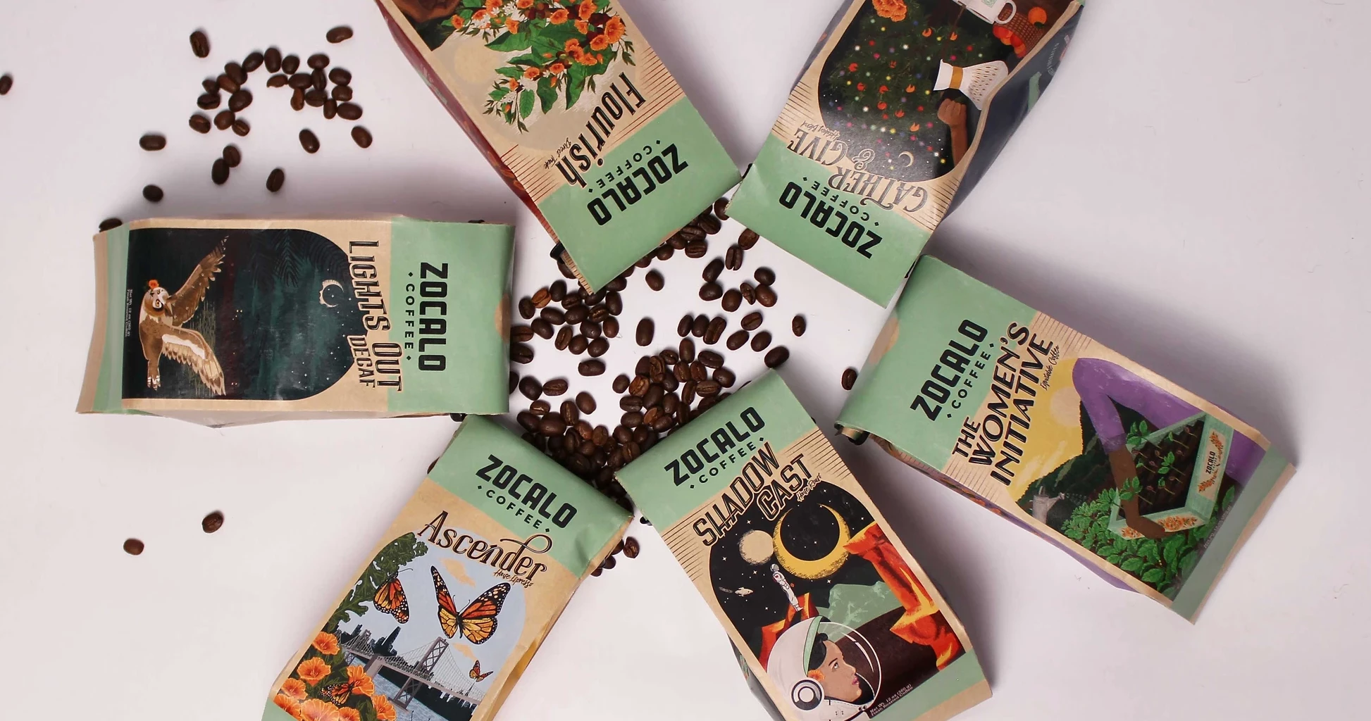
Standout features:
- Custom illustrations
- Vintage feel
- Color gradient
Zocalo Coffee partnered with Norlo Design to create an elevated brand identity that reflects its hometown roots and core values while evoking a nostalgic, vintage feel.
The agency redesigned Zocalo’s series of six compostable 12 oz coffee bean bags, giving each a distinct look aligned with the new branding direction. Each bag features a custom illustration and wordmark tailored to its specific roast.
Each bag features a single ‘punched out’ element, revealing the tan Kraft material beneath. Growing California Poppies illustrated at the side of each bag is a nod to the state where Zocalo Coffee has its storefront and roasting facility. While each roast showcases a unique color gradient, the series maintains a consistent composition and layout.
Why This Branding Works
- Nostalgic storytelling: Custom California Poppy illustrations create a strong regional connection, reinforcing the brand’s heritage and authenticity.
- Sustainable commitment: Compostable coffee bags align with eco-conscious consumer expectations, strengthening Zocalo’s responsible brand image.
- Timeless aesthetic: Vintage-inspired visuals and warm, earthy tones establish an artisanal feel that appeals to consumers seeking handcrafted experiences.
- Local pride: By celebrating its roots through design, Zocalo Coffee resonates deeply with its community while maintaining broad market appeal.
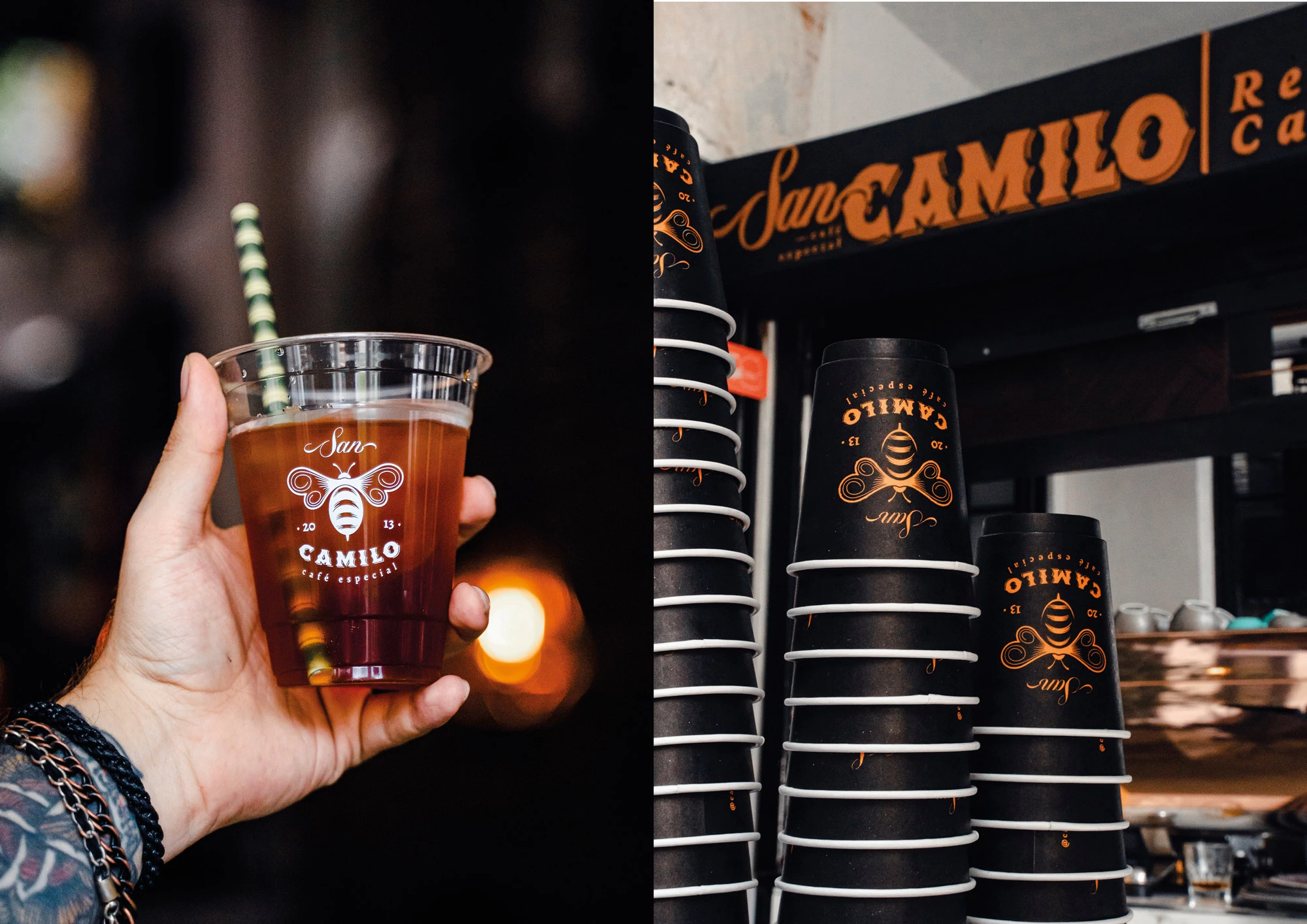
13. San Camilo by Simon Londono
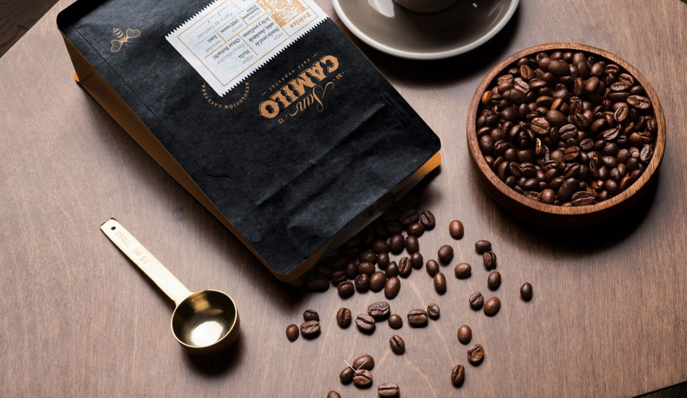
Standout features:
- Creative illustration
- Striking typography
- Great choice of packaging material
San Camilo is a Colombian coffee brand dedicated to awakening a genuine love for coffee. For years, it has produced top-quality blends, catering to enthusiasts who appreciate coffee sourced directly from its origin.
To support this mission, Simon Londono developed a bold and powerful brand identity and packaging, which clearly focuses on the brand’s name with a masculine, industrial tone.
The strong, industrial-style lettering is balanced by nature-inspired illustrations, narrating the brand’s deep connection to Colombia’s land, ecosystems, and biodiversity. Meanwhile, the bee-shaped symbol unites all these elements, cleverly merging a bee and a coffee bean — an emblem of the brand’s deep connection to nature and coffee cultivation.
Why This Branding Works
- Heritage-driven identity: The fusion of bold typography and organic illustrations highlights the brand’s deep ties to Colombian coffee culture.
- Nature-infused symbolism: The bee-coffee bean emblem uniquely represents sustainability and craftsmanship, adding depth to the brand story.
- Emotional resonance: The balance of strength and warmth fosters a deep consumer connection, making San Camilo memorable and meaningful.
- Authenticity meets artistry: By embracing both tradition and modern design, San Camilo stands out as a brand that values both heritage and innovation.
Major Trends Shaping Coffee Branding
As seen in the examples above, modern coffee branding has evolved into a multifaceted narrative. Brands are no longer just selling a beverage — they’re creating an immersive experience that spans from product packaging to the café environment.
Here are some key trends shaping how coffee brands communicate their identity:
- Clean and simple design
- Eco-friendly packaging
- Artisanal quality and craftmanship
- Storytelling and provenance
- Cohesive brand experience
- Digital engagement and social media presence
- Innovation in functionality
- Fusion of local heritage and global trends
1. Clean and Simple Design
Many coffee brands are adopting minimalist aesthetics that let the quality of the coffee speak for itself. Clean lines, uncluttered layouts, and a focus on essential information emphasize product purity and quality, appealing to consumers who value transparency and authenticity.
2. Eco-Friendly Packaging
Sustainability is a top priority for modern consumers. Brands are increasingly using biodegradable, recyclable, and reusable packaging to reduce their environmental footprint. This eco-friendly approach not only addresses environmental concerns but also builds trust and loyalty among environmentally conscious buyers.
3. Artisanal Quality and Craftsmanship
Designs that evoke a sense of heritage and craftsmanship are gaining traction. By incorporating vintage elements, bespoke typography, and tactile materials, brands communicate an artisanal, hand-crafted quality. This trend resonates with consumers looking for authenticity and a tangible connection to the traditional methods of coffee production.
4. Storytelling and Provenance
Consumers are drawn to brands that share the unique journey of their coffee. Detailed narratives about the coffee’s origin, the farmers behind the beans, and the journey from field to cup add an emotional and ethical dimension to the brand. This storytelling builds a richer connection with consumers who value transparency and ethical sourcing.
5. Cohesive Brand Experience
Beyond just the packaging, a cohesive brand experience across all touchpoints — from online presence to the physical cafe environment — is essential. Consistent design, messaging, and ambiance create a unified identity that reinforces customer loyalty and elevates the overall brand experience.
6. Digital Engagement and Social Media Presence
With the rise of digital platforms, coffee brands are leveraging social media to build communities and share their stories. Engaging content, visually appealing posts, and interactive campaigns allow brands to connect with a broader, often younger audience, while reinforcing their identity and values.
7. Innovation in Functionality
Innovation isn’t limited to the beverage itself; packaging innovation plays a crucial role too. Features like resealable bags, ergonomic designs, and even QR codes that lead to brewing tips or detailed origin stories combine functionality with modern aesthetics, meeting the practical needs of consumers while enhancing brand storytelling.
8. Fusion of Local Heritage and Global Trends
Many brands are finding success by blending local, artisanal roots with global design trends. This approach allows them to honor traditional methods and local identity while appealing to a diverse, global audience. It is a balancing act that results in a brand story rich in authenticity yet modern and inclusive.
![]()
Our team ranks agencies worldwide to help you find a qualified partner. Visit our Agency Directory for the Top Branding Agencies, as well as:
- Top Food and Beverage Branding Agencies
- Top Food and Beverage Marketing Agencies
- Top Restaurant Digital Marketing Agencies
- Top Product Design Companies
- Top Cincinnati Branding Agencies
And don’t miss our Awards section, where we showcase the top agencies recognized for exceptional creativity and impact.


-preview-webp.webp)