Jewelry is more than just a pretty accessory; it's a powerful form of self-expression. Similarly, building a successful jewelry brand goes beyond crafting beautiful pieces; it requires a strategic branding approach that forges emotional connections with consumers.
Effective jewelry branding relies on key elements like color psychology, as seen in Tiffany & Co.’s signature Tiffany Blue, which conveys luxury and exclusivity. Iconic logos, such as Cartier’s monogram, become symbols of prestige. Meanwhile, influencer-driven social media strategies help engage a wider audience and foster loyalty.
Let’s explore 19 jewelry brands that have mastered these strategies — leveraging distinctive logos, impactful visuals, and luxurious packaging — to transform their identity into a symbol of status and sophistication.
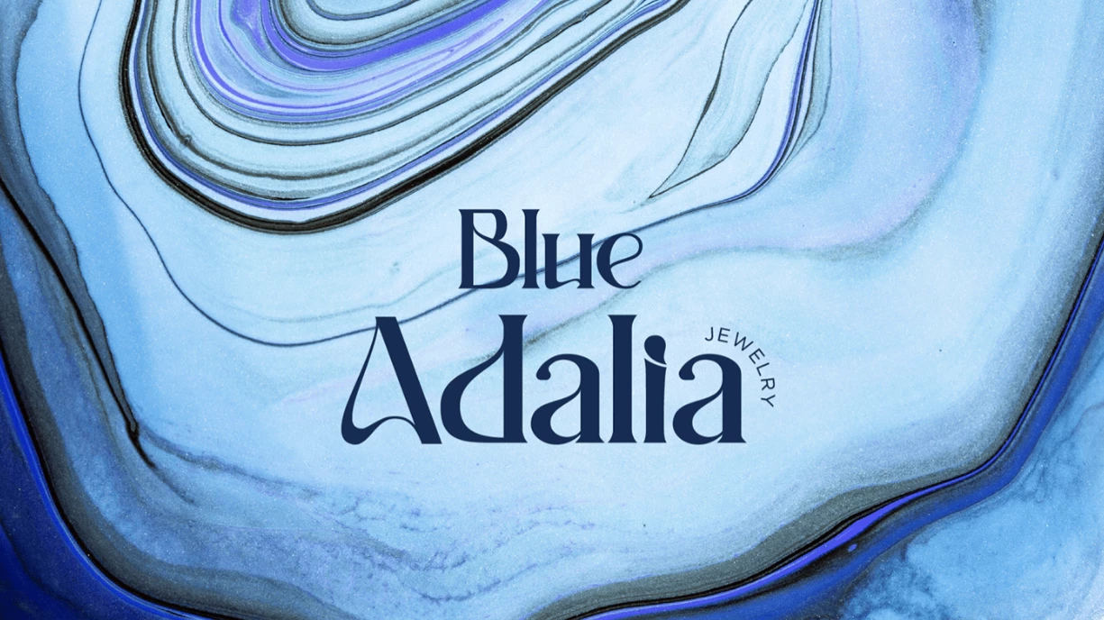
1. Blue Adalia
Standout Features:
- Modern, artistic aesthetic
- Refreshing yet luxurious color palette
- Sophisticated font pairing for timeless appeal
Blue Adalia, a jewelry brand known for its high-quality, affordable pieces, faced the challenge of standing out in a crowded market. To refine its identity and carve a more distinct space, the brand underwent a rebrand that emphasizes creativity, sophistication, and modern elegance.
Here are some of its most striking brand elements:
- The color palette balances vibrancy with luxury, blending light and dark shades to reflect the brand’s dual personalities — artistic and refined. This dynamic range communicates modernity while still appealing to consumers looking for a premium appeal.
- The reworked marble-like logo reflects the brand's artistic craftsmanship, communicating uniqueness and high quality. Complementing this, sparkling outlined icons modernize the design, ensuring it’s versatile enough for various digital platforms.
- The sans-serif typography brings a contemporary touch to the brand, making it impactful on social media — especially visually-driven platforms like Instagram. This clean, refined font helps Blue Adalia establish an approachable, yet polished, identity that resonates with a younger, style-conscious demographic.
Blue Adalia’s rebrand succeeds by merging artistic sophistication with digital relevance. Every design choice — color, typography, and iconography — reinforces the brand’s creative yet luxurious essence.
2. Tiffany & Co.
Standout Features:
- Iconic color (Tiffany Blue)
- Classic, instantly recognizable logo
- Strong emotional connection through storytelling
Tiffany & Co. is a brand synonymous with luxury, and its enduring appeal stems from a carefully crafted brand identity that fuses rich heritage with modern relevance. As one of the most iconic jewelry brands globally, Tiffany’s success lies not just in its exquisite pieces but in how its branding has remained consistently aspirational and deeply connected to consumers’ emotional desires.
Tiffany & Co.’s strategic branding lies in the following elements:
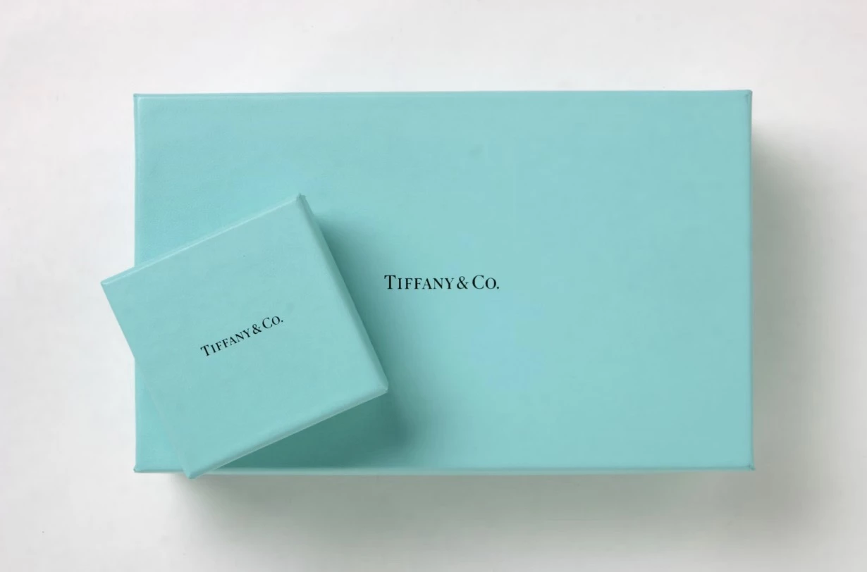
- Tiffany & Co.’s trademark ‘Tiffany Blue’ is a pivotal branding element seamlessly integrated across packaging, store interiors, and marketing materials to evoke luxury and exclusivity. This consistent use of an iconic color leverages color psychology with the soft blue hue inspiring feelings of calmness, trust, and elegance — key attributes in luxury branding
- The Tiffany’s logo, with its classic serif typography, conveys a sense of timeless sophistication, while the soft curves add a human, approachable touch. The monogrammed ‘T’ has become an instantly recognizable symbol of exclusivity, often used as a standalone symbol.
- Tiffany’s branding excels in storytelling. The brand taps into a rich history of craftsmanship, heritage, and romance — traits that resonate deeply with customers. Its association with Breakfast at Tiffany’s elevates its cultural significance, while its long-standing reputation as a go-to jeweler for engagement rings strengthens its emotional ties to consumers’ most cherished moments.
View this post on Instagram
In today’s digital age, Tiffany has continued to leverage its legacy to create aspirational imagery across platforms like Instagram and TikTok. By partnering with influencers and sharing high-quality visuals, Tiffany brings its timeless brand to younger audiences while maintaining its image as a luxury leader.
3. VALCCI
Standout Features:
- Minimalist logo with a symbolic nature motif
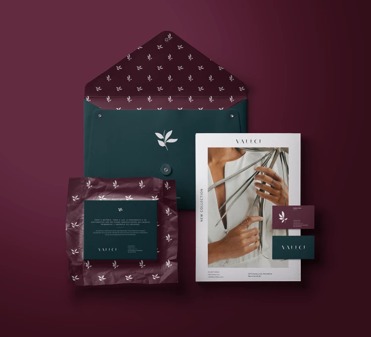
- Luxurious, refined packaging design
- Rich, evocative color palette
VALCCI’s jewelry collection draws inspiration from the elegance of nature, incorporating geometric shapes, floral motifs, and architectural influences into its designs. The branding skillfully integrates these elements into a visual identity that speaks to both timeless sophistication and natural beauty.
VALCCI’s branding success is built on these key elements:
- The delicate leaf icon at the center of VALCCI’s logo embodies the brand’s tropical identity, seamlessly connecting the jewelry’s natural inspiration to its visual branding. The minimalist design is powerful in its simplicity, while the geometric typography reflects the structural strength and elegance found in both nature and crystals.
- The brand’s signature color palette — burgundy and dark green — evokes romance and sophistication, appealing to consumers seeking elegance with a nature-inspired allure. These rich, bold tones are often associated with luxury and exclusivity, positioning VALCCI as a brand of beauty and substance.
- VALCCI’s packaging design mirrors its jewelry’s luxury. Featuring a carefully crafted logo pattern that adds depth and texture, the packaging elevates the unboxing experience. This attention to detail enhances its exclusivity, making each piece feel truly special and rare.
Additionally, this makes the products ideal for influencer unboxing collaborations, expanding the brand’s reach while reinforcing its aspirational image. These collaborations amplify credibility, as consumers often look to influencers for recommendations in luxury purchases.
4. Juliana Brasileiro - Design de Joias
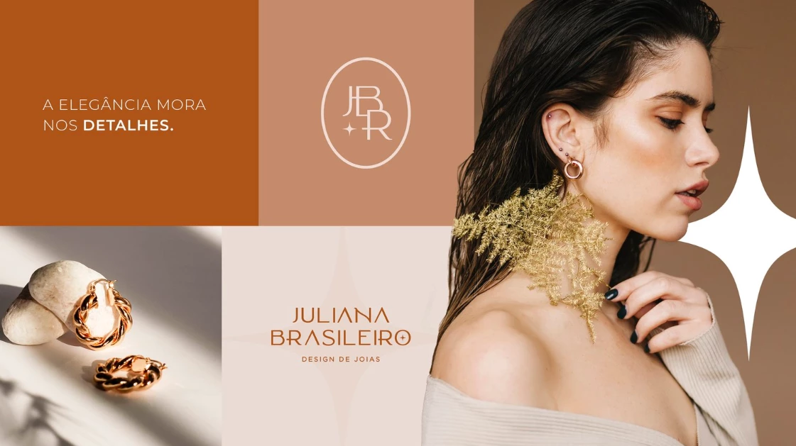
Standout Features:
- Strong, feminine brand identity
- Earthy, light color palette
- Outlined visuals and modern typography
Juliana Brasileiro’s jewelry brand captures the essence of modern femininity, combining fine craftsmanship with a minimalist aesthetic. Designed for women who seek exclusivity, empowerment, and sophistication, the brand exudes a sense of elegance and strength while remaining deeply connected to sustainability.
These key branding elements set Juliana Brasileiro apart:
- The intertwined logo design symbolizes the connection between feminine strength, grace, and power. A wide, linear font reinforces this modern aesthetic, adding balance and structure, while the circular framing softens the edges — creating an approachable yet strong brand identity.
- Its clean, light packaging design allows the brand’s logo to stand out in a subtle yet impactful way. Using eco-friendly materials enhances the unboxing experience, fostering a deeper connection between the consumer and the brand’s sustainable values. The minimalist approach keeps the focus on the brand’s ethos of understated elegance.
- The earthy color palette was intentionally chosen to reflect the brand’s sustainable values. These nature-inspired tones evoke organic beauty and timeless sophistication, resonating with conscious consumers and reinforcing the brand’s eco-friendly luxury positioning.
- The contemporary typography further defines the brand’s identity. The clean, modern font complements the brand's minimalist aesthetic while ensuring clarity and legibility, particularly in digital spaces like eCommerce sites.
In a competitive market, the combination of design integrity, sustainable practices, and community-driven engagement makes Juliana Brasileiro a brand that resonates with the values of today’s conscious consumer while standing out with timeless elegance.
5. Sonia Sartre
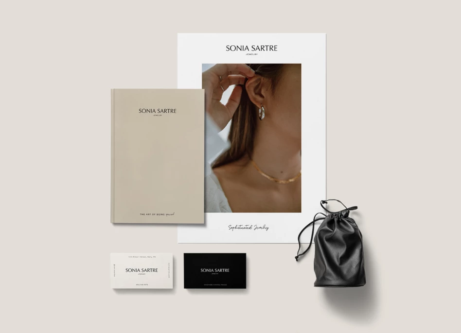
Standout Features:
- Clean, minimalist visuals
- Monochromatic color palette
- Dainty, refined product photography
Sonia Sartre’s branding succeeds by combining the power of simplicity with the allure of luxury. The clean, timeless visuals, combined with a monochromatic palette and refined product photography, create a cohesive brand identity that resonates with sophisticated, modern women.
This approach ensures the brand remains compelling across both physical and digital platforms, offering an aspirational experience of understated luxury.
Here are Sonia Sartre’s defining brand elements:
- The logo’s sleek, elegant typeface, paired with an outlined brandmark, embodies timeless sophistication. This minimalist design enhances versatility, ensuring the logo adapts seamlessly to applications ranging from packaging to digital branding.
- A monochromatic color palette reinforces sophistication, giving the brand a clean, refined aesthetic that appeals to a broad spectrum of luxury consumers.
- Its dainty product photography enhances storytelling and social media impact. Close-up shots highlight the intricate details of each piece, reinforcing the brand’s aspirational message — simplicity, elegance, and quiet sophistication. By placing the jewelry in serene, minimal settings, the imagery conveys that true luxury lies in subtlety, not excess.
These visuals work effortlessly on platforms like Instagram, where clean aesthetics and high-quality imagery are essential for engagement. By focusing on the intrinsic qualities of the jewelry and highlighting its craftsmanship, Sonia Sartre positions itself as a high-end brand that prioritizes elegance and longevity over trends.
The minimalist yet refined approach gives it a lasting appeal, ensuring that it remains relevant to consumers seeking timeless, luxury accessories for years to come.
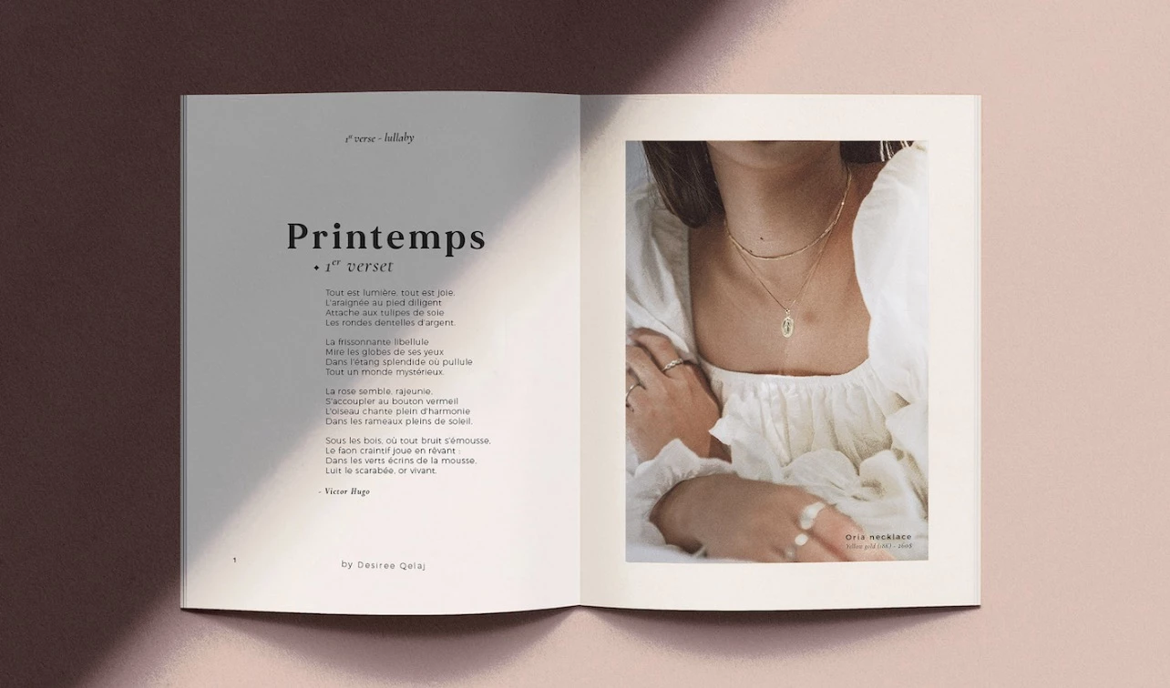
6. Desiree Qelaj
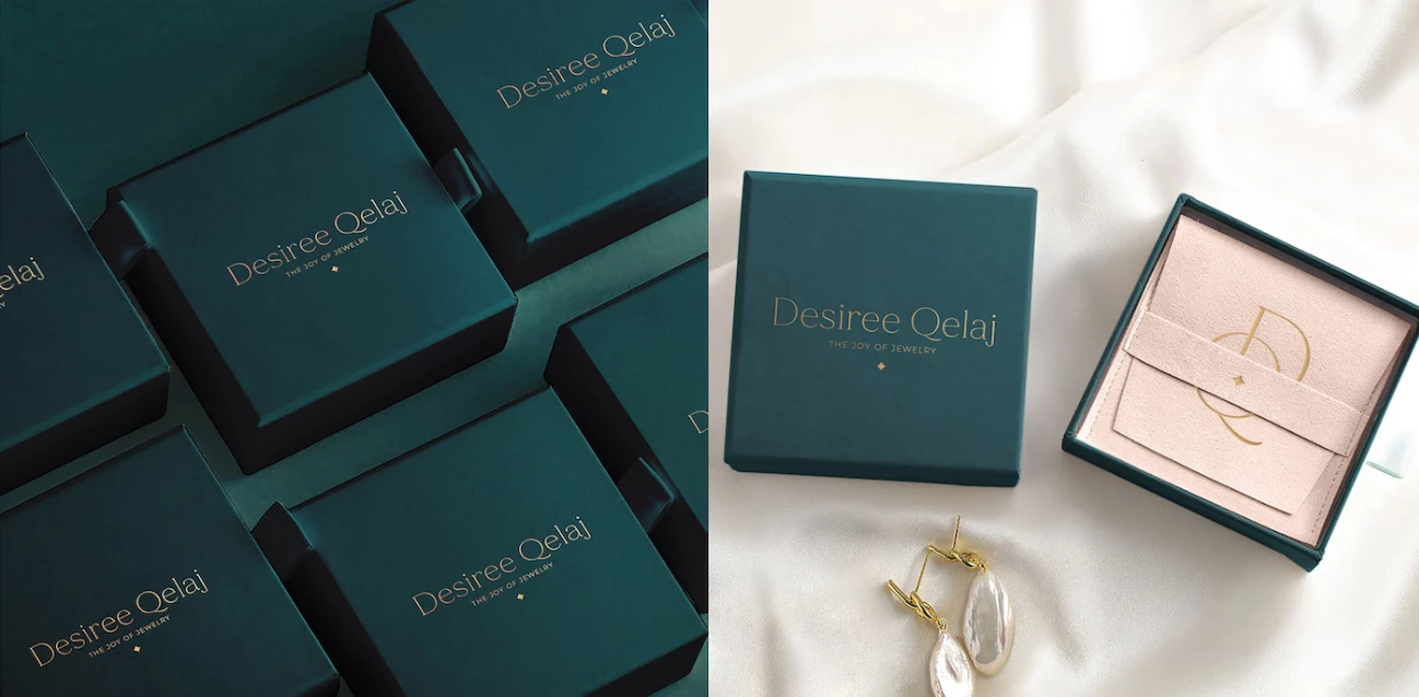
Standout Features:
- Contemporary and luxurious branding
- Sophisticated jewelry lookbook
- Dynamic pairing of bold and bright colors
Desiree Qelaj’s jewelry brand is dedicated to empowering women through bold, exquisite creations that embody modern elegance, luxury, and strength. Its branding speaks to women who seek sophistication and confidence in their accessories, elevating the experience through thoughtful design choices.
- The brand’s sans-serif typography exudes modernity and refinement, with clean lines and minimalistic shapes emphasizing its high-end, exclusive appeal. Paired with delicate icons, the font reinforces sophistication and exclusivity, appealing to a discerning audience.
- A bold and unexpected palette of soft pink and emerald green sets Desiree Qelaj apart. The soft pink represents femininity, joy, and warmth, inviting consumers into a world of delicate beauty. Meanwhile, the rich emerald green conveys premium quality, power, and luxury.
- Its sophisticated jewelry lookbook enhances customer engagement by offering a curated experience. By showcasing multiple designs in a cohesive narrative, the lookbook helps customers envision how each piece complements their personal style, fostering an emotional connection that encourages exploration and purchase.
Through the strategic use of vibrant colors and minimalist design across digital touchpoints, Desiree Qelaj creates a compelling visual identity that remains consistent online and offline. Social media engagement, paired with the inspirational lookbook, nurtures a strong community around the brand, driving both awareness and consumer loyalty.
7. Ocean Jewellery
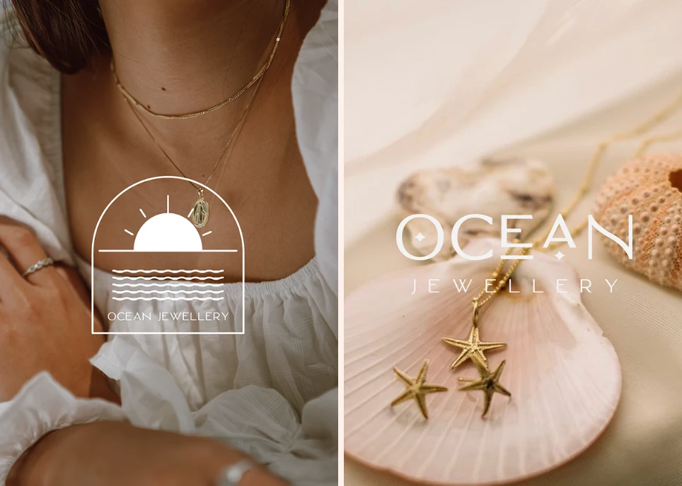
Standout Features:
- Distinct brand icon
- Oceanic themes and illustrations
- Sparkly, attention-grabbing packaging design
Ocean Jewellery blends enchantment and luxury, bringing the beauty of the ocean into its branding. By weaving oceanic themes into its identity, the brand captures nature’s splendor while maintaining a high-end appeal. This captivating visual language speaks to consumers seeking elegance and wonder, with each design element telling the story of the sea’s treasures.
Here are Ocean Jewellery’s defining brand elements:
- The distinctive logo features a stylized "O" designed to resemble a precious jewel. Its simplicity and elegance create a strong, recognizable image, essential for brand recall in a competitive market.
- Ocean-inspired visuals are at the heart of the brand’s identity. From the aquatic logo to the intricate sun and sea illustrations, every design choice reflects the brand's connection to the natural world. By using oceanic motifs, Ocean Jewellery’s branding taps into a universally appealing theme: the ocean as a symbol of beauty, rarity, and depth.
- Its sparkling packaging design also adds to the brand’s allure. The shimmer mimics sunlight reflecting off the ocean’s surface. More than just jewelry, Ocean Jewellery delivers a moment of wonder, transporting consumers to a world of glittering waters and radiant beauty.
Ocean Jewellery’s clever fusion of storytelling and design builds a strong emotional connection between the product and the consumer.
8. Adorna Luxury Jewelry
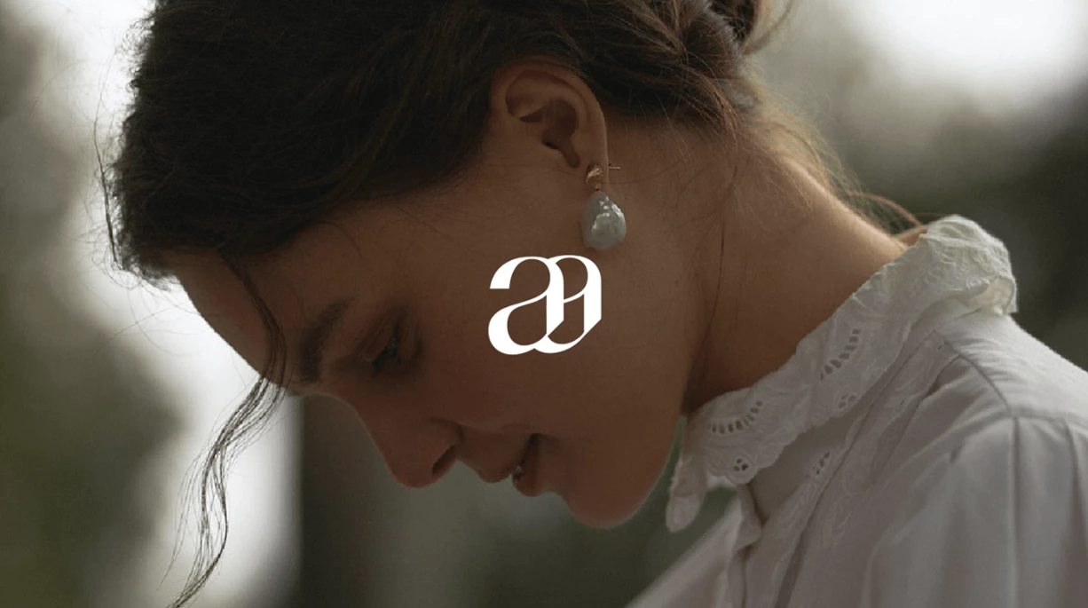
Standout Features:
- Remarkable logo symbol
- Well-designed eCommerce website
- Stylish yet neutral color story
Adorna Luxury Jewelry’s branding masterfully combines simplicity with sophistication, allowing its core values — exclusivity, sustainability, and craftsmanship — to shine through every design choice. Its minimalist logo, refined color palette, and user-friendly eCommerce platform create a seamless, premium customer experience that sets the brand apart.
Here are some of its most striking brand elements:
- Adorna's remarkable logo symbol — an intertwined "A" — elegantly mimics the shape of a jewelry piece. The simplicity of the logo, paired with its graceful styling, conveys exclusivity without overwhelming the viewer, resonating with consumers who appreciate subtle refinement.
- The brand’s neutral color palette, featuring white, cream, and beige, further reinforces its sophisticated and timeless aesthetic. These soft, timeless tones enhance the feeling of luxury, allowing the craftsmanship of each jewelry piece to take center stage.
- Adorna’s eCommerce website plays a crucial role in turning visitors into loyal customers. Designed for both elegance and functionality, the site features stunning product photography, a clean layout, and intuitive navigation that makes browsing effortless. High-quality images showcase the jewelry in its best light, further elevating the brand's premium feel.
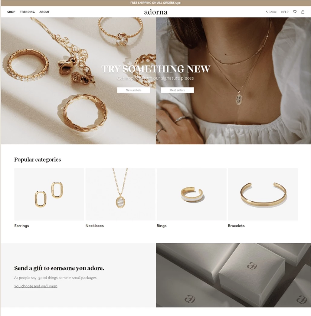
The website’s clean, functional design ensures a smooth transition from browsing to buying, creating an experience that encourages customers to act on their desire for fine, handcrafted jewelry. By seamlessly merging minimalist design with luxury branding, Adorna Luxury Jewelry has created a visually cohesive identity that enhances its online presence while elevating the customer experience.
9. Cartier
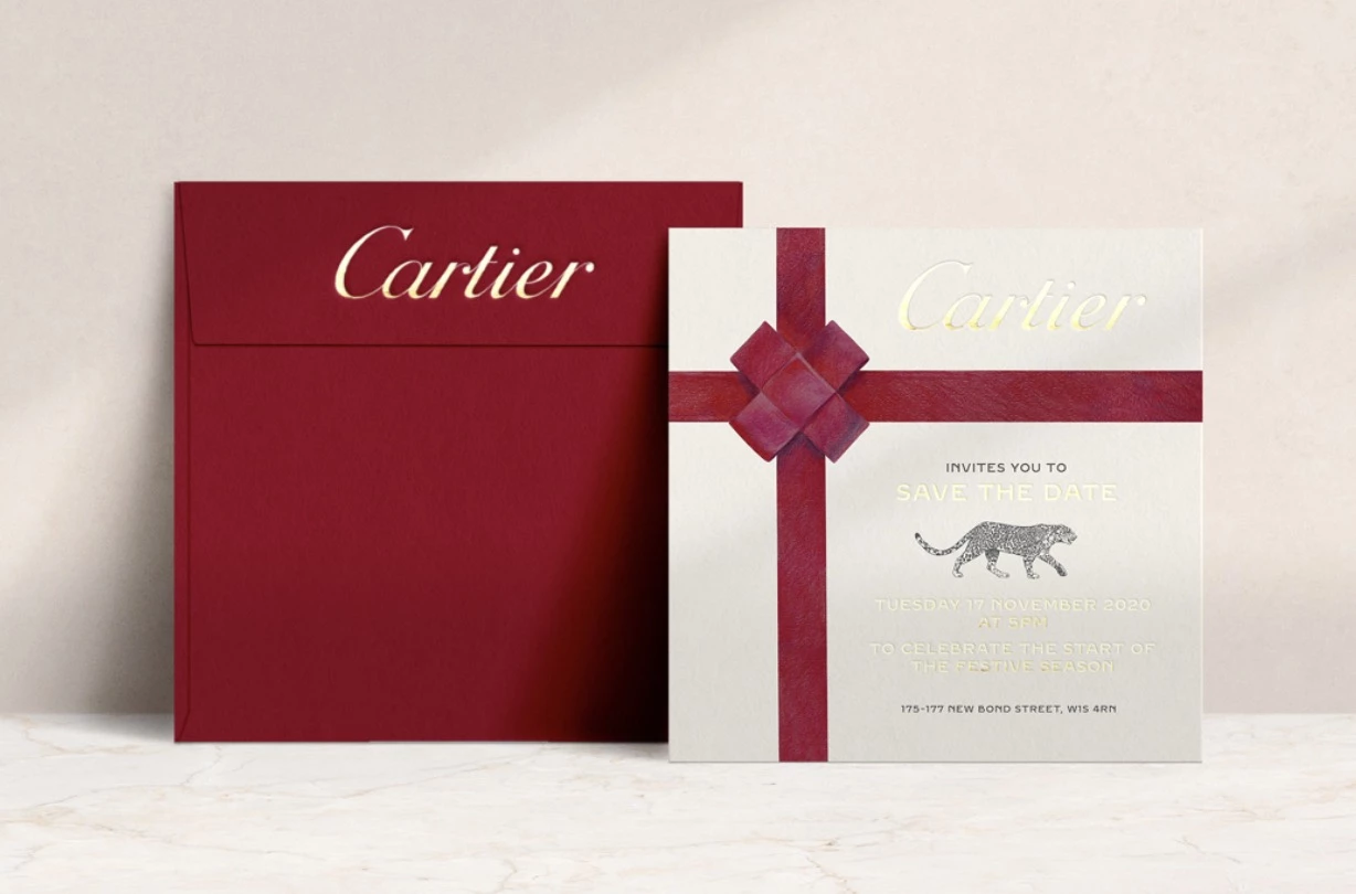
Standout Features:
- Iconic logo and Panther symbol
- Heritage-driven, refined design
- Luxurious packaging and customer experience
Cartier, one of the most prestigious names in luxury jewelry, has successfully cultivated an aura of timeless elegance and exclusivity. With its rich heritage and a reputation for impeccable craftsmanship, Cartier’s branding transcends generations, appealing to the sophisticated and discerning tastes of high-end consumers.
These key branding elements set Cartier apart:
- The Cartier logo — a simple yet refined wordmark — embodies tradition and prestige. Its sleek, elegant serif font reflects the brand’s luxury statues, while the subtle curves add an air of softness.
- The panther symbol, introduced in the early 20th century, has become Cartier’s most iconic visual element. Representing beauty and power, the Panthère de Cartier motif embodies the brand’s fearless commitment to bold artistic expression. This enduring emblem reinforces Cartier’s legacy as one of the world’s most innovative and luxurious jewelry houses.
- Rich, deep tones like ruby reds, gold, and black are often used in packaging, store interiors, and visual communications. These colors evoke feelings of luxury, exclusivity, and sophistication, aligning with the brand's positioning as a top-tier purveyor of fine jewelry.
- A powerful narrative of heritage and craftsmanship is at the heart of Cartier’s identity. Since its founding in 1847, the brand has long been a symbol of excellence, designing jewelry for royalty and the elite. This emphasis on tradition and quality positions Cartier not just as jewelry brand but as a symbol of heritage, status, and artistry
- Cartier’s luxurious packaging is also a significant factor in its branding success. The signature red box with gold accents has become an integral part of the brand’s appeal. The unboxing experience is as lavish as the jewelry itself, reinforcing the brand’s commitment to an immersive luxury experience.
While Cartier has a long-established reputation, it continues to adapt to modern trends, using social media to maintain its aspirational image.
View this post on Instagram
On platforms like Instagram, Cartier shares high-quality imagery that emphasizes not just the jewelry but the lifestyle it represents. The brand engages with influencers and digital tastemakers to showcase its creations, ensuring its relevance among younger, more digitally-connected audiences.
10. PFJ Insignia
Standout Features:
- Linear visuals and fonts
- Flowy logo design
- Delicate color story
PFJ Insignia, celebrated for its minimalist gold jewelry, has a brand identity that reflects its simple yet sophisticated aesthetic. The branding strategy expertly balances elegance and modernity, translating the essence of the brand’s luxurious pieces into a refined visual experience.
Here are key branding elements that make PFJ Insignia stand out:
- The brand’s visual identity is defined by linear visuals and bold typography, conveying strength and modernity while maintaining an air of elegance. These stand out design elements help PFJ Insignia carve out a unique space in the crowded luxury market.
- The flowy logo design introduces fluidity and movement, softening the otherwise sharp, structured aesthetic. This juxtaposition visually embodies PFJ Insignia’s balance between timeless luxury and modern design.
- The color palette — cream and gold — creates a soft, understated elegance. Gold evokes luxury and exclusivity, while cream adds a warm, welcoming undertone, ensuring the brand feels both premium and inviting. This refined color story provides the perfect backdrop for PFJ Insignia’s gold jewelry, allowing each piece to shine as the focal point.
By embracing minimalist design, PFJ Insignia reinforces the beauty of its craftsmanship while maintaining a strong, recognizable identity. With a refined aesthetic, timeless colors, and a balance of boldness and delicacy, the brand speaks to consumers who seek understated elegance and enduring sophistication in their jewelry choices.
11. Brudany Semijoias
Standout Features:
- Elegant and confident visual language
- Personalized packaging design with attention to detail
- Distinctive brand stamps
Brudany Semijoias embodies a refined fusion of confidence, elegance, and femininity, meticulously woven into every aspect of the brand. More than just a jewelry line, Brudany Semijoias tells a story of modern femininity, positioning each piece as a statement of style and empowerment.
Brudany Semijoias’s branding success is built on these key elements:
- Its color palette fosters a deep emotional connection, with blue for confidence, pink for refinement, and white for elegance. This harmonious blend reinforces the brand’s image as an exclusive yet relatable luxury line.
- The logo further reinforces the brand's refined identity. Featuring an outlined gem icon, it clearly represents the brand’s niche in fine jewelry. The integrated brand initials add a personalized touch, reinforcing the bespoke nature of each piece.
- Brudany Semijoias’s personalized packaging elevates the customer experience with custom stamps that amplify its luxury appeal. In the fashion industry, packaging serves as the first tangible brand interaction, making it a key part of the customer experience.
Brudany Semijoias’ branding is a perfect blend of elegance, confidence, and sophistication. By focusing on personalization and emotional connection, Brudany Semijoias successfully differentiates itself in the competitive world of fashion jewelry. Its branding is both distinctive and cohesive, ensuring that the brand remains memorable and aspirational for its target audience.
12. HUE.S
Standout Features:
- Elegant pairing of cursive and sans-serif fonts
- Monochromatic color palette for premium impact
- Bold typography with direct, impactful messaging
HUE.S is a Taiwanese jewelry brand that stands out for its bold, edgy aesthetic, underpinned by sharp silver pieces. The brand's identity is defined by a modern luxury appeal, blending sophistication with a raw, contemporary edge.
These key branding elements set HUE.S apart:
- The logo’s flowy design, with its continuous, curving lines, embodies the malleability of silver, suggesting both flexibility and fluidity — characteristics intrinsic to the material. This aesthetic of movement and transformation resonates with the brand's craftsmanship and the artistic approach to creating jewelry.
- The typography of elegant cursive with a bold sans-serif font creates a powerful contrast in the brand's messaging. The cursive adds refinement, while the sans-serif typography brings strength, creating a sophisticated yet assertive visual language that aligns with the brand’s straightforward, no-nonsense personality.
- The monochromatic color palette of white and black enhances the brand's premium feel. These neutral tones create a clean, modern visual aesthetic, allowing the sharp silver jewelry to take center stage.
HUE.S’s branding strategy successfully merges modern luxury with edgy sophistication. This branding resonates with customers who seek jewelry that’s not only a visual statement but also an expression of bold, modern style.
13. The Lilac Collective
Standout Features:
- Elegantly intertwined logo symbol
- Soft, light-themed color palette
- Dainty, refined typography
The Lilac Collective is a brand that embodies grace, delicacy, and chic refinement, speaking to a subtle yet powerful elegance. The identity draws inspiration from the rarity and softness of the color lilac, reflecting the brand’s commitment to timeless beauty and understated luxury.
These key branding elements set Lilac Collective apart:
- The brand’s elegantly intertwined logotype merges its initials in a fluid, ribbon-like illustration, evoking movement, softness, and delicate beauty. This intertwined symbol, used as a pattern, further enhances brand distinctiveness and creates a cohesive visual identity across all touchpoints.
- The color palette of cream, grey, lilac, and white was carefully chosen to convey freshness, delicacy, and refinement. These light, airy shades provide the perfect backdrop for the jewelry collection, allowing each piece to shine through.
- The delicate typography complements the brand’s intertwined logo, striking a harmonious balance of softness and refinement. The choice of a light, serif font contributes to the brand's graceful simplicity, aligning with its identity as a jewelry line for those who appreciate timeless, understated luxury.
The combination of an elegant logo, soft color palette, and dainty typography creates a memorable, distinct brand identity that resonates with customers seeking luxury in simplicity. This cohesive approach to branding positions The Lilac Collective as a jewelry brand that stands for elegance in its purest form.
14. Van Cleef & Arpels
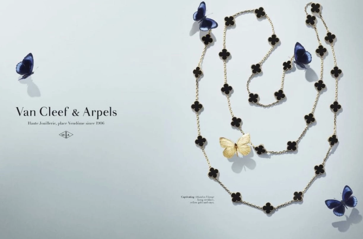
Standout Features:
- Iconic Alhambra motif
- Timeless, elegant typography
- Strong heritage storytelling and artistry
Van Cleef & Arpels is a cornerstone of luxury and artistry, blending impeccable craftsmanship with a legacy that spans over a century. Its success extends beyond exquisite jewelry — its brand identity has evolved into a symbol of timeless elegance, deeply rooted in art, beauty, and masterful craftsmanship.
Van Cleef & Arpels’ defining brand elements include:
- The brand’s visual identity is refined, yet deeply emotional. Van Cleef & Arpels incorporates rich, royal colors like deep blues and rich gold. When paired with delicate metals and gemstones, it creates an emotional connection that is timeless and irreplaceable.
- The emblematic Alhambra motif, with its quatrefoil design, serves as a powerful symbol of luck and prosperity. It’s instantly recognizable and often used as a stand-alone symbol, conveying both exclusivity and refined artistry.
- The elegant serif typography establishes the brand’s standing in the luxury market while ensuring its appeal transcends generations. The design reflects the brand’s dedication to precision, craftsmanship, and artistic inspiration, becoming a hallmark of luxury for those who appreciate the artistry behind every piece.
- Storytelling is at the heart of Van Cleef & Arpels’ branding. Drawing on its rich history of adorning royalty and Hollywood stars, the brand showcases its legacy of early 20th-century craftsmanship, positioning itself as a creator of meaningful, timeless treasures.
- The brand’s luxurious packaging — soft velvet boxes with elegant gold detailing — makes the unboxing experience almost as coveted as the jewelry itself. The packaging is a crucial part of the luxury experience, creating anticipation and ensuring the product is as precious as the occasion it commemorates.
In the age of digital transformation, Van Cleef & Arpels has masterfully continued to leverage its heritage through social media. The brand shares high-quality images that showcase its intricate designs and timeless beauty.
View this post on Instagram
Influencers and brand ambassadors further elevate the brand’s visibility among younger, affluent consumers, allowing Van Cleef & Arpels to maintain its status as an icon of luxury while continuing to attract a new generation of jewelry enthusiasts.
15. Minerva Choices
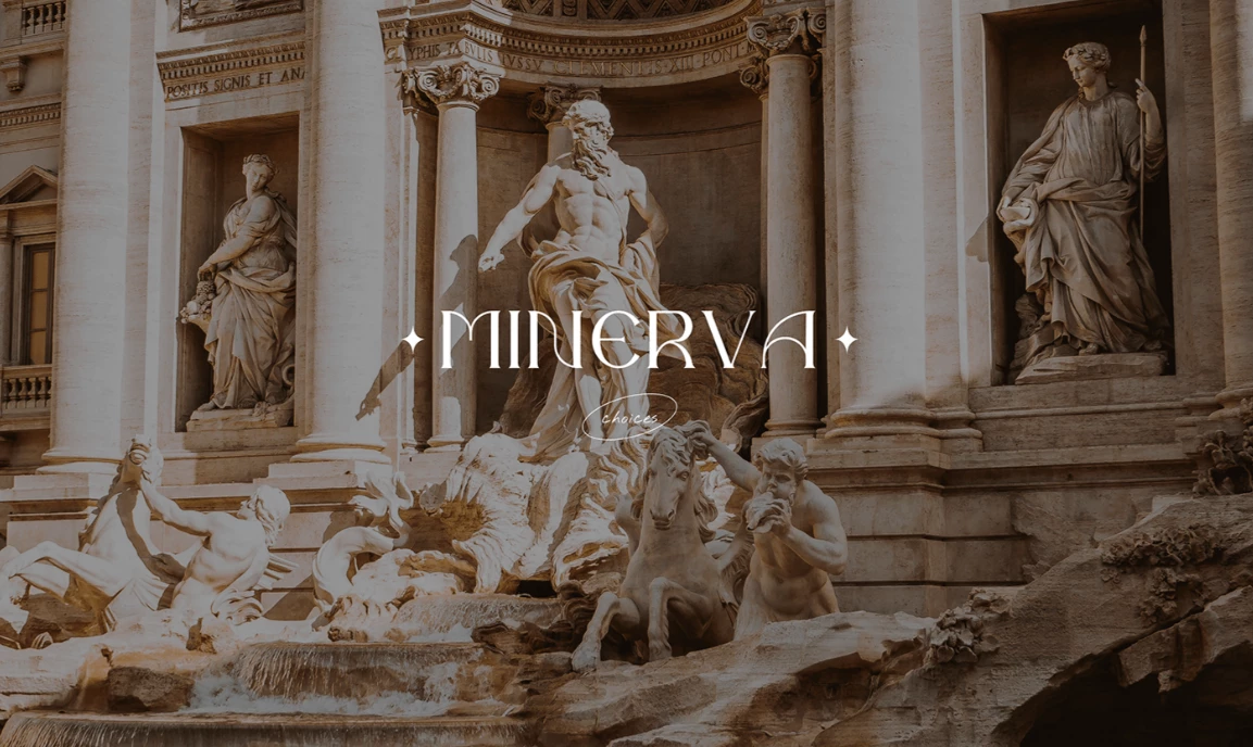
Standout Features:
- Mythology-inspired visuals
- Arc-style illustrations
- Royalty symbols and imagery
Minerva Choices draws its inspiration from the grandeur of ancient mythology, evoking images of gods, goddesses, and the celestial world. These mythological elements are expertly intertwined to position the brand as the home of celestial accessories — where luxury meets timeless elegance.
Here are key branding elements that make Minerva Choices stand out:
- The branding imagery incorporates sculptures, pedestals, and pillars — symbols that instantly convey regal sophistication. These ancient elements tie the brand to a heritage of immortality, power, and exclusivity, inviting consumers to experience something truly divine.
- The ancient font style and linear typography reinforce the brand’s connection to a classical, regal past. Meanwhile, arc-style illustrations draw from the architecture and artistry of ancient temples, adding harmony and balance to the design.
- Modern, minimalist icons, such as sparkles and celestial motifs, provide a contemporary edge to balance the historical references. These symbols add a fresh contrast, updating the ancient visuals for a contemporary audience while retaining the timeless luxury that the brand embodies.
This blend of the divine and the contemporary gives Minerva Choices a unique visual identity that connects deeply with consumers looking for luxury and elegance in every piece.
16. Tribal
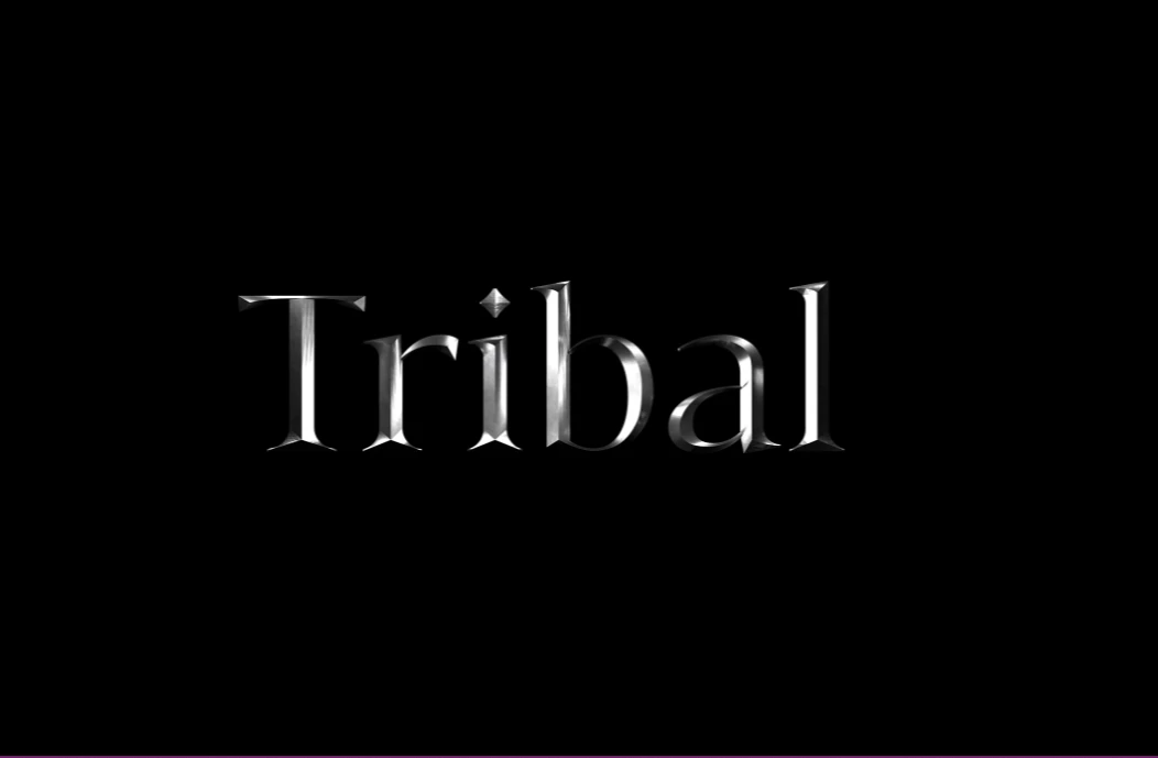
Standout Features:
- Textured logo design
- Bold and vibrant color palette
- Edgy silhouettes and sharp, dynamic close-ups
Tribal, a Bangkok-based jewelry brand, is all about bold statements with everyday wearability. Its visual identity strikes a balance between fashion-forward edge and effortless elegance, appealing to women who want their jewelry to make an impact without compromising versatility.
Here are its most striking branding elements:
- The metallic, textured logo perfectly encapsulates the brand’s modern and dynamic aesthetic. A small diamond icon within the logotype adds a subtle touch of luxury and refinement, reinforcing Tribal’s commitment to high-quality craftsmanship while maintaining a sharp, contemporary feel.
- The bold color palette — featuring red, blue, and beige against a stark black background — creates a striking visual contrast that commands attention. These colors reflect the brand’s edgy and vibrant personality, ensuring its designs stand out in a crowded market.
- Tribal’s sharp close-up shots and edgy silhouettes elevate its bold and modern aesthetic. Meanwhile, its social media art cards, featuring impactful slogans, strengthen the brand’s confident, empowering identity. These visuals do more than showcase the jewelry, they also serve to reinforce the brand narrative, making a clear statement about who Tribal is and what it stands for.
By combining strong visual elements with confident messaging, Tribal positions itself as a go-to brand for women who want to stand out effortlessly. Its branding strategy leaves a lasting impression, successfully blending boldness with approachability.
17. Larema Joias
[Source: Matheus Paschoalini]
Standout Features:
- Sharp, modern logo
- Vibrant and distinctive brand color
- Sophisticated design execution
Larema Joias has crafted a jewelry brand that stands out with its bold and contemporary visual identity. The brand seamlessly fuses modernity and elegance, creating a visual language that feels fresh, yet timeless, and speaks directly to the sophisticated customer.
Key branding elements set Larema Joias apart:
- Larema Joias’ sharp, modern logo is a striking symbol that commands attention. Avant-garde yet refined, the design embodies luxury with accessibility.
- The clean typography and sharp logo icons work in harmony to create a minimalistic aesthetic, a rarity in the jewelry space. This approach positions the brand as both elegant and forward-thinking, perfectly aligned with today’s discerning jewelry consumers.
- The vibrant red color palette, paired with white and gold, makes a bold and memorable statement. The bold red injects an element of passion and exclusivity, while white and gold enhance the brand’s sophisticated design. This combination reinforces a distinctive presence in the market.
Larema Joias’ design approach is both purposeful and refined, ensuring every element serves a clear function. Avant-garde design choices create a visually striking and cohesive identity, setting the brand apart in the jewelry industry. This innovative execution captivates a contemporary audience while reinforcing Larema Joias’ position as a luxury leader.
18. Belsi's Jewelry
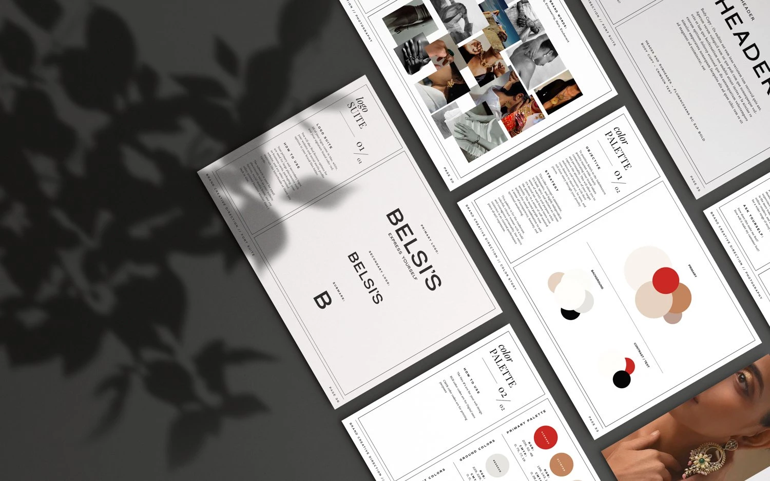
Standout Features:
- Evocative brand identity
- Traditional color palette with modern appeal
- Classy and elegant typography
Belsi's Jewelry, founded by two visionary sisters in 2010, embodies family, heritage, and self-expression. Born from a deep love for jewelry and a rich cultural background, the brand seamlessly bridges the gap between affordable yet authentic Indo-Western jewelry. Each piece tells a story—one of passion, ambition, and heritage.
Here are the branding elements that define Belsi’s Jewelry:
- The branding personality embodies Belsi’s roots and adventurous spirit, appealing to bold, ambitious women who see jewelry as an expression of individuality. This identity is woven into every design element, from its evocative logo to its photography direction, which highlights both elegance and empowerment.
- WHS pays homage to Belsi's Indian roots while ensuring a broad appeal to Western sensibilities. The color palette draws from traditional hues with cultural significance, modernized for a global audience.
- Photography plays a central role in conveying the adventurous spirit of the brand. The direction invites viewers to envision themselves in the jewelry — whether they are a traveler, a socialite, or an explorer of the world.
WHS’s branding identity featuring clean, strong fonts and striking imagery draws attention to the jewelry’s details while conveying confidence and sophistication.
19. Harry Winston
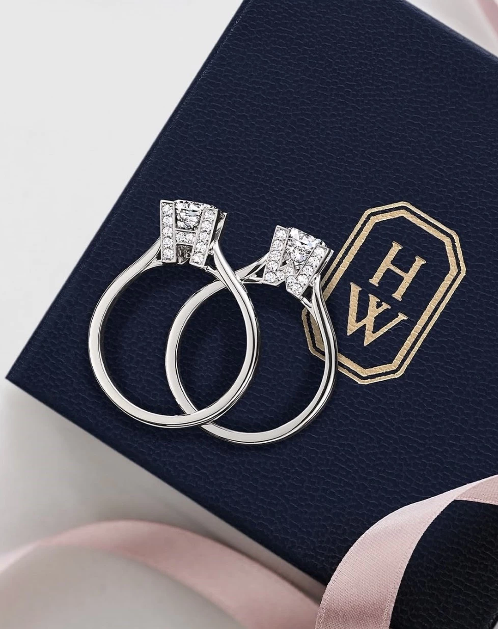
Standout Features:
- Iconic, refined monogram
- Mastery of diamond craftsmanship
- Emotional storytelling rooted in legacy and prestige
Harry Winston, known as the "King of Diamonds," stands as the ultimate symbol of luxury, refinement, and craftsmanship. Since its inception, the brand has positioned itself at the pinnacle of the jewelry industry — not just through breathtaking designs, but by cultivating a brand identity rooted in heritage, artistry, and an exclusive luxury experience.
These key branding elements set Harry Winston apart:
- The seamless integration of brand values into every customer interaction is what truly sets Harry Winston apart, elevating each piece to an iconic status. Harry Winston’s success is built on a legacy of exceptional jewelry, combining artistic mastery with timeless elegance.
- The color palette of white, gold, and platinum conveys purity, sophistication, and exclusivity, perfectly complementing the brilliance of its diamonds. The lack of overt branding through color draws the focus directly to the product, reinforcing the idea that Harry Winston is about timeless beauty, not excess.
- Harry Winston's logo — featuring its iconic HW monogram — embodies the brand’s commitment to understated elegance and luxury. It’s simple yet powerful design symbolizes rarefied excellence, with many discerning clients associating the logo with legacy and authenticity.
- The brand’s story is at the core of Harry Winston’s branding, featuring a legacy rooted in craftsmanship, prestige, and an unwavering commitment to providing the highest quality diamonds. The brand taps into the story of its founder, Harry Winston himself, who is often referred to as the “Jeweler to the Stars,” and his remarkable journey from the diamond mines to the finest jewelry ateliers.
Harry Winston’s storytelling is about owning a piece of history, encapsulated in masterpieces that tell stories of love, achievement, and cultural significance. Each piece is crafted with the knowledge that it will become part of the wearer’s story — whether it’s a family heirloom passed down through generations or an emblem of a milestone moment.
View this post on Instagram
In the modern era, Harry Winston has carefully evolved its digital strategy to connect with both existing and new audiences. While the brand still relies heavily on its heritage, it has embraced social media to bring a more aspirational experience to younger, affluent consumers.
Our design experts recognize the most innovative and creative designs from across the globe. Visit Design Awards to see the:
- Best Logo Designs
- Best Website Designs
- Best Video Designs
- Best Print Designs
- Best Packaging Designs
- Best App Designs
Our team also ranks agencies worldwide to help you find a qualified agency partner. Visit our Agency Directory for the top Logo Design Companies, as well as:
- Top Web Design Agencies
- Top Video Production Companies
- Top Print Design Companies
- Top Packaging Design Companies
- Top Mobile App Development Companies


-preview-webp.webp)