Pharmaceutical brands are widely seen as trusted providers of health and well-being. They serve as beacons of good health, offering solutions that make life more comfortable and effortless in many ways.
People often view these companies as lifesavers — quite literally — which is why their branding must consistently convey care, reliability, and trust across all visual assets, including logos and packaging.
Created by some of the top branding agencies, these exceptional pharmaceutical and medical branding solutions are sure to inspire you — and keep you in good health!
1. Lens Istanbul Pharmacy by JUST DESIGN FX

Standout Features:
- A warm and approachable color story
- Youthful branding elements
- Vibrant atmosphere
Lens Istanbul Pharmacy is a prime example of modern pharmaceutical and medical branding done right. As a new-generation pharmacy, it specializes in general medicine, skincare, and holistic care while setting trends in the industry.
Despite having a younger identity than most competitors, the brand aims to make their customers feel at ease. JUST DESIGN FX tapped into these youthful elements and Lens Istanbul’s commitment to serving the people in their community, crafting a branding kit that perfectly reflects its mission.
Additionally, its visual identity incorporates contemporary Turkish culture through its fonts, logo, and visual assets, staying true to its heritage and enhancing trust within the local community.
Why This Branding Works
- Youthful modernity: The vibrant design meets the younger generation’s need for a welcoming, modern pharmaceutical experience, balancing an energetic color palette with professional credibility.
- Cultural connection: By integrating Turkish cultural identity through typography and design, the brand strengthens local ties and builds authenticity and trust.
- Regulatory elegance: The contemporary aesthetic adheres to strict regulatory standards while remaining personable and engaging — resulting in a pharmacy that is both cutting-edge and community-rooted.
2. MEDSUPP by Creatine
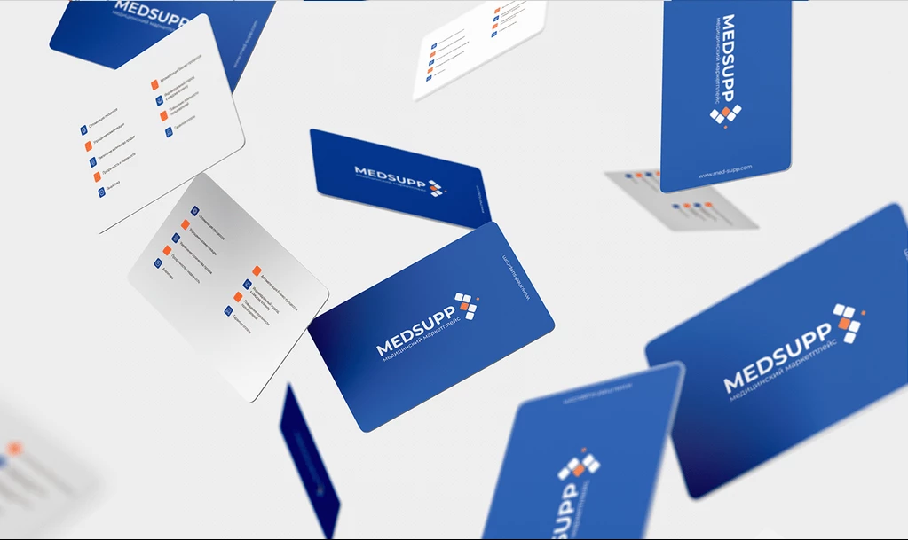
Standout Features:
- Relaxed color scheme
- Straightforward branding execution
- Reliable feel
Most pharmaceutical and medical companies prioritize reliability and trust when engaging with customers. They aim to create a sense of security, especially when providing medications that enhance health and longevity.
Creatine developed MEDSUPP’s branding assets with a strong focus on trust and professionalism. The design strategy centers on a blue, white, and orange palette, widely used in healthcare branding for its calming and reassuring effects.
Color plays a crucial role in branding, as color psychology can significantly influence how people think, feel, and behave. Blue, often associated with peace and trust, helps create a sense of comfort and reliability when prominently featured in a brand’s identity.
MEDSUPP’s visual assets embrace a straightforward, no-frills design — what you see is what you get. This minimalist approach reinforces their commitment to professionalism and trustworthiness, ensuring customers feel confident in their products and services."
Why This Branding Works
- Color psychology impact: A vibrant yet calming blue-and-orange color scheme harnesses color psychology to instill trust and reliability, reassuring customers about the brand’s dependability.
- Transparent design: The clean, no-frills aesthetic enhances transparency, ensuring that the brand appears straightforward and trustworthy — essential for a medical supplier.
- Normative differentiation: By aligning with established pharmaceutical branding norms while retaining a fresh, modern feel, MEDSUPP is recognized as both professional and reliably innovative.
3. Holos Concept by Dijan Marcel

Standout Features:
- Nude and earth color palette
- Lively imagery
- An elegant and solid portrayal
No matter the industry, looking your best in front of clients is essential. Businesses in the medical field face the same challenge — they want to present a polished image without seeming like they’re trying too hard to impress patients.
Dijan Marcel understood this perfectly when developing the branding for Holos Concept. His goal was to highlight solidarity and trust, injecting elegance into the brand’s identity to ensure patients feel both safe and sophisticated when engaging with the company.
The natural color palette of nude and earthy tones complements skin tones, reinforcing the idea that the company helps people embrace and love their skin. Additionally, uplifting imagery exudes joy and celebration, creating a sense of comfort and confidence for patients visiting the clinic.
Why This Branding Works
- Personal connection: Mirroring skin tones creates a subconscious link between the product and the customer, signaling that the brand truly understands personal health and self-care.
- Distinctive palette: Departing from traditional clinical blues and whites, the unique color scheme sets the brand apart in a market prone to sterile aesthetics.
- Emotional resonance: The use of joyful, celebratory imagery fosters trust and an aspirational feel, ensuring that the brand contributes to a positive, lifestyle-focused experience.
4. Dentique by Flow Design
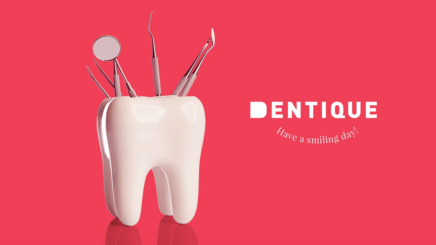
Standout Features:
- Witty imagery in logo design
- Warm catchphrases
- On-brand color story
Dentists don’t always have the best reputations, with countless dental horror stories circulating online. Dentique understands this challenge and sets out to create a brand that makes oral care feel fun and approachable. To bring this vision to life, they partnered with Flow Design, which developed a witty and engaging branding kit that perfectly captures Dentique’s mission.
Dentique took cues from well-known toothpaste brands like Aquafresh and Colgate, adapting their colors into a unique shade range that feels both familiar and distinctly Dentique.
The phrase “Have a smiling day!” cleverly incorporates dental care elements into a short, uplifting message that instantly brings a smile to people’s faces. Additionally, Dentique replicated the image of human teeth in its branding — keeping it scientifically relevant yet visually appealing, ensuring it remains on-brand without feeling overly clinical.
Why This Branding Works
- Familiarity with a twist: By borrowing color cues from well-known toothpaste brands and tweaking the shades, Dentique achieves instant recognition while carving out a unique identity.
- Personality infusion: Warm, friendly catchphrases inject charm into the branding, effectively countering common dental anxieties and softening the clinical image.
- Stigma transformation: Merging industry-relevant symbolism with lighthearted messaging, the brand transforms dental care into a modern, patient-friendly experience.
5. Matrys - Regenerative Peptides by Signorini Luca
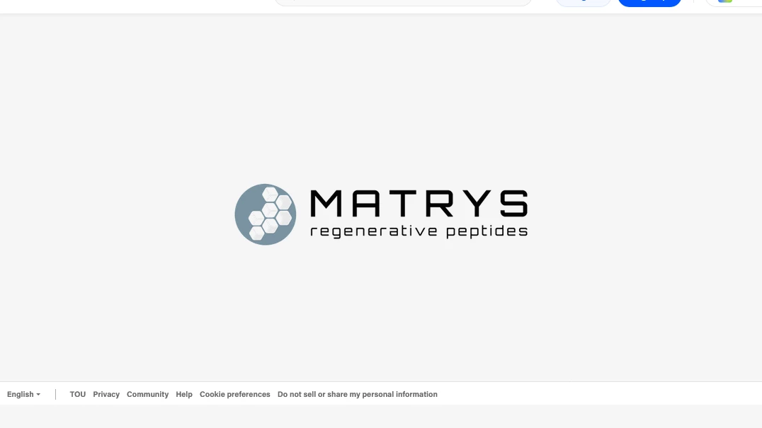
Standout Features:
- Familiar imagery
- Focus on the serious side
- Consistent with contemporaries
Pharmaceutical and medical brands don’t always need to be youthful and trendy to capture attention. Sometimes, a classic, no-nonsense approach is the best choice.
The branding kit for Matrys – Regenerative Peptides, designed by Signorini Luca, embraces the serious side of medicine. The brand conveys that medication should be taken seriously, without any frills attached.
Since they are marketing a medical device designed to improve lives, they focus on a branding style that is clean, professional, and highly respected. While vibrancy and youthfulness have their place in pharmaceutical and medical branding, some products and services benefit more from a simplistic, no-nonsense approach.
Why This Branding Works
- Classic minimalism: A clean, no-nonsense aesthetic reinforces the brand’s commitment to professionalism and scientific rigor, conveying a sense of trustworthiness.
- Scientific credibility: Traditional design cues emphasize expertise and credibility, appealing to a discerning audience that values reliability over fleeting trends.
- Authority through simplicity: In a market chasing youthful trends, Matrys stands apart by prioritizing a timeless, authoritative approach.
6. Functional Dentistry | Structura by Dare Studio
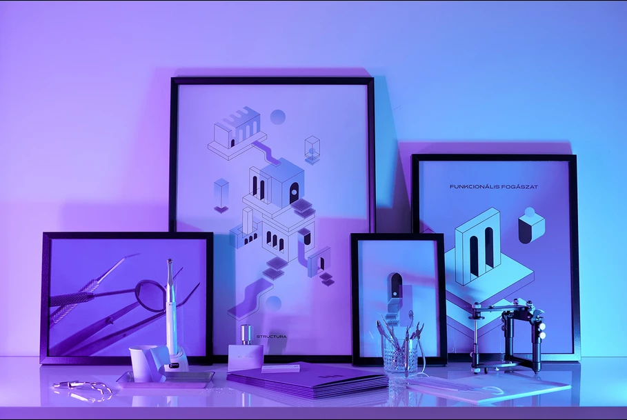
Standout Features:
- Holographic color palette
- Absence of familiar images
- Sleek presentation
Dental clinics should maintain a strong online presence to remind people of the importance of oral health. That’s why many clinics incorporate teeth and gums in their branding to reinforce their message.
However, Dare Studio took a different approach when branding this hip Italian dental clinic, opting not to use teeth or gums in its visual identity. Instead of traditional imagery, they highlight dental tools such as toothbrushes, scalpels, and forceps, presenting them in a way that is not morbid but rather memorable to their clientele.
They also incorporate a holographic color palette of magenta, purple, and blue, reminiscent of lo-fi music known for its calming and soothing effects. The result is a sleek, high-end presentation that gives the impression of premium services — now that’s effective branding.
Why This Branding Works
- Conceptual innovation: Eschewing direct dental imagery in favor of showcasing oral care tools, the brand challenges norms with a sleek, conceptual approach.
- Differentiated imagery: This creative departure sets the brand apart from clinics that rely on generic visuals, reinforcing modernity and creativity.
- Holographic sophistication: The holographic color palette evokes sophistication and innovation, positioning the clinic as exclusive and high-end while maintaining professional credibility.
7. Nicola Biancardi - Cirurgia Plastica by Cinix Design
Standout Features:
- Black and white color story
- Sleek typography
- No-nonsense branding execution
Italians have a natural talent for sophistication, effortlessly weaving elegance into their everyday lives — even in plastic surgery clinics. Cinix Design embraced this signature Italian refinement while maintaining the no-nonsense professionalism expected in the medical field, creating a branding kit that exudes confidence and credibility.
The branding kit and photos are built around black and white — timeless neutral colors that convey sophistication and professionalism. This creates a mood of somber seriousness that suits the industry without feeling dull.
Beyond its serious tone, the monochromatic palette also exudes elegance, aligning perfectly with the brand’s identity. This branding kit proves that elegance can seamlessly blend into the medical field without appearing gimmicky.
Why This Branding Works
- Monochrome elegance: The disciplined black-and-white color scheme creates a sophisticated, timeless aesthetic that meets the high standards expected in medical aesthetics.
- Serious precision: Monochrome photography underscores the meticulous nature of plastic surgery, conveying the careful thought and skilled execution required.
- Minimalist distinction: A no-nonsense, minimalist visual identity differentiates the brand from competitors using softer, more commercial aesthetics, enhancing both credibility and exclusivity.
8. DENTIA by Anto Grossolano & Adriana Medina

Standout Features:
- Emphasis on the health aspect
- Use of familiar colors
- Assuring catchphrases
Medicine isn’t a topic most people want to discuss daily, which is completely understandable. That’s why many companies work to make their brands engaging and approachable without losing credibility.
Anto Grossolano & Adriana Medina tackled this challenge brilliantly, combining colors, fonts, and visual elements to create a branding kit that feels both inviting and encouraging. Their approach highlights the importance of health while proving that taking care of oneself doesn’t have to be dull.
Additionally, the packaging features short yet uplifting phrases, reinforcing the brand’s mission to help people feel better and incorporate their products seamlessly into their daily routines.
Why This Branding Works
- Reassuring color psychology: Incorporating hues commonly associated with cleanliness, reliability, and serenity, the branding instantly evokes calm and reassurance for anxious consumers.
- Empathetic personalization: Encouraging phrases on packaging add a personal touch that differentiates the brand from impersonal competitors, fostering emotional connection and loyalty.
9. Help Remedies by Nessen Co
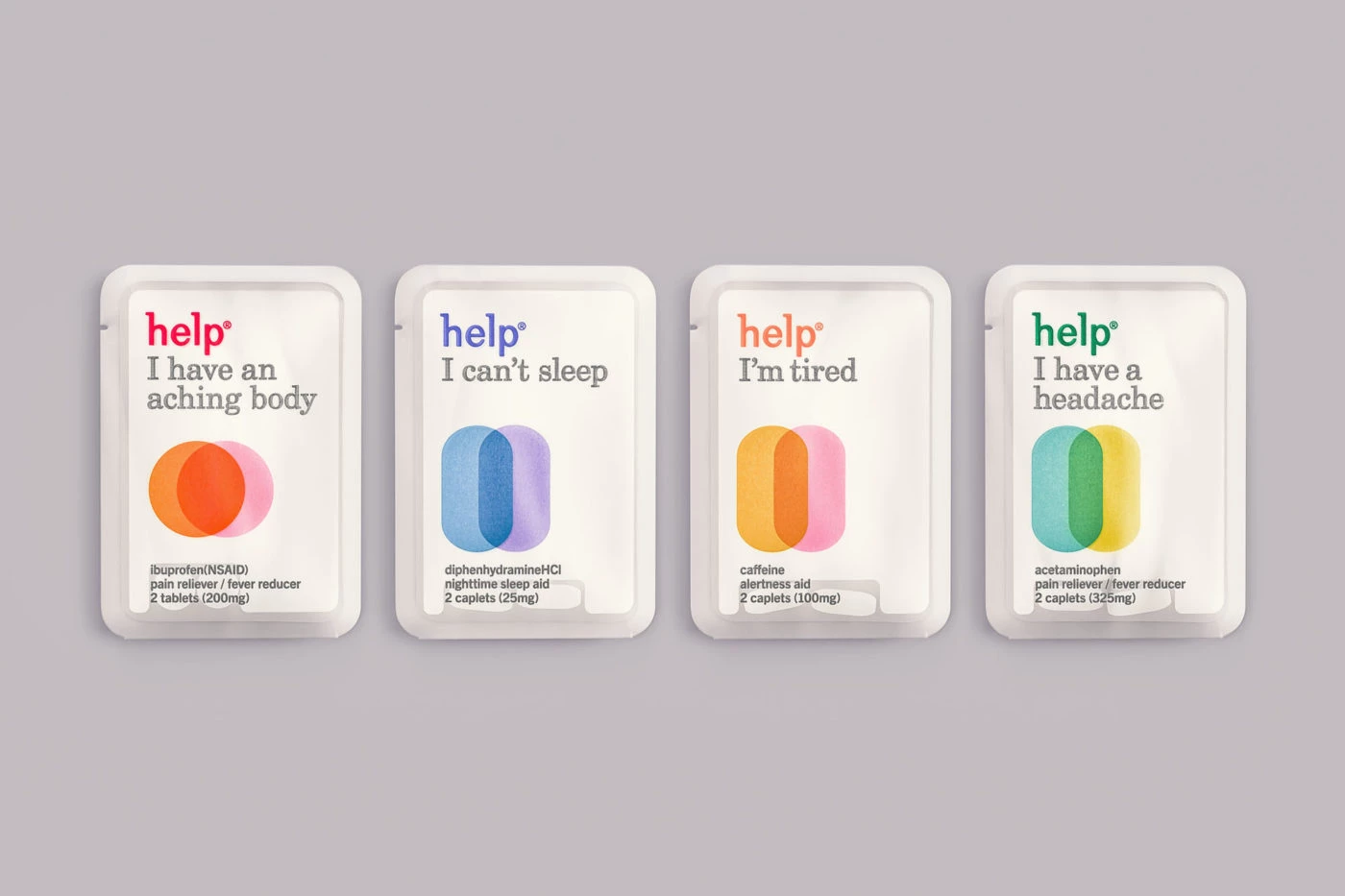
Standout Features:
- Cues on color theory
- Creative packaging idea
- Trendy execution
Positioning itself as a one-stop solution for daily medication needs, Help Remedies offers single-capsule solutions — similar to multivitamins but even more targeted. Their products address various health concerns, from weight management to sleep support.
Nessen Co designed packaging that is efficient, creative, and perfectly aligned with the company's mission and values. Drawing from color theory, they developed a vibrant color-coded system to distinguish each product variant.
The typography, imagery, and overall branding execution work seamlessly together, making this a standout success.
Why This Branding Works
- Streamlined simplicity: A streamlined packaging design addresses consumer overwhelm by simplifying the decision-making process for managing multiple medications.
- Modern clarity: Contemporary typography and playful visual elements break away from the sterile look typical of pharmaceutical companies, adding a fresh, engaging identity.
- Design-forward efficiency: This innovative, design-forward approach appeals to younger, health-conscious consumers who value both efficiency and aesthetic appeal.
10. Dra. Isabella Celina by Teller's Agency
Standout Features:
- Friendly color story
- Sleek and simple execution
- Metallic effect
We typically associate doctors with their hospitals or clinics, making it tricky to brand a doctor as an individual since the branding must reflect their personality and professional identity. However, crafting a branding kit that highlights a doctor’s expertise and trustworthiness can be both a challenge and an opportunity.
Teller's Agency successfully developed a branding kit for Dra. Isabella Celina, positioning her as a doctor that patients can trust. The result is a polished, credible, and visually appealing brand that balances professionalism and approachability.
From the carefully chosen colors — cyan, white, and metallic brown — to the well-structured logo layout, every element is thoughtfully designed to showcase the doctor’s professional image. Combined with a sleek yet simple execution, this branding is a true success story.
Why This Branding Works
- Trusted color palette: Familiar medical colors like cyan and white ensure immediate recognition and reassurance, laying the groundwork for trust.
- Prestigious accents: Metallic brown accents introduce a subtle yet effective touch of prestige, elevating the professional image of the practice.
- Sleek simplicity: A clear, uncluttered design reinforces the doctor’s expertise, ensuring that the branding remains refined and differentiated in a competitive market.
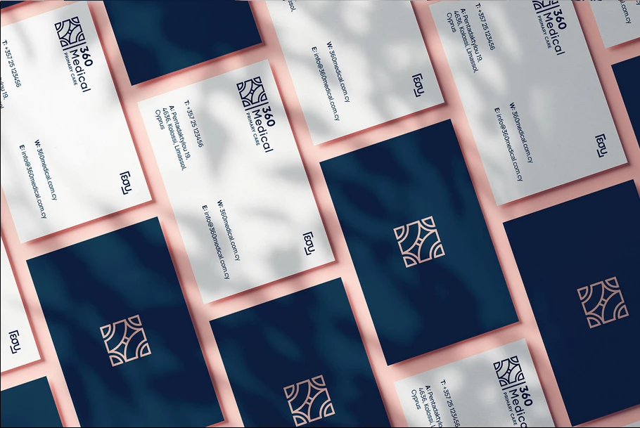
11. 360 Medical Centre by Factory 39
Standout Features:
- A successful approach in the medical field
- Invigorating color story
- Dedication to the company's ideals
Starting a new business is always challenging, especially when introducing a novel concept unfamiliar to your target audience. Recognizing this, 360 Medical Centre embraced the challenge head-on.
Offering both Primary Care and Medical Aesthetics, clinics like 360 Medical Centre are rare — not just in Cyprus, but across Europe. Factory 39 took on the challenge and executed a branding strategy that delivered spectacular results.
From its color story, inspired by the pristine blue waters of Cyprus, to the precise yet persuasive approach used in launching and promoting the establishment, every detail is thoughtfully planned and executed.
Why This Branding Works
- Coastal calm: A vibrant blue color scheme evokes calm and reliability while subtly referencing Cyprus' coastal identity, grounding the brand locally.
- Reassuring quality: This strategic color choice signals top-tier medical care and aesthetic rejuvenation, instilling confidence in patients.
- Polished innovation: A high-end, polished design appeals to a diverse audience, enhancing credibility and positioning the center as an innovative leader in healthcare.
How To Create a Compelling Pharmaceutical Brand Story
Creating a brand story that truly connects requires a thoughtful, step-by-step approach. Begin by defining your core values and mission.
- Define your brand values: Understand what your brand stands for — whether it's innovation, care, or reliability — and articulate this clearly. This foundation not only guides your narrative but also aligns with the values of both patients and healthcare providers.
- Research your audience: Invest time in researching your audience, including patients, caregivers, and healthcare professionals. Understand their unique needs, concerns, and aspirations and tailor your messaging to resonate with their experiences and expectations.
- Design a unique brand narrative: Use audience insights to build a compelling story that highlights your brand’s origins, challenges, and successes. Highlight the journey and purpose behind your solutions, using relatable language and authentic storytelling. Incorporate real-life testimonials and case studies to add credibility and humanize your brand.
- Craft your visual identity: Ensure that your color palette, typography, and imagery reinforce the tone of your story — whether it’s warm and inviting or sleek and professional. Consistency across visual and verbal messaging builds trust and makes your brand instantly recognizable.
- Ensure regulatory compliance: Maintaining strict adherence to regulatory standards is essential in the medical field. Pharmaceutical branding and advertising must comply with regulations set by agencies like the U.S. Food and Drug Administration (FDA), ensuring that all promotional materials are accurate, non-misleading, and include necessary risk disclosures.
- Refine and adapt over time: Continuously gather feedback from your audience to refine your narrative. Stay adaptable to market shifts and changing patient needs, ensuring your messaging remains relevant and impactful.
Major Trends Driving Pharmaceutical and Medical Branding
With a growing emphasis on trust, clarity, and compliance, pharmaceutical and medical brands are adapting their visual and verbal messaging to emphasize excellence and integrity. This section explores the shifting dynamics of healthcare brand positioning in a competitive market.
- Patient-centric branding
- Seamless digital experiences
- Transparent communication
- Tailored messaging for specific patient segments
- Sustainability and social responsibility
- Data-driven personalization and innovation
1. Patient-Centric Branding
Focusing on the needs and experiences of patients is at the core of effective medical branding. Successful brands go beyond just targeting patients — they also consider healthcare professionals, caregivers, and other stakeholders to create messaging and visual identities that truly connect.
By leveraging market research, surveys, and direct feedback, companies can identify the unique challenges and preferences of each group. This insight allows them to craft packaging, digital interfaces, and communication strategies that are both emotionally resonant and functionally effective.
2. Seamless Digital Experiences
Digital transformation is revolutionizing healthcare interactions. Brands are now investing in user-friendly websites, telehealth platforms, and mobile apps that ensure smooth and engaging digital experiences for both patients and providers. This seamless integration of technology not only enhances accessibility but also reflects a modern, forward-thinking approach that builds confidence in the brand.
3. Transparent Communication
In an industry where trust is paramount, transparent communication is a key differentiator. Brands that openly share information about products, practices, and clinical data build credibility and foster long-term relationships with their audience. Clear, honest messaging helps demystify complex medical information, ensuring that patients feel informed and secure in their choices.
4. Tailored Messaging for Specific Patient Segments
Effective branding increasingly relies on customized communication strategies that speak directly to diverse patient demographics. By segmenting audiences and tailoring messaging accordingly, brands can address specific needs, cultural nuances, and lifestyle factors. This personalized approach not only increases relevance but also drives engagement and loyalty.
5. Sustainability and Social Responsibility
Modern consumers expect brands to take a stand on environmental and social issues. Pharmaceutical companies are integrating sustainability and ethical practices into their branding, highlighting eco-friendly initiatives and community engagement. This commitment to social responsibility strengthens the brand's image and appeals to an increasingly conscientious audience.
6. Data-Driven Personalization and Innovation
Leveraging data analytics enables brands to fine-tune their strategies based on real-time consumer insights. From personalized marketing campaigns to innovative product development, data-driven approaches ensure that branding efforts are both relevant and adaptable. This not only differentiates brands in a competitive market but also reinforces their position as industry leaders.

Our design experts recognize the most innovative and creative designs from across the globe. Visit Design Awards to see the:
- Best Logo Designs
- Best Website Designs
- Best Video Designs
- Best Print Designs
- Best Packaging Designs
- Best App Designs
Our team also ranks agencies worldwide to help you find a qualified agency partner. Visit our Agency Directory for the top Logo Design Companies, as well as:
- Top Web Design Agencies
- Top Video Production Companies
- Top Print Design Companies
- Top Packaging Design Companies
- Top Mobile App Development Companies


-preview-webp.webp)