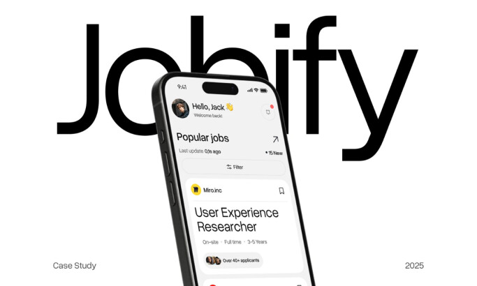
Designed by Unavailabl, Compleo is an intelligent time management app that uses AI to organize a user's day. The interface is built for adaptability, working smoothly across phones, tablets, and computers.
By using a clean dark mode with bright color accents, the design creates a focused environment that helps users stay productive and efficient.
Industry Insight: The recent global shift to remote work has caused the productivity app market to explode. Hence, the demand for productivity tools has skyrocketed, making intelligent, user-friendly apps like Compleo more essential than ever.
Key Findings for Brands:
- Strategic color use creates a clear visual hierarchy and guides user actions efficiently.
- A minimalist interface with low visual complexity reduces friction and improves user focus.
- Seamless cross-platform consistency is crucial for user retention in a multi-device world.
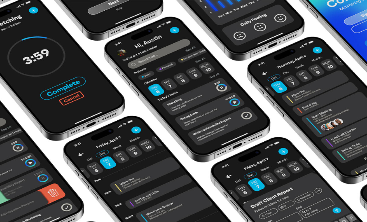
Dark Mode Interface with Strategic Use of Accent Color
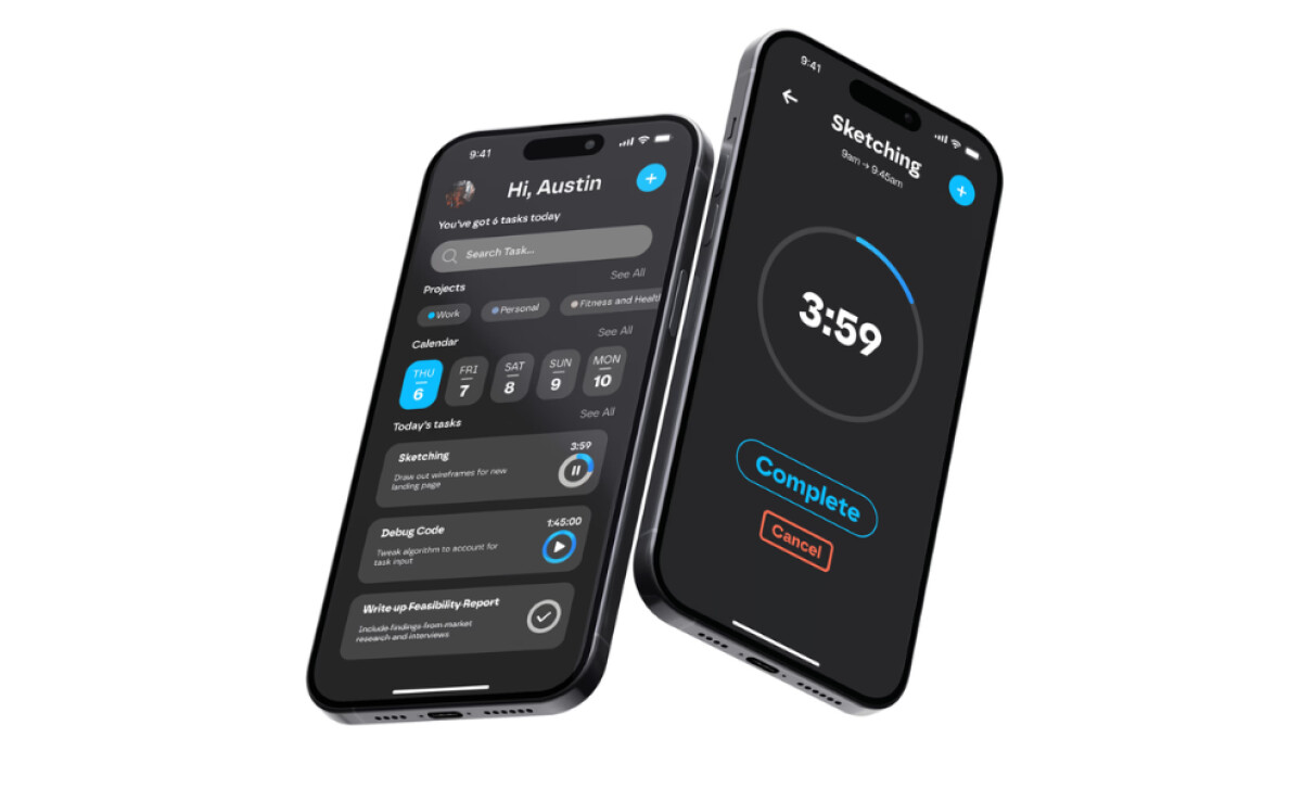
The app color scheme uses a deep charcoal backdrop, which makes the bright accent colors pop. A vibrant cyan is used for all positive or forward-moving actions, such as starting a timer.
In contrast, a cautionary red is used for negative actions, like canceling or deleting. All other text is a soft white, ensuring it is readable but not distracting.
Unavailabl has a clear performance-based reason for this dark UI. Firstly, it makes long-term use more comfortable by reducing visual fatigue (MDPI, 2025).
By sticking to a very limited palette, the design also helps you to become familiar with the controls quickly, making your interactions more fluid.
The accent colors also only provide clarity where it's needed most. This is a critical advantage in a time management tool where focus and efficiency are the primary goals.
Contextual Microinterfaces for Streamlined Task Input
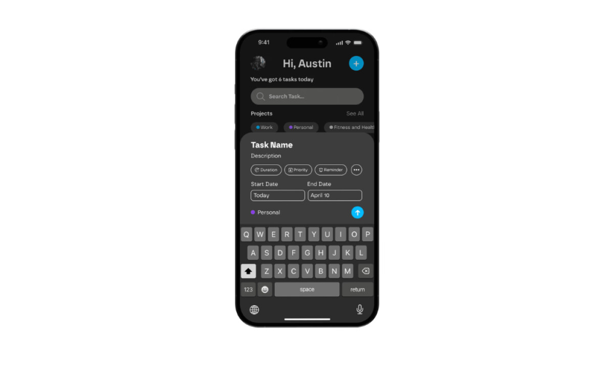
Compleo introduces a highly modular approach to interaction, with collapsible input fields and tightly-grouped button clusters. These are all examples of effective mobile app design patterns that prioritize speed and clarity.
Adding a task reveals only the essentials: duration, priority, project, and date. UI elements adapt fluidly to device size, with cards resizing or stacking based on the screen.
This is a refreshing change from many other productivity apps, which can be very cluttered. The design philosophy here is to keep every action focused and simple. This helps you to stay in the zone and get things done without distraction.
The main benefit of this design is a reduction in user friction. The interface is quick and easy to use. Plus, it’s simple enough for quick entries and detailed enough for serious planning, no matter which device you are on.
The Compleo App Features a Clear Typographic Hierarchy
A clean, rounded sans-serif font is used throughout the app for its high readability. The design creates a clear hierarchy using different font sizes and weights.
For example, the main headings are the largest and boldest. Task titles are a medium weight, and the smaller descriptive text is a soft gray.
The typography here is doing two jobs at once. The rounded font makes the app feel a little friendlier and less stark. At the same time, the clean alignment and consistent spacing make the layout easy to scan.
This is a perfect combination for a productivity app where clarity and speed are so important.
For an app that is a constant part of your day, it ensures a positive and efficient user experience every time you open it, which is the ultimate goal of the best app designs.
Multi-Device Ecosystem with Pixel-Perfect Responsiveness
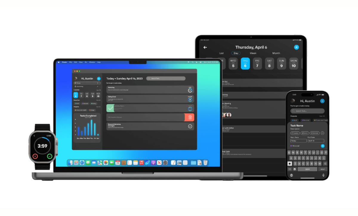
The app is designed to work perfectly on a whole range of devices, from phones to laptops to watches.
The user interface is consistent everywhere, but it also adapts to each screen size. For example, the desktop version has more space, while the watch version simplifies everything down to the essentials.
A lot of apps fail when it comes to multi-device support, but Compleo excels, delivering some of the best android and iOS app design consistency on the market.
The design feels native on every platform, yet the whole suite feels connected. The consistent use of colors, icons, and layouts ensures that you can switch between devices without having to relearn anything.
This system allows you to stay productive no matter where you are. You can manage your tasks at your desk, on the train, or at the gym. It's what makes the app so powerful and valuable to its users.
According to Think with Google, 58% of smartphone users feel more favorable toward companies whose mobile apps are well-designed.
Compleo is the precision productivity engine, purpose-built for people who treat time as their most valuable asset.
What Agencies Can Learn from Compleo
Unavailabl's design for Compleo demonstrates how to create a standout product in a competitive market by focusing on user-centric principles and a polished, cross-platform experience.
Here’s what creative teams can take away:
- Tap into a growing market. With the productivity app sector projected to grow at a 9.2% CAGR, a well-designed app that solves a real-world problem has immense potential.
- An app is a core brand asset. For a digital product, the app is the brand. A strong brand image can accelerate business growth, and the app's design directly shapes user perception.
- Great design drives adoption. A well-designed app that is clear, scalable, and easy to use on any device is more likely to be adopted, positively impacting how users view the company behind it.
All in all, Compleo sets the standard for productivity apps in a multi-device world. As one of the top app design companies today, Unavailabl has created a tool that is clear, scalable, and easy to use on any device.
A great productivity app needs to work perfectly everywhere, on your phone, tablet, and computer, without making you relearn a thing.
Visit our Agency Directory for the Top Mobile App Development Companies, as well as:
Our design experts also recognize the most innovative design projects across the globe. Visit our Awards section to see the best & latest in app design.