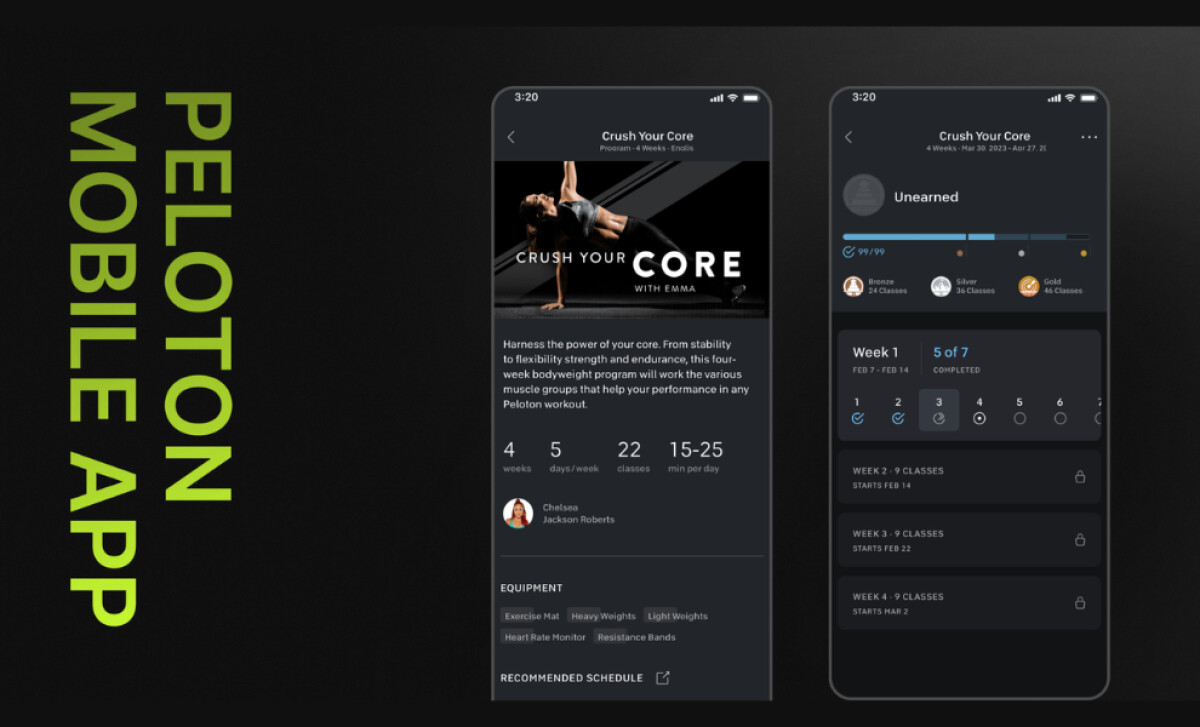
Confronting a complex fitness ecosystem, Riala Studio’s redesign of the Peloton app delivers a focused and streamlined user journey. The interface organizes numerous workout styles and detailed metrics into a cohesive whole, making the platform approachable for a wide spectrum of fitness enthusiasts.
Key Insights for Brands:
- Use a single, high-contrast accent color to steer users toward key actions
- Create a scalable UI that serves different content to various customer levels
- Break down complex information into modular sections to make it easier to read
The App Design’s Neon Color Accents Drive Visual Focus
The health and wellness app’s dark interface makes smart use of a saturated, neon-style red. This color is reserved for critical interactive elements, like the “Continue” and “Start Program” buttons.
It provides a burst of energy appropriate for a fitness app while making the main interactive elements impossible to miss, guiding the user’s next move.
Riala Studio’s disciplined use of this accent color is key to its success. It directs your attention without causing visual clutter or stress. When the red does appear, it signals a primary action, which makes the app’s navigation much simpler to learn.
The Interface’s Modular Layouts Enhance Scannability
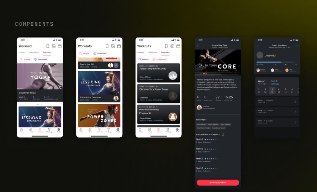
To organize dense information, the design relies on a modular system of vertically stacked cards.
Sections like schedules and progress trackers get their own distinct card, separated by clear headers and white space. Important data points are highlighted with icons, while a clean sans-serif font ensures all text is easy to read.
This approach is highly effective for mobile viewing, where screen space is limited. It presents a lot of information in a way that is easy to process at a glance.
By organizing content into logical blocks, the design empowers you to find details efficiently. It respects your time and attention by making the interface incredibly straightforward to use, a key lesson found in many of the best app designs.
A Tiered Structure Balances Personalization and Scale
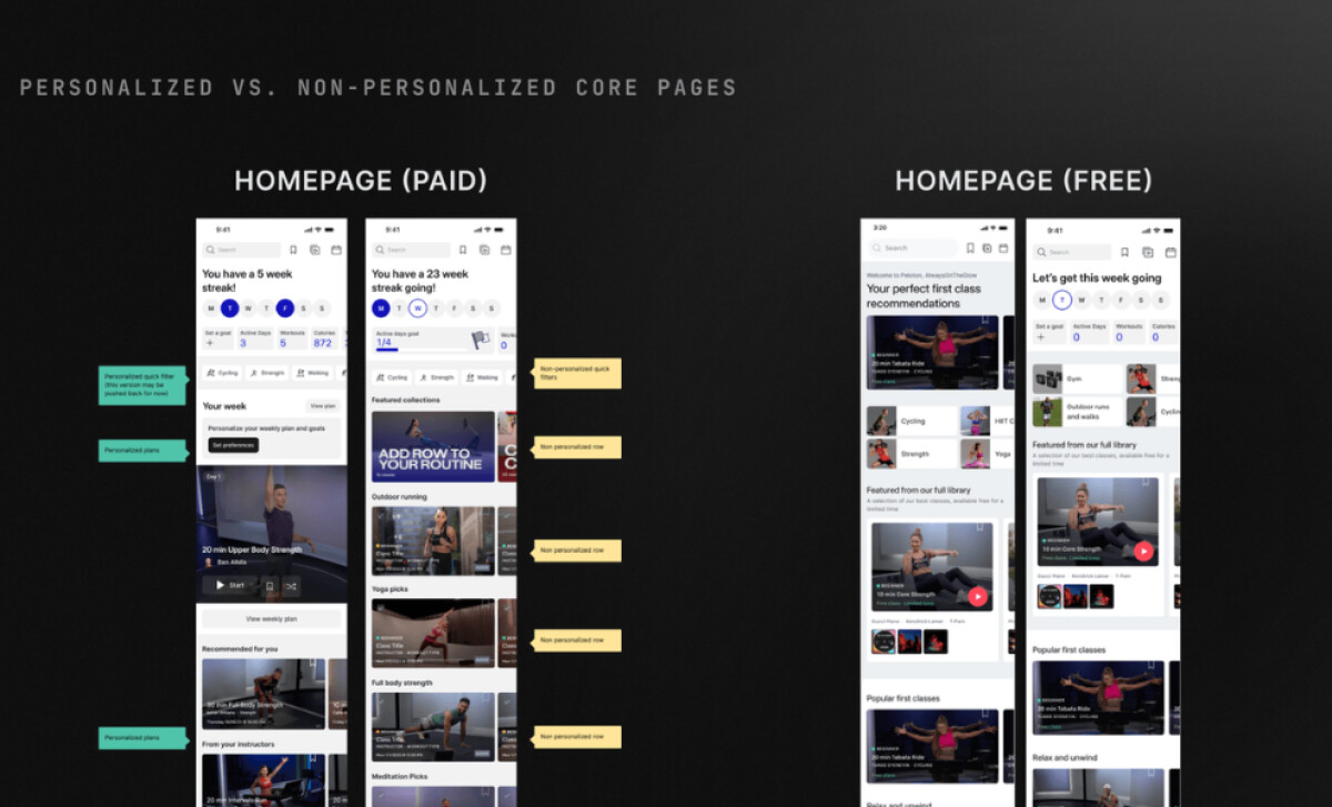
A clever, adaptable framework delivers different content depending on your subscription level. If you're a paid member, you get personalized content like workout recommendations. Free users, on the other hand, see more generic collections.
This approach allows the app’s core design to remain consistent while serving two distinct user groups. This 'freemium' strategy is also standard practice in a market where 97% of mobile apps are free to download, making a high-quality free experience essential for attracting a wide user base.
Read our enterprise mobile app development guide to learn more about creating scalable applications.
This method works well because it shows subscribers what they are paying for while still giving free users a great experience. The free version feels complete and useful, which is good for the brand. But the hint of a more personalized journey provides a compelling reason for users to consider upgrading.
This incentive to upgrade is central to the modern app economy, where in-app purchases and subscriptions have become a dominant business model, generating over $124 billion in revenue in 2024 alone.
The Peloton App’s Onboarding Is Smoothed by Focused UI
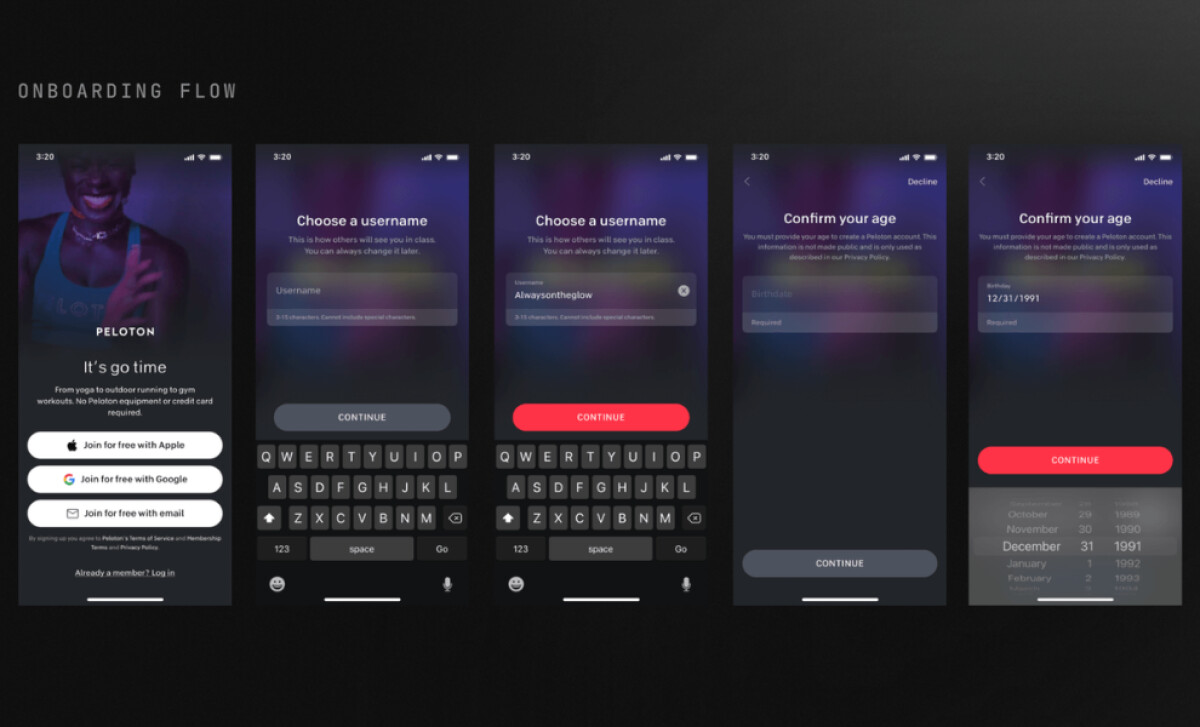
The onboarding screens use a layered dark blur effect behind the sign-up forms. This keeps background visuals like instructor photos visible for branding but prevents them from becoming a distraction.
Input forms also use progressive disclosure, asking for your username first, then birthday, and so on, so each field appears only when needed.
For those learning how to create an app, this focused onboarding is a masterclass in user retention from the very first interaction. It has a primary clear benefit: higher completion rates.
The low-distraction environment and simplified forms make the process feel less intimidating. It’s a well-executed strategy that sets a positive tone for the user’s entire journey with the app, showing that the design is there to help them succeed.
The work by Riala Studio on the Peloton app is a powerful example of successful user-centered design. Its intelligent structure and visual polish are the results you can expect from top mobile app development companies. It's motivating and easy to use, making it a worthy winner of this month’s Design Awards.