Interface showcases curated content, metrics, and interactive elements
Qupid is a Web3-based content platform built around a curator-centric ecosystem, where users discover and exchange value through decentralized technologies. The project introduces a capsule-driven concept, positioning content as compact, essential units that can be collected, expanded, and shared — reflecting a new model for how digital content is organized and experienced.
Collection view organizes capsules and highlights featured content
Notification highlights new content update with clean mobile UI layout
This website uses a colour palette of 4 colours
  • #6A4FFF
  • #B88AE6
  • #FEF3EE
  • #17171B
Technologies & Tools
Description
Team Behind the Design
  • Agency: Tom&Nick Inc
  • Client: Qupid
  • Category: App Design — Technology
  • Location: Seoul, South Korea
  • Project Brief: Design a mobile app that enhances decentralized content discovery with intuitive navigation and curator-driven interactions.

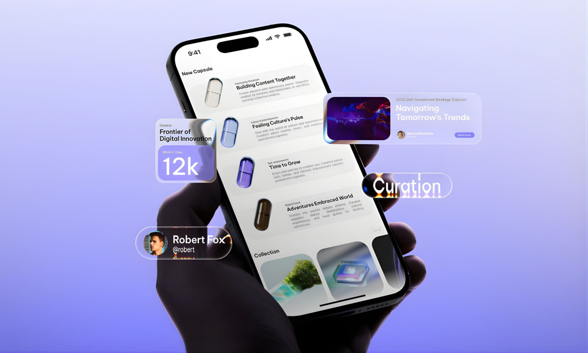
The more intricate a technology app becomes, the harder it is to design a human-centric interface. Web3 apps love complexity. Tom&Nick Inc's work for Qupid goes the other direction. The whole interface organizes around one idea: the capsule.

The capsule works as a direct analogy. Like a supplement that packs value into a small form, each content capsule delivers curated information without excess. That single shape serves as the foundation for the entire ecosystem.

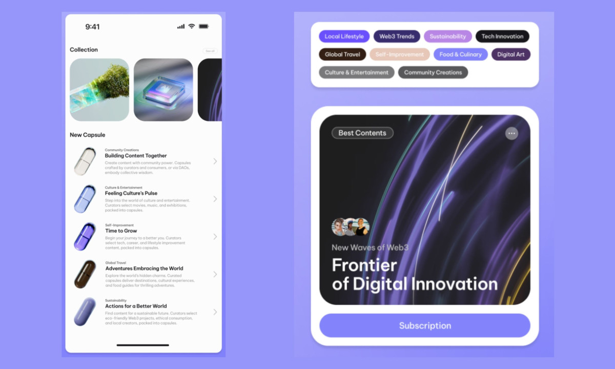
This graphical framework ensures all content resides inside structured containers that expand based on context. Curator profiles, collections, and category tags all sit inside the same pill-shaped design elements.

The color system runs on purple. It shows up in backgrounds, navigation bars, and category accents. The tone signals Web3 without the over-engineered aesthetic that usually comes with it. Typography and capsule shape do the rest.

The category tag hierarchy demonstrates how the design scales. Nine content categories. Each gets a pill-shaped label with its own color. Same shape, same size, different hue. Users don't have to relearn how each section works.

Explore this year's Design Awards finalists and see the projects selected for top recognition. These entries are now in the finalist stage, moving forward for jury evaluation across categories like web, branding, product, and digital design.
Argus App Design by Zach Ennis Design
Argus
DesignFiles App Design
DesignFiles
Elixir App Design by Quentin Jeanningros
Elixir
Amani Gallery App Design
Amani Gallery
Designed byEno Inyangete
Matcha Mobile App Design by Eric Burress Design
Matcha Mobile
Silveride App Design by Serok's Design
Silveride
Designed bySerok's Design
View All BestApp Designs

Ready to elevate your designs?