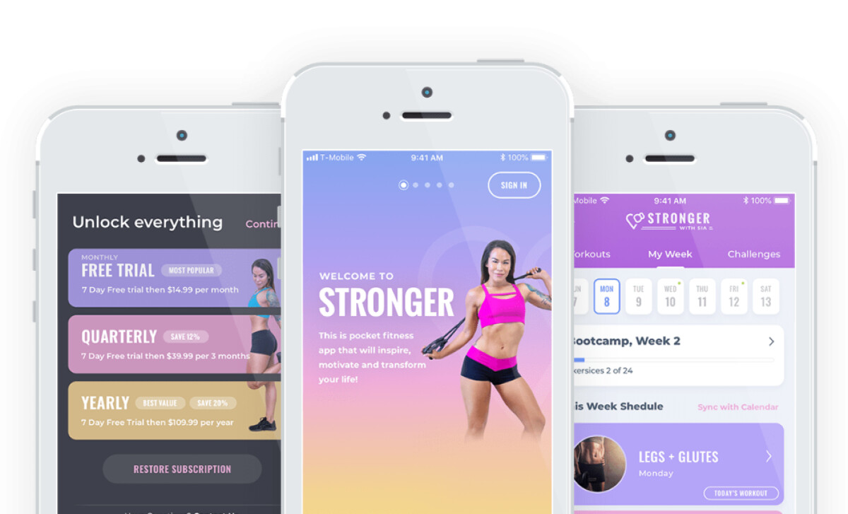
The Stronger app, designed by Net-Craft.com for fitness influencer Sia Cooper, turns daily health habits into an encouraging and organized experience. Known for her Diary of a Fit Mommy brand, Sia wanted to build an app that supports women on their fitness journey, whether they're just getting started or following a structured program. Net-Craft delivered a mobile app that blends workouts, meal plans, community, and progress tracking into a cohesive digital product that feels personal and practical.
Key Insights for Brands
- Use bright color schemes to motivate users without overwhelming them
- Match each screen to user intent while keeping the design consistent
- Reveal features gradually to simplify complexity and reduce user fatigue
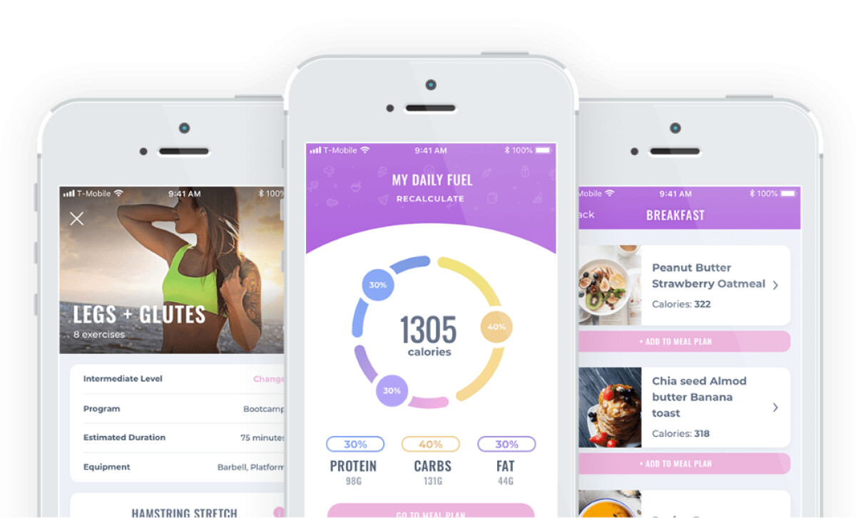
Clear Visual Hierarchy and Energizing Colors Fuel Motivation
The Stronger app greets users with vibrant pastel gradients that balance energy with a soothing aura. The interface uses purples, pinks, and golden tones to convey warmth, empowerment, and clarity without drifting into overstimulation.
Learn how to choose app colors.
Each screen applies high-contrast UI elements against soft backgrounds to guide the eye toward primary actions. CTAs like “Sign Up Free With Email” stand out without disrupting the visual harmony.
The layout remains consistent across sections, with just enough contrast to clearly distinguish workouts, meals, trackers, and community features.
This color strategy aligns with findings from ResearchGate, which indicate that using warm colors can generate 65% more engagement, leading to improved retention and a more satisfying user experience.
Task-Specific Screens Unify the App Interface
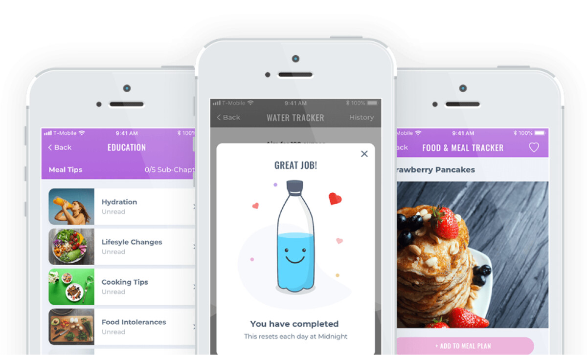
One of the app’s standout aspects is how it aligns each screen with a specific task the user performs. Instead of relying on a single layout across the experience, each section is purposefully designed to support its unique function while maintaining visual cohesion.
From the education hub to the food and meal planner, Stronger keeps the interface consistent through its soft iconography and clean, legible typography.
These shared design elements tie the experience together and make navigation feel familiar, even as content and functionality vary from one screen to the next.
It reflects a key principle from Apple’s Human Interface Guidelines: UIs must be intuitive and align with users' mental models.
By matching screen layouts to the user's intent while preserving consistent visuals, Stronger reduces decision fatigue and helps users stay engaged throughout their fitness journey.
This is especially important for wellness apps, where clarity and ease of use directly influence user commitment.
Customization Tools and Minimalist Elements Enhance User Control

Stronger offers an array of customizable features like photo-based progress logs, body measurement tracking, and calendar-based comparisons. Despite the number of tools, the interface maintains a sense of clarity.
Rather than overwhelming users with too many options on a single screen, app designers often leverage progressive disclosure.
Here, the interface guides users step-by-step, first capturing baseline metrics like front, back, and side photos. Then, it gradually introduces measurement fields like waist, arms, and thighs. Each form is separated by generous white space and pastel accent buttons, making interaction feel light and approachable.
Given that minimalist design reduces cognitive load and lets users process information more effectively, Stronger’s interface hides complexity behind clean visuals. It offers only the necessary tools at each moment.
The result is a user journey that encourages consistency and lowers the barrier to regular tracking, which is one of the hardest behaviors to maintain in health apps.
Explore more insights in our roundup of mobile app development trends in 2025.
A Well-Organized Interface Balances Simplicity and Function
Stronger is an app that respects the user's time and energy. Instead of trying to impress with too many animations or features upfront, Net-Craft.com designed an interface that stays out of the way by letting the user’s progress, routines, and results take center stage.
For wellness brands, this is a valuable lesson: good design should guide behavior, not distract from it. With its colors, layout, and interactions, Stronger shows how to support users through every step of their journey.
These intentional design decisions not only enhance the user experience but also demonstrate what excellence in app design looks like.
-preview.jpg)