Team Behind the Design
App Design Analysis
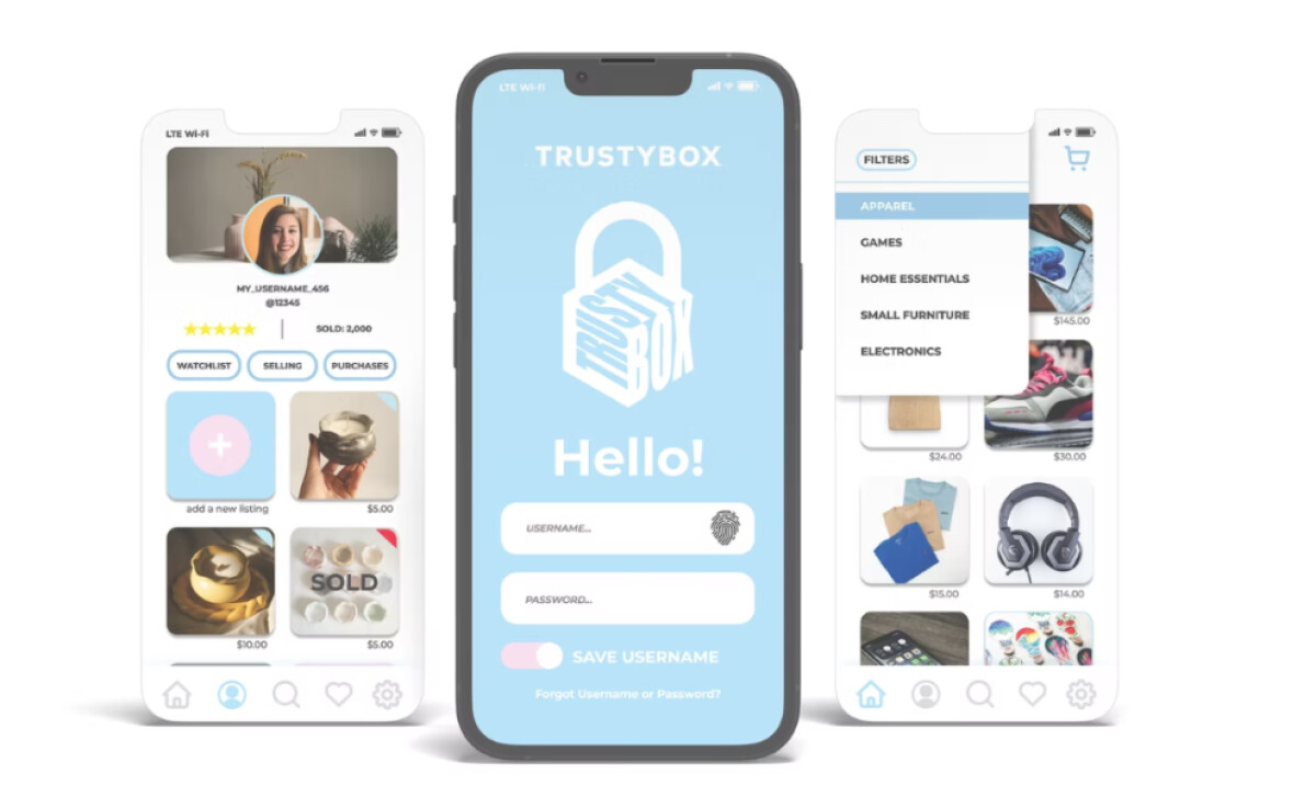
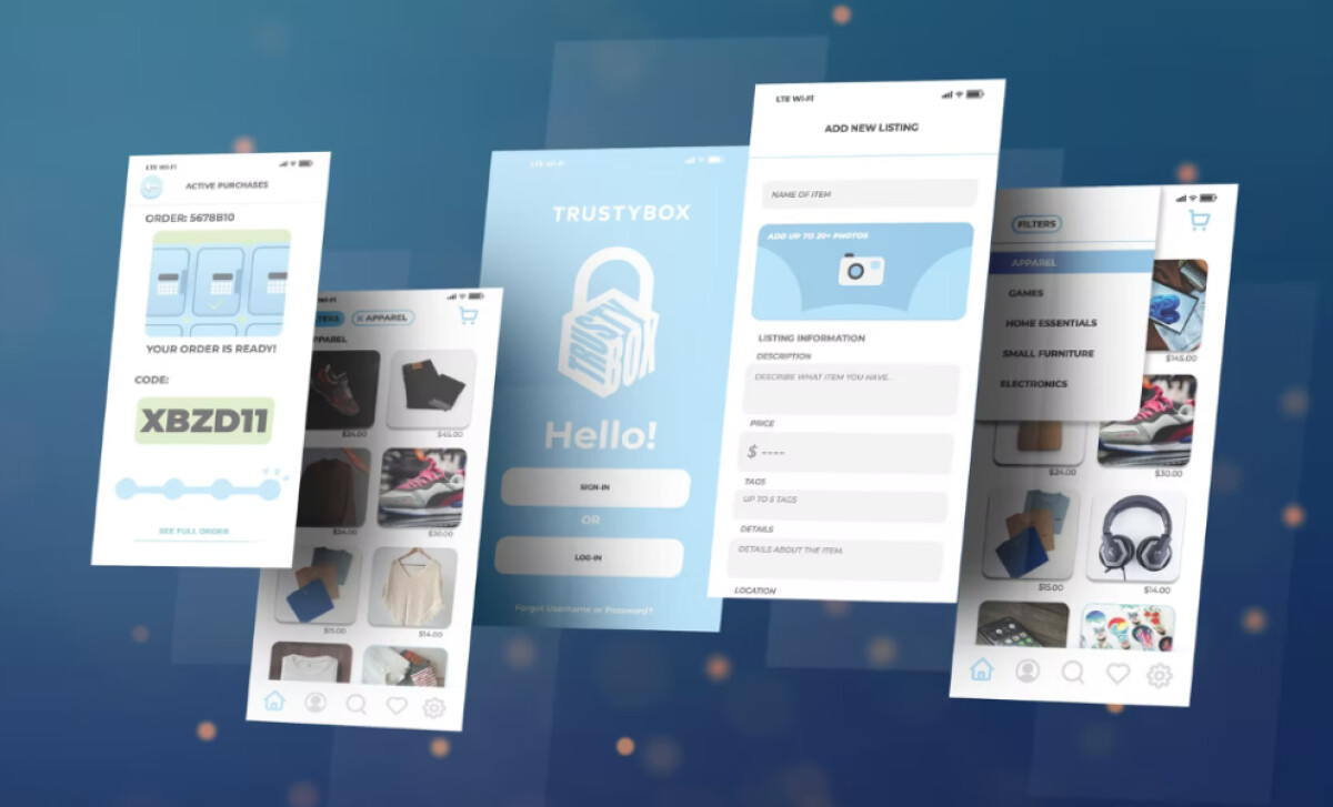
When I review android and iOS app designs, I often look at onboarding flow, visual hierarchy, and how confidently the interface builds trust.
TrustyBox approaches these aspects through gentle palettes and familiar marketplace patterns, making the experience feel structured and welcoming.
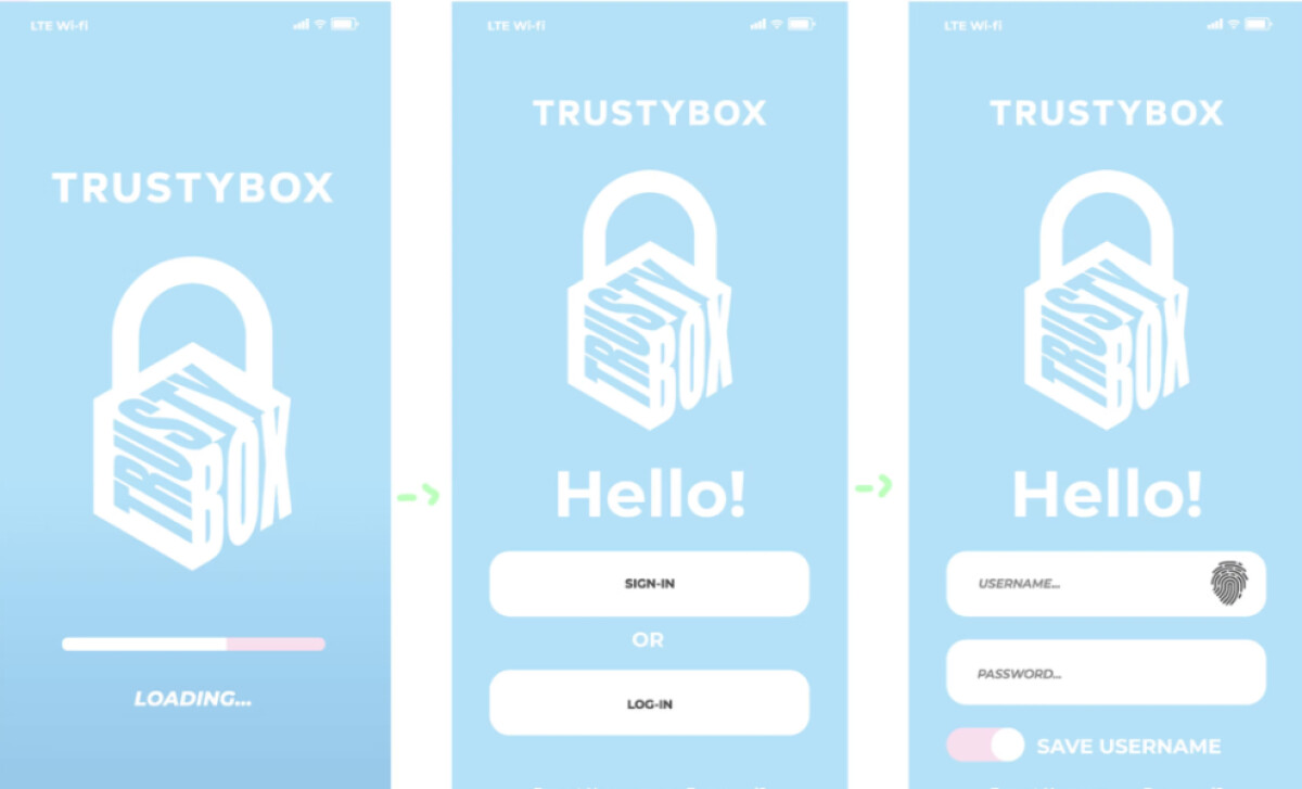
- Onboarding: I appreciate how the pastel palette and rounded components immediately set a friendly tone. This softness may help reduce the intimidation some users feel when navigating peer-to-peer marketplaces.
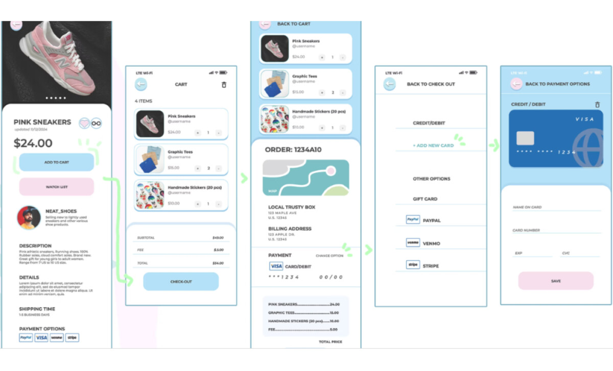
- Interaction Flow: The structured layouts and clear segmentation guide users through browsing and checkout without friction. I like how each screen uses predictable patterns, which can support confidence for less tech-savvy shoppers.
- Visual Hierarchy: The minimalist card system and clean typography make scanning effortless. Prices, seller ratings, and product images stand out in a way that feels natural rather than pushy.
- Performance & Ease: The multi-step checkout flow works well. Breaking actions into simple stages may help minimize transactional anxiety — a known barrier in marketplace environments.

What Agencies Can Learn from TrustyBox
This project highlights how a marketplace experience can feel safer and more approachable through intentional visual and structural decisions.
1. Design With Emotional Reassurance in Mind
The soft palette and rounded UI components show how visual gentleness reduces hesitation and builds comfort. This approach is especially effective when creating products for users who may feel cautious about peer-to-peer transactions.
2. Let Clear Structure Do the Heavy Lifting
TrustyBox’s segmented screens and predictable flow make each step feel manageable. When a user understands the path ahead, confidence rises and so do completion rates.
3. Surface Transparency as a Core Feature
Prominent seller info, clear ratings, and orderly product modules reinforce honesty from the first interaction. Treating transparency as a visual strategy, not just a content requirement, strengthens trust in any high-risk digital environment.
About DesignRush Featured Designs
At DesignRush, we review hundreds of digital projects each month across app design, UX, and branding. These featured works stand out for clarity, thoughtful structure, and strong alignment with user needs.
Only the most compelling projects advance to our Monthly Design Awards, which highlight excellence and industry-leading creativity.
Looking for more inspiring app designs and other projects? Explore our curated lists here:
- Best App Designs
- Best Website Designs
- Best Logo Designs
- Best Print Designs
- Best Packaging Designs
- Best Video Designs
For a full list of design agencies and related services, see our Agency Directory.