Team Behind the Design
App Design Analysis
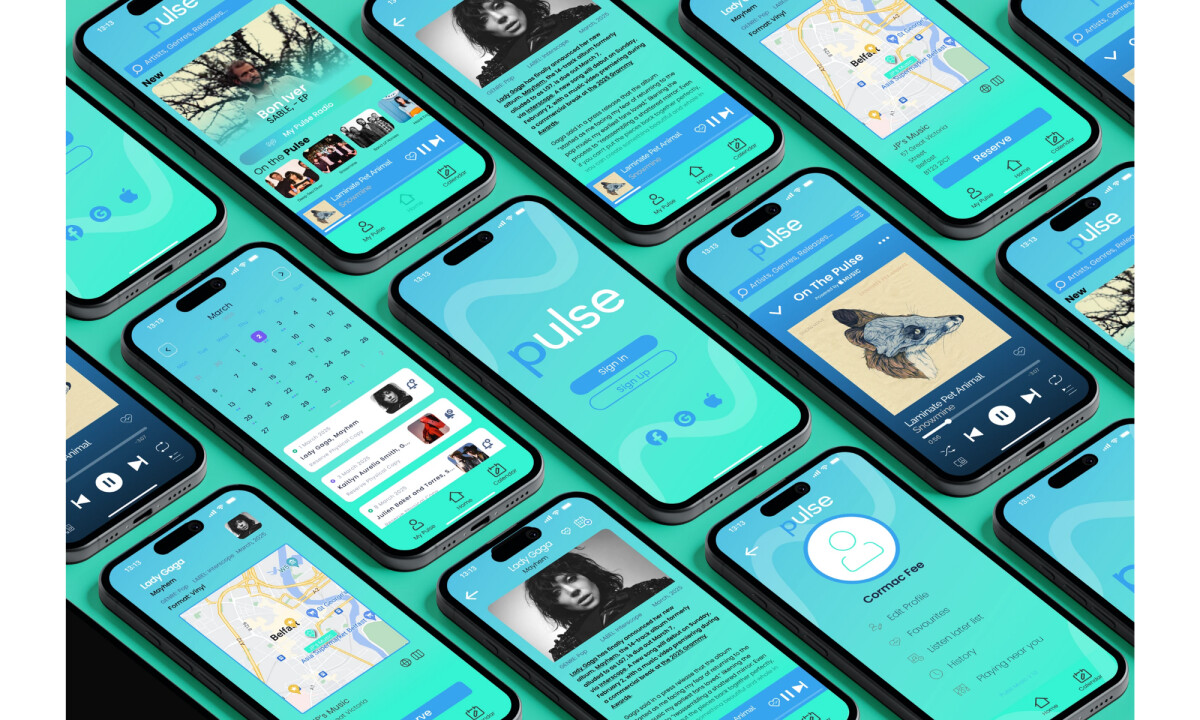
Looking at app design in music and media products, I focus on how visual hierarchy, interaction patterns, and feature prioritization support repeat daily use.
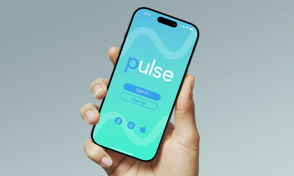
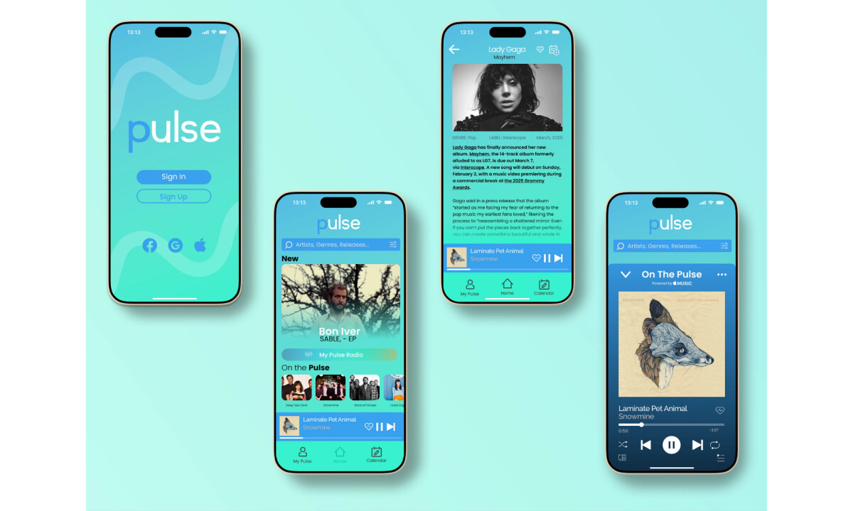
Pulse stands out by balancing discovery tools with calm layouts that keep the interface approachable for long listening sessions.
- Navigation & Feature Structure: The tab-based navigation clearly separates discovery, playback, and planning, which keeps the experience predictable as users move through the app. I like how core actions stay accessible without stacking too many controls onto a single screen.
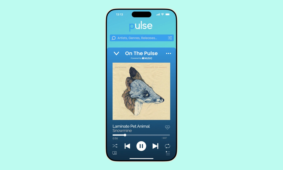
- Visual System & UI Consistency: The gradient-driven color palette and rounded interface elements create strong visual cohesion across screens. I appreciate how typography and spacing remain consistent, helping content scale from dense feeds to focused playback views.
- Motion & Interaction Feedback: Subtle transitions between screens and components guide attention without interrupting flow. I find the animated state changes and micro-interactions effective in reinforcing hierarchy while keeping the interface responsive and controlled.
- Calendar & Content Integration: The calendar feature translates music releases into a familiar planning format, making upcoming drops easier to track. It's a strong example of adapting a common UI pattern to support a niche but meaningful user need.
What Brands & Designers Can Learn from Pulse
1. Organize Features Around User Flow
Separating discovery, playback, and planning keeps the experience predictable and easy to navigate. Clear feature boundaries help users stay oriented as functionality grows.
2. Maintain Strong Visual Consistency Across States
Consistent color, typography, and spacing allow the UI to scale from dense feeds to focused views without feeling fragmented. Cohesion builds confidence and reduces cognitive load.
3. Use Familiar Patterns to Introduce New Value
Adapting a calendar format for music releases makes a niche feature instantly understandable. Familiar UI patterns help users adopt new functionality with minimal friction.
About DesignRush Featured Designs
At DesignRush, we review hundreds of digital projects each month across app design, UX, and branding. These featured works stand out for clarity, thoughtful structure, and strong alignment with user needs.
Only the most compelling projects advance to our Monthly Design Awards, which highlight excellence and industry-leading creativity.
Looking for more inspiring app designs and other projects? Explore our curated lists here:
- Best App Designs
- Best Website Designs
- Best Logo Designs
- Best Print Designs
- Best Packaging Designs
- Best Video Designs
For a full list of design agencies and related services, see our Agency Directory.


-preview.jpg)