Urban Outfitters is both a brick-and-mortar and an ecommerce retailer, selling women’s and men’s clothing and accessories as well as a select offering of home goods. The brand has a playful, whimsical, youthful vibe that is carried through its stores and the designs of its web properties.
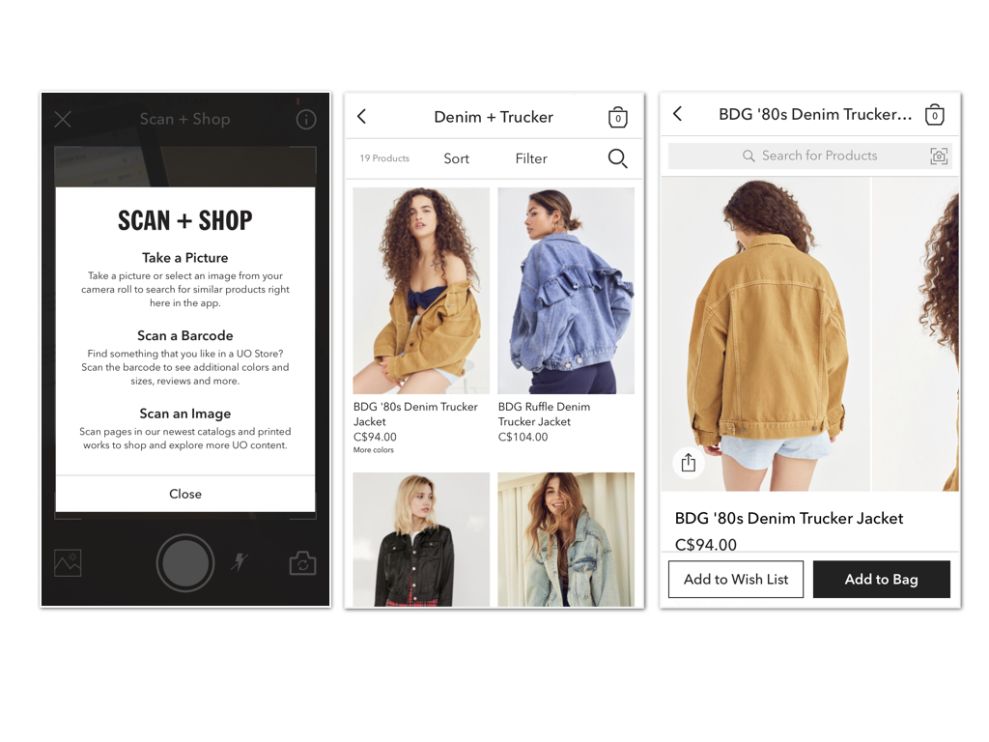
The app keeps search prominent on the homescreen -- taking a permanent position just below the navigation. The search functionality goes a step further than simple text search, though. It allows users to take a photo of an item in order to locate similar items within the app. Users can also scan a barcode from an Urban Outfitters product or an image from a print catalogue. This feature helps tie the offline and mobile Urban Outfitters experiences together, providing a more robust customer experience overall.
Main product navigation is done from a series of vertically-stacked images representing a handful of top product categories, including Women’s, Men’s, Home, and Shoes. A collapsible left navigation includes access to UO Community and Music, and to the user’s account features. Large product imagery makes the browsing experience immersive and enjoyable, and robust filtering options make finding the product you’re searching for a relatively painless process. Product pages are packed with content -- from multiple product images, to user reviews and suggested options to cross-sell.
The Urban Outfitters app features light, minimalist typography, and relies solely on white, black, and greyscale colors for text and calls-to-action. This choice has the effect of putting the user’s focus on the products, many of which are colorful and attention-grabbing.
Urban Outfitters is a clean app design in the fashion & beauty industry.