Content marketing infographics are powerful tools that enable brands to effectively present data, narratives, and marketing messages while capturing audience attention. By integrating compelling visuals with strategic storytelling, infographics make information more accessible and memorable.
With their ability to boost engagement, improve comprehension, and enhance brand visibility, content marketing infographics remain a crucial asset for businesses. Let's explore ten innovative examples that demonstrate their impact and versatility.
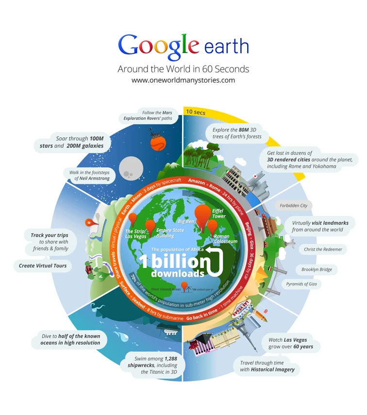
1. Google Earth’s Around the World in 60 Seconds by Jess3
Standout Features:
- Simple illustrations
- Prominent text clouds
- Circular timeline layout
To celebrate Google Earth’s milestone of one billion downloads, Jess3 crafted the Around the World in 60 Seconds infographic. This visual shows users how quickly they can virtually explore iconic global destinations through a unique storytelling approach.
The circular, clock-based layout features a globe at its center, with segments radiating outward to represent 10-second intervals of navigation time. Each segment highlights the incredible destinations users can "visit" in those seconds, accompanied by simple yet charming illustrations that evoke exploration and adventure.
Between the globe and the surrounding illustrations, a text ring offers comparisons between real-world travel times and the speed of Google Earth navigation, reinforcing the platform's ability to make the world accessible in mere moments.
Prominent text clouds ensure that key information remains clear and legible while allowing the illustrations to shine. The balance between visuals and text enhances the infographic’s accessibility, inviting users to dive into the story it tells.
With its creative blend of simplicity, storytelling, and visual appeal, the infographic not only celebrates Google Earth’s milestone but also inspires curiosity and exploration.
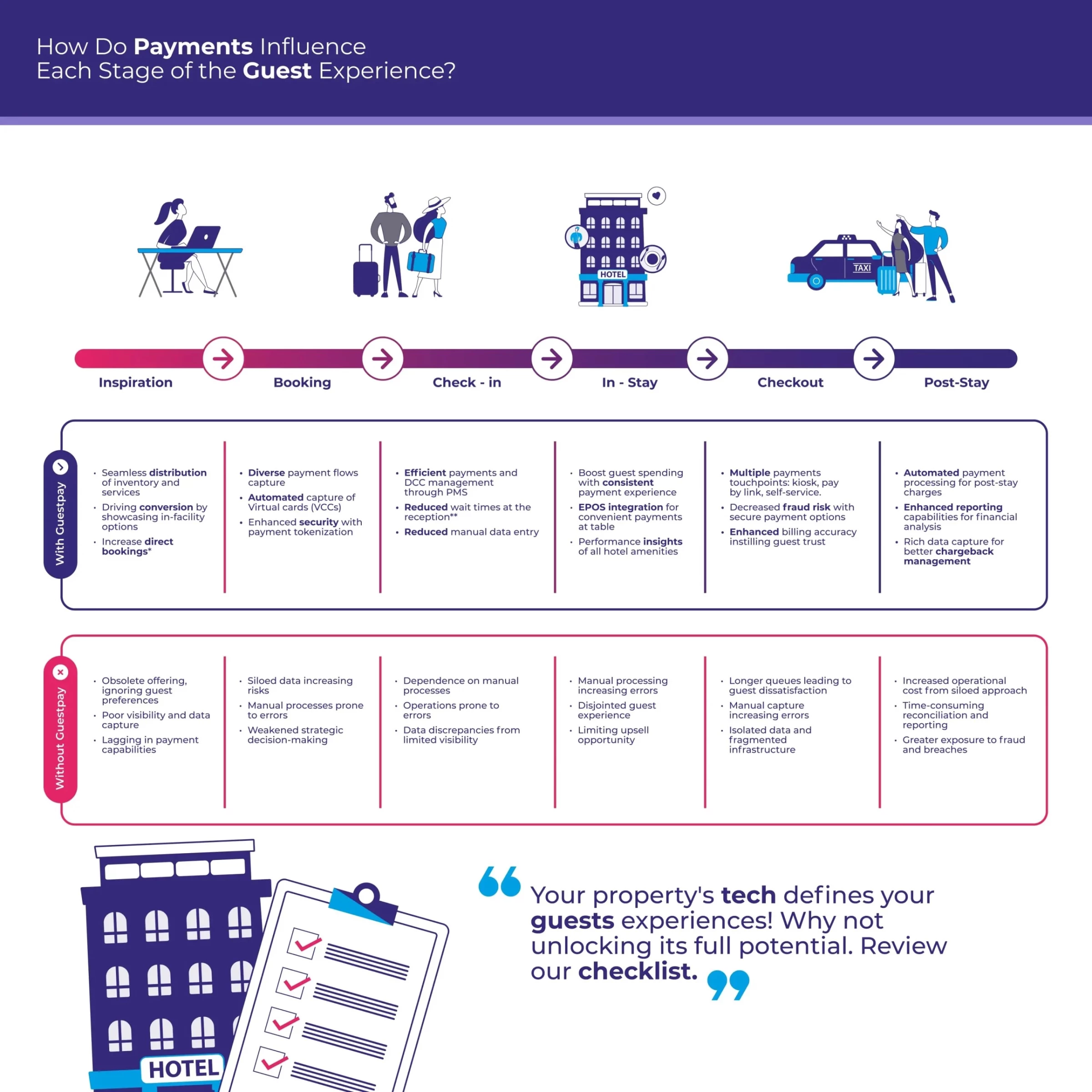
2. Guestpay’s How Payments Influence Guest Experience by Duck.Design
Standout Features:
- Intuitive horizontal timeline organization
- Relatable illustrations
- Engaging marketing quotes
The How Payments Influence Guest Experience infographic is a visually structured and easy-to-navigate breakdown created for Guestpay by Duck.Design, presenting how seamless payments this system provides enhance hotel stays.
The design employs a horizontal timeline at the top, guiding viewers through key phases of a guest’s journey, from booking ideas to post-stay. Below, two tables provide a clear contrast: one highlights the benefits of using Guestpay for visitors and businesses at each stage, while the other outlines the potential drawbacks of not adopting the system. This layout excels in simplifying complex information.
Furthermore, the infographic doesn’t only rely on text, it incorporates relatable, minimalistic illustrations that evoke real-world hospitality scenarios, fostering an emotional connection with its audience. The clean design enhances readability, while a compelling marketing quote at the bottom is a persuasive call to action.
By inviting hotels to embrace the Guestpay system, the design crafts an engaging, conversion-driven atmosphere that effectively communicates its value.
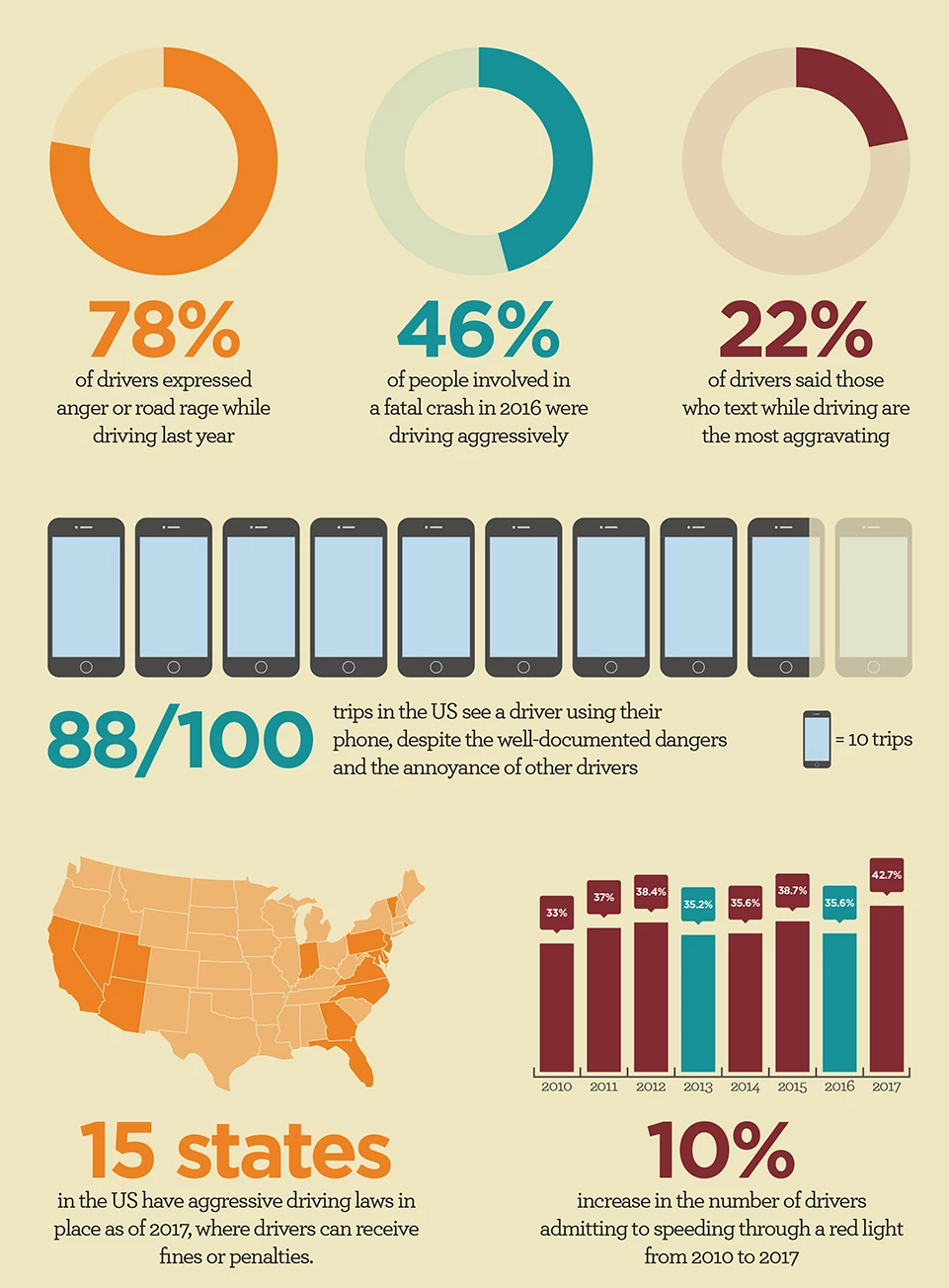
3. The Hartford’s Extra Mile’s Freeway Frustrations by Designbysoap
Standout Features:
- Comprehensive, multilayered organization
- Streamlined, uncluttered layout
- Calming color palette
The Freeway Frustrations infographic, designed for auto and home blog The Hartford’s Extra Mile by Designbysoap, provides an insightful and structured look at road rage in the United States.
Using a well-organized, multi-layered approach, the design divides content into key sections, including statistical insights on aggressive driving, a timeline of US driving laws, and practical advice for managing road rage. This flow ensures viewers can easily absorb factual data and actionable solutions.
Its clean and clutter-free design also enhances readability, especially in the final section, where advice is distilled into three concise bullet lists. Moreover, the pastel color palette reinforces the infographic’s message with its soft, calming hues, creating a stress-free visual experience. Paired with simple, inviting illustrations, the design effectively promotes safe and mindful driving habits.
4. Leeds Building Society’s Kick My Habits by BryBry
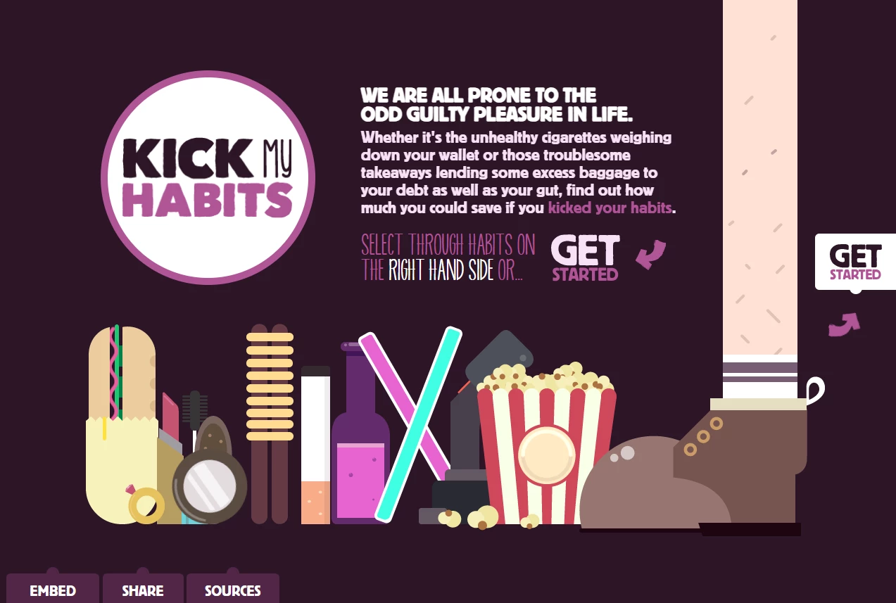
Standout Features:
- Humorous, vibrant UI
- Interactive cost slider
- Live-updating pie charts
The Kick My Habits infographic, designed for Leeds Building Society by BryBry, takes a playful and interactive approach to financial awareness. This engaging tool presents a questionnaire that helps users visualize their spending on common indulgences like cigarettes, alcohol, and takeaways.
Instead of a stern, guilt-driven tone, the design leans into humor and relatability with vibrant illustrations and dynamic typography. As users adjust the cost sliders for each habit, the visuals respond in real-time — blurry vision for alcohol spending, stained fingers for excessive smoking — adding an entertaining yet thought-provoking element to the experience.
Beyond its quirky design, Kick My Habits delivers insightful financial takeaways. A live-updating pie chart contextualizes users’ spending by comparing it to national averages, fostering a sense of relatability and awareness.
By the end of the design, users can virtually "kick" their costly habits and see how much they could save monthly and yearly by redirecting those funds into a savings account. This final feature ties the experience together, balancing lighthearted engagement with a meaningful financial lesson, making the infographic fun and impactful.
5. Heineken’s When You Drink, Never Drive Campaign by Data Design Studios
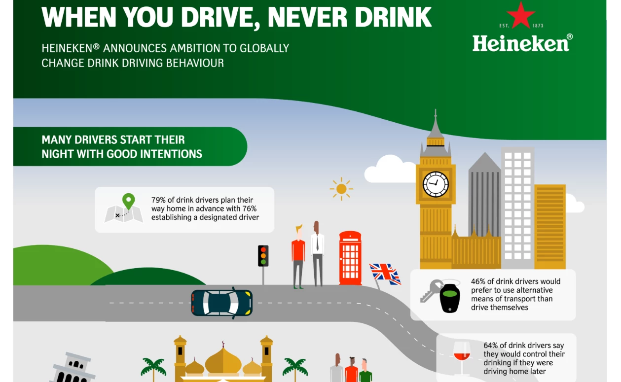
Standout Features:
- Colorful timeline illustrations
- Creative downward-spiral storytelling
- Eye-catching and accessible data boxes
Designed by Data Design Studios, Heineken’s visually compelling and engaging When You Drink, Never Drive campaign infographic delivers a critical message about the dangers of drinking and driving. Using a vibrant roadmap illustration, the design incorporates well-known landmarks from surveyed countries, making the message feel globally relevant and culturally resonant.
A downward spiral narrative structure effectively mirrors how initial good intentions deteriorate under the influence of alcohol and social pressures. As viewers move along the illustrated road, they witness how driver behavior shifts, with statistics becoming progressively more alarming. This gradual progression immerses the audience in a thought-provoking journey that underscores the real-life consequences.
To further enhance the infographic’s impact, the design employs data boxes with eye-catching illustrations. Designed with semi-transparent grey backgrounds, these boxes seamlessly integrate into the road illustrations, ensuring readability while maintaining visual harmony. Lastly, simple yet powerful illustrations accompany the text, making key insights prominent and engaging.
6. NSW Elder Abuse Helpline: 2015-2016 by Percept Brand Design
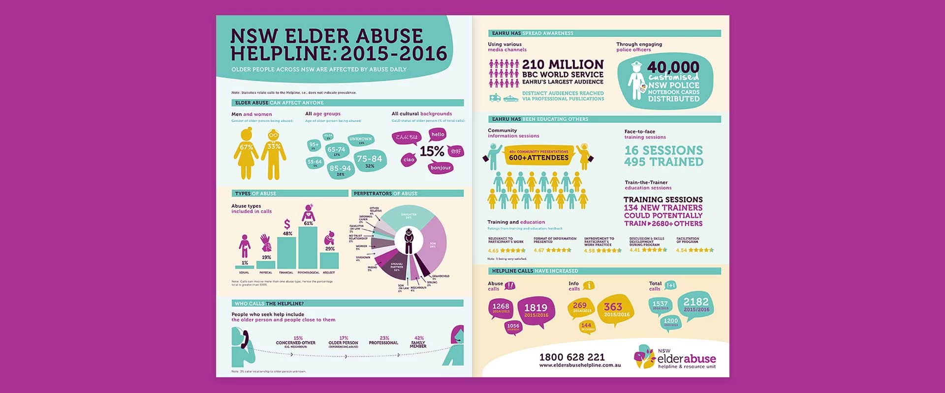
Standout Features:
- Vibrant color palette
- Rounded shapes and typography
- Separation lines with titles
The NSW Elder Abuse Helpline & Resource Unit’s infographic, created by a results-driven Sydney creative agency Percept Brand Design, transforms critical information into an engaging and accessible visual format. Designed as part of an annual report, the infographic effectively communicates the organization’s mission of providing support and referrals for elder abuse cases across NSW.
An energetic color palette featuring vibrant brand hues adds warmth and optimism, reinforcing the organization’s supportive and approachable role. Moreover, the rounded shapes and typography that take inspiration from the organization’s branding create a cohesive and inviting visual language. These soft, organic forms elevate comfort and accessibility, making the information less overwhelming while maintaining a professional and structured presentation.
Separation lines and well-defined section titles structure the content effectively and make navigation easier. These elements break down complex data into digestible segments, ensuring that key statistics and insights are easy to locate and understand.
7. The Asian American Foundation’s Decoding Asian Hate by PitchInteractive
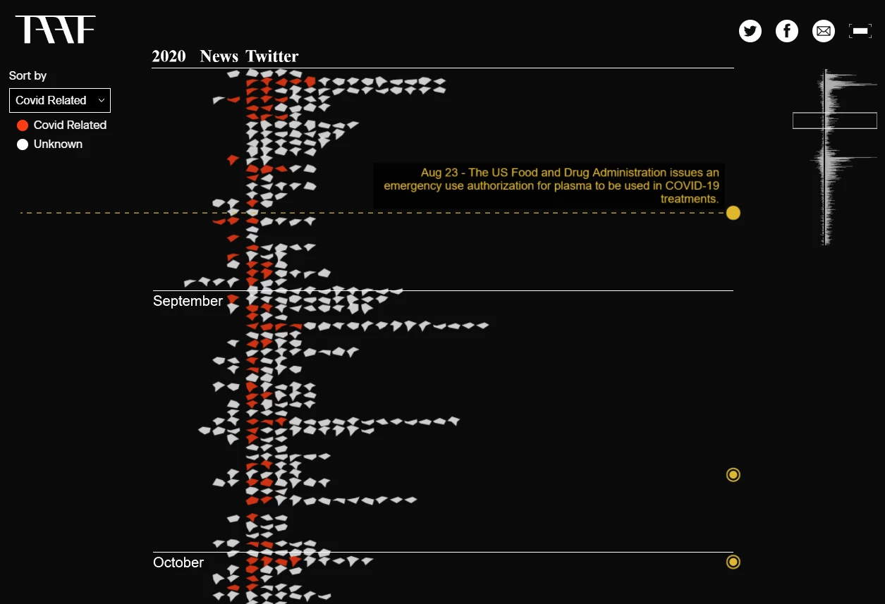
Standout Features:
- Chiling flood of fragments animation
- Slow-burn explanatory section
- Comprehensive vertical timeline with sort filters
The Decoding Asian Hate infographic, created for The Asian American Foundation by PitchInteractive, delivers a powerful visual representation of the rise in hate incidents against the Asian American Pacific Islander community.
The design opens with a slow-building explanatory section that contextualizes the issue, emphasizing how verbal harassment, shunning, property damage, and physical assaults have surged since the start of the COVID-19 pandemic.
After the introduction, a striking flood of animated fragments immediately immerses the viewer, symbolizing the overwhelming scale of hate incidents captured from news sources and Twitter data. Each fragment represents a single hate incident, reinforcing the human impact behind the statistics.
Later in the process, in the infographic’s main interactive section viewers can engage with the data, utilizing sort filters and a vertical timeline to explore cases by location, victim gender, and whether the incident was COVID-related. This comprehensive visualization raises awareness and empowers audiences to grasp the depth and complexity of the issue, driving home the urgent need for change.
8. Vision’s Real Estate Investor Survey by Infobrandz
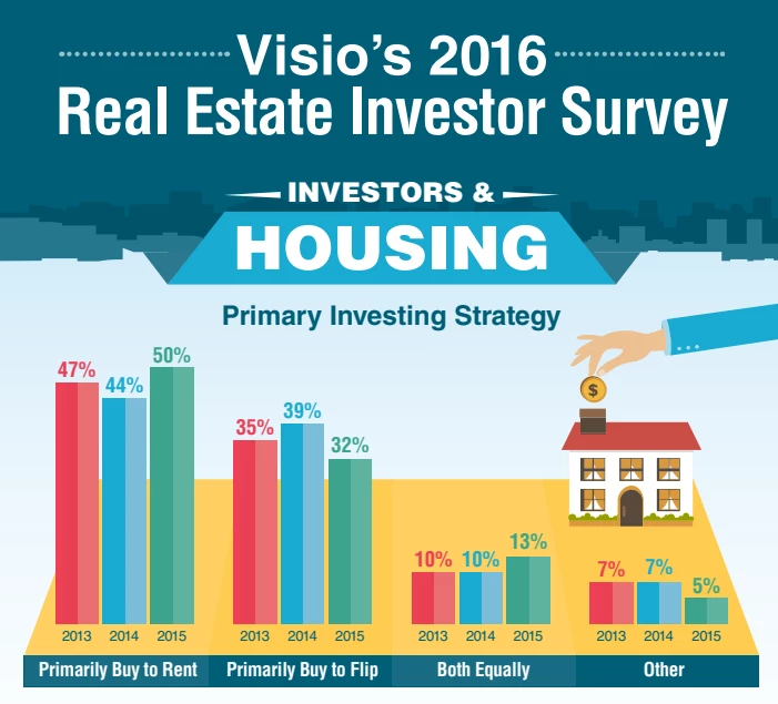
Standout Features:
- Simple, easy-digestible graphs
- Bold sans-serif typography
- Sleek, uncluttered layout
The Real Estate Investor Survey structured and visually engaging infographic, designed by Infobrandz for Vision, reinforces this company’s role as a trusted partner for investors. A sleek, uncluttered layout ensures that complex investment data remains accessible, reinforcing Vision’s professionalism in the rental loan sector. Bold, sans-serif typography enhances readability, clearly defining sections and drawing attention to key takeaways, while strategic use of negative space keeps the content well-organized and digestible.
A variety of simple yet effective graph styles — including pie charts, vertical and horizontal stripes, and even a human silhouette segmented into different percentages — transforms statistical data into easily interpretable visuals. Thoughtful illustrations resonate with the real estate investor audience, such as an image of money flowing into a house chimney to symbolize financial growth and businessmen shaking hands to represent successful deals.
9. 5 Things You Should Always Include in Your Infographic by InfoGraphic Design Team
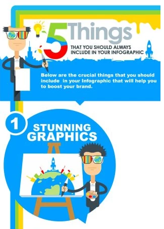
Standout Features:
- Eye-catching, playful illustrations
- Energizing, vibrant color palette
- Informative iconography
The 5 Things You Should Always Include in Your Infographic, crafted by a comprehensive graphic design and animation agency InfoGraphic Design Team, showcases its creative storytelling expertise while reinforcing credibility and trust with potential clients.
Playful, eye-catching illustrations make the infographic engaging, particularly through its quirky main character — a designer with sharp black hair and sunglasses featuring a rainbow hue in one lens and planet Earth in the other. This unique visual approach captures attention and makes the infographic highly shareable across social media.
To ensure the design stands out in any environment, the agency utilizes a vibrant, energizing color palette that exudes creativity and enthusiasm — both essential in the design industry. Moreover, recognizable icons function as bullet points, making the content easy to scan, while key words are highlighted in different colors to improve readability for those who prefer speed reading.
10. Lumina Foundation’s A Stronger Nation by Periscopic
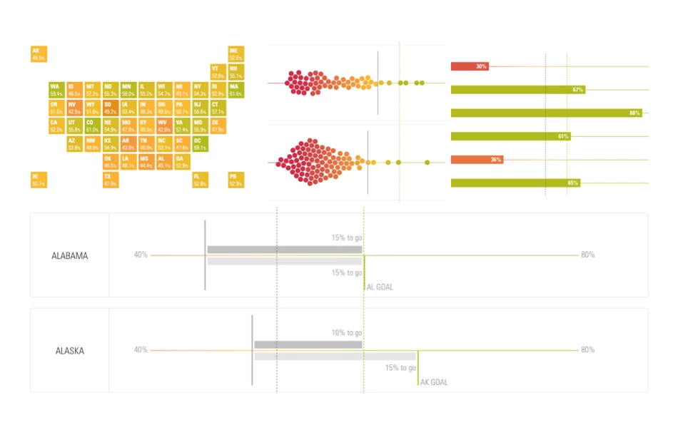
Standout Features:
- Robust data control feature
- Educational explanatory text
- Insightful racial equity sequence
The interactive infographic designed by Periscopic for the Lumina Foundation’s dynamic, online tool A Stronger Nation provides an in-depth, data-rich experience that helps educators and policymakers assess educational attainment and enrollment trends. By offering robust data control features, the design allows users to explore statistics through multiple lenses, compare states, and analyze key age groups that Lumina is tracking.
Beyond national trends, visitors can delve into localized data at the state, county, and metropolitan levels, while also filtering by race and ethnicity. This granular approach ensures a comprehensive understanding of progress and gaps in educational achievement.
Between the interactive graphs, well-placed content provides essential context, outlining Lumina Foundation’s efforts and long-term goals for improving higher education access. A key highlight is the racial equity sequence, which elevates underrepresented populations through dedicated visualizations. By spotlighting disparities linked to race, ethnicity, and gender, this infographic emphasizes the urgency of closing attainment gaps.
Why are Content Marketing Infographics Effective?
Content marketing infographics allow businesses to communicate information, increase engagement, and drive brand awareness. These infographics make the content more impactful by combining engaging visuals with strategic messaging.
Below are key reasons why infographics are highly effective in various types of content marketing:
- Enhances Brand Authority: Well-researched and data-driven infographics establish businesses as industry leaders by providing valuable insights in a visually digestible format.
- Increases Engagement: Eye-catching designs capture attention and encourage audiences to interact with and share the content.
- Improves Message Retention: People process visuals faster than text, making infographics an excellent tool for reinforcing brand messages and key takeaways.
- Boosts Social Media Performance: Infographics perform exceptionally well on social media, generating more shares and increasing organic reach.
- Supports Multi-Channel Marketing: Infographics can be repurposed across different platforms, including blogs, emails, social media, and presentations, maximizing content reach.
- Strengthens Call-to-Action: When designed effectively, infographics can guide users toward specific actions, such as signing up for a newsletter or purchasing a product.
- Builds Emotional Connections: Through compelling visuals and storytelling, infographics evoke emotions that create a stronger connection between the brand and its audience.
Best Practices in Creating Content Marketing Infographics
Creating an impactful content marketing infographic requires a blend of strategic design, audience awareness, and data storytelling. To ensure effectiveness, brands must follow best practices that align with their marketing objectives. Below are essential guidelines for crafting high-performing content marketing infographics:
- Align with Marketing Goals: Every infographic should serve a clear marketing purpose, whether it’s increasing brand awareness, generating leads, or educating customers.
- Use Storytelling Techniques: A well-structured narrative makes an infographic more engaging by guiding viewers through a logical and compelling sequence.
- Keep Branding Consistent: Incorporate brand colors, fonts, and logos to reinforce brand identity and make the infographic instantly recognizable.
- Highlight Key Takeaways: Prioritize essential information so that viewers can quickly grasp the most important insights at a glance.
- Design for Shareability: Create visually appealing infographics with attention-grabbing headlines and a format optimized for social media sharing.
- Balance Data and Design: Ensure a harmonious blend of informative content and visual aesthetics, avoiding overly text-heavy or cluttered designs.
- Optimize for Different Formats: Design infographics that work well in multiple formats, such as vertical for Pinterest, square for Instagram, and widescreen for blogs.
- Incorporate SEO Elements: Use relevant keywords in infographic titles, file names, and alt text to improve search engine visibility.
Content Marketing Infographic Examples: The Bottom Line
Content marketing infographics are invaluable tools for businesses looking to present information in an engaging and visually appealing manner. By combining data visualization with compelling storytelling, they help brands communicate more effectively and leave a lasting impression on their audiences.
Marketers should leverage these versatile tools to enhance their content strategy, ensuring their messages resonate with target audiences while maintaining clarity, impact, and engagement.
Content Marketing Infographics Ideas FAQs
1. What role do infographics play in a content marketing strategy?
Infographics play a crucial role in a content marketing strategy by visually presenting complex data and key insights in a clear, engaging, and easy-to-digest format. Infographics simplify intricate details, making them more accessible and appealing, and help deliver the brand’s message effectively without overwhelming the viewer. By incorporating infographics into a content marketing plan, businesses can drive traffic, boost user interaction, and ultimately strengthen their content’s impact.
2. How do you optimize infographics for SEO?
Incorporate target keywords into file names, alt text, and captions to improve searchability. Ensure the infographic is mobile-friendly and compressed for fast loading without sacrificing quality. Use structured data markup to help search engines understand and index the content. Embedding it within keyword-rich articles also enhances relevance and rankings.
3. What makes a great content marketing infographic?
The use of striking visuals and a clean layout guides the viewer's attention, ensuring key points are highlighted without overwhelming them. Clear, concise messaging complements the visuals, making complex concepts easy to grasp and remember. When backed by credible, well-researched data, a great infographic can effectively educate, engage, and drive action, making it a powerful tool in any content marketing strategy.