Infographics turn complex data into engaging, digestible visuals that inform, persuade, and inspire. From detailed data visualizations to conceptual illustrations, these designs push creative limits while ensuring clarity and impact.
Let’s explore some of the coolest infographic designs that set the bar high and redefine how we consume visual information.
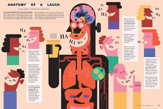
1. Anatomy of a Laugh by John Devolle
Standout Features:
- Playful, flat illustration style
- Clever breakdown of laughter’s mechanics
- Engaging, easy-to-absorb design
Laughter is a universal currency — every culture, every generation, every bad first date has its own variation. John Devolle deconstructs this human quirk with surgical precision, turning something instinctive into a step-by-step diagram.
Devolle employs a vibrant color palette — warm peach tones, rich reds, and bold greens — to create a playful yet structured breakdown of laughter's mechanics. The mix of geometric shapes and expressive typography adds a lively, almost kinetic energy to the design, making it as engaging as the act of laughing itself.
The brilliance here? It makes you overanalyze something that’s supposed to be spontaneous, yet somehow, that’s exactly what makes it funny. It’s part art, part science, and 100% engaging.
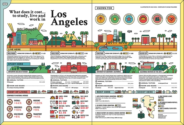
2. What Does It Cost to Study, Live, and Work in Los Angeles by Anacuna
Standout Features:
- Clean and organized data visualization
- Harmonious color palette for readability
- Comprehensive comparison approach
Anacuna takes a behavioral economics approach to a problem everyone faces: the cost of living in Los Angeles. Money is emotional, and the infographic plays into this by presenting financial realities in a way that feels less like a spreadsheet and more like a guided city tour.
The warm yellows, deep greens, and bold reds aren’t just for aesthetics — they create a cognitive shortcut, helping viewers quickly categorize expenses and living conditions. Playful yet precise icons serve as signposts, guiding the reader through LA’s neighborhoods, rent prices, and tuition costs as if they were exploring the city themselves.
This design doesn’t just convey information; it shapes how we think about affordability, choices, and trade-offs. And it succeeds because it transforms a traditionally dry subject into a digestible, intuitive, and even enjoyable visual experience.
Check out these unusual website layouts that break the mold and defy user experience conventions.
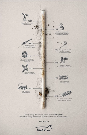
3. MarViva’s #StrawsSuck by McCann Panama
Standout Features:
- Strong environmental advocacy
- Bold typography and striking imagery
- Clear, urgent messaging
Here’s a thought experiment: What’s takes more time to happen — developing the laws of gravity, landing a man on the moon, or the decomposition of a plastic straw?
According to MarViva’s #StrawsSuck campaign, the first two took centuries of innovation, while the last one simply never happens. The infographic’s brilliance is in how it exploits our cognitive biases.
By aligning a single, dirt-covered plastic straw with humanity’s greatest scientific achievements, it rewires our sense of scale. The brain struggles to process that something as trivial as a straw can persist as long as Galileo’s ideas, but there it is — staring us in the face.
What McCann Panama succeeds in doing here is that it doesn’t just present information; they also leveraged perception, turning an everyday object into an intellectual dilemma. That’s not just clever design — it’s an economics lesson in how we undervalue long-term consequences.
4. 100 Treasures of the Past by Lucas Infografía
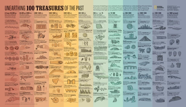
Standout Features:
- Comprehensive timeline storytelling
- Expansive gradient color segmentation
- Rich historical insights
Think about the last time you walked through a history museum. What stood out — the artifacts themselves, or the stories behind them? The '100 Wonders' infographic by Lucas Infografía operates on that same principle: context is everything.
Instead of a dull catalog of discoveries, this design presents an interconnected web of breakthroughs, organized in a gradient timeline that guides the reader through the progression of human history. The soft color transitions subtly separate historical eras without overwhelming the viewer, while the minimalist iconography keeps the focus on the discoveries themselves.
The brilliance here isn’t just in the information; it’s in how it’s structured to nudge our brains into recognizing patterns, spotting connections, and appreciating the long arc of human innovation. This isn’t just a timeline; it’s a cognitive shortcut to understanding our past.
5. Fish Pharm by Oliver Uberti
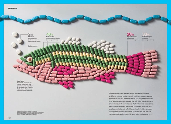
Standout Features:
- Use of real pharmaceutical pills as design elements
- Collage-style composition for visual storytelling
- Seamless blend of data, science, and imagery
Some things age like fine wine. Others — like pharmaceutical waste in our water — just linger, polluting everything in their path. 'Fish Pharm' by Oliver Uberti isn’t just an infographic; it’s a visual gut-punch that still lands more than a decade later.
Using actual pills to form the shape of a fish, Uberti makes a point so visceral it’s impossible to ignore: the drugs we consume don’t just disappear. They cycle back through the environment, accumulating in our ecosystems like a bad decision that keeps haunting us.
And here’s what makes it brilliant — this was designed in 2010, yet it still hits hard in 2024. No gimmicks, no unnecessary flair. Just raw, compelling design that forces you to think.
It blends art, science, and data so seamlessly that it doesn’t just present facts — it changes the way you see them. That’s what great design does. It lingers, like the problem it’s exposing.
Watch Design Editor Oliver Uberti walk through the creative process behind Fish Pharm, a striking, unsettling message about pharmaceutical pollution.
6. Fast Fashion by Lucas Infografía
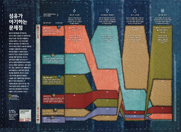
Standout Features:
- Tactile, stitched aesthetic
- Rich data-driven storytelling
- Strong visual hierarchy
Fast fashion moves at the speed of impulse — clothes produced in days, bought on a whim, and discarded just as quickly. But this infographic forces you to sit with the consequences.
Instead of sterile bar charts, it stitches the data directly into a textile-inspired design, mimicking the very industry it critiques. Patches of fabric, rough seams, and thread-like details make the data feel tangible — almost like you could reach out and touch the waste it represents.
And that’s the genius here. The design isn’t just visually interesting; it’s thematically perfect. It makes you feel the industry’s chaos, the patchwork of overproduction, the frayed edges of a broken system.
With a mix of detailed data visualizations and stark comparisons, it highlights the staggering environmental and social costs of the industry. Its "coolness" lies in its ability to shock and educate simultaneously, forcing a deeper reflection on consumer habits.
7. What Makes a Bong Joon Ho Movie by James Round
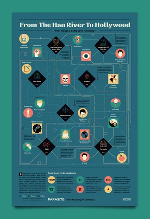
Standout Features:
- Icon-driven storytelling
- Engaging blend of text and visuals
- Deep thematic analysis
Bong Joon Ho doesn’t tell stories in a straight line, and neither does this infographic. James Round’s design unpacks the filmmaker’s signature style like a detective board — webs of connections, intersecting themes, and recurring motifs all mapped out with precision.
The dark teal background and electric wiring-like paths mimic the tension and controlled chaos that define Bong’s narratives, while crisp iconography highlights key themes: class struggle, corruption, murder, and moments of absurd humor.
What makes this infographic brilliant is its structure — it doesn’t just tell you what makes a Bong Joon Ho movie, it makes you feel it. The interconnected elements force your brain to engage, to follow the breadcrumbs, much like Bong’s characters navigating his layered stories.
8. Essential Cocktails: A Scratch-Off Chart by Pop Chart
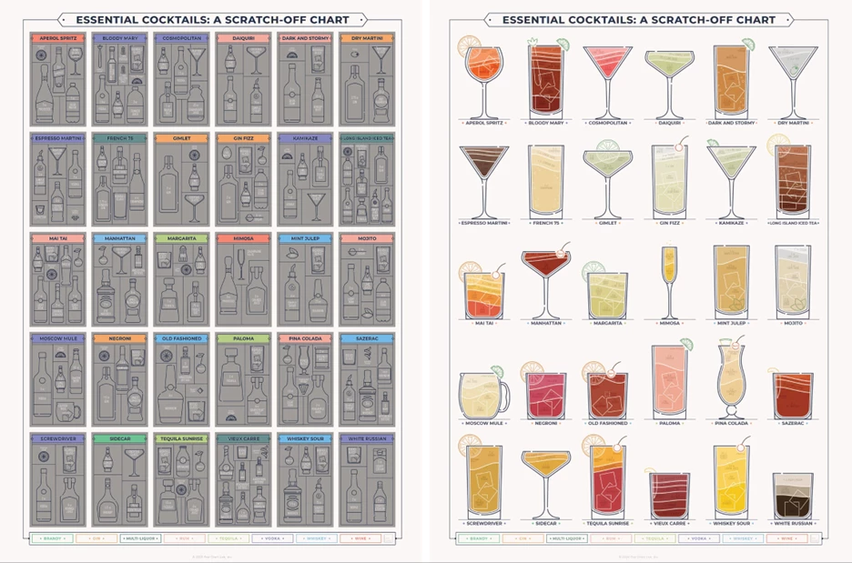
Standout Features:
- Gamified, interactive scratch-off format
- Clean, minimalist design with precise iconography
- Stylish, vintage-inspired aesthetic
A good cocktail isn’t just about ingredients — it’s about anticipation, ritual, and the satisfaction of getting it just right. Pop Chart’s Essential Cocktails infographic understands and plays on that experience, turning mixology into a game with its scratch-off format. The sleek, minimalist layout isn’t just for show; it streamlines information, categorizing each drink by base spirit and offering a roadmap for anyone looking to expand their repertoire.
And here’s the genius move: it taps into behavioral psychology. The scratch-off feature adds an element of achievement, a subtle nudge to try every cocktail on the list. It’s part education, part challenge, and entirely addictive.
This is more than an infographic — it’s a social experience, a beautifully designed nudge toward discovering, mixing, and enjoying drinks beyond your usual go-to.
How to Make a Cool Infographic: Best Practices & Use Cases
A truly effective infographic does more than display data. It guides, informs, and engages. Here are some best practices and infographic use cases to consider:
Best Practices
- Make Data Visually Intuitive: Structure the layout in a way that naturally leads the eye, using hierarchy, contrast, and white space effectively.
- Tell a Story: A strong narrative helps people connect with information. Whether it’s an environmental issue or a cultural deep dive, framing data as a journey makes it more engaging.
- Use Metaphors & Real-World Analogies: Concepts become more relatable when they are tied to familiar objects or experiences, like using a plastic straw as a timeline in the #StrawsSuck campaign.
- Incorporate Interactive or Tactile Elements: Scratch-off charts, scrollable digital infographics, or data visualization animations add an element of engagement beyond static visuals.
- Balance Aesthetic & Functionality: Infographics should be visually compelling but never at the expense of clarity. Avoid clutter and keep the design clean while ensuring key points pop.
Use Cases
- Brand Marketing: Companies use infographics to simplify their value propositions, showcase statistics, or highlight customer success stories.
- Educational Content: Schools, researchers, and publishers leverage infographics to break down complex topics in an easy-to-digest format.
- Advocacy & Awareness Campaigns: Nonprofits and activists use compelling visuals to bring attention to pressing social and environmental issues.
- Product & Service Guides: Interactive or illustrated infographics help businesses explain processes, product benefits, or how-to guides in a more engaging way.
Cool Infographics: The Bottom Line
Infographics live at the intersection of design, psychology, and storytelling. At their best, infographics do more than present information. They can actually change the way we think.
And they work because they tap into how we process information: through patterns, contrast, and narrative flow. A cool infographic doesn’t flood you with facts; it guides you through them, making each insight feel inevitable.
If you want to create one that stands out, focus on clarity and creativity, then, inject something that makes people care. If you’re looking for inspiration, diving into the best infographic design trends is a good place to start.
Cool Infographics: FAQ
1. What makes an infographic effective?
A great infographic balances strong visuals, clear storytelling, and well-structured data. The most effective ones simplify complex information while keeping the audience engaged.
2. How can I design a compelling infographic?
Focus on hierarchy, contrast, and readability. Use visual metaphors, bold typography, and interactive elements to enhance engagement and make the data more intuitive.
3. What are the best tools for creating infographics?
Popular tools include Adobe Illustrator for advanced design, Canva and Piktochart for easy templates, and Tableau for data-driven visuals.
4. Why do some infographics go viral?
Infographics that trigger emotion, tell a unique story, or simplify widely relevant data tend to be shared the most. The key is making the information both valuable and visually striking.