With 70% of organizations shifting to more complex data, the right data visualization tool helps you achieve faster reporting with real-time dashboards and AI-driven insights.
We compare the top data visualization tools and show you exactly which ones to use based on your goals.
Best Data Visualization Tools 2026: Key Findings
- Choose Power BI or Looker Studio if you want a quick setup and budget-friendly options, as their free and entry-level plans already cover most SMB reporting needs.
- Use AI-powered tools like ThoughtSpot or Domo to reduce manual analysis, so your team can generate insights instantly via natural-language queries.
- Invest in Tableau or Qlik Sense if your team works with complex datasets, and go with Datawrapper or Visme for audience-friendly visuals.
What Are Data Visualization Tools?
1. Interactive Infographic Examples
2. Guide to a Big Data-Driven Org
3. Best Data Governance Tools
4. Small Business Guide to Data Analytics
Data visualization tools transform raw data into charts, dashboards, and visuals that make insights easier to understand and act on.
The demand behind these tools is growing fast:
- The global business intelligence software market reached $46.42 billion in 2025 and is projected to hit $150.24 billion by 2034.
- Gartner predicts that 70% of organizations will shift from big data to small and wide data in 2025, which makes visualization tools even more important for simplifying diverse data sources.
That growth is pushing teams to be more deliberate about which tools they use and why. To help you find the right fit, we evaluated 15 of the top data visualization platforms available today.
As Tamir Roter, Chief Corporate Development Officer at Bright Data, puts it:
“The right data tools don’t just display charts — they help small businesses spot patterns like customer churn, product demand fluctuations, or underperforming marketing channels.
At Bright Data, we often advise businesses to start with tools that integrate easily with their existing systems and prioritize real-time visibility into what’s working and what’s not.”
Each tool was evaluated across six criteria:
- Ease of use: Can non-technical users build dashboards without coding?
- Feature depth: Does the tool support AI, real-time data, embedding, and governance?
- Free plan availability: Is there a meaningful free or open-source tier?
- Pricing transparency: Are costs clearly documented and predictable as teams scale?
- User sentiment: Based on aggregated reviews from Capterra and Reddit communities.
- Competitor coverage: Do leading industry roundups consistently include this tool?
This data visualization tools comparison table shows how they stack up side by side:
Tool | Best For | AI Features | Embedded Analytics | Ease of Use | Pricing |
Advanced analytics, enterprises | ✅
| ✅
| Medium | From $15/user/mo | |
Microsoft stack, SMBs | ✅
| ✅
| High | Free; from $14/user/mo | |
Marketing, Google ecosystem | ✅ (Via integrations) | ❌
| High | Free | |
Animated storytelling | ✅
| ✅
| High | Free; Custom pricing | |
Journalists, publish-ready charts | ✅
| ❌
| High | Free; from $599/mo | |
Startups, SaaS self-service BI | ✅
| ✅
| Medium | Free; from $100/mo | |
Data engineers, warehouse-native | ❌
| ❌
| Low | Free (open-source) | |
DevOps, real-time monitoring | ✅
| ✅
| Medium | Free; cloud from $19/mo | |
Enterprises, deep exploration | ✅
| ❌
| Medium | From $300/mo | |
Real-time ops, exec dashboards | ✅
| ✅
| High | Custom (credit-based) | |
AI/search-driven analytics | ✅
| ✅
| Medium | Free; from $24/user/mo | |
Marketing, branded visuals | ✅ (design AI) | ❌
| High | Free; from $12.25/user/mo | |
Embedded analytics, enterprises | ✅
| ✅
| Low | From $399/mo | |
Data teams, governed metrics | ✅
| ✅ | Medium | From $800/mo | |
Custom, developer-driven visuals | ❌
| ✅
| Low (dev) | Free (open-source) |
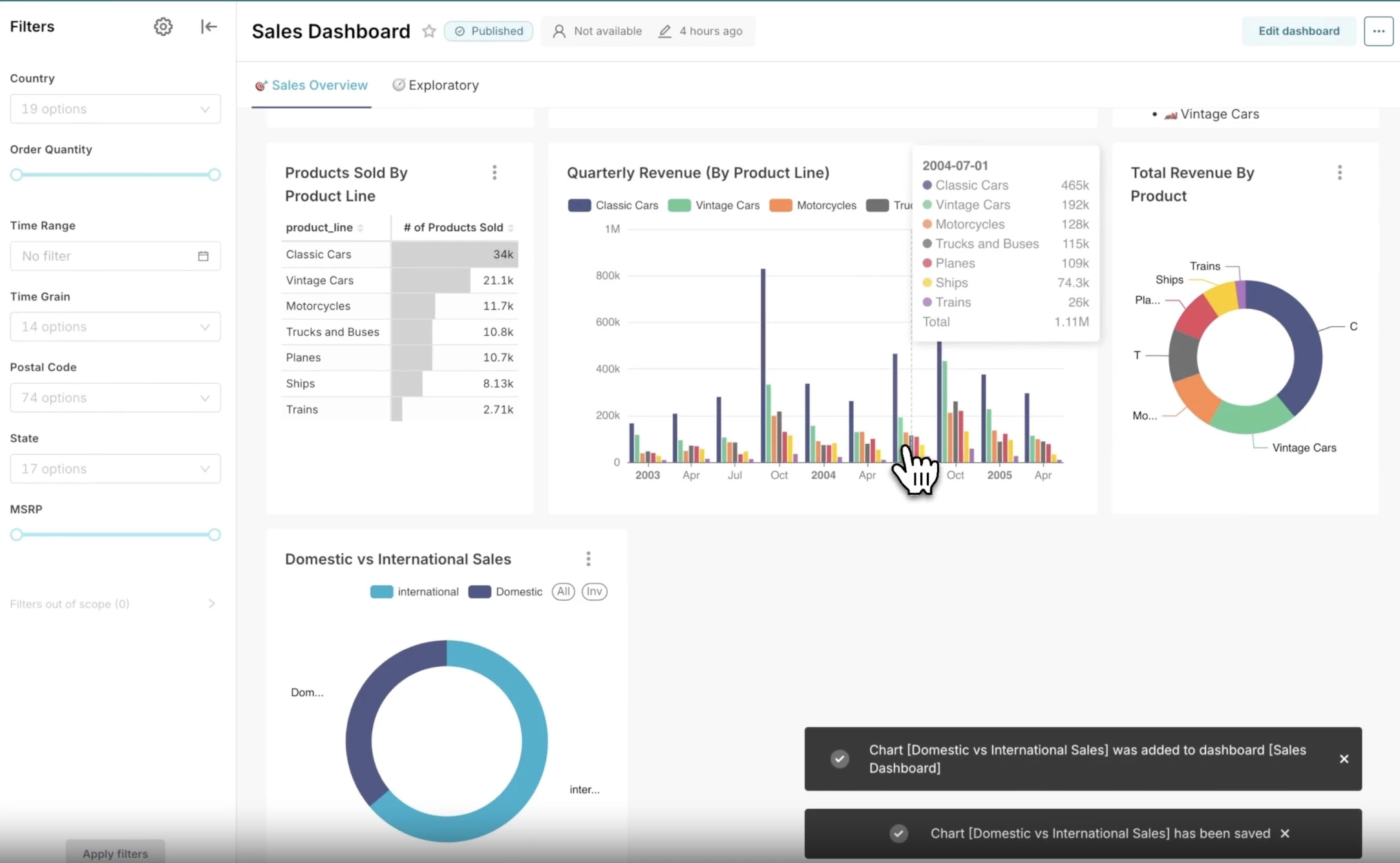
1. Tableau: Best for Advanced Visual Analytics
Ideal for analysts, data teams, and organizations building a data-driven culture
Tableau, now part of Salesforce, is an industry staple for data visualization.
Its drag-and-drop interface lets users build charts, maps, and dashboards without coding, and built-in visual best practices mean you don't need a design background to produce faster, more intuitive analysis.
It leans on visual elements like color, shape, and position to turn raw data into a clear narrative. That approach scales up, too; teams can build large, interactive visuals and share them across departments.
The analytics ecosystem is broad. You can deploy it in the cloud, host it yourself, or plug it into Salesforce.
And if you want AI in the mix, Tableau Next brings natural-language Q&A and AI-powered visualizations through Agentforce.
Then there's Tableau Public, a free platform with a community layer sitting on top of it all. This is where users can access millions of visualizations for inspiration, learning, and even building a portfolio.
| Pros | Cons |
|
|
Pricing
- Tableau Cloud: Starts at $15/user/month, billed annually
- Tableau Enterprise: Starts at $35/user/month, billed annually
- Tableau Next: Starts at $40/user/month, billed annually
Notable Features
- Tableau Cloud for hosted analytics with no infrastructure headaches
- Tableau Server if you need on-premises control
- Tableau Desktop for offline building and visualization
- Free training videos and resources for all skill levels
What Users Say
Users consistently point to Tableau as one of the most powerful data visualization tools, especially with large datasets.
Many highlight how quickly it turns raw data into polished visuals, with advanced filtering, parameters, and drill-downs that feel intuitive once you get the hang of it.
That said, the learning curve comes up often. While it’s easy to start, true mastery takes time. Some users also feel that collaboration and real-time sharing lag behind newer tools.
Who’s It For?
Tableau is built for analysts, business leaders, data, and IT teams that want a serious visual analytics platform, not just charts for a slide deck, but something that handles exploration, governance, and sharing across an organization.
It's also a natural fit for companies already in the Salesforce ecosystem, and a good home for organizations trying to build a data culture.
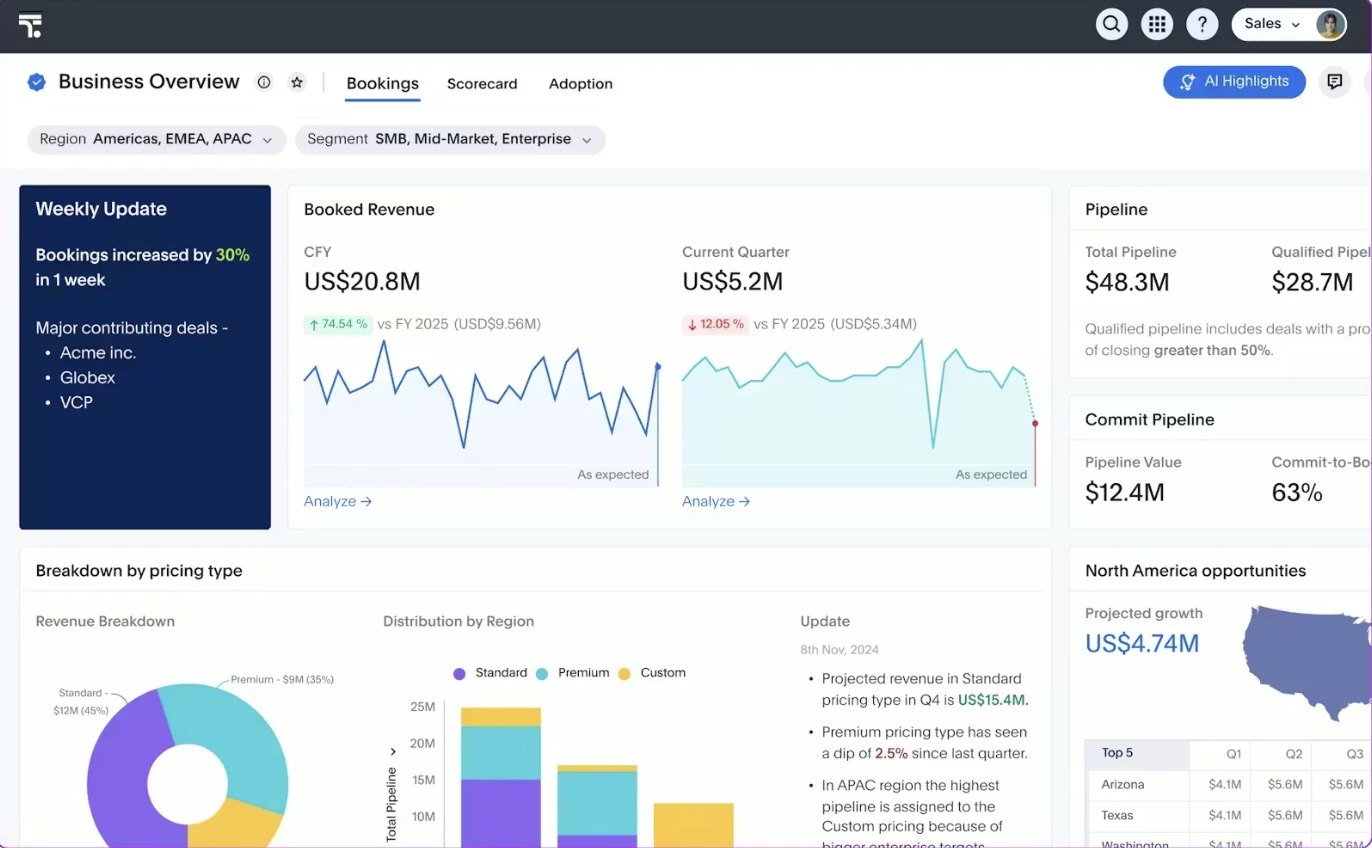
2. Power BI: Best for Microsoft-Based Reporting
Ideal for small to mid-sized teams and organizations already using Microsoft 365
Power BI is Microsoft's answer to making data accessible. It's a drag-and-drop report builder that doesn't require a technical background.
You can pull in data from Excel, local databases, or the cloud, and OneLake integration keeps everything centralized, so reports stay consistent across teams.
Its native integration with Microsoft 365 apps like Teams, Excel, PowerPoint, Outlook, and SharePoint allows insights to live directly inside the tools your team already uses.
This makes it easier to collaborate, share reports, and act on data without switching platforms.
Pair that with AI-powered reporting through Microsoft Fabric, and teams can surface patterns and generate insights without deep manual analysis.
| Pros | Cons |
|
|
Pricing
- Free account: included with Microsoft Fabric free tier
- Power BI Pro: $14/user/month, billed annually
- Power BI Premium: $24/user/month, billed annually
- Power BI in Microsoft Fabric: Custom
Notable Features
- Power BI Desktop for free, offline report authoring
- Mobile apps for Windows, iOS, and Android
- Power BI Embedded for building customer-facing dashboards
- Built-in security, encryption, and governance tools
What Users Say
Users describe Microsoft Power BI as a practical, easy-to-use tool, especially in Microsoft-heavy environments. It integrates well with Excel and helps teams quickly turn data into insights.
That said, mastering data modeling and DAX can take time, and some users feel it offers less creative flexibility than Tableau.
Overall, it’s widely viewed as a valuable, in-demand skill with strong adoption across industries.
Who’s It For?
Microsoft Power BI is best for teams that already rely on Microsoft tools and want a straightforward way to turn scattered data into usable insights.
If your workflows live in Excel, Teams, or SharePoint, it fits naturally into your day-to-day without requiring a steep learning curve or constant platform switching.
It’s also a strong choice for small to mid-sized businesses and growing teams that need both self-service dashboards and the option to scale into more advanced analytics later.
3. Looker Studio: Best for Collaborative Marketing Dashboards
Ideal for marketers, SMBs, and teams working within the Google ecosystem
Google’s Looker Studio stands out as a free, web-based data visualization tool that makes it easy to turn raw data into interactive dashboards and shareable reports.
It connects seamlessly to a wide range of data sources, from Google-native tools to partner connectors, and lets teams collaborate in real time, so everyone can edit, view, and share dashboards.
You can create dynamic reports with everything from geo maps and heatmaps to pivot tables and time series, plus extra flexibility from community-built visualizations and templates.
It also taps into lightweight AI/ML through connected tools (like TensorFlow.js), helping you spot trends and explore your data more intelligently within your dashboards.
| Pros | Cons |
|
|
Pricing
- Free (core platform with full dashboard and reporting capabilities)
- Potential costs may come from third-party connectors or data sources
Notable Features
- Built-in report gallery with ready-to-use templates
- Community visualization library (e.g., Sankey diagrams, funnel charts, sunburst charts)
- Interactive filtering (date pickers, search boxes, sliders)
- Custom branding and white-label reporting options
What Users Say
Users generally see Looker Studio as a solid entry-level, budget-friendly tool, especially within the Google ecosystem. It’s easy to use and great for quick dashboards, particularly with data from Google Analytics and Ads.
However, limitations show as data gets more complex, with users citing workarounds, performance issues, and less reliability.
It’s often viewed as a lightweight starting point rather than a full competitor to advanced BI tools.
Who’s It For?
Looker Studio is best for marketers, small to mid-sized businesses, and teams already working within the Google ecosystem.
It’s especially useful for SEO, PPC, and analytics reporting, where fast dashboard creation and easy sharing matter more than deep statistical modeling.
For teams that want collaborative, visually clean reports without investing in expensive BI tools, Looker Studio offers a practical and accessible solution.
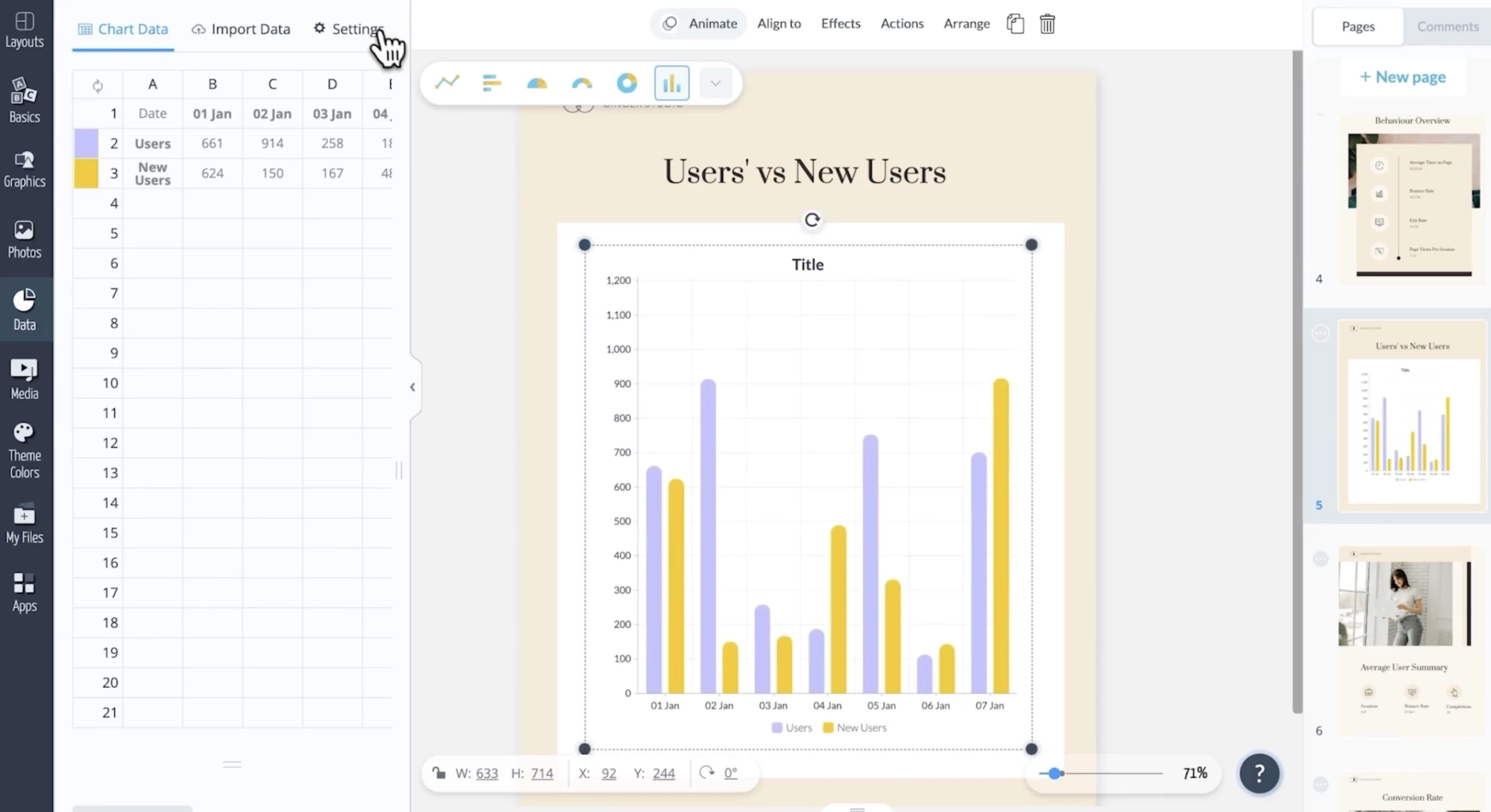
4. Flourish: Best for Animated Data Storytelling
Ideal for journalists, marketers, and content teams building narrative-driven visuals
Flourish is a browser-based platform specializing in animated, interactive data storytelling.
It lets anyone create eye-catching visualizations like animated bar chart races, scrollytelling stories, interactive maps, and network diagrams.
Its template library covers over 100 visualization types, from classic charts and maps to more creative formats like survey results, bracket tournaments, and 3D globe maps.
Flourish's 'Stories' feature allows teams to combine multiple visualizations with scrollable narrative text, creating publication-ready data stories that can be embedded on any website.
Team workspaces support real-time collaboration, making it a strong choice for editorial teams and agencies working on shared projects.
| Pros | Cons |
|
|
Pricing
- Free (public projects)
- Presenter: Get via Canva
- Publisher: Custom pricing
- Enterprise: Custom pricing
Notable Features
- Animated bar chart races and live leaderboards
- Scrollytelling stories combining charts with narrative text
- Survey and quiz result visualizations
- Custom branding and white-label options for teams
What Users Say
Users say that Flourish Studio is one of the easiest tools for creating clean, visually polished charts without coding, and is especially valued for its customization and “paste data → instant visuals” workflow.
However, users often criticize the recent export paywall, saying it limits its usefulness for free users and pushes them toward alternatives like Datawrapper, RAWGraphs, or code-based tools like Python and R.
Who’s It For?
Flourish is ideal for content teams, journalists, digital marketers, and agencies that need to turn data into engaging, shareable visual stories.
It's especially valuable for editorial use cases, including data journalism, campaign reports, social media graphics, and presentations, where the goal is communicating insights to a broad audience rather than performing deep analysis.
5. Datawrapper: Best for Clean, Publish-Ready Charts
Ideal for journalists, marketers, and teams focused on clear data communication
Datawrapper is a browser-based data visualization tool that makes it easy to create clean, professional charts, maps, and tables, without needing design or coding expertise.
It comes with 20+ chart types, along with maps and tables, all built with smart default styling so you can focus more on insights than formatting.
Everything is responsive by default, and features like color checks and non-overlapping labels help keep your visuals clear and accessible across devices.
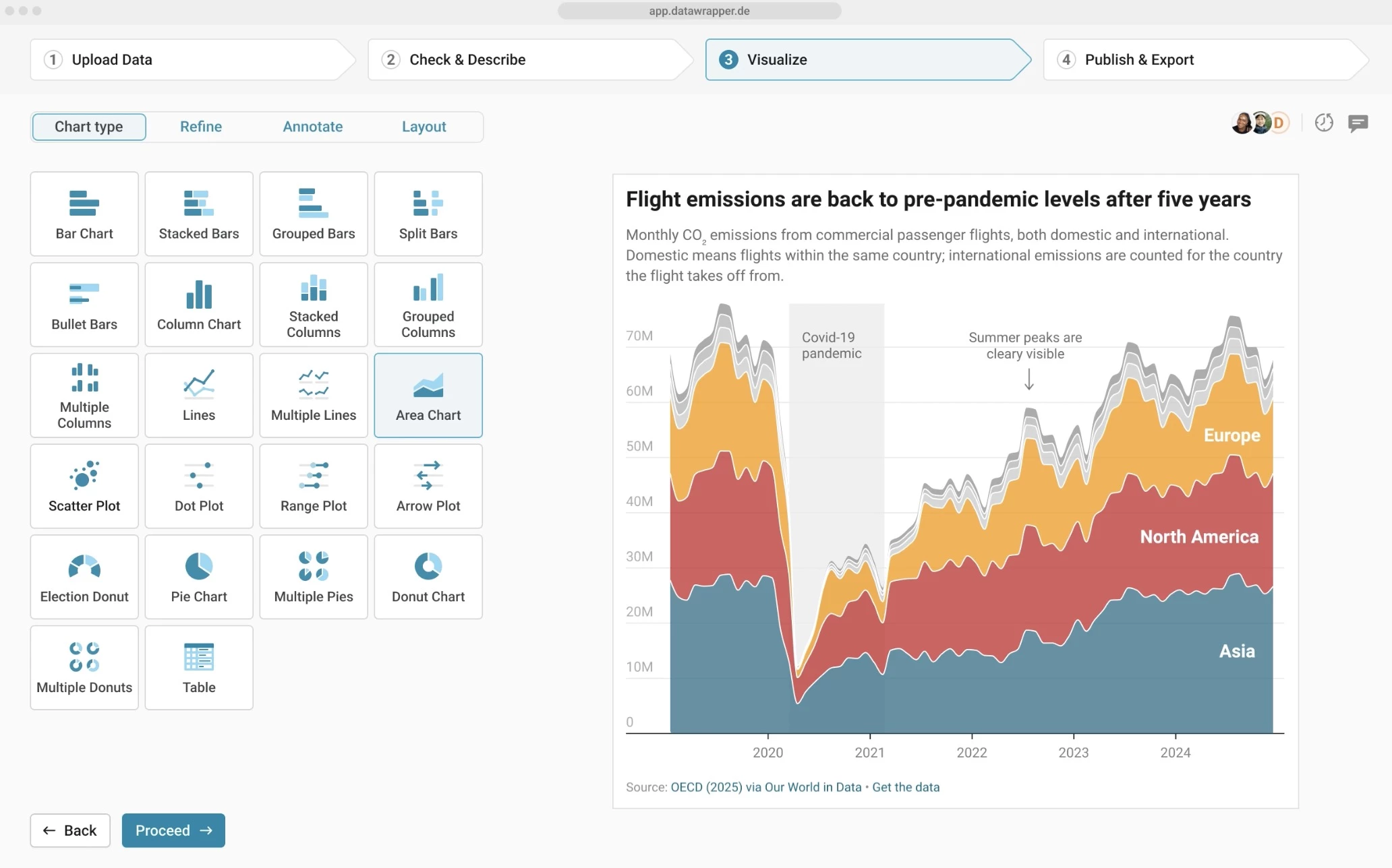
Publishing is just as simple. You can embed visuals on websites or export them as PNG, SVG, or PDF for presentations and printing.
Plus, its privacy-first setup (GDPR compliance, no tracking, and European hosting) makes it a solid choice for teams working with sensitive data.
| Pros | Cons |
|
|
Pricing
- Free plan
- Custom plan: $599/month
- Enterprise plan: Custom pricing
Notable Features
- 25+ interactive visualization types, including charts, maps, and tables
- 4000+ basemaps and cartograms for geographic data
- Built-in annotations, tooltips, zoom, and highlights
- Dark mode for improved readability
- PowerPoint integration for direct presentation use
What Users Say
Users often highlight Datawrapper for its simplicity and speed, making it easy to create clean, presentation-ready charts and maps without technical skills.
It’s a popular choice for quick reporting and storytelling, especially for beginners or teams that need fast results.
That said, it’s generally seen as a lightweight tool. It’s great for straightforward visuals, but not built for deep analysis or complex dashboards like Tableau or Microsoft Power BI.
Who’s It For?
Datawrapper is ideal for journalists, marketers, analysts, and teams that need to communicate insights clearly and quickly to a broad audience.
It’s especially valuable for organizations that prioritize accessibility, clean design, and fast publishing workflows, rather than complex data science or heavy customization.
6. Metabase: Best for Query-Driven Visualizations
Ideal for startups, SaaS companies, and teams needing flexible self-service BI
Metabase is a flexible, open-source data visualization tool that allows users to connect to 20+ databases and data warehouses, then explore and visualize data through charts, maps, funnels, tables, and more.
Non-technical users can query data without writing code using its visual query builder, while more advanced users can drop into SQL for deeper analysis.
Features like multi-tenant data segregation, granular permissions, and embedded analytics make it suitable for both internal reporting and customer-facing dashboards, while its lightweight setup keeps engineering overhead low.
Metabase also introduces AI through Metabot, enabling natural language queries and automated SQL generation
| Pros | Cons |
|
|
Pricing
- Open Source: Free (self-hosted)
- Starter: $100/month + $6/user/month
- Pro: $575/month + $12/user/month
- Enterprise: Custom pricing (starts at ~$20,000/year).
Notable Features
- Interactive drill-through and dashboard filtering
- White-label analytics and customizable embeds
- SOC 2, GDPR, and CCPA compliance
- Data Studio for managing data models and transformations
What Users Say
Users generally see Metabase as an accessible, cost-effective option. Its intuitive, self-serve approach makes it simple for non-technical users to explore data and build reports.
However, users often mention performance issues, bugs, and limited collaboration features as dashboards grow. It’s a strong fit for simpler use cases, but can become harder to manage at scale.
Who’s It For?
Metabase works particularly well for startups and SaaS companies that need embedded analytics, as well as business teams looking for a self-serve BI tool that doesn’t depend heavily on engineering resources.
If you want something lightweight, customizable, and scalable, with the option to add AI when needed, Metabase is a practical and cost-efficient choice.
7. Apache Superset: Best for Open-Source, Warehouse-Native Analytics
Ideal for data engineers and SQL-fluent analysts
Apache Superset is a free, open-source business intelligence and data visualization platform.
It connects directly to SQL-speaking databases and data warehouses, including BigQuery, Snowflake, Redshift, PostgreSQL, and 40+ more. This makes it a strong fit for warehouse-native analytics workflows.
Superset offers two modes of interaction: a no-code chart builder for less technical users, and a fully featured SQL IDE (SQL Lab) for analysts who need to write custom queries.
Both interfaces feed into a shared dashboard layer.
As a fully open-source platform under the Apache Software Foundation, Superset has a large and active community contributing plugins, connectors, and features.
| Pros | Cons |
|
|
Pricing
- Free
- Managed cloud options available through third-party providers (pricing varies)
Notable Features
- 40+ native database and data warehouse connectors
- Drag-and-drop chart builder plus SQL Lab IDE
- Role-based access control and row-level security
- Caching and async queries for improved performance
- 100+ visualization types, including geospatial charts
What Users Say
Users generally think Apache Superset is a strong open-source BI tool for technical users who want flexibility, SQL control, and self-hosting.
Most users like its customizability and modern data stack fit, but note it can be harder to set up and depends heavily on the underlying database performance.
Compared to tools like Power BI or Metabase, it’s seen as more powerful but less plug-and-play.
Who's It For?
Apache Superset is best for data engineering teams, analytics engineers, and organizations that want a warehouse-native BI tool without licensing costs.
It's especially well-suited to teams that are already comfortable working directly with their data warehouse, run their own infrastructure, and want the control and flexibility of open-source software.
8. Grafana: Best for Real-Time Monitoring and Observability
Ideal for engineering, DevOps, and operations teams tracking live systems and infrastructure
Grafana is an open-source platform built for visualizing time-series data from monitoring systems.
While it started as a metrics dashboard for DevOps teams, it has expanded into a full observability platform covering metrics, logs, and traces across a wide range of data sources.
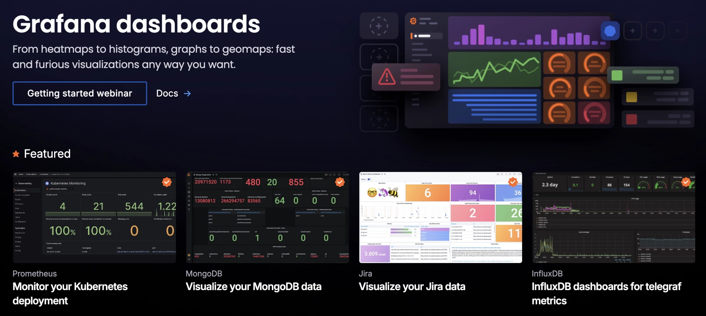
It connects to Prometheus, InfluxDB, Elasticsearch, and 100+ other data sources via its plugin system.
Its panel-based dashboard builder lets teams assemble custom real-time views of their systems without writing front-end code.
For business analytics use cases, Grafana also connects to SQL databases and cloud data warehouses, though it's optimized for time-series patterns rather than ad hoc reporting.
| Pros | Cons |
|
|
Pricing
- Open Source: Free (self-hosted)
- Grafana Cloud Free: With usage limits
- Grafana Cloud Pro: From $19/month
- Enterprise: $25,000/year spend commit
Notable Features
- 100+ data source plugins, including Prometheus, Loki, and cloud databases
- Unified dashboard for metrics, logs, and traces
- Threshold and anomaly-detection alerting
- Templated dashboard variables for dynamic filtering
What Users Say
User sentiment around Grafana generally frames it as a top-tier choice for monitoring and time-series dashboards, especially in DevOps and self-hosted environments.
They also consistently highlight its strong integrations with tools like Prometheus and Loki.
At the same time, many note that it isn’t a traditional BI tool. Working with messy or non-standard SQL data often requires extra transformation outside Grafana, since it doesn’t store data itself.
Who's It For?
Grafana is purpose-built for engineering, DevOps, and SRE teams that need real-time visibility into system health, application performance, and infrastructure metrics.
It's the go-to choice for organizations running cloud-native or microservices architectures, where monitoring data lives across multiple systems and needs to be unified in one place.
For operational intelligence, not business intelligence, it's best in class.
9. Qlik Sense: Best for Deep Data Exploration
Ideal for enterprises handling complex datasets and advanced analytics needs
Qlik’s associative engine lets you explore data in any direction, including clicking, filtering, and drilling down across visuals without ever losing context.
This makes the experience more dynamic, with relationships between data points surfacing instantly instead of being boxed into predefined queries or dashboards.
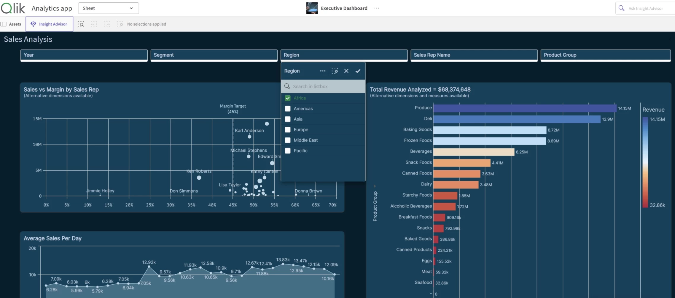
With AI features like Insight Advisor and natural language search, you can simply ask questions and get instant visualizations and insights.
Its flexible, no-code environment also supports everything from standard charts to fully customized dashboards.
| Pros | Cons |
|
|
Pricing
- Starter: $300/month (10 users, billed annually)
- Standard: $825/month (25 GB data capacity)
- Premium: $2,750/month (50 GB data capacity)
- Enterprise: Custom pricing (starts at 250 GB data capacity)
Notable Features
- Support for a wide range of visualization types (maps, treemaps, scatter plots, KPIs, and more)
- Built-in alerting and automated actions based on data changes
- Mobile-ready dashboards with responsive design
What Users Say
With Qlik Sense, users often point to performance first. It handles large datasets well and keeps dashboards fast and responsive, even at scale.
Its associative data model also makes exploration feel more fluid, with filters and relationships updating dynamically as you interact with the data.
On the flip side, getting comfortable with its logic can take time. Cost and setup can also be a hurdle, but for data-heavy environments, it’s widely seen as a powerful choice.
Who’s It For?
Qlik Sense is best for organizations that want deeper data exploration beyond standard reporting.
It’s especially suited for enterprises with large, complex datasets and teams looking for AI-driven and predictive analytics.
If you need to uncover hidden relationships and act on insights quickly, it offers a more advanced approach than traditional BI tools.
10. Domo: Best for Real-Time, Interactive Data Dashboards
Ideal for enterprises and leaders needing data-to-action workflows in one platform
Domo is a cloud-based BI and data visualization platform that lets you create visuals from 150+ chart types, including trellis charts, period-over-period comparisons, maps, and data science visuals, no coding required.
Dashboards double as “data stories,” combining visuals, text, and context to guide decisions.
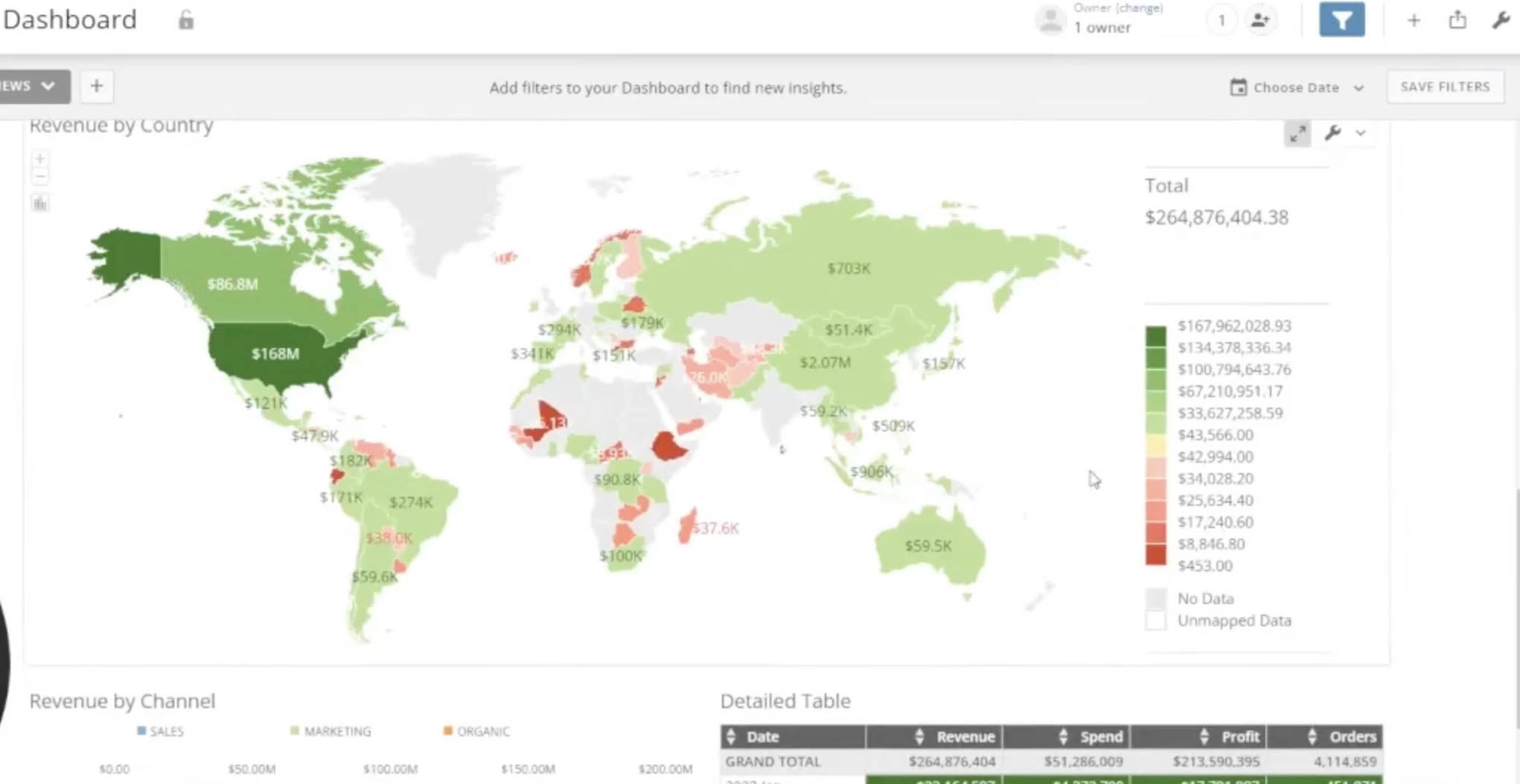
Features like calculated fields, automated color rules, annotations, and projections help surface trends, while customizable dashboards adapt to different teams.
Beyond that, Domo extends into workflows and app-building, so teams can act on insights directly within the platform.
| Pros | Cons |
|
|
Pricing
- Paid plan: Credit-based pricing
Notable Features
- 1,000+ data connectors for integrating multiple data sources
- Drag-and-drop ETL and data transformation tools
- Mobile access for dashboards and collaboration
- Unlimited users with no per-user pricing
What Users Say
Feedback on Domo tends to lean toward ease of use over depth. Many users find it beginner-friendly, with an approachable interface that makes it ideal for smaller datasets or straightforward reporting.
That said, more advanced users often run into limits with customization, flexibility, and scalability. Performance issues, bugs, and higher costs also come up, making it harder to justify for complex use cases.
Who’s It For?
Domo is ideal for enterprises, data teams, and business leaders who need a platform that connects data, insights, and action in one place.
It’s ideal for organizations dealing with fast-moving data that need real-time insights, AI-driven recommendations, and tools to turn data into action.
11. ThoughtSpot: Best for AI-Generated Visual Insights
Ideal for enterprises shifting to search-driven, self-service data exploration
ThoughtSpot is a next-gen data visualization platform built around AI and real-time interactivity.
It introduces “Liveboards,” a dynamic view that updates in real time and lets you explore data freely.
With tools like Spotter and SpotterViz, you can ask questions in natural language and instantly generate dashboards with relevant charts and narrative contexts.
Paired with its flexible visualization engine (Muze), ThoughtSpot is a strong fit for data-heavy teams that want fast, AI-driven insights.
| Pros | Cons |
|
|
Pricing
- Free version available
- Essentials: $24/user/month, billed annually
- Pro: $50/user/month, billed annually
- Enterprise: Custom pricing, per user or per usage
Notable Features
- AI Highlights and Change Analysis for automatic insight surfacing
- Real-time alerts and KPI monitoring via Watchlists
- Embedded analytics for apps, workflows, and tools (e.g., Slack, Teams)
What Users Say
Users often see ThoughtSpot as more search-driven than visualization-focused. Its strength lies in quickly surfacing answers through keyword-style queries.
When it comes to visuals, though, feedback is more mixed. Many feel it lacks the flexibility and depth of tools like Tableau. It also relies heavily on well-structured data, which can limit the experience if not set up properly.
Who’s It For?
ThoughtSpot is especially useful for enterprises working with complex data, where traditional dashboards can feel too rigid or time-consuming to manage.
If your team wants to shift from static reporting to conversational analytics, where anyone can ask questions and get instant answers, ThoughtSpot offers a more forward-looking approach.
12. Visme: Best for Branded Visual Content
Ideal for marketing, sales, HR, and education teams focused on presentations and infographics
Visme is an all-in-one visual content creation platform that combines data visualization with design, branding, and storytelling tools.
Unlike traditional BI platforms, Visme focuses on turning data into visually engaging content such as infographics, presentations, and reports.
It offers thousands of customizable templates, millions of stock assets, drag-and-drop editing, and built-in charts and data widgets.
You can manage colors, fonts, and logos in one place to keep everything on-brand, while interactive and animated visuals help bring reports to life.
Visme AI Designer can also generate ready-to-use visuals from simple prompts, helping you create presentations, infographics, and data visuals faster.
| Pros | Cons |
|
|
Pricing
- Basic: Free
- Starter: $12.25/user/month, billed annually
- Pro: $24.75/user/month, billed annually
- Enterprise: Custom pricing
Notable Features
- Millions of stock photos, icons, and videos
- Built-in analytics to track engagement (views, time spent)
- Integrations with tools like Google Drive, Salesforce, and Dropbox
- Brand Wizard for maintaining a consistent visual identity
What Users Say
Visme is often praised for how easy it makes creating polished visuals, with a drag-and-drop interface and plenty of templates for charts, infographics, and reports.
It’s a natural fit for presentation and marketing use cases where design matters.
However, it’s less suited for deeper analysis. Users note limits in data capabilities, along with some friction around pricing and exports.
Who’s It For?
Visme is ideal for teams and individuals who need to communicate data visually rather than analyze it deeply.
It’s especially valuable for marketing, sales, HR, and education teams that want to create branded, interactive content quickly and consistently.
13. Sisense: Best for Embedded Analytics in Complex Products
Ideal for product teams and enterprises building data-rich, customer-facing applications
Sisense is an enterprise analytics platform purpose-built for embedding business intelligence into products, applications, and workflows.
Its Compose SDK gives development teams the flexibility to integrate analytics deeply into their own UI, matching the look, feel, and interaction patterns of the host product.
Under the hood, Sisense uses an in-memory analytics engine (Elasticube) that ingests and compresses data from multiple sources, enabling fast query performance even on large, complex datasets.
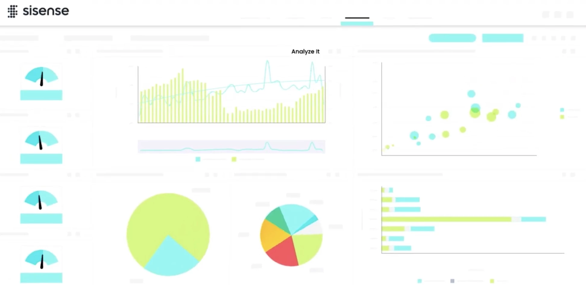
AI-powered features, including Sisense Pulse for automated anomaly detection and natural language querying, allow business users to surface insights without relying on data analysts for every question.
Security and governance features like row-level security, multi-tenancy support, and audit logging make Sisense well-suited to SaaS companies serving multiple customers from a single platform.
| Pros | Cons |
|
|
Pricing
- Launch: $399/month
- Grow: $1,299/month
- Scale: Custom pricing
Notable Features
- Elasticube in-memory data engine for fast analytics on large datasets
- Sisense Pulse for automated insight alerts and anomaly detection
- Row-level security and multi-tenant data isolation
- White-label dashboards and custom branding
What Users Say
Feedback on Sisense is mixed, with some users valuing its embedded analytics and flexible data modeling, especially for SaaS use cases.
However, many criticize its steep learning curve, clunky UX, and reliance on scripting or plugins for customization.
Compared to Power BI or Tableau, it’s often seen as less intuitive, but still useful in specific embedded BI setups.
Who's It For?
Sisense is built for software companies, product teams, and enterprises that need to deliver analytics as a feature inside their own applications.
It's especially well-suited to SaaS platforms serving multiple customers that need isolated, white-labeled analytics with strong governance, high performance, and deep customization.
14. Holistics: Best for Metrics-Driven Dashboards
Ideal for data teams and organizations prioritizing consistency, governance, and scalable reporting
Holistics is a modern BI and data visualization tool built around a strong semantic layer and self-service analytics.
It centralizes metrics and business logic so every report pulls from the same source of truth, making data more consistent and easier to trust.
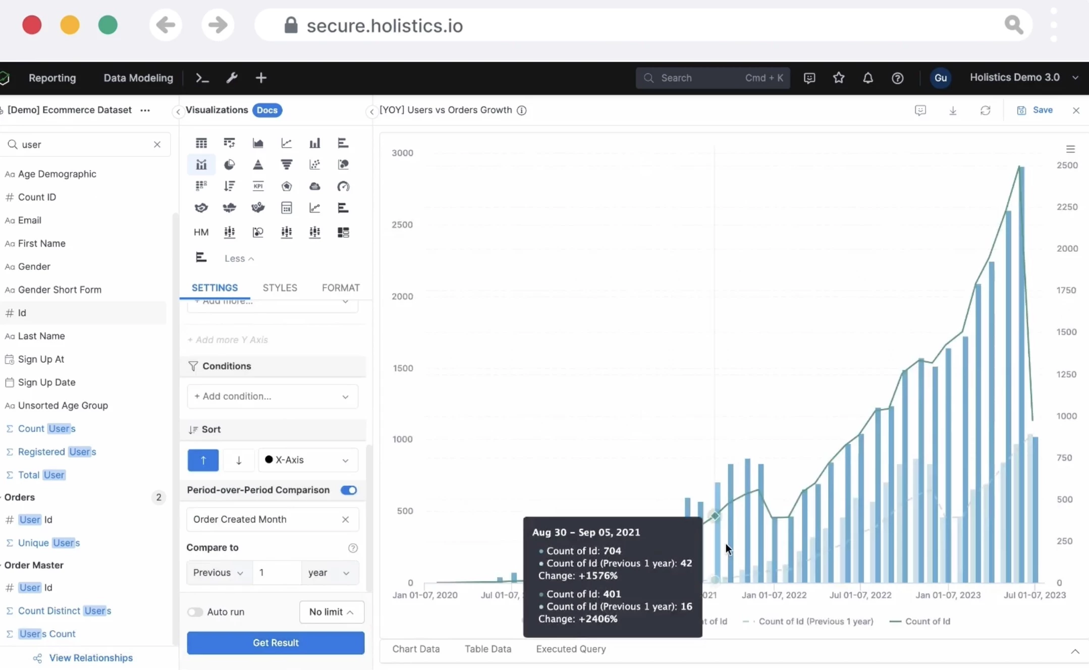
Metrics are defined once and automatically reflected across dashboards, while the visual report builder lets non-technical users create charts with filters, drill-downs, and time comparisons.
Holistics also follows an “analytics-as-code” approach, where models and dashboards are version-controlled through Git.
| Pros | Cons |
|
|
Pricing
- Entry: $800/month (100 reports, first 10 users)
- Standard: $1,000/month (unlimited reports, first 10 users)
- Security Compliance Suite: $2,000/month
- Enterprise: Custom pricing
Notable Features
- Canvas dashboards for building narrative-style reports
- Built-in time-period comparisons for contextual insights
- Support for multiple databases (PostgreSQL, BigQuery, Snowflake, etc.)
What Users Say
With Holistics, users often point to the balance. It brings structured data modeling together with flexible dashboard creation.
Features like “dashboard as code” stand out, giving teams more control over how visuals look and behave.
It may not be the most visually advanced option, but it hits a practical middle ground between rigid BI tools and fully custom setups.
Who’s It For?
Holistics is especially well-suited for data teams that need strong governance and reusable metrics, while still giving business users the freedom to explore data on their own.
If you want to reduce ad hoc requests, keep reports consistent, and use AI without compromising accuracy, Holistics offers a great approach.
15. D3.js: Best for Custom, Code-Driven Data Visualizations
Ideal for developers and data engineers who need full creative and technical control over visualizations
D3.js (Data-Driven Documents) is a JavaScript library for creating bespoke, interactive data visualizations in the browser using SVG, Canvas, and HTML.
Unlike point-and-click BI tools, D3 gives developers complete control over every visual element, from pixel-level positioning to complex animated transitions.
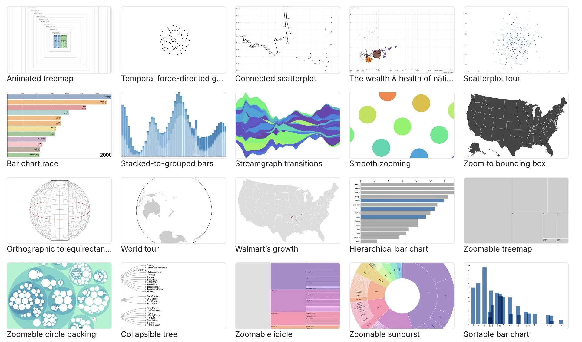
D3 is widely used by leading publications, including The New York Times, The Washington Post, and The Guardian, for data journalism that requires visuals that can't be produced with standard charting tools.
Its flexibility means the only limit is what's possible in the browser.
Because D3 is a library rather than a full application, it integrates naturally with React, Vue, Angular, and other front-end frameworks, making it a natural fit for engineering teams building data-rich web applications.
| Pros | Cons |
|
|
Pricing
- Free (open-source, MIT license)
- Notebook Pro: $22/mo/editor
Notable Features
- Scales and axes for mapping data to visual space
- Geographic projections and GeoJSON support for maps
- Force-directed graph layouts for network visualizations
- Hierarchical and treemap layouts for nested data
What Users Say
Many users find D3.js powerful, but it’s rarely used day-to-day in most data roles.
It stands out for highly custom, interactive visuals, especially in data journalism or web-based storytelling, but can be overkill for standard data visualization.
The trade-off comes up often: people like the creative freedom, but find it time-consuming, low-level, and hard to maintain, especially for teams.
Who's It For?
D3.js is for software engineers, data journalists, and front-end developers who need to produce highly customized, interactive visualizations that no off-the-shelf tool can deliver.
It's the right choice when visualization is the product, such as a custom data journalism piece, a unique interactive feature on a website, or a bespoke chart type embedded in a software application.
How To Choose the Best Data Tool for Your Business
When choosing the right data visualization tool, always consider matching features to how your team actually works with data. Here are some questions to guide you:
- What is your budget? Many strong tools are free, such as Looker Studio, Grafana, and Metabase. Paid tools range from $12/user/month to $2,750/month and up.
- How technical is your team? Non-technical teams do best with Looker Studio, Power BI, Datawrapper, or Visme. SQL-comfortable teams unlock more value from Metabase, Holistics, or Superset.
- What data sources do you use? Microsoft stack teams should start with Power BI. Google ecosystem teams should start with Looker Studio. Warehouse-native teams should look at Holistics, Metabase, or Superset.
- Do you need embedded analytics? If you're building customer-facing dashboards inside your product, prioritize Metabase, Sisense, or Holistics.
- Do you need compliance? For SOC 2, GDPR, or CCPA requirements, verify compliance for your chosen tool. Metabase, Power BI, Tableau, and Datawrapper all have documented compliance programs.
- How large is your team? Tools like Domo (no per-user pricing) and Looker Studio (free) scale well for larger teams. Per-user pricing at Tableau or ThoughtSpot can get expensive fast.
- Will you outgrow it? Lightweight tools like Looker Studio or Datawrapper may not scale to complex analytics. Factor in potential migration costs before committing long-term.
Data Visualization & BI Tools: Best Picks by Use Case
With so many options, the right tool depends on your team's specific situation. Use this decision framework to narrow your options:
Use Case | Best Tools |
Working with zero budget | Looker Studio, Datawrapper, Metabase (OSS), Grafana, Apache Superset, D3.js |
Using Microsoft ecosystem | Power BI |
Using Google Analytics / Ads data | Looker Studio |
Working in journalism or newsroom | Datawrapper, Flourish |
Creating branded marketing visuals | Visme, Flourish |
Building analytics for startups or SaaS | Metabase, Holistics, ThoughtSpot |
Needing enterprise BI platforms | Tableau, Qlik Sense, Domo |
Monitoring real-time systems or ops | Grafana, Domo |
Using AI / natural language queries | ThoughtSpot, Domo, Qlik Sense, Power BI |
Building embedded customer analytics | Metabase, Sisense, Holistics |
Developing custom data visualizations | D3.js, Plotly, Chart.js |
Managing data governance or semantic layers | Holistics, Tableau |
Prioritizing compliance (SOC 2 / GDPR) | Tableau, Power BI, Metabase, Datawrapper |
Supporting non-technical teams | Looker Studio, Power BI, Datawrapper, Visme |
In practice, most teams fail from choosing tools that don’t match their team’s skill level, data complexity, and long-term goals.
Start simple if you’re building momentum and move into more advanced platforms as your data needs grow.
Accessibility Standards for Data Visualizations: What Teams Need to Know
For teams building public dashboards, especially in government, healthcare, or education, WCAG 2.2 conformance is increasingly a procurement requirement.
Enterprise buyers and public-sector clients now routinely include accessibility compliance in their vendor checklists.
WCAG 2.2 outlines four core principles that apply directly to interactive charts and dashboards.
- Perceivable: Don’t rely on color alone. Use labels, patterns, and proper contrast (4.5:1 text, 3:1 UI).
- Operable: Ensure full keyboard navigation for all interactive elements.
- Understandable: Use clear labels and plain language; avoid jargon.
- Robust: Support screen readers and consistent rendering across browsers (SVG + ARIA works best).
Tools with built-in accessibility features, like Datawrapper’s automatic color contrast checks and Flourish’s responsive output, have a structural advantage here.
For custom implementations using D3.js or embedded analytics via Sisense or Metabase, accessibility must be engineered in from the start; retrofitting it later is significantly more costly.
![]()
Our team ranks agencies worldwide to help you find a qualified partner. Visit our Agency Directory for the Top Digital Marketing Agencies, as well as:
- Top Marketing Analytics Agencies
- Top Big Data Companies
- Top New York Marketing Analytics Companies
- Top California Marketing Analytics Companies
- Top Digital Advertising Agencies
And don’t miss our Awards section, where we celebrate the most innovative projects in design — from logo and app design to print and packaging.
Data Visualization Tools FAQs
1. What are data visualization tools used for?
Data visualization tools turn raw data into charts, dashboards, and visual reports, making it easier to identify patterns, trends, and insights without needing deep technical analysis.
They are used across marketing, finance, operations, product, and executive teams.
2. Which data visualization tool is best for beginners?
Microsoft Power BI and Google Looker Studio are the most beginner-friendly options, with drag-and-drop interfaces and ready-made templates.
Datawrapper is also excellent for beginners focused on creating charts for publication or presentations.
3. What are the best free data visualization tools?
- For business dashboards: Google Looker Studio (completely free). For publish-ready charts: Datawrapper (generous free tier).
- For open-source BI: Metabase (free self-hosted) or Apache Superset (free).
- For developers: D3.js, Grafana, and Chart.js (all free/open-source).
4. Do data visualization tools require coding skills?
Not always. Most tools covered here, including Tableau, Power BI, Looker Studio, Datawrapper, Visme, and Flourish, allow users to create visuals without coding.
However, developer-oriented tools like D3.js, Grafana, and Apache Superset do require coding. Metabase sits in between: no-code for most users, SQL-optional for advanced queries.
5. What are the best data visualization tools for marketers?
Google Looker Studio is ideal for marketers using Google Analytics and Ads data. Visme and Flourish excel for branded, shareable visual content like infographics and presentations.
Datawrapper is great for clean, publish-ready charts. For marketing teams needing deeper analytics, Power BI or Domo are strong options.
6. Which tools are best for embedded analytics?
Metabase, Sisense, Holistics, and Domo are the strongest options for embedding dashboards into customer-facing products or SaaS applications.
All four support white-labeling and customizable embed code. Tableau and Power BI also offer embedded analytics at the enterprise tier.
7. What is the difference between Looker and Looker Studio?
Looker Studio (formerly Google Data Studio) is a free, user-friendly dashboard tool focused on marketers and SMBs, especially within the Google ecosystem. Looker is a separate, enterprise-grade governed BI platform acquired by Google in 2019.
Looker uses a proprietary modeling language (LookML) and is designed for data engineering teams building governed analytics at scale. The two products share a brand but serve very different audiences.
8. Is Tableau better than Power BI for small teams?
For small teams, Power BI is usually the better starting point: it has a meaningful free tier, lower per-user pricing, and native integration with Microsoft 365 tools most small teams already use.
Tableau's strengths, including superior visual storytelling, deeper analytics, and flexible deployment, typically matter more at scale.
If budget is a primary constraint, start with Power BI or Looker Studio and graduate to Tableau as your team's analytics needs grow.
9. What are the best open-source data visualization tools?
The strongest open-source options are:
- Metabase: Best for self-service BI,
- Apache Superset: Best for SQL-savvy teams and warehouse-native analytics,
- Grafana: Best for real-time monitoring
- D3.js: Best for developers building custom visualizations.
All are free to self-host.
10. Which tools support natural language queries (AI-driven analytics)?
ThoughtSpot leads in this category, as natural language querying is its core feature.
Domo, Qlik Sense (Insight Advisor), Power BI (Copilot via Microsoft Fabric), and Tableau (Tableau Next/Agentforce) all offer substantial NLQ and AI capabilities.
Metabase's Metabot brings NLQ to open-source BI, though it requires a paid plan.