The healthcare industry is full of complex information that can be overwhelming for professionals and patients alike. Healthcare infographics bridge this gap, transforming dense data into visually engaging, easy-to-understand formats. When done right, they educate, persuade, and even drive policy changes.
An effective healthcare infographic is clear, accurate, and visually pleasing, ultimately urging engagement. Below, we explore five outstanding examples of healthcare infographics, analyzing their design choices and why they work so well in simplifying vital medical information.
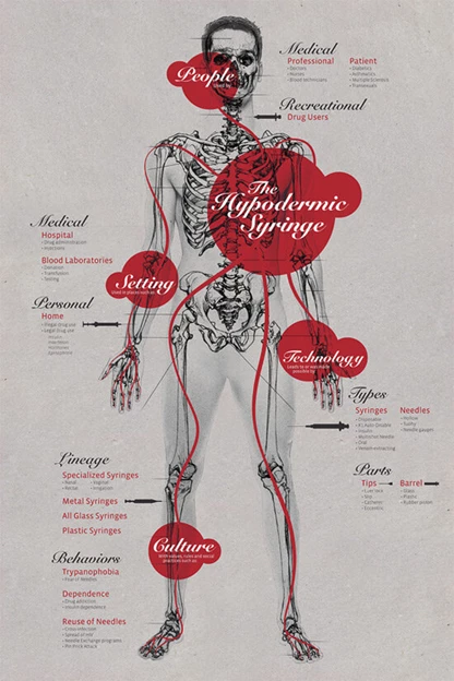
1. The Hypodermic Syringe by Mariana Silva
Standout Features:
- Anatomical illustration with scientific elements
- Contrasting red highlights for emphasis
- Historical and cultural context of medical tools
At first glance, this infographic looks like a page torn from an old anatomy textbook: detailed, precise, and authoritative. But that’s precisely why it works. The anatomical illustration grounds the design in scientific realism, signaling that what you’re about to read isn’t just interesting, it’s also factual. This is a visual that earns trust before you’ve even processed the information.
Then, there’s the use of bold red highlights. In a grayscale-heavy design, these pops of color act like flashing beacons, guiding your eye to the most critical points. But they’re not just aesthetic choices; they mirror the real-world presence of blood and medical urgency, reinforcing the subject matter. It’s a perfect example of color psychology done right.
Finally, this infographic doesn’t just explain what a hypodermic syringe is; it tells a story about its impact. It explores the medical, cultural, and even behavioral implications of syringes, connecting the tool to everything from hospitals to addiction. That’s what makes this more than just an infographic. It’s a narrative that compels you to see a simple medical device in an entirely new light.
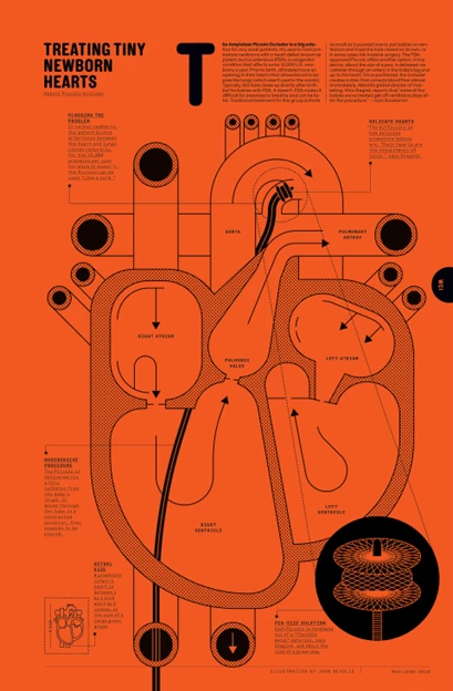
2. The Piccolo Occluder by John Devolle
Standout Features:
- Bold, high-contrast color scheme
- Minimalist yet technical line art
- Organized typographic hierarchy
In a sea of sterile, clinical visuals, The Piccolo Occluder embraces a high-contrast, almost industrial aesthetic. It makes a bold first impression, and that’s no accident. The striking orange background is both eye-catching and sparks engagement. It feels urgent, modern, and, most importantly, designed to be remembered.
The minimalist yet precise line art is where form meets function. It strips away unnecessary clutter while keeping the medical illustration highly detailed, making it easy for non-specialists to follow along. There’s a delicate balance between simplicity and sophistication, and this design walks that line masterfully.
Finally, the typographic hierarchy ensures that even the most medically dense information feels digestible. Large headers draw you in, subheadings break down key points, and body text delivers the details. The result? A complex medical procedure made surprisingly accessible. This is what great design does: it turns difficult concepts into intuitive visuals that stick.
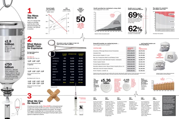
3. Why is Health Care So Expensive by Heather Jones
Standout Features:
- Hard numbers for powerful narration
- Convincing real-world imagery
- Sharp typography and clear section breaks
Healthcare costs are one of those topics everyone has an opinion on, but few truly understand. This infographic cuts through the noise by grounding its argument in hard data. Instead of vague claims, it presents cold, hard numbers — from drug prices to hospital costs, forcing the reader to confront the reality of the system.
The integration of real-world imagery is a brilliant move. Instead of generic bar graphs, you see syringes, pills, and medical tools, visually tying abstract costs to everyday medical necessities. It’s one thing to say that the U.S. spends billions on healthcare; it’s another to show it in a way that makes it feel real.
The clean layout and strong typography seal the deal. Bold numerals, clear section breaks, and intentional whitespace make the information digestible. There’s no excess or filler, just punchy, well-structured storytelling backed by data. If knowledge is power, this infographic arms its audience well.
4. The Ways We Die Early by TOM Agency
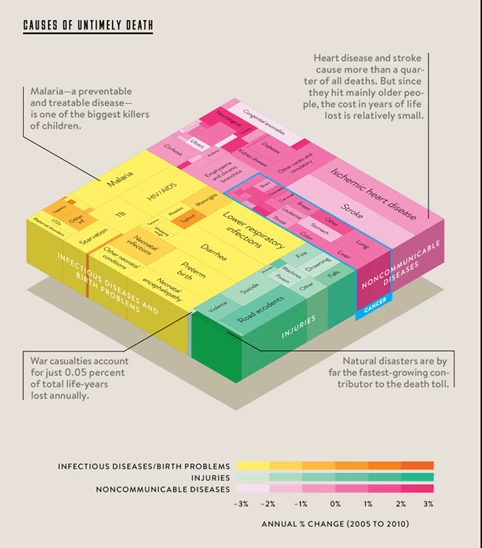
Standout Features:
- 3D block visualization
- Color-coded categories for clarity
- Embedded contextual insights
This healthcare infographic takes a morbidly complex subject—causes of early death—and turns it into something immediately understandable. Instead of overwhelming the audience with raw statistics, it stacks the data into a 3D block structure, visually proportioning different causes of death by their impact. The result? A design that’s as visually compelling as it is informative.
The color-coded segmentation is a smart move. By dividing infectious diseases, non-communicable diseases, injuries, and other factors into distinct color groups, the design ensures that viewers can grasp the major trends in mortality even at a glance. This is especially powerful when paired with the subtle gradient scale at the bottom, illustrating how these causes have changed over time.
What makes this infographic particularly compelling, though, is how it weaves in key takeaways directly within the visual. Instead of relying on a separate legend or footnotes, the most striking insights (like the fact that war casualties account for just 0.05% of total life-years lost annually) are built into the layout itself. This keeps the audience engaged without requiring them to decode the data.
No wonder Bill Gates called this his favorite infographic; it’s a masterclass in data storytelling. Through clear and impactful visualization, it demonstrates that great design isn’t just about aesthetics; it’s about shifting perspectives.
5. Covid Deadliest Chart by Statista
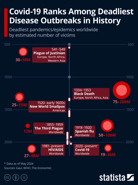
Standout Features:
- Timeline-based disease outbreak visualization
- Proportional red circles
- Clean and data-focused design
Some infographics educate, others shock. This one does both. The timeline format is a masterstroke of simplicity, showing at a glance how COVID-19 compares to history’s deadliest outbreaks. No long explanations are needed; the design itself tells the story.
The proportional red circles add another layer of instant understanding. Rather than listing numbers, the infographic scales each outbreak visually, making it immediately obvious how the Black Death dwarfs everything else. This is data storytelling done right: it transforms statistics into something visceral.
What’s most effective about this infographic, though, is its uncompromising clarity. There’s no excess decoration, no unnecessary embellishments — just cold, hard facts, elegantly arranged. And in a world where misinformation is rampant, a data-driven, fact-first approach like this is exactly what we need.
What Makes a Good Healthcare Infographic?
A well-designed healthcare infographic does more than just display data; it transforms complex medical information into an easy-to-understand, engaging, and impactful format. Whether educating patients, informing healthcare professionals, or raising awareness about public health issues, a strong infographic follows these key principles:
1. Simplify Complex Information
Healthcare topics are often packed with technical jargon, statistics, and intricate medical concepts. Well-crafted infographics distill this information into concise, digestible sections using clear language and visuals that communicate the core message at a glance. Think of it as translating medical complexity into something anyone, even without a medical background, can grasp in seconds.
2. Use Data Visualization Effectively
Numbers alone rarely make an impact unless presented well. A good infographic presents figures and makes them meaningful. Whether it’s:
- Bar charts
- Pie graphs
- Heat maps
- Timelines
Every visual element should enhance comprehension rather than overload the viewer. The goal is to turn raw data into an intuitive and immediate takeaway rather than something that requires extra effort to decipher.
3. Follow a Clear Narrative
Facts on their own can feel disjointed, but they become memorable when woven into a structured story. The most effective healthcare infographics go beyond information dissemination by telling a compelling story that guides the viewer from problem to insight to conclusion. Whether illustrating a historical trend in disease outbreaks or breaking down healthcare costs, a strong narrative flow keeps the audience engaged and ensures the information sticks.
4. Incorporate Strong Design Principles
A healthcare infographic is only as effective as its design clarity. The best ones strike a balance between visual appeal and functionality by leveraging:
- Typography that is easy to read and differentiates between headers, subheads, and body text
- Color contrast that enhances readability and directs attention to key points
- A clean layout with intentional white space that prevents clutter and makes the information easy to scan
- Consistent iconography and imagery that support the topic without distracting from the main message
Explore mental health infographics for more inspiration on simplifying complex medical data with powerful visuals.
How to Make a Healthcare Infographic
Creating a healthcare infographic that resonates with an audience isn’t just about making it look good; it’s about clarity, accuracy, and engagement. Want to create an infographic design that sticks? Follow these key steps:
1. Start with Bulletproof Data
Credibility is everything in healthcare. Unlike marketing infographics that allow for creative liberties, medical and healthcare data must be rooted in verifiable sources. Use trusted references like:
- World Health Organization (WHO)
- Centers for Disease Control and Prevention (CDC)
- National Institutes of Health (NIH)
- Peer-reviewed medical journals
- Government healthcare databases
Not only does using reliable data enhance trust, but it also protects your brand from misinformation risks.
2. Choose a Format That Fits Your Message
The structure of your infographic should align with the type of information you’re presenting. Some formats work better than others depending on the message:
- Timelines: Ideal for tracking disease outbreaks, medical advancements, or policy changes over time.
- Comparisons: Perfect for showing cost differences, treatment effectiveness, or global health disparities.
- Process Diagrams: Best suited for explaining step-by-step medical procedures, patient care protocols, or how a treatment works.
- By-the-Numbers Layouts: Great for summarizing large datasets in a visually engaging way, such as healthcare spending or disease prevalence.
Choosing the proper format helps reinforce the story behind the data, making it easier for the audience to absorb and retain the information.
3. Make It Scannable
The average viewer spends less than 10 seconds deciding whether to engage with an infographic. Your audience will move on if key information doesn’t pop out immediately. Here’s how to make your infographic scannable and engaging:
- Use large, bold numbers for impactful statistics
- Break content into sections with clear headings
- Employ contrasting colors to separate key information
- Limit text-heavy explanations — let visuals do the talking
A strong visual hierarchy ensures that readers don’t have to hunt for the main takeaway; they should see it right away.
4. Use Visuals Strategically
Not every infographic needs flashy graphics. Every image, chart, and icon should serve a clear purpose. Ask yourself:
- Does this visual aid understanding, or is it just decoration?
- Could this text be replaced with an image or symbol?
- Is the color palette enhancing clarity or creating confusion?
For example, using proportional circles or bar charts to represent disease impact instantly clarifies data comparisons.
On the other hand, an unnecessary stock photo of a doctor might add visual clutter without contributing meaningfully. Every design choice should help clarify, not complicate.
5. Test for Clarity
A simple but effective rule: if someone can’t grasp the main point in five seconds, the design needs work. Before publishing, do a quick usability test:
- Show the infographic to someone unfamiliar with the topic. Can they summarize the key takeaway instantly?
- Check for cognitive overload. Are there too many competing elements? If so, simplify.
- Assess readability. Is the text immediately legible? Do colors and contrast make key details easy to spot?
If your infographic passes these tests, it’s ready to inform and engage.
Healthcare Infographics: The Bottom Line
The best healthcare infographics don’t just inform; they reframe how we see the world. They transform overwhelming data, statistics, or medical jargon into clear, memorable, and actionable narratives. Whether breaking down a complex procedure, exposing industry flaws, or making a public health crisis impossible to ignore, the right infographic turns cold data into a story that sticks.
And that’s the real power of design. Numbers alone won’t change minds, but the right narrative will. An excellent infographic doesn’t just show you the facts. It makes you see what they mean...and why they matter.
Healthcare Infographics: FAQ
1. What is a healthcare infographic?
A healthcare infographic is a visual representation of medical or health-related data designed to simplify complex information. It can illustrate disease trends, healthcare costs, treatment processes, or public health statistics in an easy-to-understand and visually engaging way.
2. Why are healthcare infographics important?
Healthcare infographics help make technical medical information more accessible to both professionals and the general public. They improve patient education, raise awareness about health issues, and enhance engagement by breaking down dense data into clear, scannable visuals.
3. What makes a good healthcare infographic?
A successful healthcare infographic should:
- Simplify complex medical data without losing accuracy
- Use effective data visualization (charts, graphs, icons) to enhance understanding
- Follow a clear narrative that guides the viewer from problem to solution
- Apply strong design principles like color contrast, typography, and layout for readability
4. What tools can I use to create a healthcare infographic?
Popular tools for designing healthcare infographics include:
- Canva: Great for beginners with easy-to-use templates
- Adobe Illustrator: Ideal for high-quality, custom designs
- Piktochart: Best for creating professional-looking infographics with data integration