A mental health infographic does what long-winded reports and endless articles can’t — it makes the conversation around mental health accessible, digestible, and impossible to ignore. These visual tools cut straight to the point by turning complex mental health data into something people can use.
Mental health infographics are impactful because they cater to the way many people consume information today: quickly skimming, scrolling, and swiping. Infographics bridge the gap between information overload and digestible insight. In other words, they make complex topics relatable, sharable, and memorable.
In this article, we’re spotlighting the top examples of mental health infographics for 2026. They’re smart, visually engaging designs that educate and inspire action.
1. Neurodiversity Statistics by Chris Van Rooyen
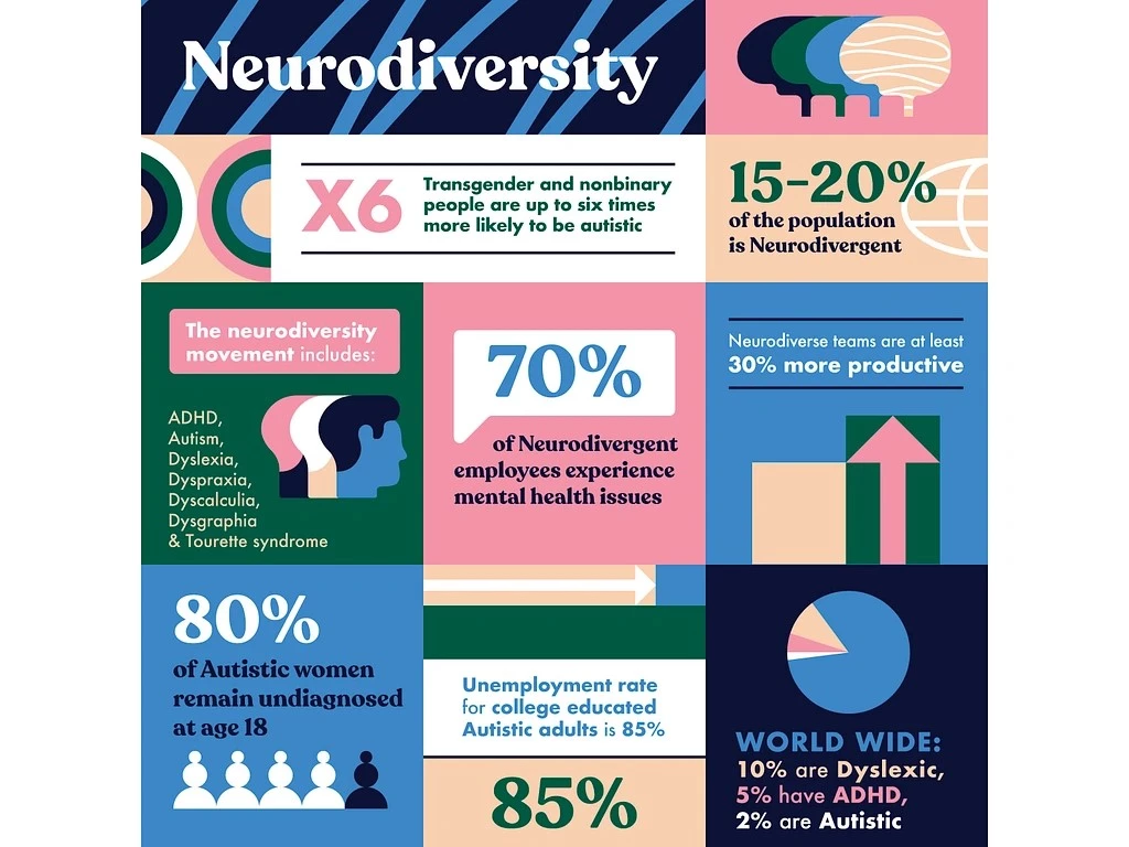
This infographic on mental health awareness turns overlooked truths into a visual narrative that’s impossible to ignore. The design cuts through societal misconceptions to reveal critical truths about neurodivergent individuals and the unique challenges they face.
With vibrant colors, clean typography, and a structured layout, it transforms complex statistics into a digestible, thought-provoking narrative. It’s less a wall of data and more a visual manifesto, designed to challenge biases and spark meaningful conversations about mental health and inclusion.
Key Feature: Bold visuals paired with hard-hitting stats that clarify the reality of neurodivergence without losing the audience's attention.
Why This Works: People absorb visuals faster than text, and this design keeps focus on the numbers that matter most — helping the message hit home without losing the audience.
2. Let’s End the Stigma by Pictoline
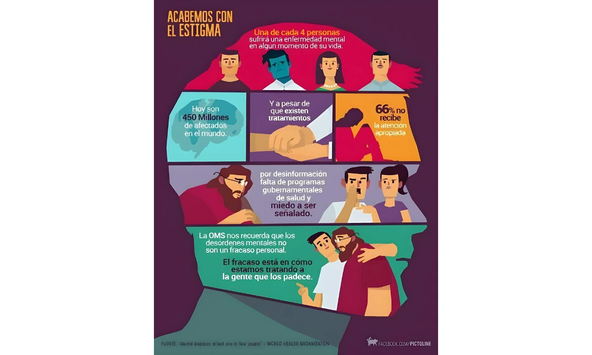
Diverse imagery and icons take center stage in this infographic, breaking down stereotypes around mental health. It features visuals of various ethnicities and cultural representations, paired with approachable messaging.
The example from Pictoline cleverly uses visual sequencing to guide the viewer through a structured story arc: normalize the issue, expose the barriers, and flip the script — mental illness isn’t failure; failing to support those who suffer is.
Brands looking to engage with social issues should take note of this narrative approach to infographic design. Instead of dumping raw statistics, try to focus on:
- Humanizing the data. Show the faces and experiences behind the numbers.
- Creating a structured flow. Frame the problem, highlight the barriers, and offer a reframing or solution.
- Using color psychology. The blend of warm and cool tones here subtly balances urgency with reassurance.
- Making the audience feel seen – Representation matters. If people can see themselves in the issue, they’ll engage emotionally, not just intellectually.
Key Feature: Bright, inclusive visuals with a welcoming aesthetic.
Why This Works: Mental health is universal, and this design ensures everyone sees themselves in the conversation. The focus on cultural inclusivity builds trust and relatability.
3. How To Overcome America’s Employee Engagement Epidemic by Avalaunch Media
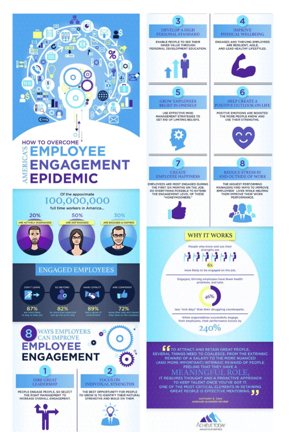
"How to Overcome America's Employee Engagement Epidemic" reframes a workplace crisis into a structured, solutions-driven narrative.
Clean design, bold stats, and actionable advice make an ideal mental health awareness infographic for HR teams and leaders looking to inspire change. The light blue and purple tones strike the right balance — professional enough for the boardroom, and approachable enough to spark real engagement.
Key Feature: A clever juxtaposition of striking visuals and impactful statistics, emphasizing the scale of disengagement while subtly nudging leaders toward practical solutions.
Why This Works: This skips the hand-wringing and goes straight to solutions. It frames disengagement not as a disaster, but as a fixable challenge, backed by clear steps and hard numbers. The design pushes action, with just enough data to make you care and just enough clarity to make you act.
4. How To Be the Master of Your Smartphone by Scriberia
-content-large-webp.webp)
"How to Be the Master of Your Smartphone" takes the chaos of our digital habits and smacks it with a dose of reality, wrapped in bright yellow confidence.
Its hand-drawn illustrations feel like a friend gently nudging you toward better choices, while the clear, no-frills advice cuts straight to the point. It’s a rare combination: clever without being preachy, making it a refreshingly effective guide to reclaiming your attention span.
Key Feature: Hand-drawn visuals that don’t take themselves too seriously, paired with crisp advice that skips the fluff. Each section lands, simplifying smartphone detox into steps you might actually follow.
Why This Works: The mixed-media approach lowers your defenses, making big truths easier to swallow. Instead of guilt-tripping you about screen time, it sneaks in solutions that feel obvious once you see them — like all good advice should.
Discover how to effectively use social media to transform healthcare communication and patient engagement.
5. Keeping Your Brain Active by Hot Butter Studio
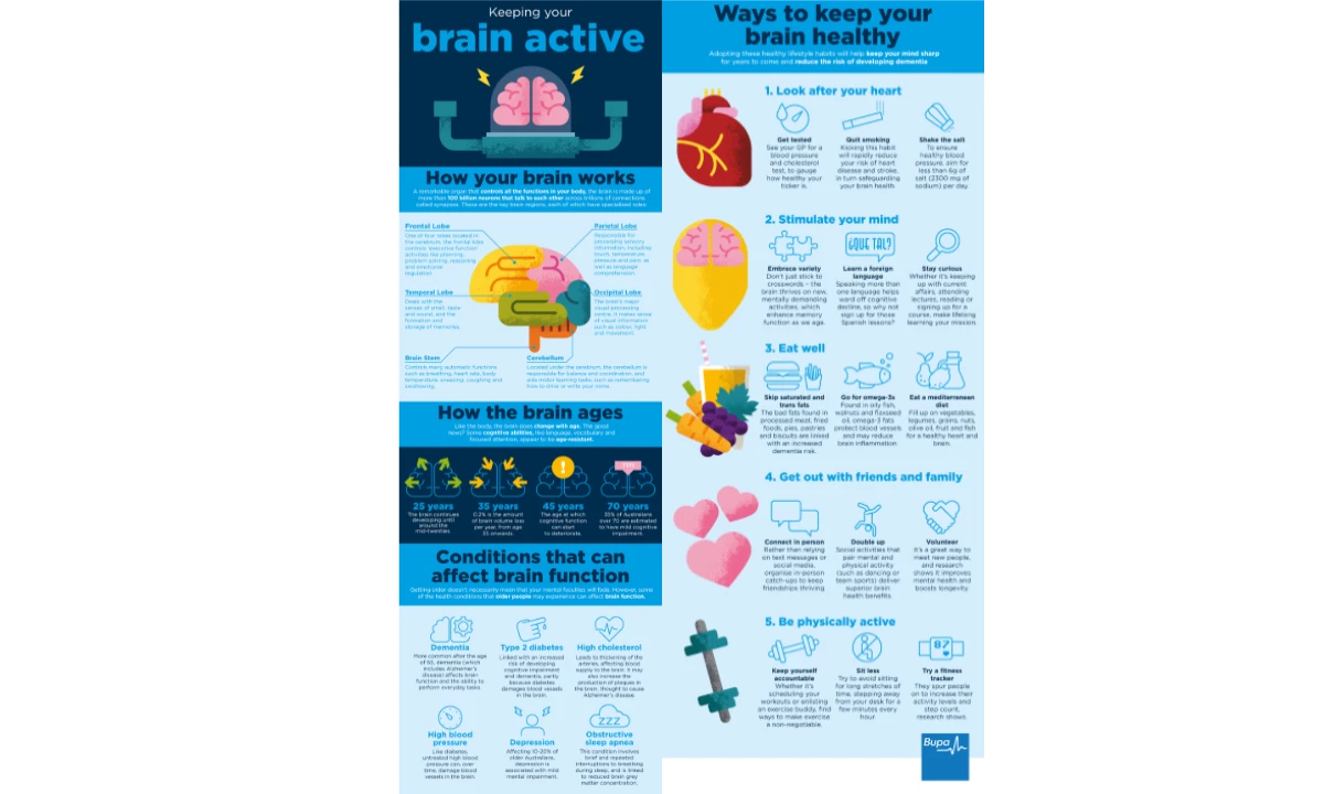
This infographic nails the art of clarity. It takes the insanely complex topic of brain health and breaks it into bite-sized, actionable insights. It takes each section in focus — what your brain does, how it ages, and how to keep it sharp. No fluff, no jargon — just straight facts delivered with clean visuals and smart design.
Key Feature: Color-coded sections paired with custom illustrations, making dense topics like brain anatomy, aging, and cognitive health both approachable and memorable.
Why This Works: It’s science without the jargon — accessible, visual, and actionable. By distilling complex brain chemistry into relatable takeaways, this infographic transforms "what" into "why it matters." It grabs your attention and keeps it long enough to make you care about your mental health.
6. The Science Behind Exercise & Your Brain by MIT RecSports
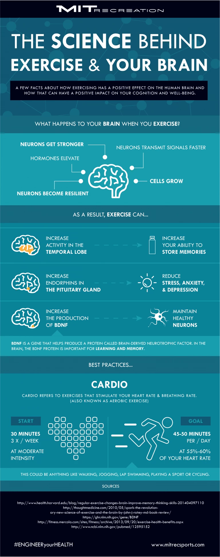
This example takes the complex interplay between exercise and brain health and makes it digestible, engaging, and actionable. Bold typography and crisp visuals do the heavy lifting here, delivering clarity without overcomplicating things.
Furthermore, it’s an infographic that informs and motivates. Clear goals and actionable tips tap directly into the audience’s drive to level up their mental and physical health. It nails the sweet spot between education and motivation with science-backed stats and practical recommendations.
Key Features: Organized sections break down the science behind exercise and its impact on the brain in a logical progression. Diagrammatic illustrations in simple, brain-centric icons also help depict concepts like neuron growth and hormone elevation, making neuroscience accessible.
Why This Works: This infographic reframes exercise as a brain hack — fun, visual, and packed with undeniable benefits. Most importantly, it leaves you with clear takeaways — what to do and how to do it. It turns a chore into a choice, motivating you to show up for your body and your brain.
7. The 12 Stages of Burnout by The Present Psychologist
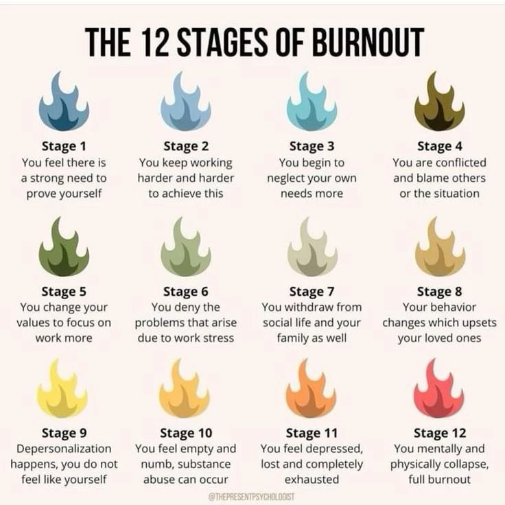
This infographic walks us through the creeping progression of burnout — from an innocent need to prove yourself to the devastating collapse of physical and mental health.
Using a series of flaming icons that escalate in intensity, it visually captures how burnout builds over time, making it easy to identify the warning signs at every stage.
Key Feature: A simple yet powerful visual progression that mirrors the worsening effects of burnout, accompanied by clear, relatable descriptions for each stage.
Why This Works: Burnout often feels intangible until it’s too late. This infographic makes the invisible visible, offering a step-by-step breakdown that encourages early intervention. It’s not just informative; it’s a wake-up call to prioritize balance and self-care.
8. How To Get a Good Night’s Sleep by MilkWhale
-content-large-webp.webp)
"How to Get a Good Night’s Sleep" turns one of the most overlooked pillars of mental health into a step-by-step action plan. The calming color palette and approachable illustrations make the information not just easy to follow, but oddly comforting — a nudge toward self-care wrapped in a design that’s both engaging and unpretentious.
Key Feature: A logical, step-by-step breakdown that moves from creating a sleep-friendly environment to actionable bedtime habits.
Why This Works: The step-by-step format taps into how humans naturally tackle change — through small, digestible actions that build momentum over time. The visuals make the steps relatable and disarmingly simple.
Instead of lecturing you about sleep, it shows you how easy and achievable better rest can be. It transforms a universal struggle into a personal roadmap, one practical tweak at a time.
9. Stress Eat Marketers by Avalaunch Media
-content-large-webp.webp)
This infographic on mental health tells a sobering story: the alarming levels of stress plaguing marketing professionals. Marketing’s dirty secret is laid bare, like 80% reporting they’re overworked or the 28% in creative services feeling the most career regret, through bold visuals and gut-punch stats.
This infographic turns the often-ignored stress of marketing into a story that demands attention with clear, organized insights.
Key Features: A bold pie chart with clean, easy-to-grasp percentages that exposes the cracks in the industry. Contrasting colors and clean segmentation also make it easy to compare data.
Why This Works: It doesn’t sugarcoat the issue. The stark visuals and hard stats force you to confront the reality that marketing is a high-pressure industry that eats away at its professionals, and without systemic change, stress will remain its most consistent deliverable.
10. How To Recognize Anxiety in Yourself and Others by Tutor Doc
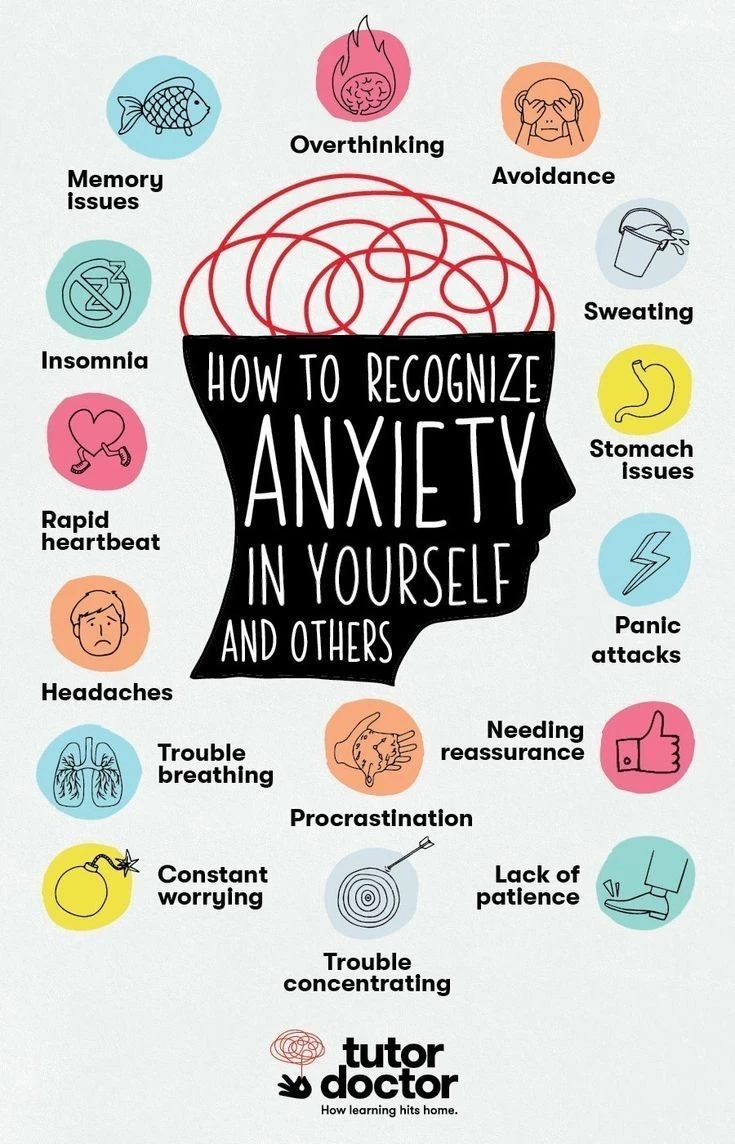
This infographic delivers a clear and compassionate guide to the complex topic of anxiety, breaking it down into visual cues and concise labels. The use of a humanized sketch with surrounding symptoms creates immediate relatability. Its tone is empathetic but actionable, guiding viewers to recognize anxiety in themselves or others.
Key Features: Color-coded symptoms use muted but distinct colors to categorize them. The informal, handwritten font adds an empathetic, conversational tone that resonates with the viewer.
Why This Works: Anxiety can feel overwhelming, but the playful icons and conversational tone help normalize discussions about mental health, fostering understanding and encouraging individuals to seek support or offer it to others.
Key Features of an Effective Mental Health Infographic
We live in an age where attention spans rival that of a goldfish, and the mental health crisis demands solutions that grab attention, fast. An infographic about mental health is a tool that combines the power of storytelling with the immediacy of visual impact. These infographics are not just pretty designs; they’re the antidote to information overload.
Creating an effective mental health awareness infographic requires a delicate balance of art and science. It should present vital data in a visually compelling way that resonates emotionally, while also ensuring accessibility for all audiences. Let’s get into the key elements transforming an infographic from simply informative to truly impactful.
1. Compelling Data and Statistics
Numbers don’t lie — but they can be ignored if they’re buried in text. The best infographics about mental health spotlight credible, relevant data to build trust and engagement.
The key? Choose data that hits home and connects emotionally with your audience. Pair that with a clear call to action, like seeking therapy or advocating for mental health policies, and you’ve got a tool that doesn’t just inform but drives change.
2. Creative Visuals and Layouts
Great design isn’t just about looking good, but about making people feel something. Effective mental health infographics leverage design elements like color psychology and iconography to set the tone.
Calming palettes — think soft blues and greens — can create a sense of safety and trust, while minimalist icons keep the design clean and focused.
Consider an infographic on anxiety: using swirling lines and fragmented shapes might evoke an overwhelming sensation, making the message relatable. On the flip side, clear, structured layouts can convey solutions and coping strategies, providing a sense of clarity and hope. The goal is to reflect the topic while making it approachable visually.
And if design isn’t your strong suit, worry not. Professional infographic agencies exist for a reason. Their expertise lies in translating complex topics into striking, persuasive visuals that inform and make an impact.
3. Data Visualization Tools
Data visualization tools make raw data clear and powerful. They turn numbers into charts, graphs, and maps that tell a story. Complex mental health stats become simple truths — easy to grasp and hard to forget.
Clear visuals boost comprehension, build trust, and drive engagement. The right tool ensures your design is both accurate and visually compelling, creating a stronger connection with your audience.
4. Accessibility and Inclusivity Features
If your infographic isn’t accessible, it’s missing the mark. Mental health affects everyone, and your design should reflect that.
Start with readable fonts — sans serif styles in sizes large enough for all demographics. Ensure high contrast between text and background colors to support viewers with visual impairments.
Language matters, too. Simplified, jargon-free phrasing widens your reach, making the information digestible for a general audience.
And don’t forget inclusivity: use diverse imagery and examples that resonate across cultures and communities. An effective infographic about mental health isn’t just informative — it’s a universal bridge that connects people to the support and solutions they need.
Mental Health Infographics: The Bottom Line
Mental health infographics aren’t just pretty visuals — they’re vehicles for change. They transform complex data into digestible, impactful stories that inform, inspire, and, most importantly, resonate.
Whether it’s helping someone understand the signs of depression, tackling workplace stress, or a primer for non-profit organizations, these designs are proof that visuals can do what words alone often can’t: stick.
So, what’s the play here? Share these infographics. Use them as templates. Better yet, create your own. Armed with the examples and tools highlighted here, you have the power to make mental health conversations clearer, louder, and harder to ignore.
The world doesn’t need more information — it needs better communication. These infographics are a step in the right direction.
Mental Health Infographics FAQs
1. Why are infographics so effective for mental health awareness?
Infographics simplify complex topics, making information more accessible and memorable. They engage both the logical and emotional parts of the brain, driving home critical points in ways that text-heavy content often fails to do.
2. How can I create my own mental health infographic?
Use tools like Canva, Piktochart, or Adobe Express to design infographics. Start with a clear objective and focus on clean, easy-to-read visuals. Incorporate trustworthy data from credible sources to maintain accuracy.
3. What are some design best practices for mental health infographics?
Stick to calming color palettes, use inclusive visuals, and avoid overly technical jargon. Ensure the text is readable, use high-quality icons or illustrations, and include actionable takeaways that guide viewers toward the next steps or additional resources.