Instagram infographics are visually engaging posts that combine text, data, and design to communicate information in a concise, impactful way. Perfect for tips, stats, or step-by-step guides, infographics thrive on Instagram's visual-first platform since they are easy on the eyes, hard to ignore, and are built to feed our endless scrolling addiction.
In 2026, Instagram infographics are embracing bolder visuals, focused narratives, and striking colors — all designed to grab attention and keep viewers engaged. After all, Instagram is where bold designs, clever messaging, and a touch of drama get rewarded with double taps and shares.
Let’s unpack the seven most innovative examples of Instagram infographics that turn heads and start conversations. These examples double as Instagram infographic templates you can follow to boost your brand's engagement. If your message isn’t memorable yet, it’s about to be.
1. Taylor Swift Album Sales by Lemonly
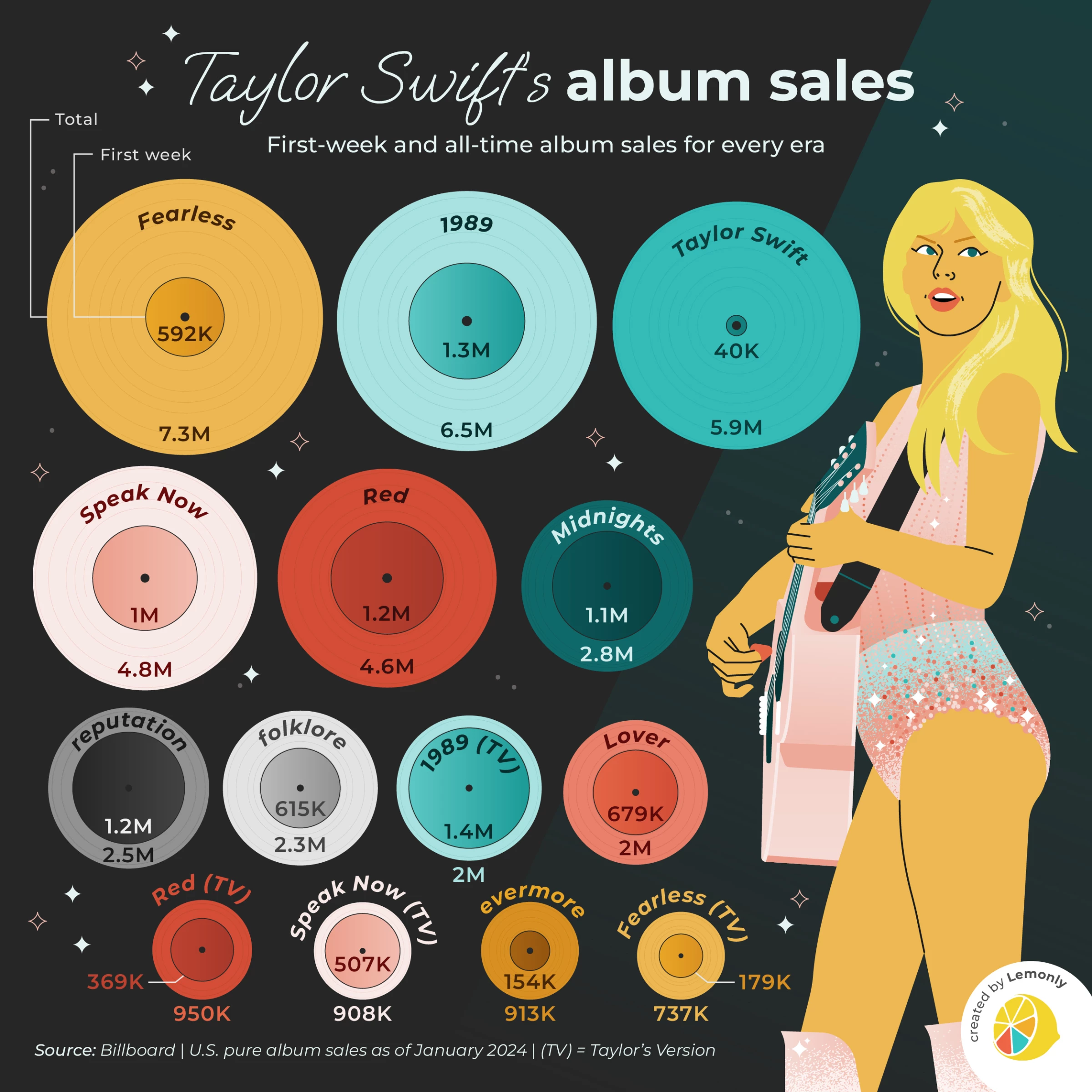
Data, but make it irresistible. A statistical infographic takes numbers and figures and turns them into a visual story people want to look at. Think bold charts, clean numbers, and just enough context to make the stats hit hard. The art is not in the data dump but in your ability to frame it so that it informs, engages, and maybe even sparks a share or two.
Lemonly's example spins Taylor Swift’s album sales into a visual masterpiece — turning stats into storylines and raw data into visual gold. Each record-shaped graphic captures the pop star’s eras with clarity and flair using bar graphs, pie charts, percentages, and more. Why do they work? People trust numbers, especially when they’re easy to digest.
Pro Tip: Highlight your key number in a larger, contrasting font to make it pop on the feed.
2. How to Become the Next Beatles by Scriberia
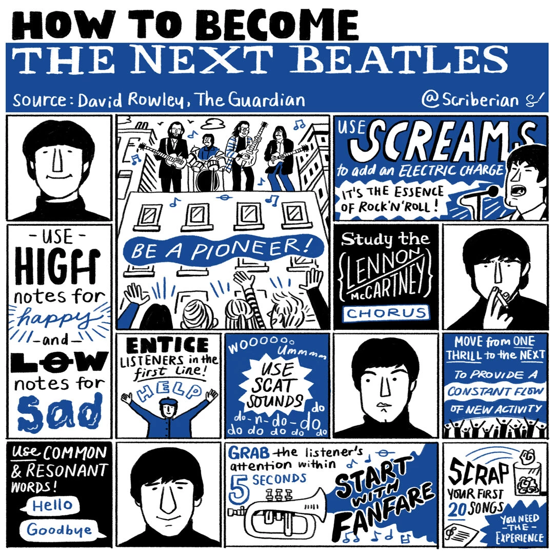
Process infographics explain workflows, sequences, or timelines with visual cues like arrows or numbered steps, making even complicated tasks feel manageable.
Scriberia's example transforms the mythical "how to become the next Beatles" process into something absurdly entertaining yet surprisingly actionable. With its quirky hand-drawn style and punchy, attention-grabbing steps, it’s designed to stop the scroll. Blending humor with insight, this infographic turns the process into play.
Pro Tip: If the process or workflow is lengthy, use carousels to break the process into one step per slide. This format keeps the audience swiping while ensuring they grasp each step without being overwhelmed.
3. 12 Lessons from Nike to Help Brand Awareness by Toast Design UK
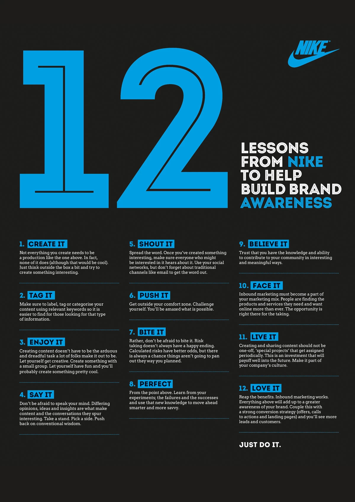
Another infographic Instagram loves is the easily shareable list infographic. It uses numbered steps, bullet points, or rankings paired with visuals to make each point stand out. On Instagram, it’s the go-to format for everything from “Top 5 Tips” to “10 Mistakes to Avoid,” delivering content that’s skimmable, shareable, and instantly engaging.
This infographic example by Toast Design is Nike’s no-nonsense playbook for brand building — 12 bold steps from “Create it” to “Love it.” Clear, actionable, and as direct as “Just Do It.”
Pro Tip: Stick to one overarching theme and pair each point with a bold icon, image, or number. Make it so clear and punchy that users can absorb the message in seconds — and feel compelled to save or share it instantly.
4. The Top 10 Swear Words Used in America by NeoMam
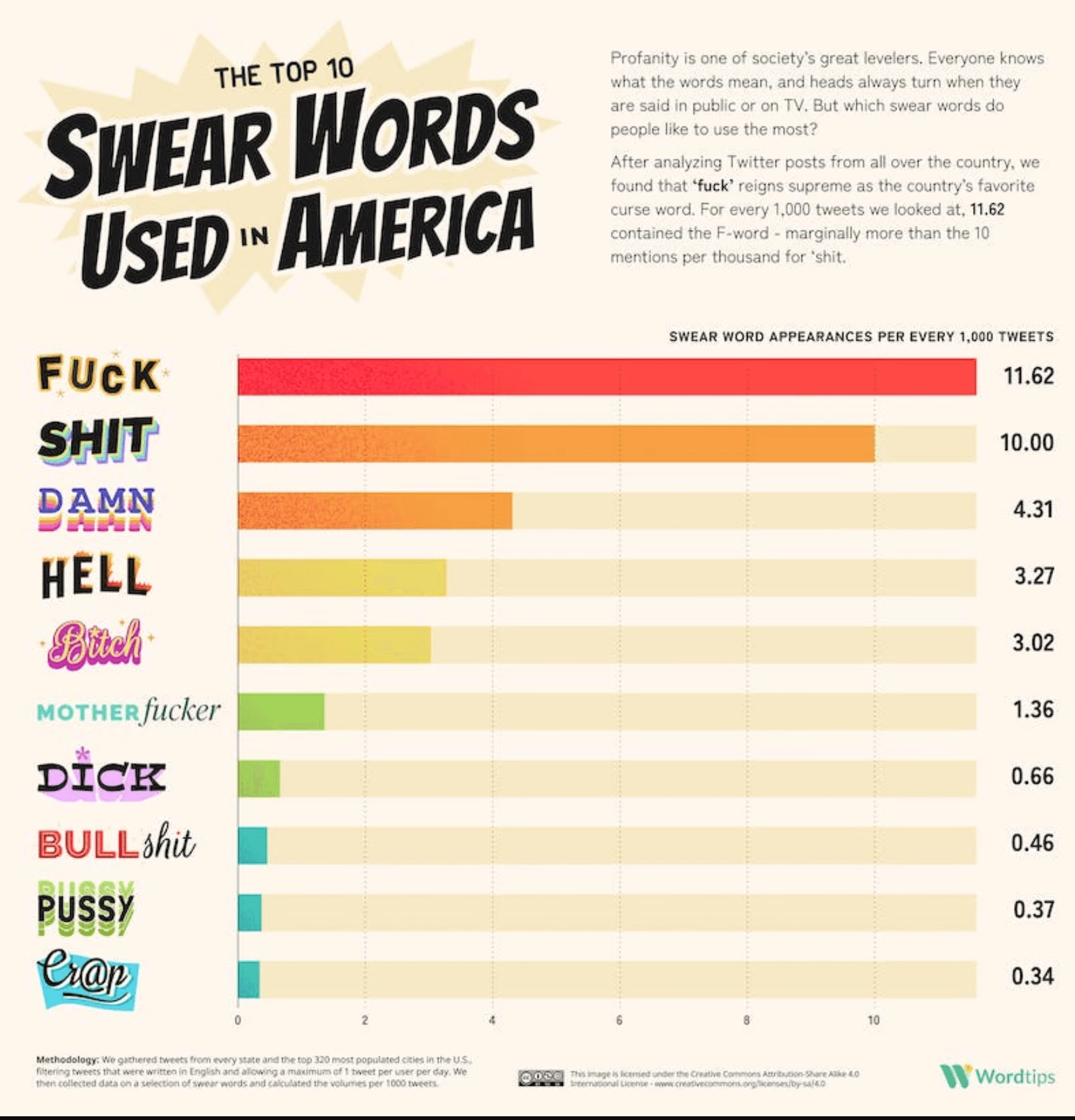
Humans are wired to compare — it’s how we process choices, weigh pros and cons, and make decisions. Thus, presenting two or more options side-by-side in an infographic takes away the cognitive heavy lifting from the viewer.
Comparison infographics thrive on Instagram because they appeal to our primal need to evaluate. They work best anywhere there’s a choice to be made. Whether comparing products and service tiers or breaking down concepts and choices, comparison infographics help your audience see the path that suits them best.
Or, in the case of The United States of Cussing by NeoMam, the comparative infographic can be used as a hilariously unfiltered look at how Americans express their frustration, one expletive at a time. It’s data visualization with a foul mouth — and we’re here for it.
Pro Tip: Use Instagram’s built-in interactive tools like Polls or Quiz stickers in your Stories to complement your comparative posts. This double-layered engagement drives more interaction and builds community.
5. A Guide to Logotypes by Chris Do

Sometimes, one image isn’t enough to tell your story. Carousels solve that for you. They're versatile as you can use them to educate (tutorials or lists), inspire (motivational quotes), or entertain (memes or before-and-after photos).
There's something undeniably engaging about swiping. It taps into our innate curiosity — that desire to know "What's next?" This makes carousels incredibly addictive and a perfect tool for content creators aiming to keep their audience hooked.
Plus, carousels naturally increase the time users spend on your post. Every swipe counts as engagement, and the longer someone interacts, the more Instagram’s algorithm loves you. More swipes = more visibility = more chances to connect with your audience.
The example by Chris Do shows that it’s not about perfection — it’s about pacing and pulling you in with each swipe until you’re hooked on the simplicity of its design and the clarity of its message. Less isn't just more. It’s irresistible when done right.
Pro Tip: Saved posts perform better in Instagram’s algorithm. So, remember to include a “Save this for later” CTA to extend the shelf life of your content.
6. Gen AI Prism by JESS3
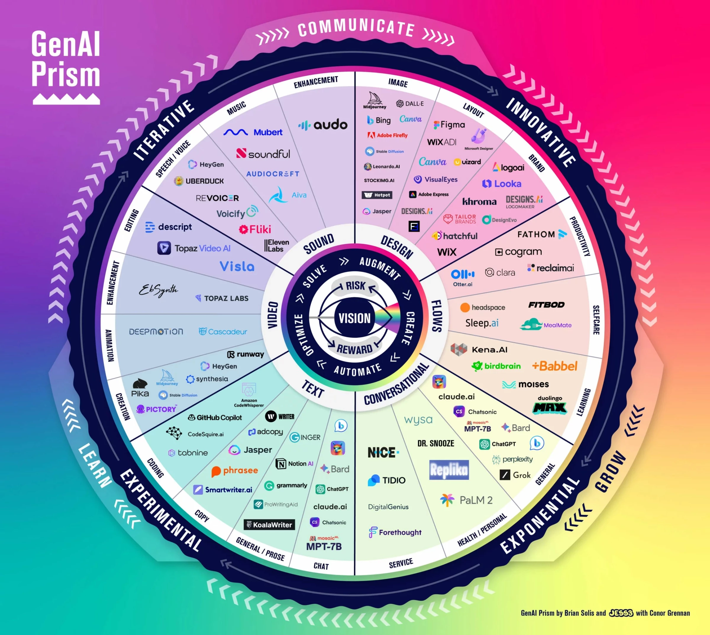
Think of Instagram users scrolling through endless content; what stops the thumb is not just beauty but utility. Conceptual infographics harness the power of design to simplify the complex, breaking down productivity systems, personal growth models, or industry frameworks into something you can “get” in seconds.
One of the more popular Instagram infographic examples, conceptual infographics rely on diagrams, overlapping shapes, and visual hierarchies to help viewers understand how various elements connect.
Why do they work? They transform intangible ideas into something people can see, digest, and apply — perfect for creating those "aha" moments.
Take the "GenAI Prism" as a prime example of an infographic Instagram would boost. The world of generative AI is a chaotic space, but Jess3's prism gives you a framework to swing through it. It maps this multifaceted world into a circular framework, where categories like video, sound, and text are broken down into functional domains.
The bold segmentation and concentric layers draw your eye in, guiding you from general categories to specific examples. This works brilliantly because it not only clarifies what generative AI encompasses but also demonstrates how interconnected tools and concepts converge toward a central vision.
For Instagram’s audience of multitaskers and knowledge seekers, this format is a dopamine hit for the brain, delivering clarity and utility in one scroll-stopping moment.
Pro Tip: Use consistent color coding to guide the audience through the relationships and make the concept easier to grasp. Pair the graphic with a brief written explanation for added context.
7. The Deadliest Places for Journalists in 2024 by Statista
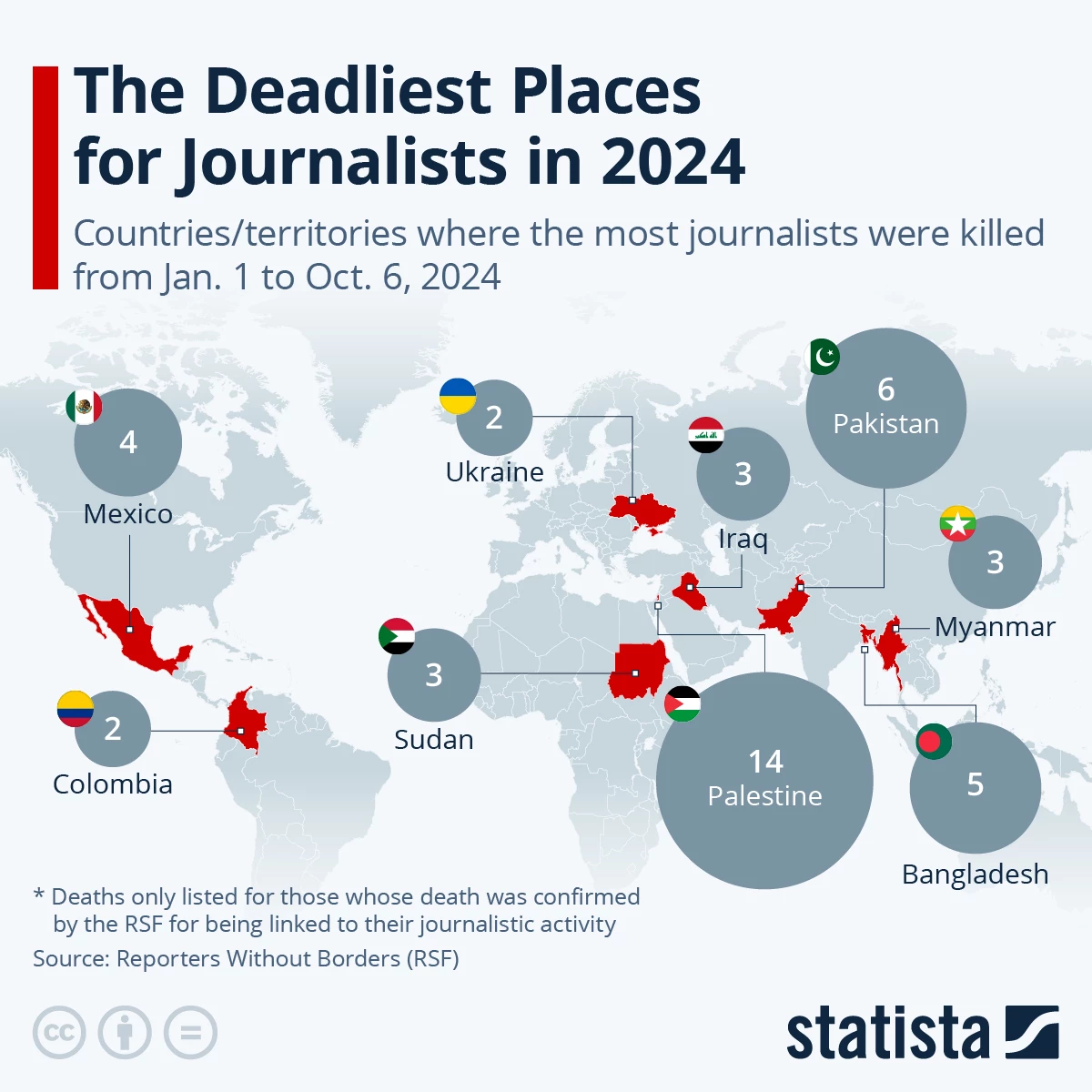
A statistic on its own might be ignored, but plot it on a map, and it becomes a story. Geographical infographics combine maps with data points to highlight trends, distributions, or impacts across areas. Ideal for world rankings, crisis zones, or resource allocation, they make complexity feel approachable and impossible to ignore.
The example from Statista works because a world map provides instant context. Bold visuals highlight key data, and proportional circles emphasize the severity of journalist deaths in specific regions. It’s clear and impactful, and as a result, it delivers a global issue in a format that’s impossible to scroll past.
Pro Tip: Use contrasting colors to emphasize key regions and add icons or symbols to represent data visually. Always include a clear legend or context to ensure viewers understand the story behind the map.
Why Infographics Dominate Instagram in 2026
Instagram's 2026 updates emphasize two key factors: speed and stickiness. The platform prioritizes content that encourages longer viewing times and higher interaction rates. Infographics excel in both areas.
Bold visuals instantly capture attention, while carousels encourage users to swipe through multiple slides. Furthermore, saves and shares act as powerful indicators of valuable content. It’s a formula that users — and the algorithm — simply can’t resist.
As one of the most popular types of content marketing, here are a few reasons why infographics are dominating on Instagram:
1. Data + Design = Engagement
In social media marketing, information is currency, but attention is king.
Infographics thrive on Instagram because they simplify the complex, turning mountains of data into bite-sized visuals that demand engagement.
A chart showing mental health stats? A swipeable carousel breaking down fitness goals? More than mere posts, they’re conversations waiting to happen. By blending clean design with sharp messaging, and just the right timing in posting, infographics make learning effortless and irresistible.
2. Algorithm Optimization
Instagram’s algorithm loves what its users love, and visually stunning, shareable content is always at the top of the list. Infographics aren’t just seen; they’re saved, shared, and commented on, feeding the algorithm exactly what it craves.
This creates a flywheel effect: the better your design, the wider your reach. In 2026, if your post isn’t algorithm-friendly, it might as well not exist. Infographics are built to win in this landscape.
3. Branding Opportunity
Infographics are more than just educational; they give brands a chance to combine storytelling with their visual identity. Whether you’re a tech startup or a nonprofit, using your brand colors, typography, and layouts can turn an Instagram infographic from a design asset to an opportunity to showcase your brand.
Key Features of High-Impact Instagram Infographics
Instagram is the ultimate testing ground for design. If your infographic doesn’t grab attention in less than 3 seconds, it’s already lost. High-impact infographics succeed because they look great and perform even better. Let’s break down the anatomy of an infographic that stops the scroll, earns the save, and drives engagement.
1. Scroll-Stopping Design
The best infographics nail symmetry and balance. Clean layouts and appealing color schemes can guide the viewer’s eye and make complex information intuitive. Tools like Canva, with their Instagram infographics templates and drag-and-drop functionality, make this easier than ever, giving creators professional-grade results with minimal effort.
2. Interactive and Shareable Content
Instagram loves action, and so do its users. High-impact infographics include CTAs like “Save this for later” or “Swipe to learn more.” Carousels in particular shine here, allowing creators to break down information into digestible, multi-slide journeys that keep users engaged and scrolling.
These infographics are shareable because they do what most content fails to do: they respect your time while rewarding your attention. By turning complex ideas into visually striking, easy-to-grasp formats, they scratch the itch for clarity in a cluttered digital world.
People share infographics because they make the sharer look smart, the recipient feel smarter, and the algorithm very happy — an elegant trifecta of utility, status, and satisfaction.
3. Data-Driven Storytelling
Information without context is static; storytelling brings it to life. Infographics thrive when they turn raw numbers into narratives, since visualizing information makes it more accessible and persuasive.
Keep it simple. Too much data overwhelms; too little leaves gaps. If the numbers don’t tell a story, they’re just noise. Use stats that matter, frame them with context, and let the numbers do the talking.
Consider an infographic about climate change: a rising line graph illustrates emissions approaching a critical tipping point, accompanied by the headline "2026: Hottest Year on Record." The narrative makes the data clear, urgent, and impossible to ignore. Isn't this impactful approach far more effective than simply presenting dry statistics?
How to Create Instagram-Ready Infographics
To create infographics that don’t just survive but thrive on this platform, you need more than creativity. You need strategy. Here’s how to craft Instagram-ready infographics that captivate, inform, and engage your audience.
Step 1: Define Your Message
Clarity is non-negotiable. A great infographic starts with a singular purpose: educate, inspire, or persuade.
Trying to cram too many ideas into one design? That’s a recipe for confusion and the dreaded scroll past. Your message should be laser-focused.
Ask yourself: What’s the one thing your audience should walk away with? Lock that down, and let it guide every design decision.
Step 2: Choose the Right Tools
The best infographic designs don’t require a degree in graphic design, thanks to many drag-and-drop platforms (like Canva and Adobe Express) that offer simplicity paired with professional-grade Instagram infographics templates.
However, remember to use templates wisely. Yes, they save time and help keep your designs Instagram-ready, but the real value lies in how you make them your own. Platforms like Canva and Adobe Express offer endless options, but don’t just copy and paste — your audience will notice.
Tweak the colors, swap out icons, and refine the typography to reflect your brand’s identity. Templates should speed up your process, not strip away originality. Use them to enhance your work, not replace your creativity.
Ultimately, you pick your weapon of choice. But remember, it’s the artist, not the brush, that creates the masterpiece.
Step 3: Follow Best Practices
Even the most creative infographic will flop without proper execution. Start with readability — clean, legible fonts are your best friend. Avoid clutter by embracing white space; it’s not “empty,” it’s intentional.
Finally, design with Instagram’s DNA in mind: pick Instagram’s newest size of 1080 x 1350 (at 4:5 aspect ratio), optimized for crisp visuals on any device. Test your layout before posting — on Instagram, presentation is everything.
Instagram Infographics: The Bottom Line
The brands winning on Instagram this year aren’t just dabbling; they’re mastering the craft of creating more engaging posts using infographics. They’re experimenting with bold visuals, refining their messages, and connecting with audiences on a visceral level.
Now it’s your turn. Think about what your brand stands for, what your audience needs, and what story only you can tell. Then, design infographics that don’t just fit into the Instagram feed — design to dominate.
This year, the game isn’t just about being seen. It’s about being remembered. And Instagram infographics are your ticket to becoming unforgettable.
Instagram Infographics FAQs
1. What tools can I use to create infographics for Instagram?
There are several user-friendly tools to help you design Instagram-worthy infographics:
- Canva: Offers ready-made templates and drag-and-drop features.
- Visme: Great for data visualization and customization.
- Adobe Express: Ideal for professional-looking designs with advanced options.
- Piktochart: Focused on simplifying complex information into visual stories.
Remember to choose the tool that aligns with your design needs and skill level.
2. How can I create a successful infographic for Instagram?
To make a successful Instagram infographic:
- Pick one clear message — don’t overwhelm your audience.
- Make it actionable. Deliver insights your audience can use now — content that solves a problem is content they’ll remember.
- Use visuals strategically. Stick to bold colors, clear fonts, and consistent design.
- Format for Instagram. Create 1080x1350px (4:5) designs for posts or 1080x1920px for Stories.
- Add a CTA. Encourage users to save, share, or comment on your post.
The key is balancing aesthetics with valuable content.
3. Can Instagram infographics improve engagement?
Yes! Infographics drive engagement by being highly shareable and easy to save.
They simplify complex topics, grab attention with visuals, and encourage interaction through calls-to-action like “Share this with a friend” or “Save for later.” Instagram’s algorithm rewards this kind of engagement, boosting your content’s visibility.