Step into a realm of artistic philanthropy with our carefully curated selection of the best non-profit print designs, each capturing the essence of impactful messaging and showcasing the master craft of the finest print designers on DesignRush.
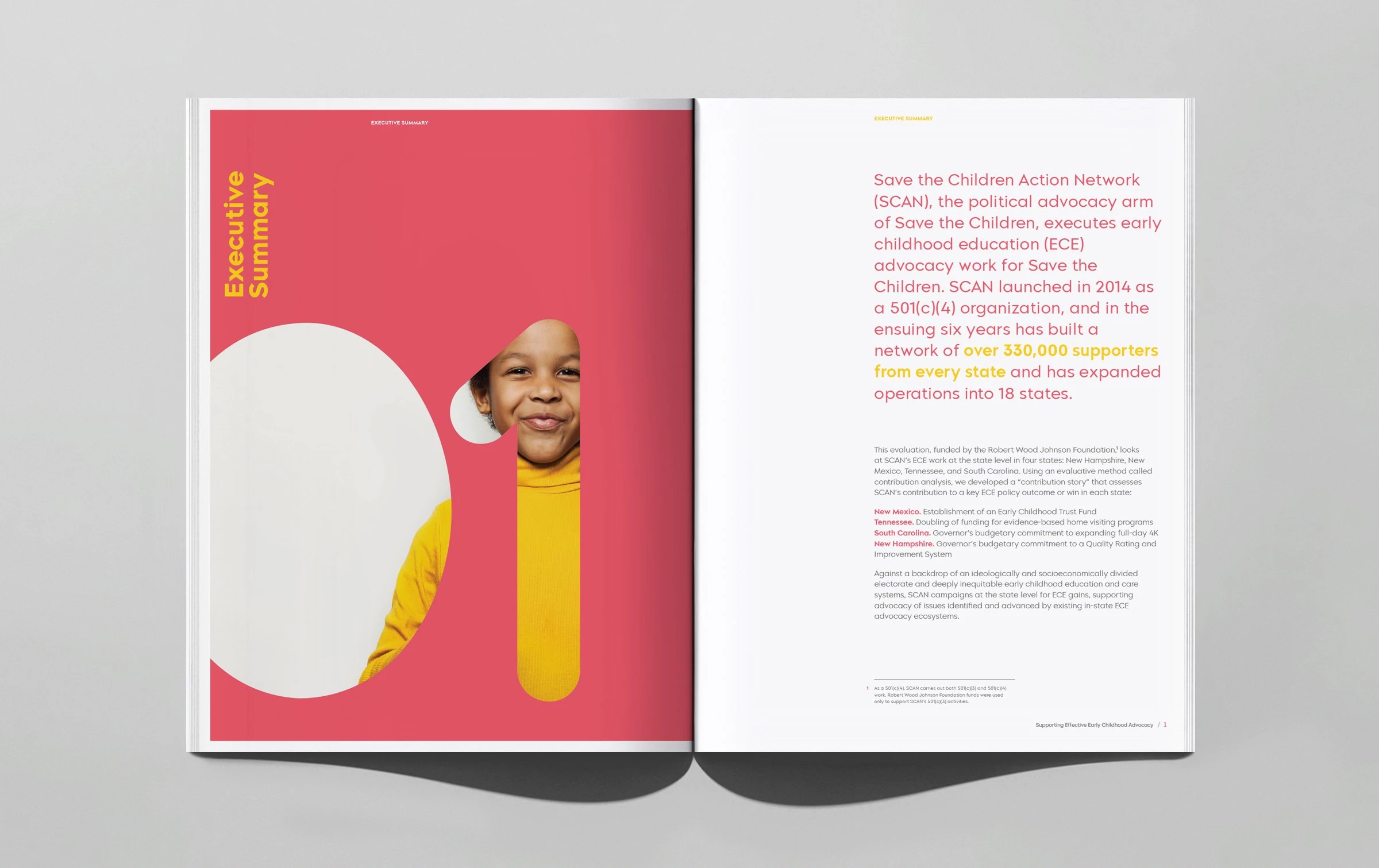
1. Save the Children by Niedermeier Design
Standout Features:
- Bold, vivid colors
- Children peeking behind large numbers
- Crayon-drawn elements
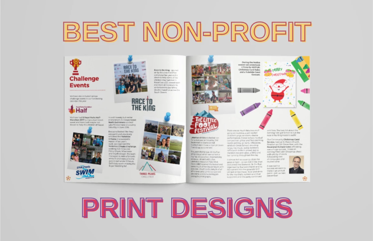
Save the Children launched SCAN (Save the Children: Action Network) in 2014 to help execute advocacy work for children in need. Niedermeier Design helped the organization design an evaluation report to help reflect what SCAN is about.
The layout relies on a colorful approach full of bold, vivid colors and a playful, laid-back style to make the formal work more appealing and entertaining. Each page of the design features a child striking a carefree pose as they make room for lots of data evaluating the organization’s progress.
Each new section is represented by a number occupying the entire page, with children peeking behind them. This layout adds a lighthearted tone to the design, further supported by certain crayon-drawn elements that help portray the children’s part in the advocacy's achievements.
Check out this collection of the best non-profit organization website designs!
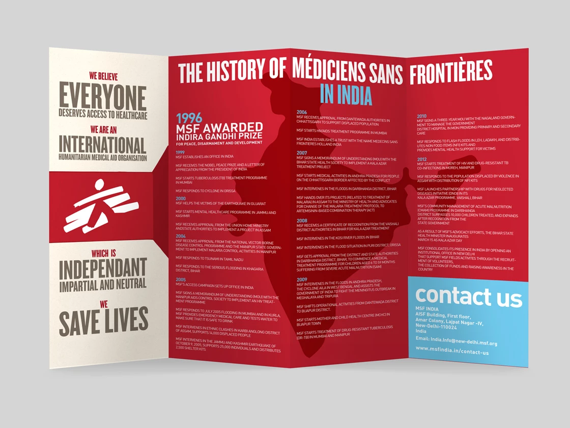
2. Médecins Sans Frontières (MSF) by Studio Eksaat
Standout Features:
- Reliable color scheme
- Creative growth depiction
- Blue as an accent color
Studio Eksaat's designs for the medical humanitarian organization Médecins Sans Frontières cement their place among our best non-profit print designs.
The designs include a visual that expands over the years with landmark years denoting all the significant events that marked progress in MSF’s work, a world map with a legend of their presence, and a report book emphasizing all their efforts in 2017.
The expansive visual representing the organization's growth is even more effective because of its color-coding design. With the standard combination of attention-grabbing red as a background and white typography, the reliable color scheme also features light blue as an accent color to help highlight crucial dates or details. This meticulous approach exemplifies award-winning brochure design.
Check out more of the best print designs!
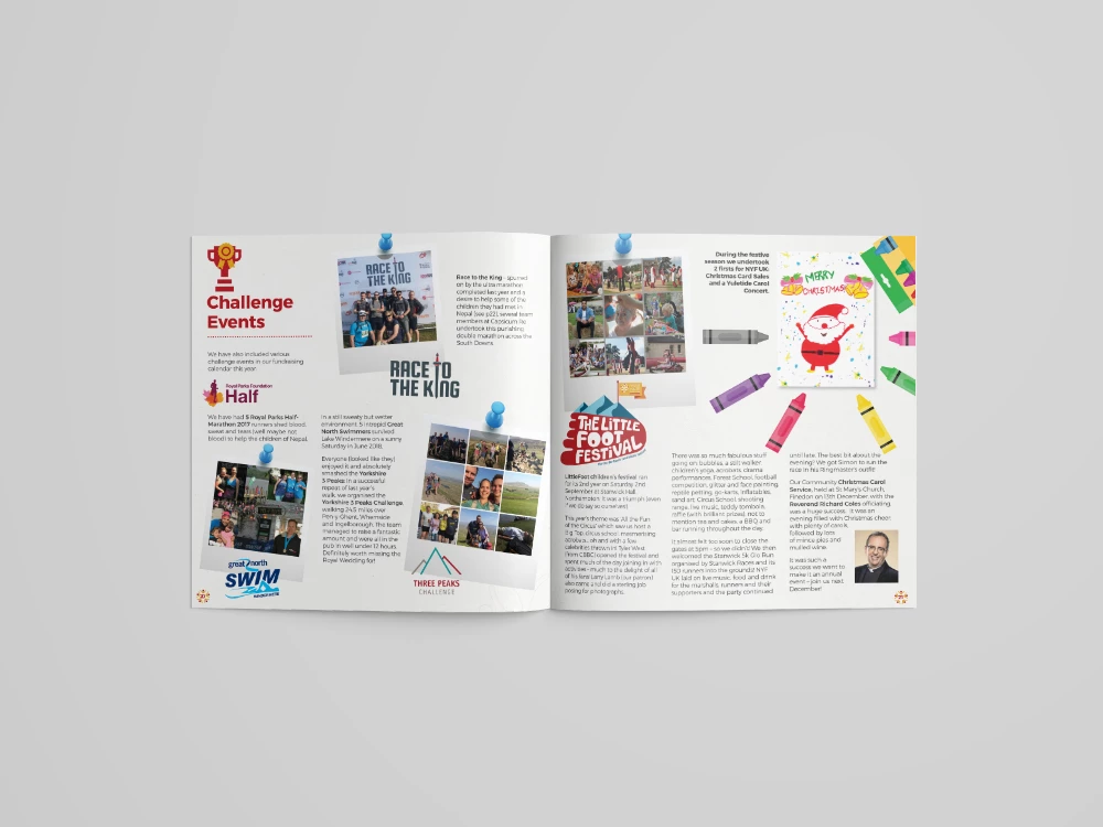
3. Nepal Youth Foundation (UK) by Charlotte Delmonte Design
Standout Features:
- Colorful and playful
- Large images of children
- Red and yellow visuals and typography
Charlotte Delmonte Design's print design for the Nepal Youth Foundation Annual Report is appealing and resonates with a broad audience. (Find more great examples of the best annual report print designs.)
The design includes high-resolution images of children, some evoking emotions of sadness and some of joy. These evocative images display real-life scenarios of children enjoying their youth with the foundation's help.
The seriousness of the content is balanced by the colorful and playful layout, decorated with lots of crayons and cool icons like trophies and pins.
Finally, the design relies on a red and yellow color story to ensure that the most vital details remain prominent, so specific visuals and headlines are highlighted in these shades. Check out the best kids and baby designs here.
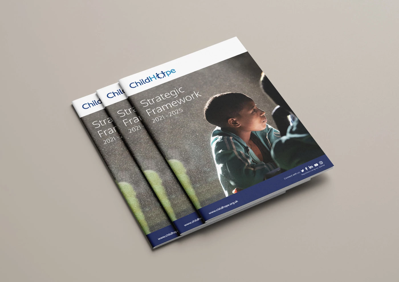
4. ChildHope Charity by Far'n'Beyond
Standout Features:
- Infographic legend
- Color-coded units
- Clean and well-organized content
Far’n’Beyond delivers ChildHope Charity's achievements, ideas, and vision through this well-organized, visually appealing print design.
The large spacing between content makes information easily digestible. Flipping through the pages, you'll see visuals and images that complement that information. Some include infographics with appropriate legends indicating the color-coded units that label each new section.
The color coding extends to subsections with the same hue inside a rectangular frame, and the headlines within the content are highlighted with a sky-blue shade.
Browse through more of the best non-profit print designs.
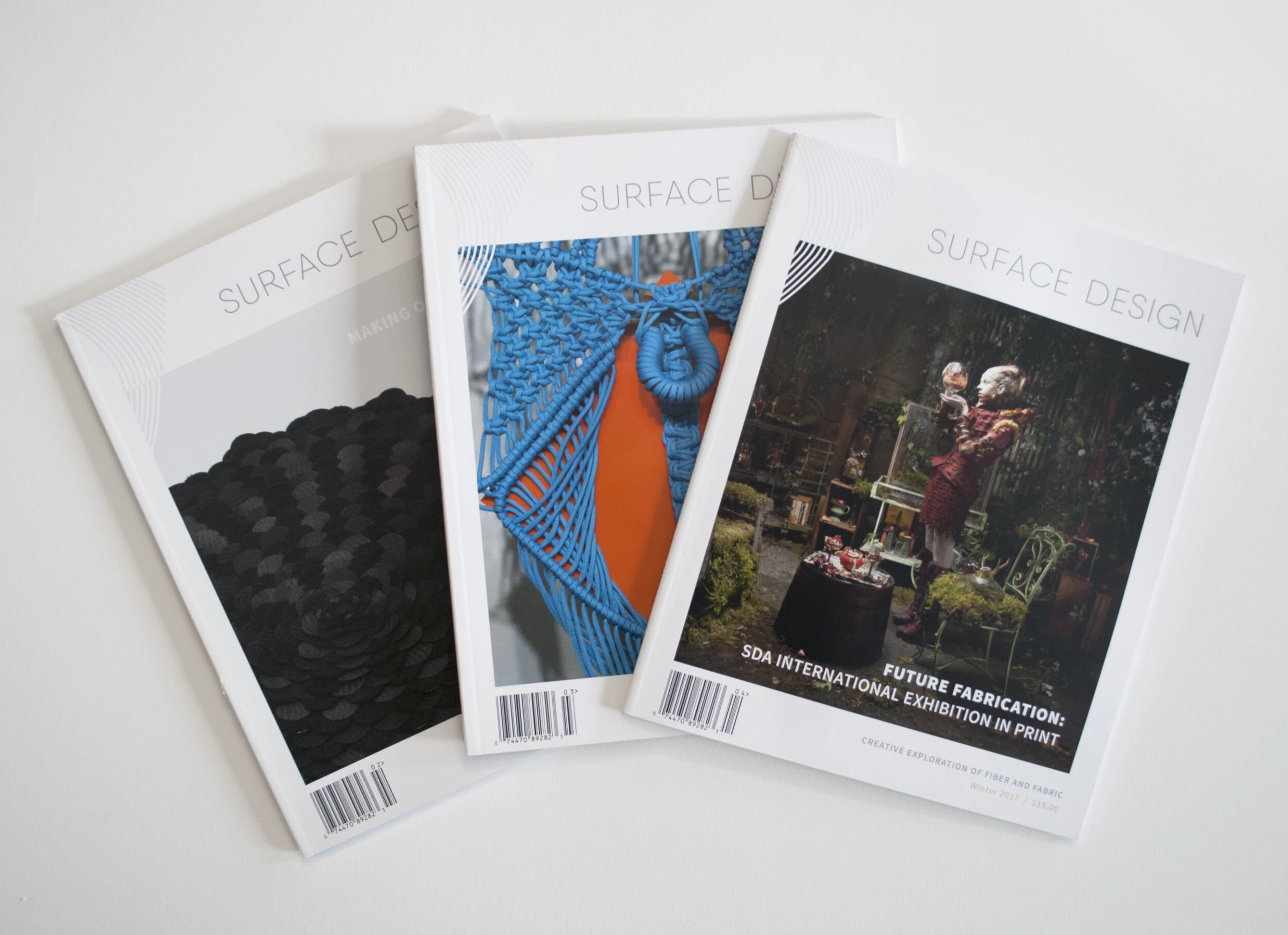
5. Surface Design Association by Michelle Silver Design
Standout Features:
- Clean, white background
- Prominent gallery
- Orange color used for emphasis
Michelle Silver Design's rebranding project for the Surface Design Association births a stunning, refreshed magazine layout for the organization. The agency's magazine redesign featuring vivid, colorful, free-style posters is an excellent addition to this list of best non-profit print designs.
Some posters feature a bundle of colorful crafting materials. In contrast, others feature complementary cool colors in liquid, abstract shapes as backgrounds for a list of the grants presented in a solid orange typography.
Meanwhile, the magazine resembles a gallery exhibition thanks to the white background that lets the prominent gallery accommodate and support the content.
Some elements, like the new sections, artist names, and page numbers, are emphasized using an orange hue to indicate certain typefaces.
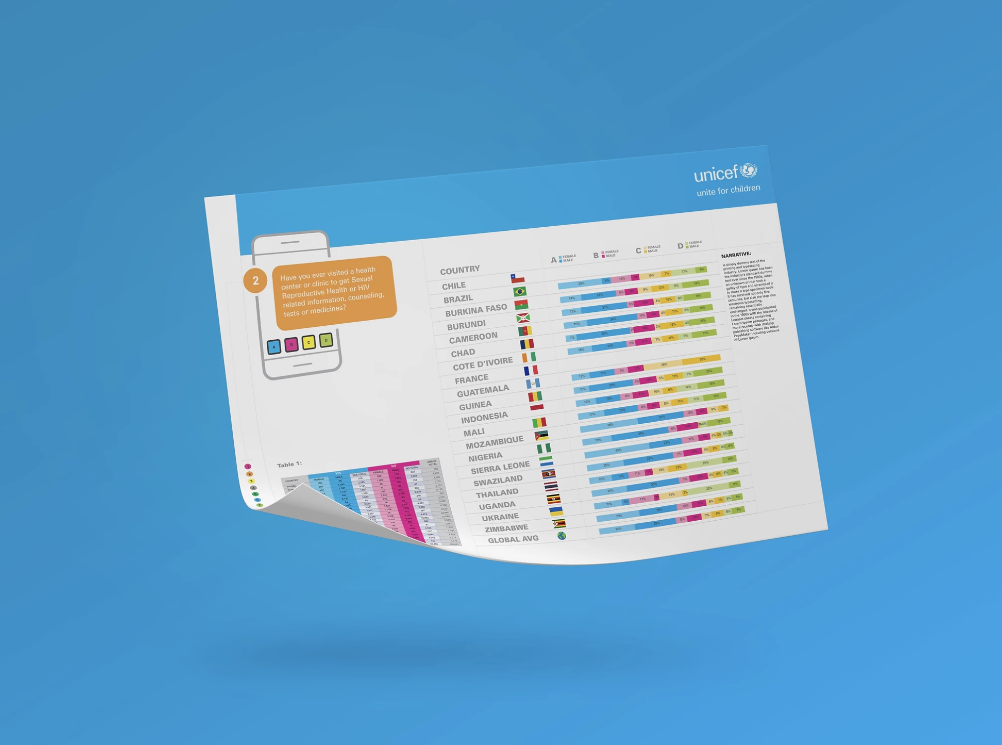
6. UNICEF Infographics by Lawal Bakare
Standout Features:
- Detailed geographic view
- Color-coded data bars
- Clean geometric borders
The UNICEF Infographics print design is proof that regardless of how heavy the data is, presenting it in an artistic, easily digestible way is possible. All it takes is creative visualization skills. And the designers at Lawal Bakare harnessed this skill to deliver this colorful and informative infographic.
While some pages feature color-coded data bars in a table featuring different countries and their comparative statistics, the table is divided through clean geometric borders that balance the vivid imagery with light gray or bold black lines.
Each country on the list features in-depth details that provide more information. The data is placed into colored cards on the right side of the print, whereas the left side features a geographic view of the country.
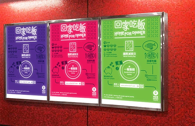
7. Oxfam Hong Kong - Home For Dinner Campaign by THE CABINET
Standout Features:
- Colorful design
- Minimalist approach
- Eye-catching from the get-go
"One in every eight people worldwide suffer from hunger. By advocating the public to have dinner at home and donate the same amount of money you would spend by dining out, Oxfam Hong Kong is branding itself as an agency determined to change the world by mobilizing the power of people against poverty." The annual Home For Dinner campaign held on World Poverty Day, 17th October, inspired The Cabinet to redefine it early by presenting the issue as something discernable and in fact, eye-pleasing.
The agency successfully reintroduced the campaign to the public with a much clearer message, using the relevant infographic direction as the main key visual. Attracting the broadest audiences, The Cabinet used simple, minimalist and modern icons to illustrate each of the brand's mission points. With the varying palette, the backdrop draws from Oxfam's signature brand colors to give off a bold, fresh feeling and impact at first sight.