Real estate graphics play a crucial role in property marketing, helping realtors, agencies, and homeowners present information in an engaging and visually compelling manner.
Well-designed real estate graphics make listings more appealing and help communicate key insights — whether it’s comparing the costs of renting versus owning, showcasing neighborhood trends, or providing staging tips.
When used effectively, they enhance marketing materials, build trust, and ultimately increase engagement. Let’s explore outstanding infographics for real estate that exemplify innovative design and powerful storytelling.
1. Setting Up Your Home for Sales Success by Pennington Creative

Standout Features:
- Structured, step-by-step storytelling
- Streamlined, approachable illustrations
- Legible, sans-serif fonts
Setting Up Your Home for Sales Success is a well-structured infographic designed by Pennington Creative to guide homeowners through the process of preparing property for sale. The step-by-step storytelling approach ensures that viewers can easily follow along, moving from one preparation stage to the next in a logical and intuitive manner. By breaking down the home-selling process into clear, actionable steps, the infographic transforms what might feel like an overwhelming task into a manageable and effective plan.
Visually, the design is inviting and calming. The streamlined, approachable illustrations add warmth to the content, making it visually appealing without distracting from the core information. Moreover, a color palette dominated by green and soft blue reinforces tranquility, helping to ease any stress associated with selling a home.
To enhances readability and ensure the content remains accessible immediately, the agency employs legible sans-serif fonts. Step numbers and titles feature rounded edges, lending a touch of playfulness, while the informational sections maintain a sleek and professional aesthetic.
2. Cost of Renting vs. Owning a Home In Each State by HowMuch.net
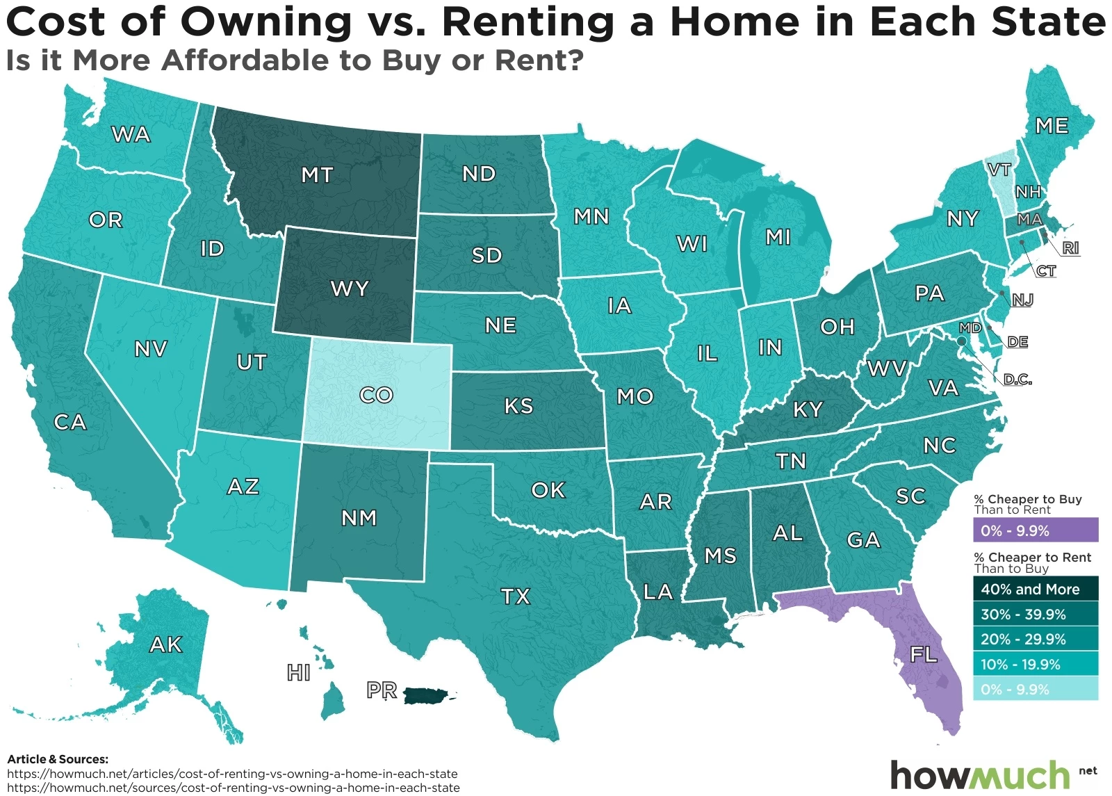
Standout Features:
- Dual data representation
- Color intensity as a value display
- Explanatory legend
HowMuch.net compares the financial viability of renting versus buying a home across the United States in an informative yet digestible graphic Cost of Renting vs. Owning a Home in Each State. The design effectively utilizes a dual data representation approach, combining a color-coded map with a detailed bar graph. The map provides a broad overview by categorizing states based on whether renting or buying is more cost-effective. At the same time, the accompanying graph offers a precise breakdown of rental and mortgage costs for each state.
The agency uses color intensity as a value indicator to ensure the map remains visually clean and easy to interpret. Rather than overwhelming viewers with excessive numerical data, the map employs a gradient system where turquoise signifies states where renting is more affordable, and purple represents states where buying is the better financial option. Darker shades within each color category indicate a more significant percentage difference between the two choices.
Moreover, an explanatory legend is strategically placed to enhance clarity, which is key to understanding how the colors correlate with percentage differences. This thoughtful design choice makes the infographic aesthetically appealing and highly functional.
3. The Beauty of Block by Lemonly
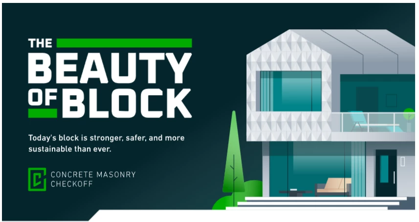
Standout Features:
- Tranquil blue-and-green gradients
- Charming 2-D illustrations
- Attention-holding, dynamic layout
The Beauty of Block is a creatively designed infographic that transforms a seemingly technical topic — concrete masonry — into an engaging visual experience. Designed by Lemonly in partnership with the Concrete Masonry Checkoff, the graphic highlights the cost-effectiveness, durability, and sustainability of concrete blocks for construction.
Visually, the infographic employs tranquil blue-and-green gradients that evoke harmony and contrast beautifully with the gray tones of concrete blocks. This color softens the industrial nature of the subject and subtly reinforces the sustainability of masonry construction by evoking elements of nature.
The charming 2D illustrations further enrich the experience, depicting various stages of construction and showcasing how concrete block buildings stand resilient against natural disasters like hurricanes, fires, and floods. The design adds warmth and humanizes the technical content by incorporating human elements, such as workers in action and satisfied building owners.
To ensure each section presents information in a fresh and engaging way, the agency crafts a dynamic and varied layout. The design alternates between different formats — some sections use bullet-point lists with accompanying illustrations, others follow a grid-like structure, and some rely on full-width visuals with bold text. This mix of presentation styles keeps the reader’s attention throughout, making complex information feel effortless to absorb.
4. How Much Should You Tip Your Mover by Designedbysoap

Standout Features:
- Relatable, simple illustrations
- Clear, uncluttered layout
- Muted color palette
How Much Should You Tip Your Mover is an engaging and informative real estate graphic created for The Hartford’s Extra Mile blog by Designedbysoap. As part of a more extensive content campaign, this design transforms a frequently searched topic — how much to tip a moving company — into a visually appealing, shareable asset.
The infographic makes an often-overlooked aspect of moving easy to understand and memorable by distilling essential tipping guidelines into a streamlined visual format.
The design features relatable, simple illustrations that humanize the content, depicting common moving scenarios such as loading trucks, handling fragile items, and interacting with movers. These visuals help viewers connect with the information on a personal level, making the tipping etiquette feel more intuitive.
A clear, uncluttered layout enhances the readability of the content, allowing viewers to absorb information effortlessly. Each section is carefully spaced, maintaining a relaxing visual flow that prevents cognitive overload. The muted color palette complements this ease of navigation, offering a calming effect that contrasts with the often stressful nature of moving.
5. Exploring the Orange County NY Commercial Real Estate Scene by NowSourcing
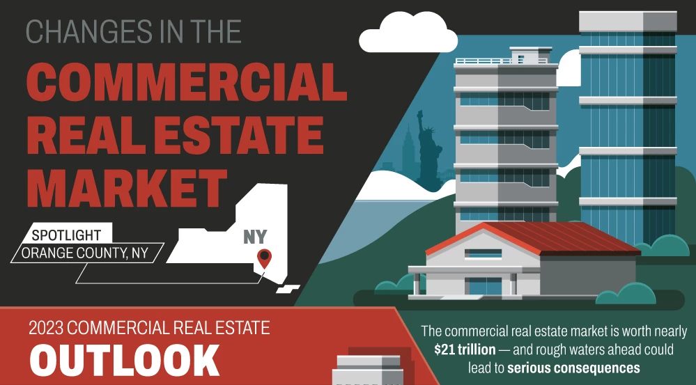
Standout Features:
- Problem-solution storytelling
- Attention-grabbing red accents
- Simple yet engaging illustrations
Exploring the Orange County NY Commercial Real Estate Scene effectively presents key insights into the local commercial real estate market using a problem-solving storytelling approach. This infographic, designed by NowSourcing for Chess Realtors Inc., begins by outlining the situation of commercial properties in Orange County, NY. Then, it seamlessly transitions into strategic guidance and concludes with a call to action to contact this real estate agency.
Visually, the design employs bold red accents that immediately capture attention and highlight crucial data points. These pops of color guide the viewer’s eye across the content, ensuring that essential information stands out amidst the more neutral tones. The strategic use of red enhances visual appeal and reinforces a sense of urgency and importance, encouraging potential investors to take action.
The illustrations are simple yet engaging, depicting commercial buildings, business professionals, and real estate elements in a way that enhances the overall message without overwhelming the viewer. These visuals add clarity to key points, making the information more accessible and enjoyable to explore.
6. 9 Biggest Myths About Singapore Properties by Milkwhale

Standout Features:
- Engaging, illustrated myths
- Highlighted advice boxes
- Insightful, explanatory graphs
9 Biggest Myths About Singapore Properties is a visually engaging infographic crafted for seasoned real estate agent Jack Sheo by creative agency Milkwhale to debunk common misconceptions in Singapore’s property market. This infographic is an educational tool, helping viewers navigate misinformation by clearly breaking down each myth and replacing uncertainty with well-researched facts.
The design employs playful yet informative illustrations to bring each myth to life, making the reading experience more enjoyable. Instead of relying solely on text-heavy explanations, the infographic uses engaging visuals that reinforce key messages, helping viewers retain the information more effectively.
Under each myth, a highlighted advice box provides clarity on why the misconception is false and suggests what can be done instead. These boxes are marked with attention-grabbing icons — such as exclamation points, plus signs, or arrows — and presented in a distinct color intensity, ensuring they stand out from the surrounding content.
When text alone isn't enough to convey the reality behind these myths, the design integrates insightful graphs to support its claims. These data-driven visuals establish credibility by showcasing research and market trends, reinforcing trust in the information provided.
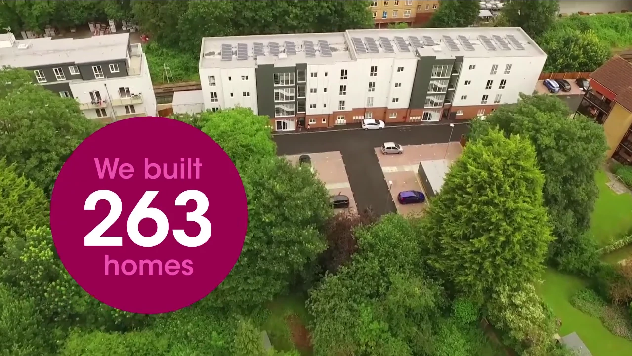
7. MHS Homes Annual Report 2016/17 by The Hideout
Standout Features:
- Dynamic mix of footage, animation, and photos
- Sound effects as data-highlights
- Legible, bold typography
The Hideout’s real estate graphic design takes a fresh, engaging approach to transform MHS Homes’ key achievements in real estate during 2016 and 2017 into a dynamic video format. Instead of relying on a traditional printed or digital document, MHS Homes Annual Report 2016/17 leverages a mix of real-life footage, animations, photos, and infographics to tell a compelling visual story. The video format also allows MHS Homes to seamlessly share their report across social media and their website, broadening its reach and accessibility.
One of the standout features of this report is its strategic use of sound effects to highlight key data points, ensuring that crucial statistics not only appear on screen but also leave an auditory impact. Whether it’s a subtle chime to emphasize growth percentages or a bold sound cue for financial milestones, these elements enhance the overall engagement and make the information more memorable. Complementing this is the use of bold, legible typography, ensuring that text-based insights remain clear and easy to read even within the fast-paced visuals of the video.
By blending various visual elements with sound and motion, the MHS Homes Annual Report 2016/17 redefines how corporate data can be presented, making it a worthy real estate branding example. This approach makes the report more digestible but also positions MHS Homes as an organization that embraces innovation in communication.
Benefits of Real Estate Graphic Design
Real estate graphics are more than just decorative elements—they serve as powerful marketing and communication tools. Here are some of their key benefits:
- Enhances Visual Appeal: Real estate graphics make property listings and reports more visually attractive, quickly capturing the viewer’s attention.
- Simplifies Complex Information: Through charts, infographics, and visual hierarchies, real estate graphics make data easier to understand, whether it's pricing trends or mortgage comparisons.
- Increases Engagement: Well-designed graphics encourage viewers to interact with the content, keeping them engaged longer and improving message retention.
- Strengthens Brand Identity: Consistent use of high-quality real estate graphics helps agencies and realtors establish a recognizable and professional brand image.
- Improves Marketing Effectiveness: Eye-catching graphics are more likely to be shared on social media and used in real estate advertising, expanding reach and visibility.
- Builds Trust and Credibility: Clear and informative graphics help establish transparency, giving potential buyers or investors confidence in the information presented.
Graphic Design for Real Estate: The Bottom Line
Real estate graphics are essential tools for marketing, communication, and engagement. Whether used in listings, real estate website designs, reports, or promotional campaigns, they effectively present data in a visually appealing and easy-to-digest format.
For real estate professionals, hiring an infographic design agency and investing in high-quality graphics is a strategic move that enhances brand credibility and improves overall market reach. As the real estate industry continues to evolve, leveraging innovative graphic design will remain a key driver of success.
Realtor Graphics FAQs
1. How can real estate infographics improve sales?
By simplifying complex data, infographics help potential buyers understand property details, leading to informed decision-making. Well-designed visuals can highlight key selling points, such as price comparisons, location benefits, or financing options, making the information more digestible. They also create an engaging experience that keeps potential buyers interested in listings for longer.
2. Can real estate graphics be used in social media marketing?
Yes, visually compelling graphics are highly shareable, increasing engagement and exposure on social media platforms. Eye-catching designs with concise, valuable information can attract attention as users scroll through their feeds.
3. What are common mistakes in infographics for real estate?
Overcrowding with too much information, poor readability, inconsistent branding, and lack of mobile optimization are common mistakes. Cluttered layouts can overwhelm viewers, making it challenging to grasp key details quickly. Using fonts that are too small or colors with low contrast can also hinder readability, reducing the effectiveness of the design. A balanced layout, cohesive branding, and adaptability across devices are essential for impactful real estate graphics.
4. How do real estate graphics impact branding?
High-quality, consistent graphics establish a professional real estate brand identity and help build trust with buyers and investors. A visually appealing and cohesive design language across marketing materials makes a company or agent more recognizable. By maintaining a polished visual presence, real estate professionals can create a lasting impression that sets them apart from competitors.