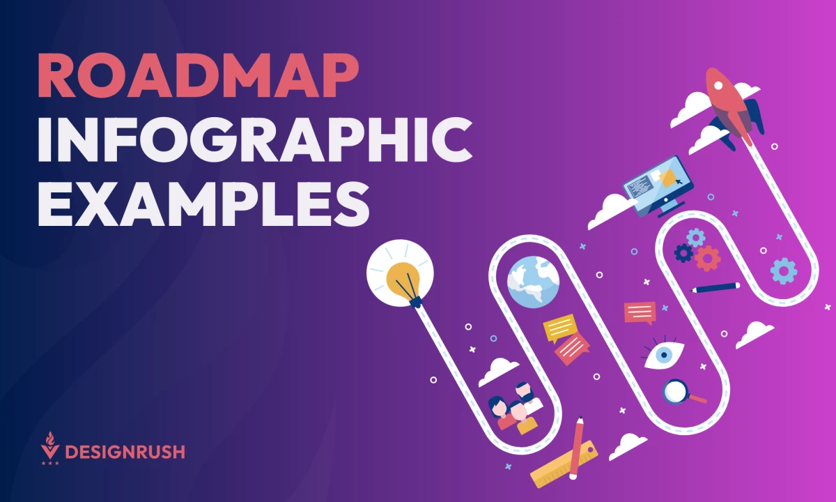
Roadmap infographics are essential tools for visualizing strategies, plans, and development timelines. They break down complex goals into digestible, easy-to-follow visuals that guide teams and stakeholders through each project phase. Over the years, these infographics have evolved beyond static charts into dynamic, interactive designs that enhance clarity and engagement.
With the ability to incorporate icons, color coding, timelines, and even interactive elements, roadmap infographics simplify planning while making information more accessible. These visuals organize objectives and progress, whether used for business strategies, software development cycles, or product launches.
In essence, roadmap infographics communicate goals and process stages. Let’s explore eight compelling examples of roadmap infographics that exemplify clarity, creativity, and practicality.
1. The Simple Guide to Business Blogging by Simply Business
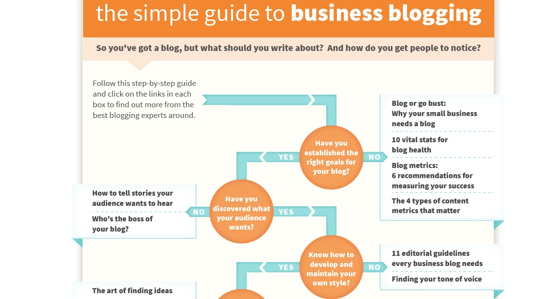
Standout Features:
- Interactive link lists
- Minimal visual elements
- Sleek, easy-to-follow layout
The Simple Guide to Business Blogging by Simply Business is a well-structured roadmap infographic that guides users through starting a business blog. Its interactive flow features a step-by-step decision-making approach, where users answer "Yes" or "No" questions.
If they answer "Yes," they progress forward, while a "No" response redirects them to an informative section containing useful interactive links. This intuitive format ensures users follow a clear learning path and quickly gain access to additional materials that help them fill knowledge gaps.
Visually, the infographic embraces minimalism to keep the focus on clarity and usability. Blue arrows direct viewers through the roadmap, while orange circles highlight key decision points. White, note-like sheets containing interactive links provide a structured yet engaging way to access further information.
This sleek, well-organized layout ensures a smooth user experience, making it easy to navigate without overwhelming the viewer.
2. 5 Years of Let's Venture by InfoGraphic Design Team
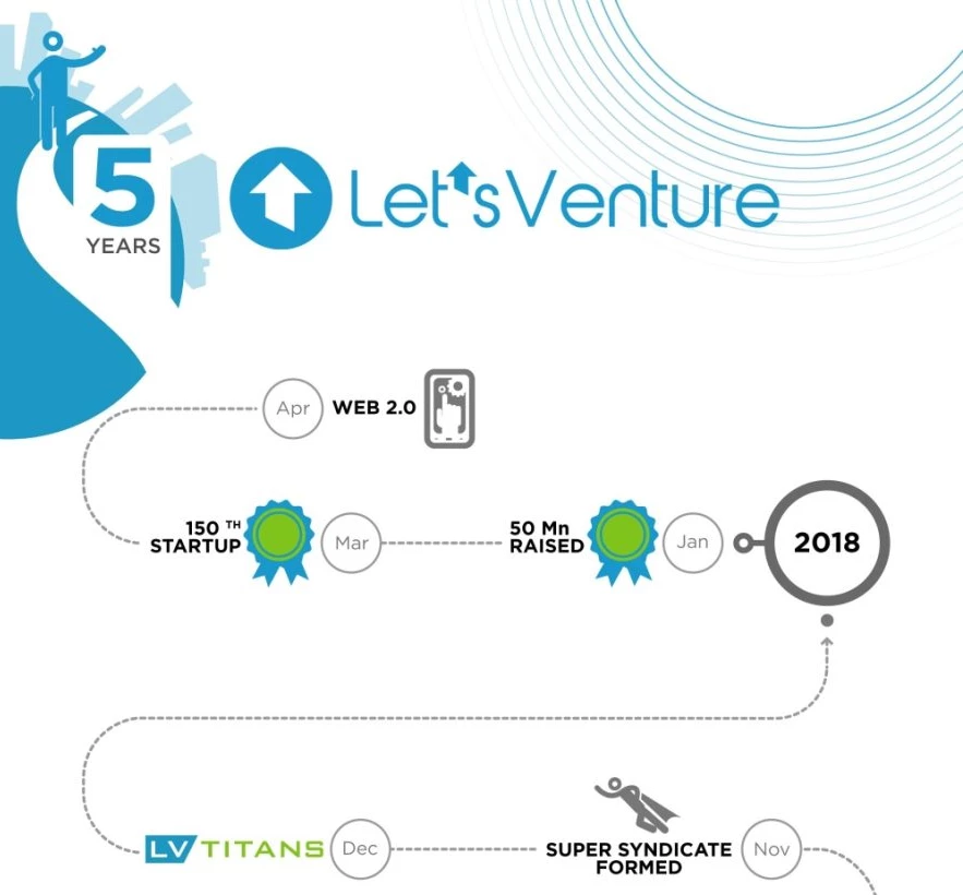
Standout Features:
- Eye-catching milestone highlights
- Navigational year marks
- Streamlined, uncluttered organization
5 Years of Let’s Venture by the InfoGraphic Design Team presents a roadmap celebrating this company's five years of angel investing and fundraising success.
The infographic highlights key milestones using vibrant green-and-blue award badges, making achievements stand out at a glance. These visually appealing milestones create a sense of accomplishment, reinforcing Let’s Venture’s impact in the industry.
A well-thought-out navigation system enhances usability, with year markers placed in circles along the right side of the infographic. This layout lets viewers quickly locate specific years without following a rigid chronological path.
The organization remains clean and structured — free from overlapping elements that could clutter the experience. With a streamlined approach, the infographic ensures a seamless reading process that makes it easy for investors, entrepreneurs, and stakeholders to grasp Let’s Venture’s growth story effortlessly.
3. Year In the Life of an Employee by Scriberia
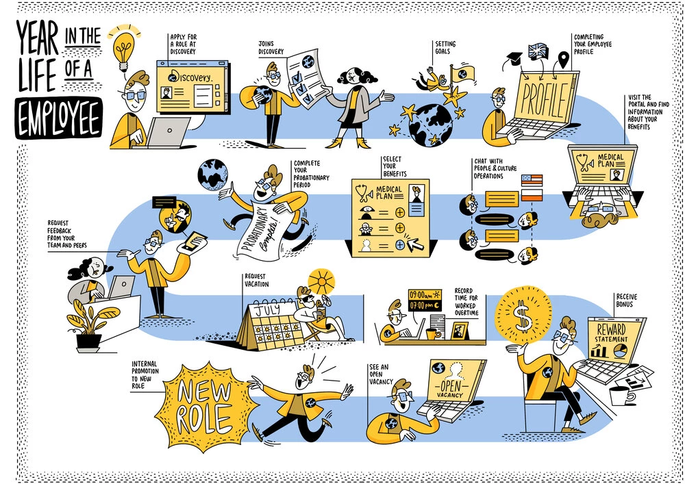
Standout Features:
- Charming, comic-like illustrations
- Approachable, rounded typography
- Simple yet joyful palette
Year in the Life of an Employee by Scriberia is an engaging motivational roadmap infographic that presents the journey of an employee’s first year.
Designed to make job applications and workplace adaptation more enjoyable, the infographic uses charming, comic-like illustrations to create a lighthearted and optimistic tone. By transforming what can be a daunting experience into a visually engaging story, this roadmap infographic serves as an encouraging guide for those stepping into a new professional chapter.
The typography further enhances the design's approachable and friendly nature. Rounded, comic-style lettering blends seamlessly with the illustrations, reinforcing the laid-back and engaging atmosphere.
Plus, a carefully curated color palette complements the text. Despite being limited in range, it radiates warmth and enthusiasm. Soft pastel blues, yellows, and browns, contrasted with bold black outlines, create a balanced, inviting, and easy-to-follow aesthetic!
4. Talking to Kids About Cancer by Hot Butter Studio
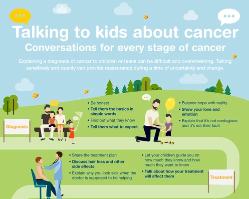
Standout features:
- Calming natural palette
- Comforting 2D illustrations
- Clear, list-organized advice
Talking to Kids About Cancer by Hot Butter Studio is a thoughtful road map infographic that guides parents and caregivers through difficult conversations with children. It tackles the topic with clear, step-by-step instructions that convey sensitive information in an approachable and empathic way.
To make the subject approachable, the agency used a calming pastel palette, creating a reassuring atmosphere that encourages open discussions without overwhelming young audiences. Approachable 2D illustrations enhance warmth and accessibility, depicting challenges to craft emotional connections with parents who need to make these difficult conversations.
Moreover, the structured advice list enhances readability, with bold key points for quick reference and better comprehension. This combination of clear organization and gentle visuals ensures that complex information is conveyed simply and meaningfully.
5. 5 Wins for Outdoor Brands by Duck.Design
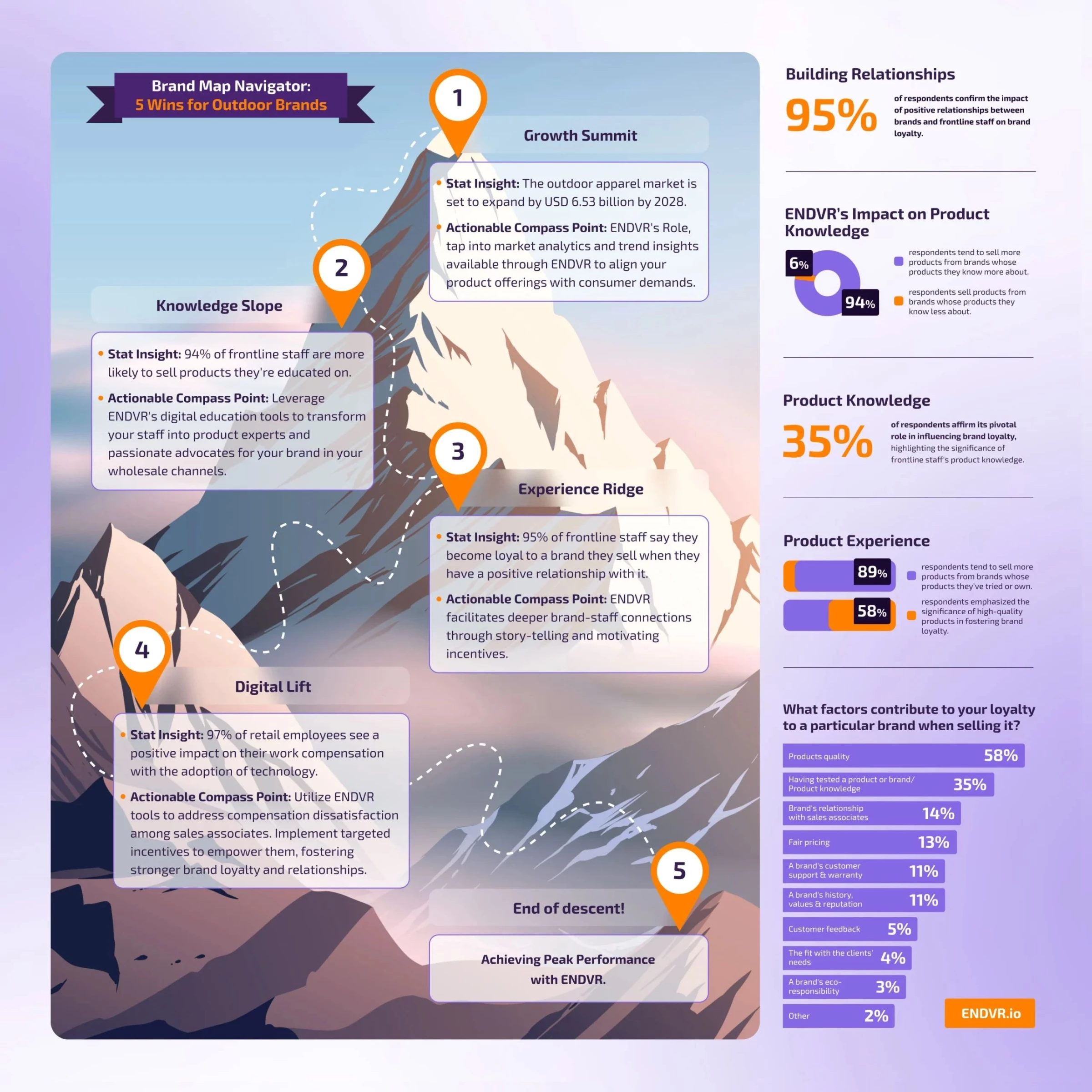
Standout Features:
- Mountain-inspired visual metaphor
- Strategically organized bullets
- Insightful graph section
5 Wins for Outdoor Brands by Duck.Design is a product roadmap infographic tailored for ENDEVR, a retail sales enablement platform. Designed with outdoor enthusiasts in mind, it cleverly incorporates a mountain peak as the backdrop, reinforcing the idea of progress and achievement.
The infographic’s structure is both visually appealing and highly functional. Each milestone along the mountain path features a text box containing two key bullet points. Stat Insights provides relevant statistics, while Actionable Compass Point offers practical guidance on how ENDEVR supports retailers at that stage. This strategic layout ensures viewers gain data-driven insights and clear action steps without feeling overwhelmed.
Complementing this, an insightful graph section on the right side further illustrates the platform’s impact, providing tangible proof of its benefits. The thoughtful design elements and well-organized content make this infographic an effective tool for engaging and educating outdoor brands.
6. Healthy Returns From Sustainable Actions by Data Design Studios
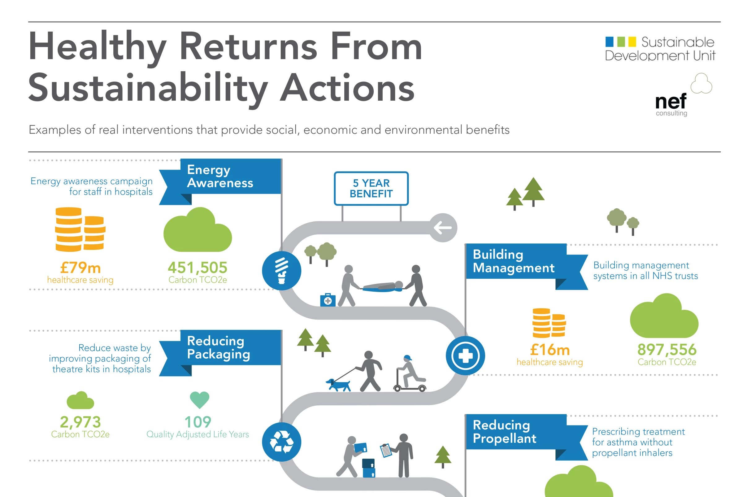
Standout Features:
- Straightforward iconography
- Eye-catching, flag highlights
- Clear, digestible content
5 Healthy Returns From Sustainable Actions by Data Design Studios presents a visually engaging roadmap that simplifies complex sustainability concepts into easily comprehensible insights.
Recognizable icons — hearts, medical crosses, sorted coins, recycling symbols — help viewers quickly grasp the significance of each stage without being overwhelmed by excessive text. These intuitive visuals create a seamless reading experience, making sustainability efforts feel more actionable and accessible.
The infographic’s design further enhances clarity through strategic flag highlights in vibrant blue, drawing attention to key milestones along the path. Additionally, the minimal text ensures the focus remains on the visuals, with each stage concisely explained through numbers and short descriptions.
All in all, this roadmap effectively communicates how sustainable actions can lead to meaningful, long-term benefits by balancing simplicity with informative depth.
7. When to Bin Your Beauty Products by Pennington Creative
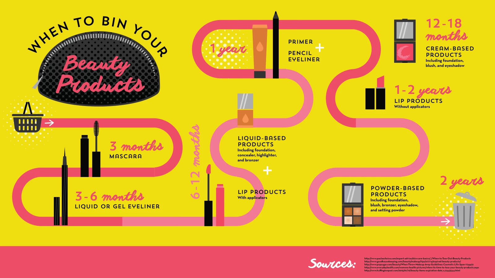
Standout Features:
- Vibrant color palette
- Sans-serif and script typography
- Silhouette-style product illustration
Pennington Creative’s When to Bin Your Beauty Products infographic helps consumers understand when to replace cosmetic items.
The infographic embraces a bright feminine color palette featuring shades of pink and yellow, perfectly aligning with the beauty industry’s aesthetic. These warm and inviting tones evoke freshness and cleanliness — important attributes when discussing a product’s lifespan.
To balance clarity and artistry, the designers combined clean, sans-serif fonts with elegant scripts. While the sans-serif text ensures effortless reading, the script elements add sophistication, making the infographic informative and stylish.
Additionally, the silhouette illustrations of beauty products make it easy for viewers to identify different items without referencing specific brands. This design choice ensures broad applicability, allowing the infographic to be a universal guide for beauty enthusiasts.
8. Dream the Next 20 by Lemonly
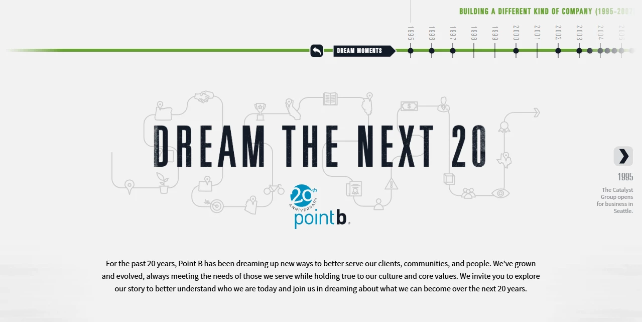
Standout Features:
- Comprehensive horizontal timeline
- User-friendly, dual navigation
- Intuitive color-coded sections
Lemonly’s Dream the Next 20 interactive roadmap infographic celebrates two decades of the management consulting firm Point B. Crafted as a minimal website UI design with a horizontal timeline, it takes users on a structured journey from the company’s foundation to key achievements.
The best part? It seamlessly integrates multimedia elements such as quotes, photos, and videos. The future goals featured at the end ensure the timeline provides a forward-looking perspective, making it an inspiring and informative resource!
The interface’s dual navigation options provide a user-friendly experience. Users can either progress through the timeline using side arrows or quickly jump between milestones via marker dots, allowing for flexible exploration. Additionally, color-coded sections organize the content by visually distinguishing the company’s development phases.
Benefits of Roadmap Infographics
Roadmap infographics are more than just visually appealing tools; they are essential for effective communication and engagement in the digital world. Their unique features make them invaluable for turning complex information into straightforward, digestible content.
Let’s explore the key benefits they offer:
- Enhances Clarity and Organization: A well-structured roadmap infographic helps break down information into logical sections, making it easier for teams and stakeholders to understand objectives, priorities, and timelines.
- Increases Engagement and Retention: Visually appealing elements like icons, color-coded phases, and interactive features make information more engaging and help audiences retain key details.
- Streamlines Project Management: Roadmaps are effective visual communication assets as they provide an at-a-glance overview of tasks, deadlines, and dependencies, improving coordination across teams and ensuring smoother execution of plans.
- Supports Decision-Making: By clearly representing progress and upcoming steps, roadmap infographics help leaders make informed decisions based on timelines, milestones, and resource allocation.
- Facilitates Stakeholder Communication: A well-designed roadmap infographic is an effective communication tool that keeps stakeholders, clients, and team members aligned with project goals and updates.
- Adaptable for Various Uses: Whether used in business, education, or personal goal setting, roadmap infographics can be customized for different industries and objectives, making them highly versatile planning tools.
Roadmap Infographics: The Bottom Line
Roadmap infographics are powerful tools for visual storytelling, offering a creative and effective way to present data. Their ability to engage audiences makes them indispensable for modern organizations, whether used on websites, apps, or marketing campaigns. With these tools, designers can communicate ideas compellingly and creatively, leaving lasting impressions on audiences.
Roadmap Infographic FAQs
1. What industries benefit the most from roadmap infographics?
Industries that benefit the most from roadmap infographics include:
- Technology: For aiding in product development and planning
- Healthcare: For visualizing patient care plans and project milestones
- Marketing: For outlining campaign strategies and timelines
- Education: For structuring course content and learning paths
- Finance: For mapping out investment or growth strategies
2. What are the key design elements of a roadmap infographic?
A well-designed roadmap infographic divides the content using visually distinct headings and color-coded sections for clarity. Incorporating icons and timelines also enhances the overall flow and guides the viewer through the process. Lastly, the concise text allows key points to stand out, maintaining focus without overwhelming the audience with excessive detail.
3. How do I choose the right roadmap infographic format?
Select a format based on your audience and objectives — linear roadmaps work well for step-by-step processes, while circular or milestone-based designs are great for flexible planning. Choosing a roadmap infographic template can help streamline this process by offering different structures suited to your objectives, making it easier to present complex information effectively.