Minimalist UI design isn’t about sacrificing complexity for simplicity — it’s about enhancing usability by eliminating unnecessary clutter. A well-executed minimalist design relies on clean layouts, strategic typography, and a limited color palette to create an intuitive, engaging experience. While it might seem like simply removing excess elements, achieving true minimalism requires careful planning and precision.
Let's explore 11 inspiring examples and essential tips that showcase why minimalism is a powerful design strategy.
Core Principles of Minimalist Website Design
Minimalist design is all about stripping away the unnecessary to highlight what truly matters. Here are eight core principles that underpin successful minimalist design:
- Effective use of negative space: Negative space isn’t just empty space — it’s an active element that creates visual balance and improves readability. By giving content room to breathe, negative space emphasizes key elements without clutter.
- Strategic typography: Choosing the right fonts and establishing a clear typographic hierarchy are essential. Thoughtful typography guides the viewer’s eye and enhances readability, ensuring headlines, subheadings, and body text are effective.
- Limited color palette: Minimalism thrives on simplicity, and a restrained color palette creates a harmonious visual experience. Carefully selecting accent hues can draw attention to crucial areas without overwhelming the design.
- Guided visual hierarchy: Using size, color, and placement strategically helps to direct user attention. Key information stands out, making navigation intuitive and interactions more effective.
- Simplified layouts: Clean, grid-based layouts are a hallmark of minimalist design. By organizing content, designers can ensure each element is presented clearly, enhancing both form and function.
- Content focus: In minimalist design, content is king. By removing distractions, every element is positioned to let the core message shine, making overall communication more impactful.
- Consistency: Maintaining a uniform style across all design elements reinforces a cohesive visual language. Consistency in spacing, color, and typography builds trust and creates a seamless user experience.
- Intentionality: Every design choice must have a purpose. In minimalist design, nothing is arbitrary — each element is carefully selected to contribute to the overall narrative, ensuring clarity and purpose in every interaction.
11 Stunning Minimalist Designs That Define Modern Trends
- X (Formerly Twitter)
- Lettuce & Co.
- Rubrasonic
- Rainy Mood
- Why We Explore
- Velvet Hammer
- Levit Pen
- Aesop
- Squarespace
1. X (Formerly Twitter)
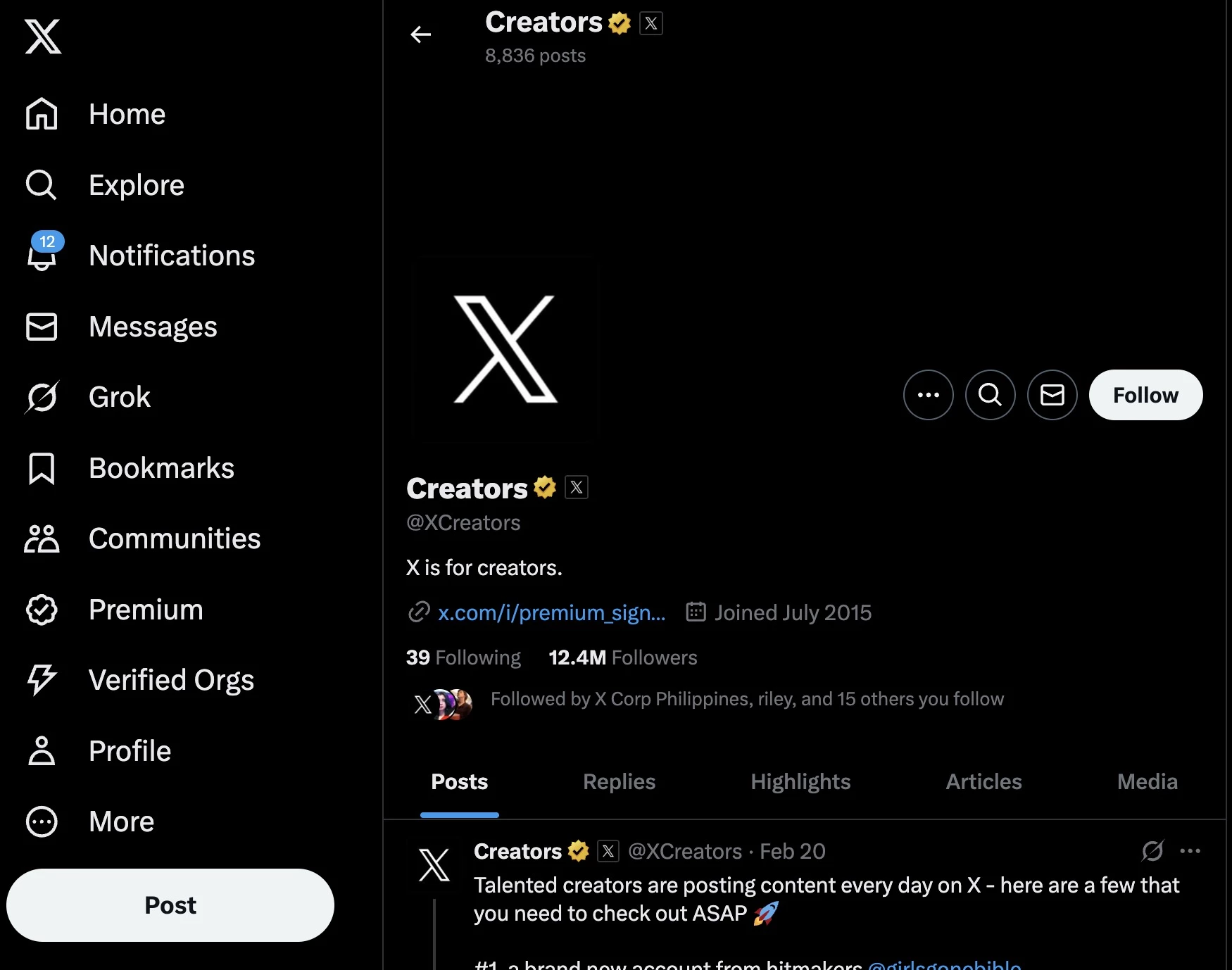
When X (formerly Twitter) became widely used, the design was functional but clunky, with a focus on speed over refinement. Over time, the platform streamlined its interface, embracing a more intentional and user-friendly minimalism.
Its key design features include:
- The switch from a star to a heart for “favorites” improved usability, making interactions more intuitive. The heart, a universally recognized symbol, reduced friction, and enhanced engagement.
- The feed’s structured layout, crisp imagery, and clutter-free design create a seamless browsing experience.
- The thoughtful use of white space in its home section and well-organized headlines in the Discover section enhance readability and reinforce the platform’s clean aesthetic.
Useful advice: Focus on creating a design that is both minimal and highly functional to engage your audience effectively. Ensure that every element serves a clear purpose, making your website intuitive and visually appealing.
2. Lettuce & Co.
![]()
The Lettuce, an event planning company, masters the art of minimalism, proving that even a highly visual profession can benefit from a refined online presence. This brand effortlessly conveys professionalism through its clean and deliberate design choices.
Here are its key design features:
- The white space provides a kind of breathing space, an open spot for the user to stand and observe what you have to offer.
- The animated moving menu creates a sense of openness, allowing users to focus on what truly matters.
- Without cluttered promotions or distractions, the site signals confidence in its aesthetic appeal, drawing users who value understated elegance.
Useful advice: Leverage white space to enhance clarity, using subtle animations to guide user focus without distraction. Additionally, let the design speak for itself by avoiding cluttered promotions.
3. Rubrasonic
![]()
Rubrasonic’s website takes minimalism beyond visuals by integrating sound as an interactive element. This background music provider highlights the power of sensory engagement through a simple yet immersive digital experience.
Its most striking design elements include:
- Interactive bubbles, which produce melodies when hovered over, subtly reinforce the brand’s expertise, demonstrating how background music can transform digital spaces.
- Rotating quotes from historical figures highlight the significance of sound.
- Engaging user journey that starts in silence, allowing users to experience the impact of background music only when they activate it
Useful advice: Enhance minimalist design with interactive elements like sound or motion to create a memorable and immersive experience without adding visual clutter.
4. Rainy Mood
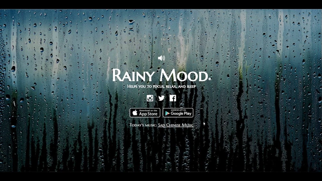
Rainy Mood exemplifies extreme minimalism, offering a single-page experience that immerses users in the soothing sound of rain.
Its key design features are:
- A solitary design approach focuses solely on playing rain sounds, creating a meditative and relaxing atmosphere without unnecessary distractions.
- A captivating background photo of a rain-splattered window overlooking a grassy field sets the mood, demonstrating how one well-chosen image can define an entire website.
- A volume knob and small, clean social media icons offer a pinch of interactivity.
- The “Daily Song” feature enhances the experience by recommending music that complements the rain.
Useful advice: Create a serene, distraction-free digital experience by focusing on a single design feature. This minimalist approach can transform a busy market into a welcoming experience.
5. Instagram

When discussing minimal design, Instagram is a must-mention, offering a sparse yet visually rich experience that balances simplicity with engagement.
Key design features include:
- A user-focused content display that prevents the “choice overload” often seen on other platforms
- Rich, user-generated visuals that keep the experience dynamic and visually compelling, even in its simplicity
- A clean, minimalist approach without sacrificing usability or credibility, proving that less can indeed be more
Useful advice: Balance minimalism with engagement by prioritizing user-generated content and a clean, intuitive layout. Regularly audit your site to eliminate unnecessary features and reduce choice overload while preserving essential functions and keeping the experience visually engaging.
6. Pinterest
-content-large-webp.webp)
When it comes to well-crafted, community-based websites, Pinterest is a prime example of minimalism enhancing an intuitive and enjoyable browsing experience. Pinterest maintains a clean, image-centric UI by emphasizing visual content that keeps users engaged.
Key design features include:
- A primary focus on visuals, with minimal text cluttering the interface, allowing images to shine and creating a seamless browsing experience for users
- The scrolling system features a “counter-intrusive” atmosphere, enabling users to explore without distractions.
- A consistent, uniform, and easy-to-navigate interface that feels lightweight and approachable, despite the platform’s vast database of images.
Useful advice: If your site relies on visuals or manages large amounts of content, maintain a clean, lightweight design to ensure balance. Minimize clutter to let the visuals take center stage.
7. Why We Explore
Why We Explore website uses minimalism not only for design but for storytelling, offering a narrative experience unlike any other. Through a smooth, left-to-right scrolling adventure, the site effectively guides users through a journey with minimal distraction.
Its most striking design elements are:
- The generous use of empty space throughout the site ensures the users aren’t overwhelmed, allowing the story to unfold in a relaxed, engaging manner.
- Chronological and hierarchical scroll-controlled flow reinforces the story's progression without overwhelming the viewer.
- 3D models smoothly blended into the background maintain a sense of space, enhancing the cosmic narrative.
- Subtle clickable icons around asteroids encourage exploration while maintaining focus on the central story.
Useful advice: Leverage minimalism to emphasize storytelling by guiding users through a structured, immersive experience. Use ample white space to reduce cognitive load and utilize a scroll-driven flow to also guide narrative progression.
8. Velvet Hammer
-content-large-webp.webp)
Velvet Hammer, a music production and PR agency, showcases the power of minimalism with its strikingly simple yet impactful website design. With a nearly monochromatic color palette of black, white, and gray, the design offers a sleek, luxurious feel that aligns perfectly with the agency’s brand.
Its key design features are:
- The quick-cut montage of clients performing draws immediate attention without overwhelming the visitor, creating an engaging first impression.
- Effective showcase of band logos presents the company’s expertise and versatility.
- The gradient background transition from light to dark, activated by scrolling, maintains focus and keeps the design visually dynamic, even without text.
- The strategic use of white space makes the page look sophisticated and luxurious.
- The subtly integrated minimal menu options provide easy navigation without cluttering the page.
Useful advice: Use minimalism strategically to reinforce your brand presence by focusing on visual elements like a refined color palette and video montages. Implement dynamic color transitions to maintain visual interest without adding clutter, while white space helps guide navigation.
9. Levit Pen
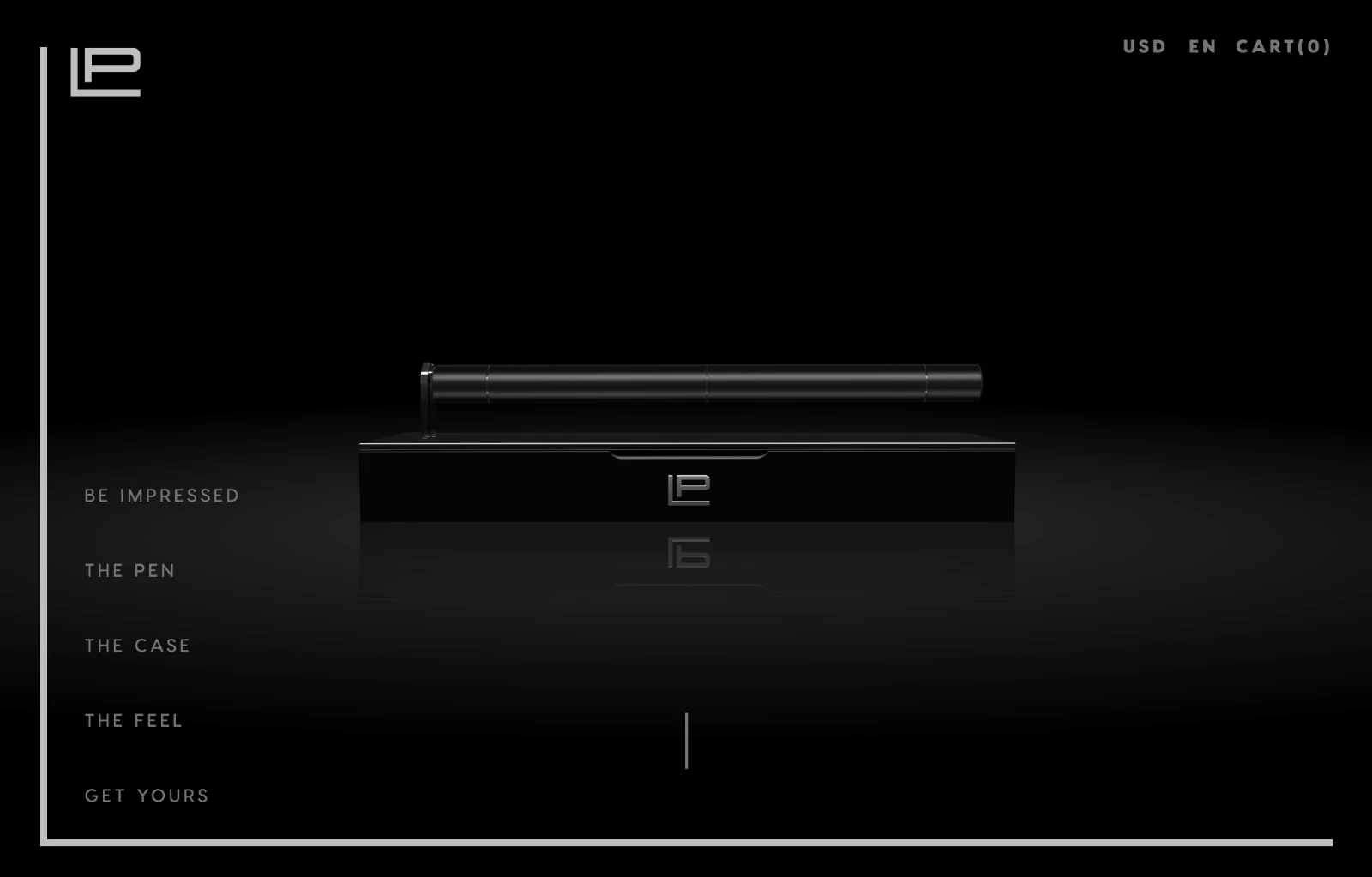
The Levit Pen website for a luxurious multifunctional pen is a perfect example of how minimalism can elevate a simple product into something extraordinary. With its clean black backdrop and modern animations, the design captures attention while maintaining a sense of sophistication.
Here are its key design features:
- The black background establishes a serious, high-end vibe, complementing the pen’s luxurious and futuristic appeal.
- Smooth animations dissect the pen and showcase its functionality, making it feel both modern and engaging.
- The white space is skillfully applied, ensuring the focus remains on the pen’s design while maintaining a tidy and accessible layout.
Useful advice: Showcase your products by stripping away unnecessary website elements to highlight their unique features and benefits. This will elevate the product but also position your brand as a leader in innovative design.
10. Aesop
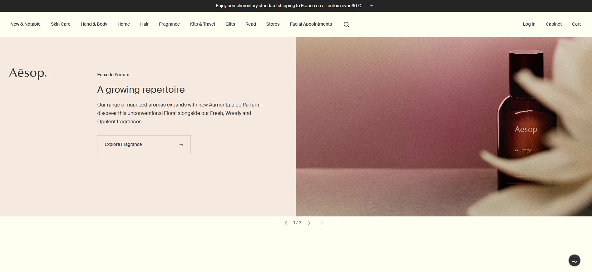
Aesop’s website is another prime example of how minimalist UI design can convey elegance, sophistication, and functionality. From the very first glance, the website exudes a sense of refined simplicity that aligns perfectly with the brand's identity.
Its most striking minimalist elements are:
- The generous use of white space enhances the high-quality imagery and creates a calming, uncluttered environment that fosters a sense of tranquility.
- Large product images, paired with a serene neutral color scheme, amplify the natural beauty of the products, aligning with Aesop’s brand ethos of understated elegance.
- The streamlined header provides easy access to product categories and brand stories without any visual distractions, making the website intuitive and easy to navigate.
- Subtle hover effects provide a gentle guide for users, ensuring smooth navigation while adding an extra layer of interactivity.
- The carefully structured grid system organizes content so that each element feels deliberate and contributes to the overall storytelling without compromising usability.
Useful advice: Use minimalism to create a digital environment that feels both exclusive and inviting by balancing white space, high-quality visuals, intuitive navigation, and subtle interactions like hover effects.
11. Squarespace
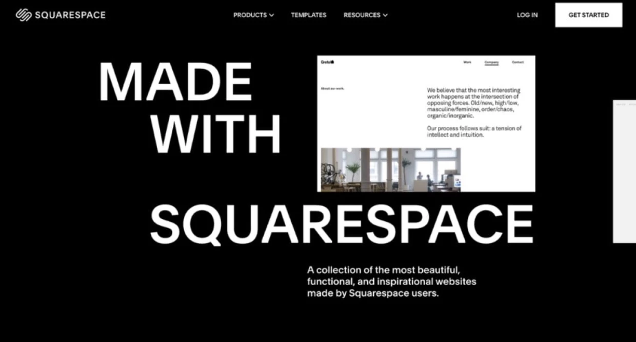
Squarespace’s website immediately conveys a sense of simplicity and elegance through its clean lines, thoughtful use of space, and focus on core functionalities, aligning perfectly with the platform's mission to empower users to create beautiful websites effortlessly.
Here are its most striking design features:
- A sleek black-and-white color palette creates a professional and sophisticated aesthetic, ensuring that vibrant imagery within the site stands out.
- High-quality, vibrant images guide the user’s attention without overwhelming the experience, creating a dynamic visual hierarchy that aids navigation.
- The mega-menu groups related categories, making it easy for users to quickly find the information they need.
- The sans-serif fonts used in headings, like “Grow your business online,” create clear focal points, promoting both readability and brand consistency.
Useful advice: Design a streamlined navigation system and structured menu to simplify information access and implement a dynamic visual hierarchy to guide attention.
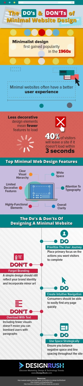
Share This Infographic on Your Website
Download Infographic
OR COPY AND PASTE THE CODE BELOW
| <imgsrc="https://www.designrush.com/uploads/users/customer-11/image_1532123981_Xfq0FGjkiSthRDvw4R79zS3xzJ56DcJ5zIeuDFCa.jpeg" alt=""> |
How Does Minimalist Design Improve User Experience?
By focusing on simplicity and clarity, minimalist design reduces distractions and optimizes functionality. Here’s how minimalist design can lead to a more seamless and effective digital experience:
- Reduced page size and improved loading speed
- Enhanced accessibility for users with disabilities
- Simplified navigation for quick access
- Focused calls to action for better conversions
- Enhanced mobile responsiveness
- Reduced cognitive load for improved engagement
1. Reduced Page Size and Improved Loading Speed
Minimalist design reduces the number of images, scripts, and extra elements, resulting in leaner pages that load much faster. This streamlined approach is especially beneficial for users on slower networks or mobile devices. Faster loading times also contribute to improved SEO and reduced bounce rates.
2. Enhanced Accessibility for Users With Disabilities
A simplified layout with clear typography and ample white space greatly enhances accessibility. High contrast colors and uncluttered interfaces make content easier to read for users with visual impairments, while simplified navigation aids those using screen readers. This focus on accessibility ensures that everyone, regardless of ability, can enjoy a seamless digital experience.
3. Simplified Navigation for Quick Access
By limiting on-screen elements, minimalist design creates an intuitive navigation system that helps users quickly locate key content. Primary menus and well-defined sections guide users effortlessly through the site, reducing the chances of getting lost or overwhelmed. This clarity not only improves user satisfaction but also enhances overall site usability.
4. Focused Calls to Action for Better Conversions
With fewer distractions, important calls to action stand out more prominently. Strategically placed buttons and links capture attention, encouraging users to take decisive actions. This focused approach can lead to higher conversion rates as visitors are naturally drawn to the most critical parts of the page.
5. Enhanced Mobile Responsiveness
Minimalist layouts adapt seamlessly to various screen sizes due to their inherent simplicity. With fewer elements to reposition, these designs maintain consistency and clarity on mobile devices. This ensures that users enjoy an optimized experience regardless of the device they use.
6. Reduced Cognitive Load for Improved Engagement
Eliminating visual clutter helps lower the cognitive load on users, making content easier to process. A focused, concise design allows visitors to engage more deeply with the information presented, resulting in a more meaningful and satisfying interaction.
Research shows that even slight visual complexity can affect user perception within 50 milliseconds of exposure, making navigation and interaction more challenging.
So, How Do You Create a Minimalist Design?
Building a perfectly minimal website or app that conveys just the right amount of information requires patience, experience, and research.
There are several ways to create the ideal UI for an exceptional UX, but the two main approaches are:
1. Building Up
This method requires more experience and is often more challenging than the alternative. Building up involves starting from scratch and designing only the necessary elements your site needs. To do this effectively:
- Define core user needs: Map out your primary user journeys and identify the absolute essentials needed for a smooth experience. Create wireframes focused solely on these key elements.
- Use a modular grid: Implement a grid system to establish structure and balance. This framework ensures that every element has its place and contributes to overall visual harmony.
- Develop a feature checklist: List the required features and review them iteratively with user feedback to avoid omitting critical components.
- Iterate with feedback: Regularly test your prototype with users or peers to catch any missing functionality. This iterative process is crucial for refining your design while keeping it minimalist.
While this approach offers precision, even experienced designers risk overlooking crucial elements. That’s why the building down method is often preferred. Working with a mobile app design agency can help you get a professional design that fits your brand.
2. Building Down
Building down (or skimming) is a longer but often more reliable approach to creating a website with a minimalist design. It starts with an exhaustive mix of potential features, which you then gradually refine and remove. To master this approach:
- Start broad: Begin with a comprehensive layout that includes every conceivable element. This brainstorming phase helps ensure that no possible idea is overlooked initially.
- Systematic elimination: Use user testing and data analytics to evaluate which features truly add value. Remove one element at a time, gauging its impact on the overall experience.
- Prioritize essentials: Focus on features that directly support user goals and brand identity. The removal process should enhance clarity while retaining functionality.
- Collaborate for clarity: Work with design professionals or agencies to gain an external perspective. They can help identify redundancies and ensure that your final product remains both visually appealing and highly functional.
Best Minimal Website UI Design Examples: Key Takeaways
There you have it — a look at well-executed minimalist designs across various industries, from commercial eCommerce to educational and advertising. Minimalism isn’t about stripping away everything; it’s about focusing only on what truly matters.
A well-crafted minimalist design helps guide navigation, emphasizes key actions for conversion, reinforces brand identity, and delivers impactful messaging.
In a digital landscape filled with loud, cluttered, and chaotic channels, choosing the calmer, more refined path can make your brand stand out. When executed well, the quiet confidence of minimal design can often speak louder than the noise.
![]()
Our team ranks agencies worldwide to help you find a qualified partner. Visit our Agency Directory for the Top Web Development Companies, as well as:
- Top Backend Development Companies
- AI Web Design Agencies
- Top Front End Web Development Companies
- Top UI/UX Design Agencies
- Top Web Development Companies in Chicago
Our design experts also recognize the most innovative design projects across the globe. Visit our Awards section to see the best in web design.