In today’s fast-paced world, simple infographics have emerged as a go-to solution for presenting information in an engaging, concise, and visually appealing manner. Unlike elaborate infographics filled with extensive data or complex visualizations, simple infographics embrace the “less is more” philosophy to deliver clear and impactful messages.
Let’s explore simple infographic examples that showcase how minimalism can enhance effectiveness, making data visualization not just informative but also memorable.
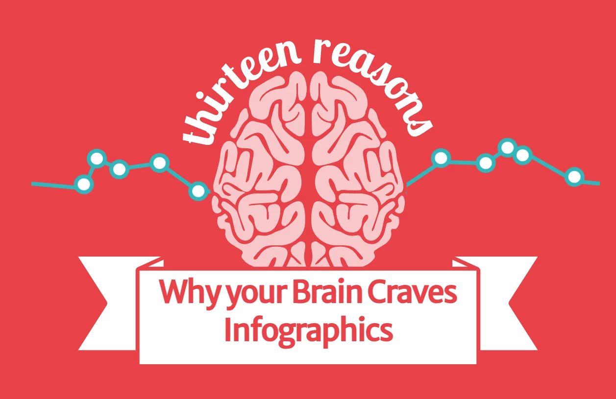
1. 13 Reasons Why Your Brain Craves Infographics by NeoMam Studios
Standout Features:
- Accessible, straightforward illustrations
- Dynamic yet organized layout
- Creative timer integration
What better way to start than with an infographic that summarizes the power of infographic designs? NeoMam Studios’ 13 Reasons Why Your Brain Craves Infographics encapsulates how well-crafted visual data can captivate and inform.
The design features accessible, straightforward illustrations that make key points easy to understand and remember. Each visual element complements the data it represents, ensuring that each information is simplified for quick comprehension. This approach enhances the infographic’s memorability while keeping it engaging for a broad audience.
Moreover, each segment maintains viewer interest thanks to their unique structure and well-organized information. This dynamic approach ensures that users stay focused and invested in the content.
Adding to its brilliance is the timer at the end, which tracks how long readers spend with the infographic. This creative detail underscores how much valuable information viewers can absorb in just a few minutes, reinforcing the infographic’s effectiveness.
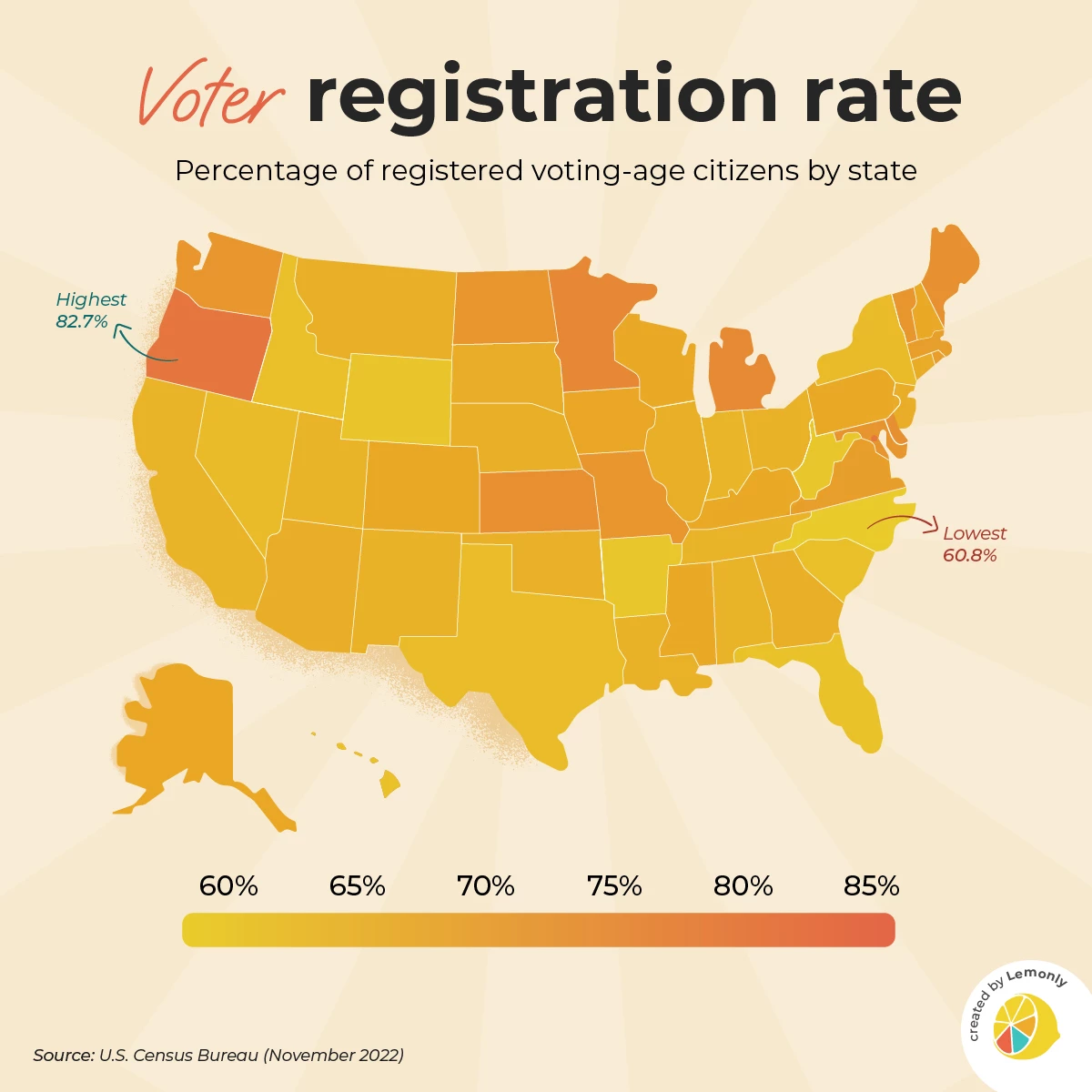
2. Voter Registration Rates by Lemonly
Standout Features:
- Streamlined US map design
- Color intensity as a value display
- Highlighted highest and lowest values
When thinking about maps, one might assume they are always packed with elaborate data on famous landmarks around the world such as the Grand Canyon or the Great Wall of China. However, Lemonly's Voter Registration Rates infographic demonstrates that maps can be simple, effective, and highly engaging. This minimalist design strips away unnecessary details and focuses solely on its primary purpose — showing the differences in voter registration rates across the US states.
The infographic features a streamlined US map where state borders are the only defined elements. Instead of overwhelming the viewer with text or excessive data points, the design uses varying shades of orange to represent registration percentages. This creative use of color intensity helps viewers differentiate states based on voter registration rates at a glance.
Below the map, a straightforward intensity bar shows what percentage each shade represents. For further clarity, the highest and lowest voter registration rates are highlighted on the map, adding valuable context without cluttering the design.
While the absence of state names maintains the clean aesthetic, it may pose a challenge for those less familiar with US geography. Despite this, the infographic effectively communicates its message, proving that even maps — a traditionally dense medium — can embrace simplicity to create meaningful and accessible visualizations.
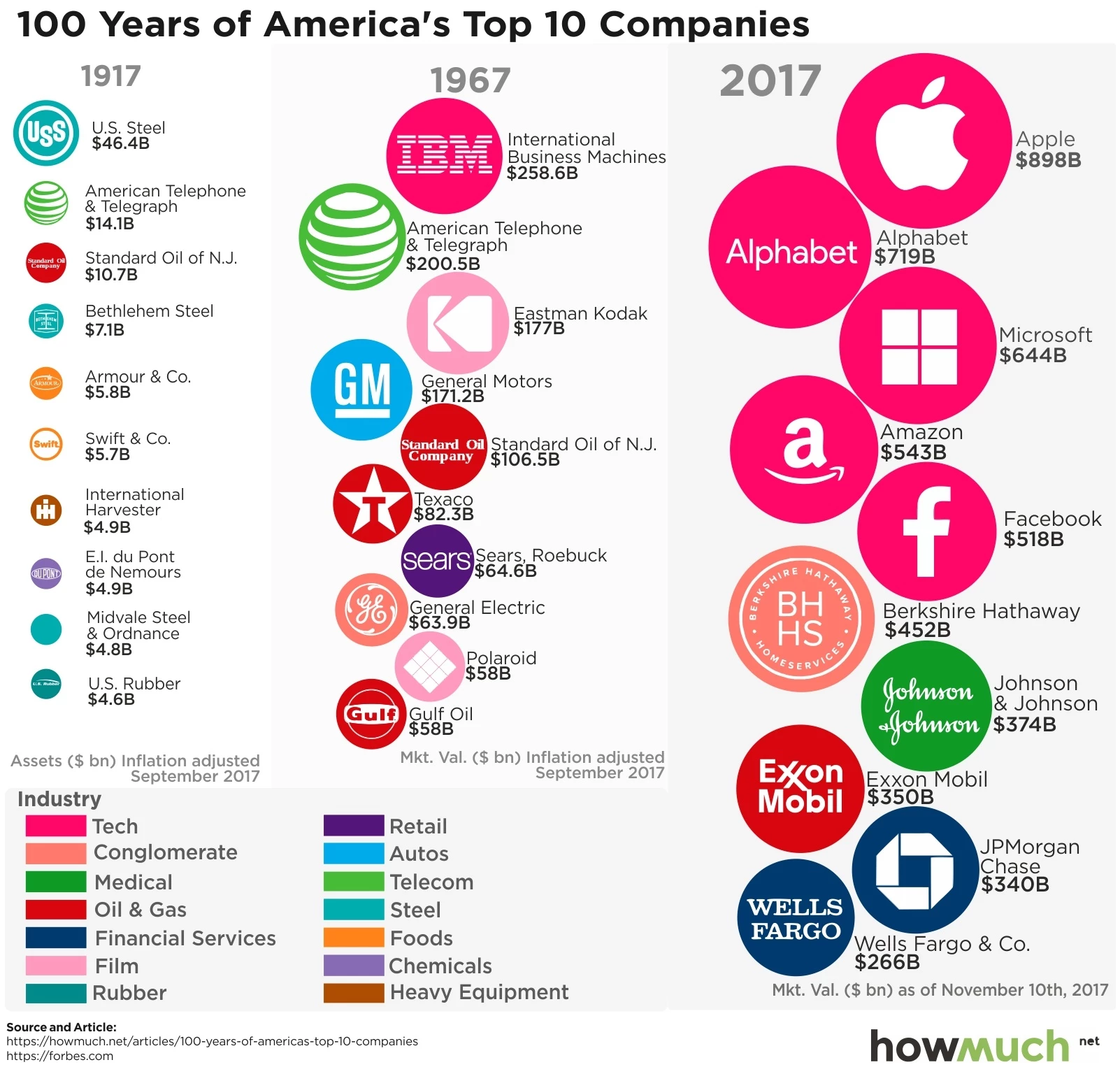
3. 100 Years of America’s Top 10 Companies by HowMuch.net
Standout Features:
- Industry-defined color coding
- Inclusion of logos for a quick read
- Clean, column-organized layout
The 100 Years of America’s Top 10 Companies infographic, designed by HowMuch.net, takes a dynamic approach to showcasing the evolution of corporate wealth in the U.S. over the past century. Its clean, column-organized layout simplifies navigation, presenting the top ten companies from 1917, 1967, and 2017. This structure highlights the shifting landscape of corporate dominance and enables viewers to track historical changes clearly.
A distinctive feature of this simple infographic example is the use of industry-defined color coding, which allows for an immediate visual comparison of the wealthiest sectors. The circles representing each company also vary in size according to their inflation-adjusted valuations, providing a clear, visual representation. This combination of color and size helps viewers quickly grasp the magnitude of corporate success in a comparative manner.
The infographic also includes logos, ensuring that the companies involved are easily identified. Overall, the design delivers an insightful, accessible, and visually compelling overview of corporate history, making it an excellent simple infographic idea.
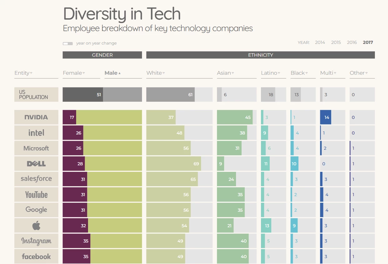
4. Diversity in Tech by Information is Beautiful
Standout Features:
- Clean, straightforward layout
- Year-on-year comparison option
- Sort order customization
If an infographic is simple, it doesn’t mean it has to be static. The Diversity in Tech interactive infographic by Information is Beautiful proves that by embracing clean website design principles to present complex data in an intuitive format.
Its neat, straightforward layout uses a tabular structure, with each column dedicated to a single data set. The percentages are displayed in relation to 100% of company employees, ensuring that values don't overlap or confuse the viewer.
The only column that presents double data is the one for gender diversity, with purple for women and pastel green for men, clarifying the distinctions without overwhelming the design with unnecessary details.
Incorporating interactivity, this simple infographic allows viewers to compare data year-on-year, which enables them to track the progress (or lack thereof) over four consecutive years. Additionally, the sort order customization feature offers another layer of flexibility, letting users organize the data either in ascending or descending order for a more personalized experience.
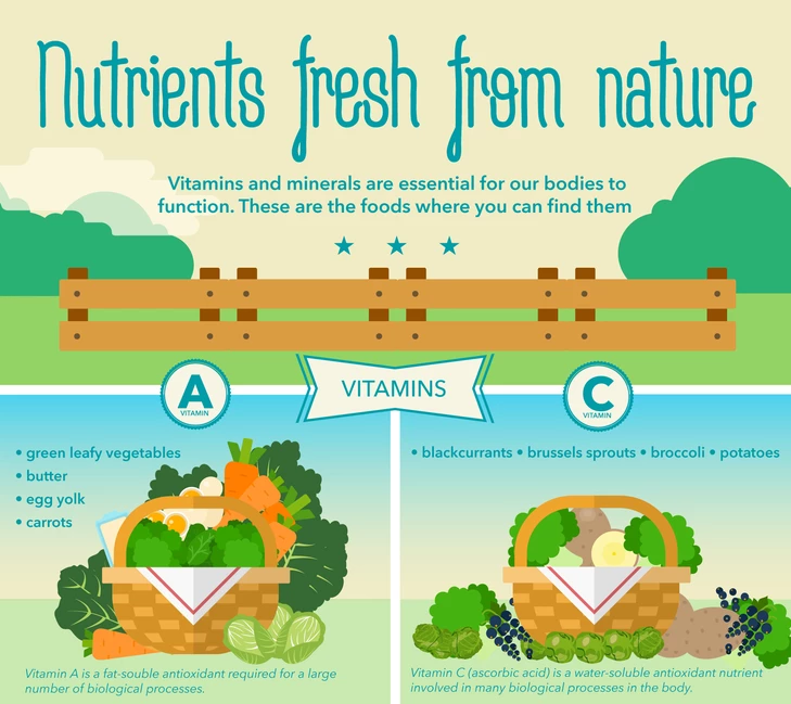
5. Nutrients Fresh From Nature by Hot Butter Studio
Standout Features:
- Inviting, 2D illustrations
- Joyful, vibrant color palette
- Sleek layout
Hot Butter Studio's Nutrients Fresh from Nature infographic presents a visually engaging and approachable guide to vitamins and minerals, motivating viewers to embrace healthier food choices.
The design features inviting 2D illustrations of fresh produce in baskets and stalls, highlighting the natural vibrancy of the food and encouraging a wholesome lifestyle. The occasional inclusion of human figures within the visuals humanizes the content, creating a more relatable experience. The joyful, vibrant color palette amplifies the infographic's inviting and energetic tone, drawing attention to the natural hues of fruits and vegetables.
Each vitamin and mineral are presented in its distinct box with a bold title. For viewers interested in a deeper understanding of the health benefits, a brief explanation at the bottom of each section offers additional context.
The clean, sleek layout and engaging visuals make this infographic design ideal for educational purposes, particularly in medical institutions focusing on children's health. It's a valuable asset in teaching young audiences about nutrition in an accessible and enjoyable way.
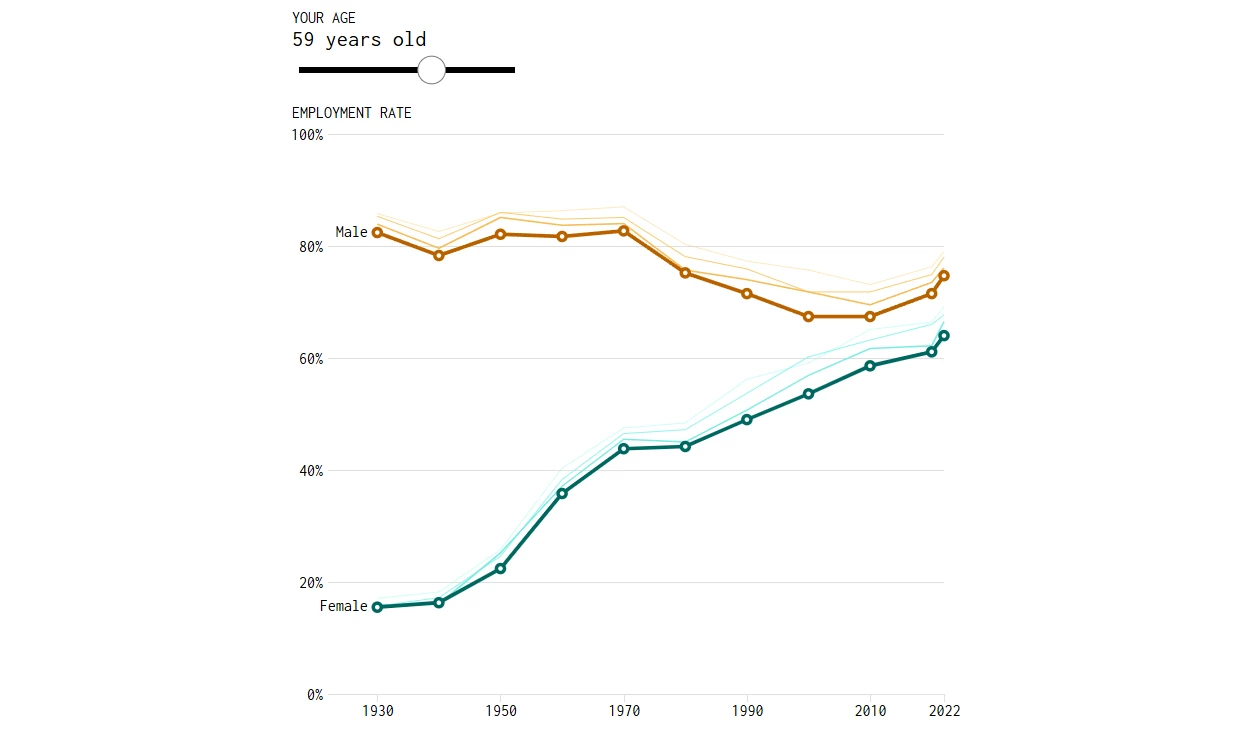
6. Employment Rates and Age, More Work and More Years by FlowingData
Standout Features:
- Minimal, straightforward UI
- Simple, intuitive data customization
- Content summary
FlowingData's Employment Rates and Age, More Work and More Years simple infographic design presents a clear and insightful look at how work patterns in the US have changed.
With four simple, user-friendly graphs, the design allows viewers to explore the changes in who works and for how long, making complex data both understandable and engaging. The minimal website UI design ensures the focus remains on the graphs and content, making it easy for users to interact with and interpret the information.
The design's intuitive data customization feature further enhances accessibility, allowing users to adjust a single bar to define the age group they want to examine. The Y-axis presents the percentage of people employed, while the X-axis shows the corresponding years, offering a straightforward way to view employment trends across different age groups.
Lastly, the written content accompanying the graphs not only summarizes the displayed data but also explains potential reasons behind the observed shifts.
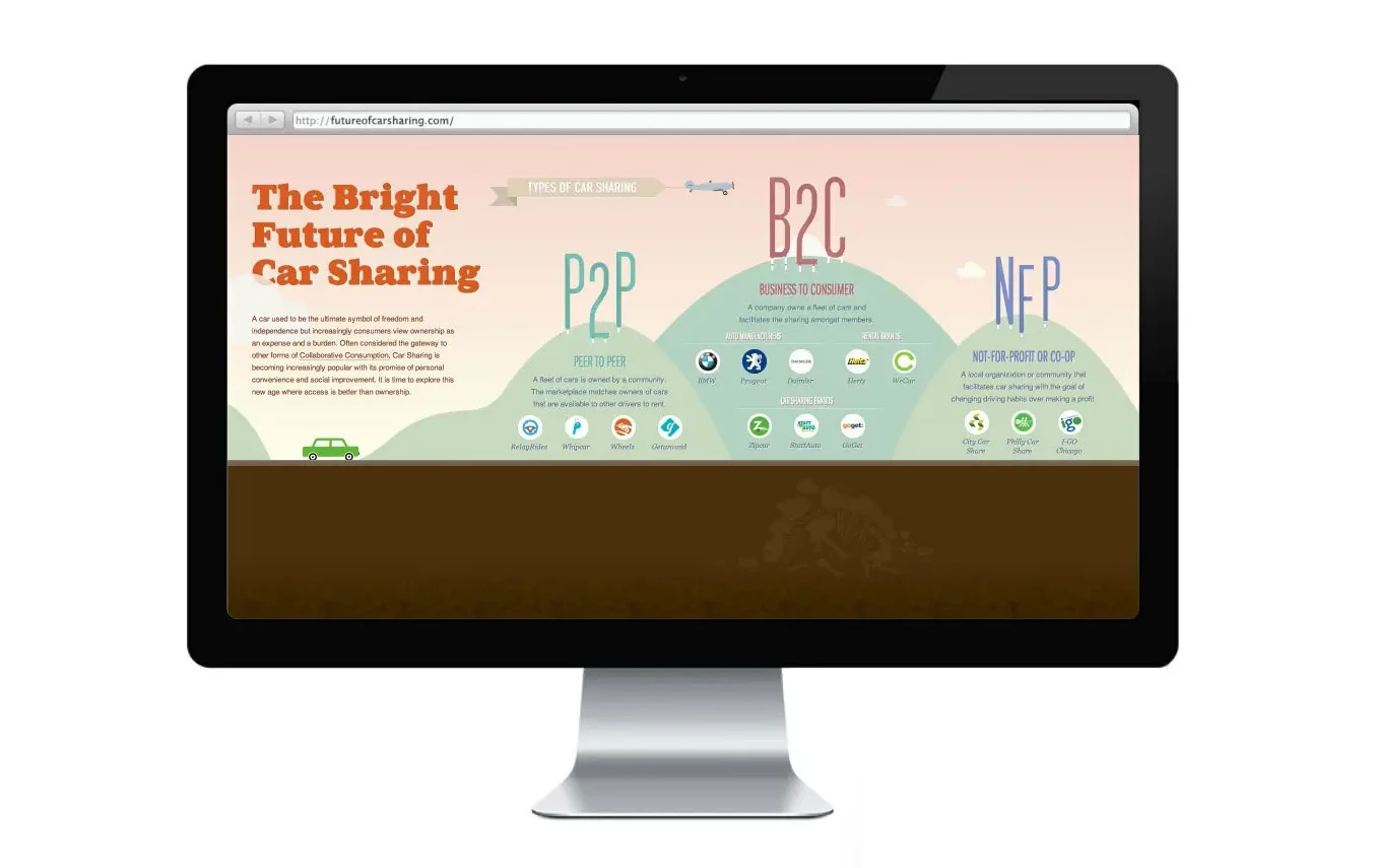
7. The Bright Future of Car Sharing by Hyperakt
Standout Features:
- Simple, guided navigation
- Creative data visualization
- Key points highlighted with bold serif font
Hypekart’s The Bright Future of Car Sharing interactive infographic invites users on a global journey to explore the transformative impact of car sharing. As they press the left and right keyboard arrows, they “drive” an animated car along a highway, encountering a dynamic landscape of data visualizations and statistics.
The design seamlessly integrates interactivity with informative content, making complex data more engaging and easier to digest. The simple, guided navigation ensures users can follow along without confusion, with each interactive feature clearly explained.
Rather than relying on traditional graphs, the infographic takes a creative approach to data visualization, using elements like tree heights, house sizes, and even billboards to represent key statistics. This fresh approach makes the experience informative and visually captivating.
Furthermore, to draw attention to the most important takeaways, the agency implements bold serif titles. This ensures users can easily grasp the significance of car sharing's rise.
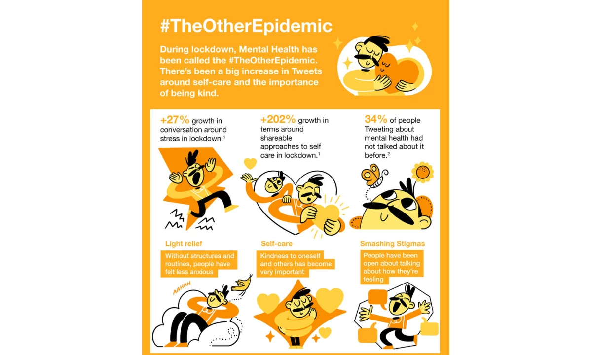
8. #TheOtherEpidemic by Scriberia
Standout features:
- Charming comic-like illustrations
- Vibrant orange-dominating palette
- Navigation-enhancing highlights
Scriberia’s #TheOtherEpidemic infographic captures the impact of the COVID-19 pandemic lockdown on mental health conversations with a thoughtful and engaging design. Organized into three clear sections — context, statistics and analysis, and practical advice for brands — it guides viewers through the narrative with clarity and purpose.
To create a laidback atmosphere, the agency employed charming, comic-style illustrations, making this sensitive topic approachable and relatable. These visuals, combined with a vibrant orange-dominating palette, energize the design while exuding motivation and positivity. This alignment of colors and illustrations reinforces the mental health theme, encouraging empathy and proactive engagement.
The infographic enhances navigation through well-placed highlights, enabling viewers to quickly absorb key information at a glance. This thoughtful combination of visual storytelling, vibrant design, and structured content makes #TheOtherEpidemic an accessible and impactful resource for understanding and addressing the rise in mental health conversations during lockdown.
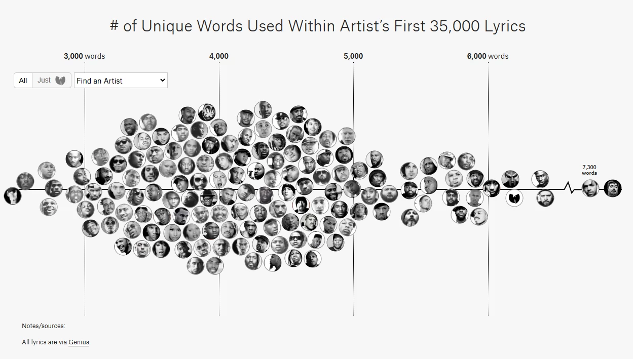
9. The Largest Vocabulary In Hip Hop by Pudding
Standout Features:
- Interactive data visualization
- Minimalist graph design
- Analytical textual content
Pudding’s The Largest Vocabulary in Hip Hop infographic delves into the lyrical complexity of hip-hop artists, showcasing the unique words used within their first 35,000 lyrics. This interactive visualization effectively blends data analysis with engaging design to make complex insights accessible and entertaining.
The primary feature is an interactive graph, where encircled rapper photos are scattered across a horizontal axis representing their vocabulary size. When users hover over an image, additional details about the artist’s word count emerge, making it informative and dynamic.
Complementing this interactive element, a minimalist list graph organizes rappers by unique word ranges, employing color coding to link them to specific eras in hip-hop. This clean, straightforward layout avoids unnecessary embellishments, focusing the user’s attention on the data.
The infographic is further enriched by analytical textual content, offering context for the visualizations. It explains how the data was gathered and highlights the decreasing vocabulary in modern hip-hop as well as the standout artists with exceptional linguistic diversity.
What Makes Simple Infographics Effective?
The effectiveness of simple infographics lies in their ability to communicate key messages without overwhelming the audience. By focusing on minimalism, these designs make information accessible, visually appealing, and easy to understand. Let’s explore five essential factors that highlight why simplicity is the cornerstone of impactful infographic design.
Clarity over complexity
Simple infographics prioritize clarity by eliminating unnecessary visual noise. This approach ensures the audience can grasp the key message instantly without sifting through excessive details or graphics.
Focused messaging
Simple infographics zero in on a single idea or topic, eliminating miscommunication tendencies and overwhelming the viewer with too much information. By focusing on a single message, these infographics foster comprehension, retention, and user satisfaction.
Strategic use of visuals
Minimalist designs use visuals strategically to emphasize critical points, minimizing distraction from the content. Icons, charts, and color coding are used with purpose, guiding the viewer’s attention to essential information.
Accessibility and versatility
Simple infographics are universally accessible and appeal to diverse audiences regardless of their expertise. Their versatile nature makes them adaptable across platforms, whether for social media, presentations, or educational materials.
Faster processing time
With clean layouts and focused content, simple infographics cater to the modern audience’s limited attention span. Viewers can quickly process and understand the information, making them ideal for today’s fast-paced environment.
How to Create Simple Infographics in 5 Steps
Infographics are a powerful way to communicate complex information quickly and effectively. Whether you're educating customers, presenting data, or enhancing your brand’s messaging, a well-designed infographic can boost engagement and retention. Here’s a five-step guide to creating clear, compelling infographics without overcomplicating the process.
1. Set your goals
Start with a clear purpose. Are you simplifying industry insights, showcasing product benefits, or driving customer action? A focused goal ensures your infographic stays relevant and delivers value. For instance, if your aim is to boost engagement, include a call-to-action that directs viewers to your website or contact page.
2. Gather and analyze data
Collect accurate, relevant data that supports your message. Instead of overwhelming your audience with excessive details, highlight only the most impactful insights. Clarity is key — your audience should grasp the main points at a glance.
3. Craft images and charts appealing to your main audience
Your infographic should speak to your customers, not just look good. Use visuals that align with their preferences and needs — charts, icons, or product imagery. A well-crafted design ensures your message is both engaging and easy to digest. If you want to take it a step further, consider partnering with expert infographic designers who can translate complex data into compelling visuals that align with your brand’s goals.
4. Use an infographic template to polish your layout
A structured design improves readability. Simple infographic templates help maintain consistency while ensuring the layout is visually appealing and easy to follow. Choose one that supports your goals and keeps the flow intuitive.
5. Review your infographic design
Before publishing, check your infographic for accuracy, readability, and alignment with your brand. Make sure the message is clear, the visuals reinforce key points, and the design remains simple yet effective. A second pair of eyes can help refine the final version.
Simple Infographic Ideas: The Bottom Line
The examples we’ve discussed offer a wealth of inspiration for crafting effective and minimalist infographics. These designs show that simplicity doesn’t mean sacrificing creativity or impact; rather, it’s a powerful tool to communicate ideas efficiently.
In today’s fast-moving world, where audiences seek comprehensive insights quickly, simple infographics are the perfect solution. They deliver maximum results by making information easy to consume and understand.
Simple Infographic Examples FAQs
1. What are some common uses for simple infographics?
Simple infographics are widely used across various industries because they make information easy to understand and visually engaging.
- Education: They simplify complex topics, making it easier for students and educators to absorb key concepts.
- Marketing: Brands use them to highlight key messages, showcase products, and boost engagement on social media.
- Business Presentations: Infographics help summarize data, visualize trends, and emphasize crucial takeaways in reports and meetings.
- Public Awareness Campaigns: They effectively communicate critical information, ensuring messages reach and resonate with a broad audience.
2. How can I ensure my infographic is visually appealing?
To create a visually appealing infographic, start with a cohesive color palette that reflects the theme or subject matter. Use legible fonts that are easy to read, avoiding overly decorative styles. Incorporate relevant visuals like icons, illustrations, or charts that complement the content and make the information engaging. Balancing white space is also crucial — it prevents the design from feeling cluttered and ensures each element stands out.
3. Are simple infographics suitable for complex topics?
Yes, simple infographics are highly effective for transforming complex topics into understandable visuals. By focusing on the core message and presenting data in a streamlined format, they make even the most intricate subjects accessible to a broad audience.