Most data gets ignored, likely because it’s not visual.
With 65% of people being visual learners and visuals processed up to 60,000 times faster than text, the case for data design is clear.
Statistical infographics bridge the gap. They transform complex metrics into quick, impactful visuals that clarify performance, reveal trends, and drive business decisions.
From pitch decks to dashboards to campaign recaps, statistical infographics give teams an edge.
This article features five statistical infographic formats that:
- Turn complex metrics into clear business narratives
Support faster, data-driven decisions across teams
Streamline reporting for stakeholders and clients
Elevate marketing, sales, and financial communication
Boost visibility and impact across digital channels
They cut through clutter, highlight performance, and turn data into decisions. Here are some standout examples and how to choose the right format for your goals.
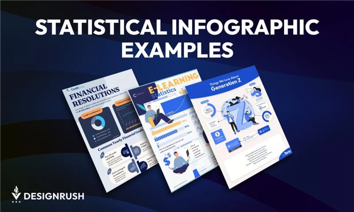
Top Statistical Infographic Examples
Explore five infographic formats that help leaders clarify data, align teams, and communicate results more effectively.
1. E-Learning Growth: Industry Trends Infographic Example
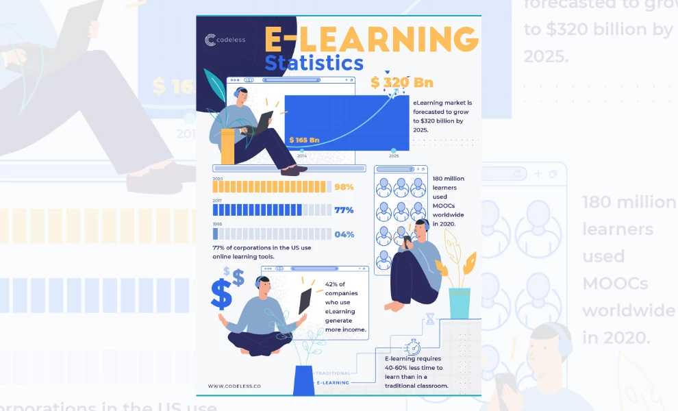
Key Features:
- Modular layout with guided vertical flow
- Character-driven visuals that humanize data
- Strategic use of color for visual emphasis
This stats infographic transforms a dense topic into a visually fluid experience. Codeless structures the design around a vertical, modular layout that feels like a guided walkthrough.
Each section is logically divided to help viewers process one idea at a time without getting lost in the numbers.
Instead of relying on generic icons or stiff graphics, the design uses character illustrations to bring energy and relatability.
These visuals feature people actively engaged in learning, which softens the corporate tone and invites connection.
Muted blues and neutrals provide a professional base, while pops of orange direct attention to key insights. The typography is crisp and consistent, creating a clear visual hierarchy that makes scanning effortless.
It comes across as polished and approachable, which is an excellent fit for brands that want to inform while staying engaging.
Our advice? Use this style for executive summaries or investor briefings where clarity equals confidence.
2. Generation Z Insights: Audience Persona Infographic Example
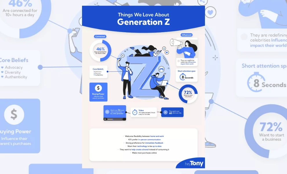
Key Features:
- Centralized layout anchored by a strong letterform illustration
- High-contrast callouts for quick scanning
- Cohesive blue tones tie visual elements together
This infographic captures Gen Z’s values, habits, and influence with a clean, stylized approach that feels modern and approachable.
The bold "Z" at the center is a visual anchor, drawing the viewer in and holding the design together. Every element branches off this focal point, which turns the layout into an interconnected map of traits.
What sets this piece apart is its use of visual hierarchy. Icons, stats, and keywords are grouped into easy-to-scan blocks, each clearly labeled with minimal clutter.
Callouts like “8-second attention span” and “72% want to start a business” are given room to breathe, allowing each insight to hit with clarity.
The best part? The cool blue palette keeps the design cohesive while offering tone variation. This uniformity adds polish, while the minimal use of secondary colors ensures nothing distracts from the message.
From top to bottom, the structure and styling make it ideal for brands that need to explain personas to internal teams or build trust with Gen Z audiences.
Why it's worth it? According to a LinkedIn B2B study, 71% of marketers who exceeded their revenue goals had documented personas guiding their strategy.
3. Financial Resolutions: Credit Card Statistics Infographic Example
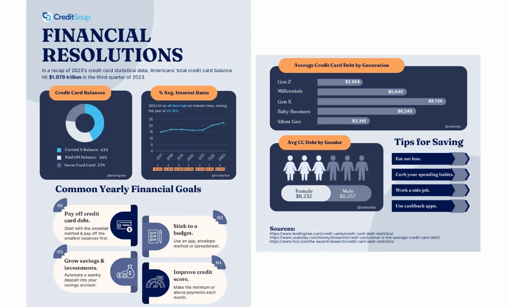
Key Features:
- Sectioned layout that moves from data to action
- Smooth color blocking for easy visual separation
- Strong use of icons and charts to support quick takeaways
This infographic feels like a visual financial checklist: structured, practical, and easy to follow.
CreditSoup lays everything out in neat panels, guiding readers through what Americans owe, how rates have shifted, and what people aim to do about it.
The design cleverly uses contrast to break up complex information.
Here, a mix of deep blues, soft greys, and pops of orange gives each section its own identity without clashing. It helps the viewer move from one part of the story to the next without missing a beat.
Charts and icons do most of the talking. From average interest rates to generational debt, everything is paired with visuals for easier comprehension.
The bottom half shifts gears into goal-setting and savings tips, making the layout feel both informative and motivational.
This kind of infographic works well in financial newsletters, blog articles, or presentations where clarity and structure are key.
Executive Takeaway: Turn financial updates into visuals to reduce confusion and speed up alignment across finance and operations teams. Clear charts lower misinterpretation risk in decision-making.
4. Facebook Statistics 2025: Platform Overview Infographic Example
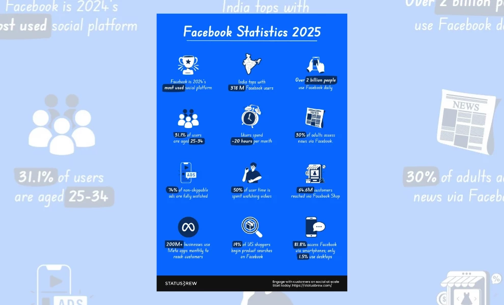
Key Features:
- Grid-based layout with stat-by-stat clarity
- Icon-forward visuals for faster scanning
- Bright color blocking for contrast and engagement
Executive Takeaway: Use this layout to turn social media analytics into bite-sized visuals for leadership and clients. Quick-scan grids improve comprehension during performance reviews and digital strategy sessions.
This infographic wastes no time. Built around a grid-style layout, it drops statistic after statistic in a format that’s easy to skim and hard to ignore. Each tile is treated like a clean, punchy, and straight-to-the-point social media card.
Icons do a lot of the heavy lifting here.
From clocks and shopping carts to smartphones and trophies, each graphic gives users a preview of the insight before they even read the text. It’s a smart move for audiences used to scrolling fast!
The bright blue background grabs attention while giving the white and dark accent tones room to pop. It keeps the energy high without overwhelming the content.
Plus, the font choices and rounded layout reinforce a casual but clear vibe, making it feel more like a social dashboard than a dry report.
This format is ideal for social marketers, pitch decks, or communicating platform impact. It’s quick, visual, and built for modern attention spans.
Our advice? Embed infographics in presentations to make value propositions more persuasive.
5. America’s Biggest Retailers: Global Sales Infographic Example
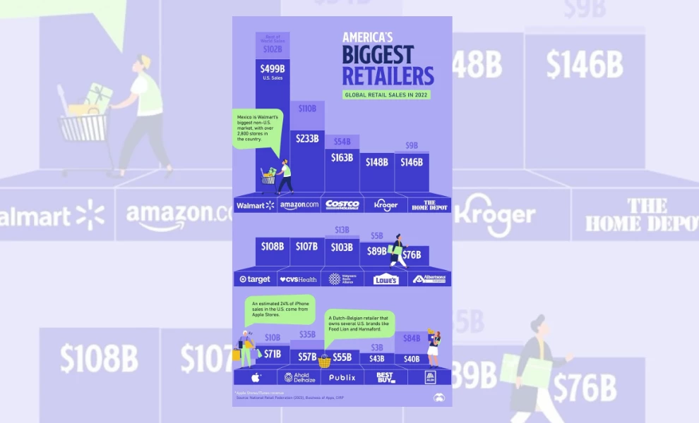
Key Features:
- Block-style bar chart that doubles as a ranking map
- Consistent vertical alignment for easy comparison
- Brand logos integrated into data visuals
This infographic takes the concept of a sales leaderboard and turns it into a visual landscape. Each company’s total retail sales are represented as building blocks, stacked by height and value.
Additionally, the design leans into scale.
Walmart towers at the top with $499 billion in U.S. sales, immediately grabbing attention. Every other retailer lines up beside it, creating a natural visual comparison without saying a word.
Clean, proportional spacing gives each brand its moment without crowding the layout.
What makes this work so well is the smart use of logos and color. Each brand is easily recognizable, with dark blues and purples keeping the focus on the numbers.
The pops of green from the speech bubbles offer quick bites of extra context, like regional dominance or product stats, without slowing the scroll.
Perfect for illustrating market position, performance, or category share, this layout provides a blueprint for creating industry reports, B2B marketing, or investor decks.
Executive Tip: Utilize modular infographic layouts to present complex industry trends in a digestible format, facilitating quicker strategic decisions.
What Is a Statistical Infographic?
A statistical infographic is a visual tool for simplifying complex data. It uses charts, graphs, percentages, and icons to highlight key metrics and trends in a clean, digestible format.
Instead of burying insights in spreadsheets or lengthy reports, this infographic brings structure to information. Good visual hierarchy leads the eye, while consistent layout and spacing ensure nothing gets lost.
Each element is designed to show what matters at a glance.
Statistical infographics are used across industries. Marketers rely on them for campaign reports, analysts for performance reviews, and educators for illustrating concepts.
They’re also common in investor presentations, quarterly updates, and high-impact social content.
The best visuals frame data in a way that drives action.
How to Choose the Right Statistical Infographic for Your Business
The key to choosing the right statistical infographic is understanding what your audience needs to take away and how fast they need to grasp it.
If you’re presenting quarterly results to stakeholders, you’ll want a clean layout that prioritizes clarity. Bar charts, timelines, and side-by-side comparisons work well for showing growth, change, or performance.
On the other hand, if you’re posting insights on social media, go for bold visuals and quick-hit stats.
Think of your infographic as a translator. The format you choose should take raw numbers and communicate them in the language your audience understands best.
Where to Find Statistical Infographic Templates
You don’t have to start from scratch. Many tools offer plug-and-play templates built for different types of stats infographics. Here are a few worth exploring:
1. Canva
This web-based design program is user-friendly and packed with ready-to-use templates for charts, timelines, and comparison layouts. It’s great for producing quick marketing visuals and internal updates.
2. Venngage
Designed specifically for infographics, Venngage offers templates tailored to business use cases like reports, surveys, and presentations. Plus, it’s beginner-friendly!
3. Adobe Express
This tool is part of the Adobe suite but simplified. It includes smart chart integrations and lets you stay on-brand if you already use Adobe tools in-house.
4. Piktochart
Piktochart is best suited for professionals who want more control over layout and data visualization. It’s ideal for long, comprehensive presentations or detailed reports.
5. Figma or Illustrator Kits
For teams with design experience, Figma and Illustrator offer complete creative control. To speed things up, look for pre-built infographic kits or chart packs.
Designer vs Template: What’s Best for You?
There’s no one-size-fits-all solution. The right choice depends on your goals, timeline, and how polished you need your final output to be.
Templates are great when you need speed, simplicity, and flexibility.
If your team regularly shares reports, social posts, or internal updates, using platforms like Canva or Venngage can save time without sacrificing clarity.
Templates are especially useful for recurring content or when you’re working with small teams that don’t have a dedicated designer.
But if you’re sharing high-stakes content, like investor decks, press materials, or a key landing page, it might be worth bringing in a professional graphic designer.
This is because a custom design gives you more control over branding, layout, and how the data is framed.
A good rule of thumb? Use templates for everyday content and consider custom design for when first impressions or high engagement matter.
Statistical Infographics: The Bottom Line
You don’t need to flood your audience with numbers or figures to prove your point. You just need to frame the story right, and that’s what great statistical infographics do.
They turn complex information into something people want to look at. The goal is to provide something memorable and drive action.
Similar to product infographics, these visuals work because they shape perception.
Whether you're pitching to investors, reporting campaign results, or educating your audience, the right visual makes the message stick.
In a world saturated with content, data only matters if it’s seen, and the best statistical infographics make sure it is.
Statistical Templates: FAQs
1. What makes a good statistical infographic?
A good statistical infographic is clear, well-structured, and easy to scan. It highlights one main idea and breaks it down with clean visuals and concise content — the kind that guides the viewer’s eye without clutter.
2. What’s the best tool to make statistical infographics?
For quick results, try Canva, Venngage, or Piktochart. For full control, go with Figma or Adobe Illustrator. Your ideal tool will depend on your needs, customization requirements, and skill level.
3. How many data points should you include?
Keep it simple. Most designs aim for three to five key insights, so focus on what matters and leave out anything that doesn’t support your message.
Here’s a tip: Use visual grouping or section breaks to guide the reader’s eye and avoid overwhelming them with too much at once.
4. What are the common mistakes to avoid?
Avoid designing your statistics infographic with:
- Huge chunks of text
- Weak contrast
- Distracting shapes or visual elements
- Data sets that dilute your key message
- Irrelevant graphics that don’t support the data being presented
Also, don’t mix too many chart types into one layout, as consistency helps users interpret information faster. Always design for clarity, not complexity.