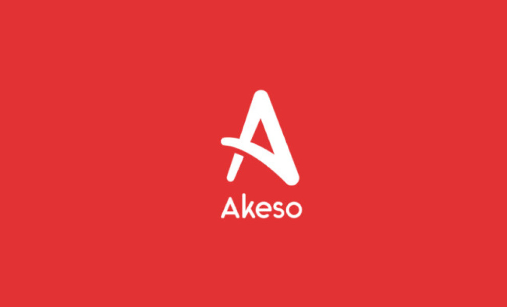
Standout Features:
- Minimalistic logo design
- Sharp edges in the middle
- Motion-like emblem
Akeso sells socks with special features. Their customers enjoy antibacterial, anti-fungal, and odor-resistant socks. On top of that, the socks are made from fire-resistant material, and they don’t have to be washed!
How do you market all those essential features and help Akeso stand out?
Checkpoint Creative underwent deep market research to find a way to combine the aesthetics of the product but also highlight the performance benefits. The design had to be simple yet memorable. The primary target audience was active life enthusiasts.
The solution: a minimalistic red logo design on a white background. The product’s functional benefits found their way to the customers through this strong color contrast. Through an aggressive look, they ensured that the inner edges were sharp and the outer ones were rounded.
The logo resembles the letter “A,” but it can also be perceived as two legs in motion. It was inspired by Greek alphabet symbols, such as Alpha, Gamma, Phi, and Omega.