Standout Features:
- Relatable illustrated storytelling
- Bold, legible label concept
- Color-coding for consistency
If wine logos could talk, this one would say: “You’ve earned this.”
The Mommy’s Time Out logo design doesn’t rely on tradition or heritage cues. Instead, it leans into lifestyle storytelling with quiet confidence. Designed for everyday relief rather than wine connoisseurship, it captures the attention of busy parents not through prestige, but through relatability.
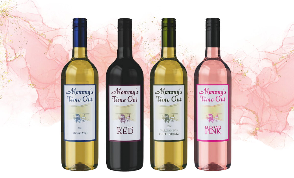
The logo is as subtle as the humor behind the name, and that’s the point. It is visually quiet, but deeply communicative. There’s no color overload, no whimsical cartoons. Just a simple corner of a room, a lone chair, a small side table, and a filled glass. It’s a minimalist domestic scene that every tired parent instantly recognizes.
The typography on the Mommy’s Time Out logo uses contrast to clarify purpose. The brand name appears in a casual, script-style typeface of soft curves and loose spacing. Below it, a traditional serif font communicates the variant, offers structure and legibility. This hierarchy creates a clear cognitive order: emotional cue first, product detail second.
Rather than reinventing the logo for each SKU, the brand uses color as a way to differentiate without disrupting recognition. This flexibility allows the Mommy’s Time Out logo design to stay consistent in structure, while giving each variant its own visual identity.
The Mommy’s Time Out logo design demonstrates how flexibility and consistency can co-exist. It manages to create a cohesive, emotionally resonant identity across a growing lineup. It’s a strong example of how the best wine bottle logo designs serve as both a visual anchor and a versatile tool for brand expansion.