Standout Features:
- Modernized
- Minimal design
- Custom font style
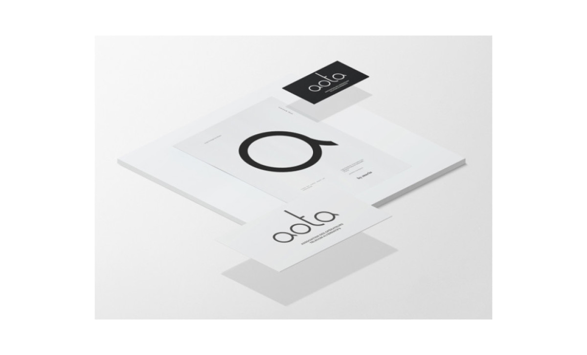
More By Us developed a new logo for the French association AOTA. While there were three exceptional proposals, one stood out thanks to its sheer simplicity and visual appeal that modernizes the brand’s identity.
The modernized emblem redesign presents the initials in a custom font style with lowercase lettering. The “A”s and the “O” are similar in this minimalistic project, with the “A” extended via a short tail. The tail is also identical to the ending of the “T” glyph, the most stylized letter.
Its vertical line is elongated, making the space between the cross-section identical rather than slightly longer downwards. The horizontal line also doesn’t cross the vertical one but stems from it to the right.
Check out other impressive logo redesigns.

-preview.jpg)
