Standout features:
- Coffee Beans symbolism
- Cozy vibe
- Energetic & playful
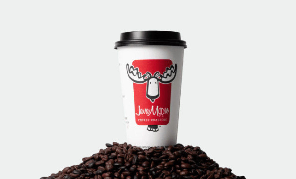
First on the list of our best red logos is Java Moose Coffee a brand that sells roasted coffee beans. The product is packaged at their facility and accessible online and in-store. They asked OrangeSprocket to help them revitalize their brand through a new, improved visual identity.
The design agency developed what appears to be a friendly mascot for the brain. The design features a black-and-white illustration of a reindeer with coffee beans as ears next to its antlers. The drawing is placed against a red rectangular background. The shade of red is mildly aggressive, and the illustration appears playful, energetic, and friendly, so this combination gives the brand’s logo a cozy, warm vibe.
The logotype is written in a cursive, frisky font. It’s placed below the reindeer. Like the logo, it features the coffee beans in places of the letter “O.”