FC Barcelona: Key Points
- Logos Drive Merch Growth: FC Barcelona recorded €179 million in kit & merchandise revenue in 2023, the highest in Europe, with a 30% YoY increase in merchandising sales.
- Heritage Meets Platforms: The 2018 logo update boosted digital clarity, enhancing e-commerce; BLM’s e-commerce revenue tripled recently.
- Brand Value Soars: As the world’s third-most valuable football club at $5.65 billion, FC Barcelona shows consistent visual identity and builds financial strength.
The FC Barcelona badge stands as one of football’s most enduring and valuable visual assets. Ranked by Forbes as the third-most valuable club in 2025 at $5.65 billion, FC Barcelona’s logo plays a key role in the €179 million kit & merchandise revenue it generates annually. Minimal yet meaningful redesigns have translated identity into income.
The Moden Barcelona Logo: A Legacy Etched in Design
- Minimalist Digital Clarity: The 2018 crest removed text ("F.C.B.") and inner lines to create a symbol that reads sharply across screens, aligning with global brands’ digital-first design strategies.
- Iconic Heritage Retained: Despite modern simplification, the cross, Catalan Senyera, blaugrana stripes, and ball remain untouched, ensuring instant global recognition rooted in culture.
FC Barcelona Logo Evolution History
1899–1910: Civic Symbolism Over Brand Identity
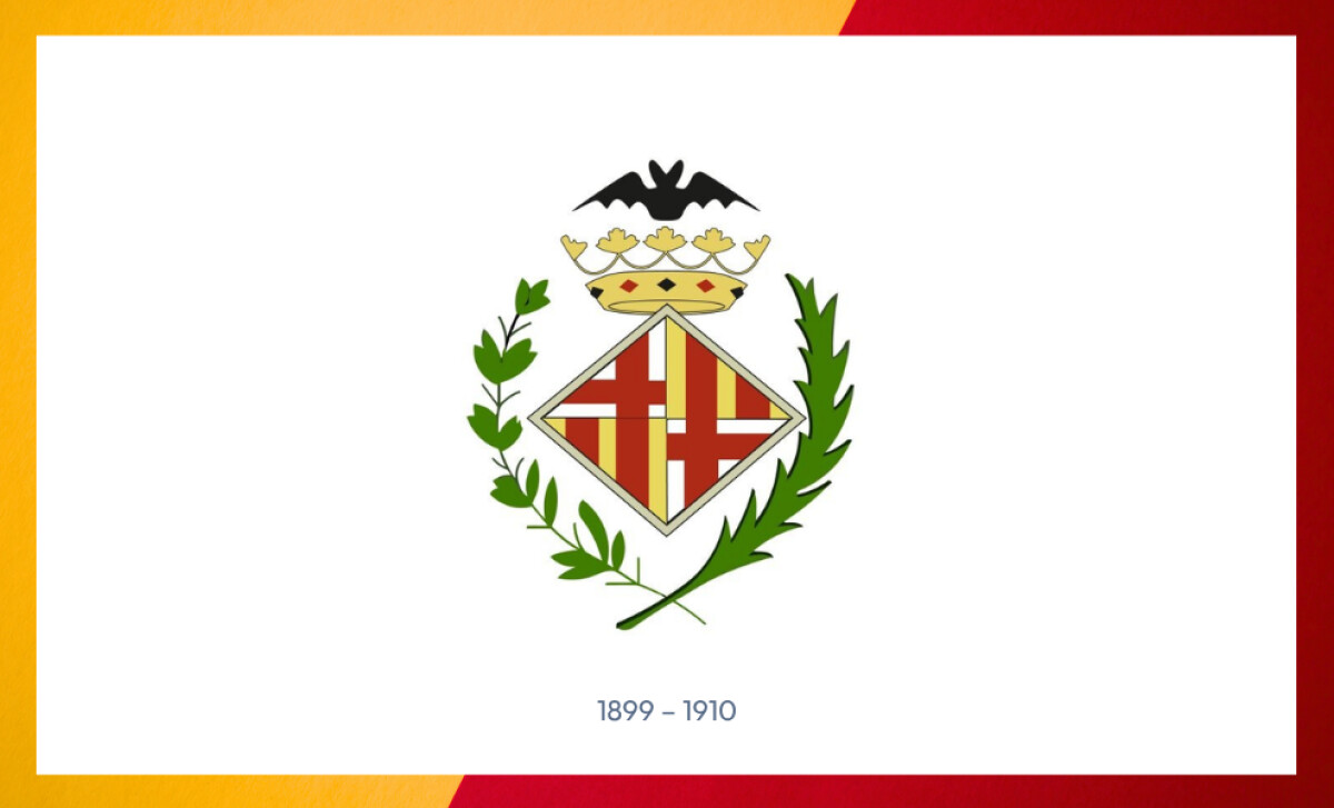
In its earliest days, FC Barcelona adopted the official coat of arms of the city as its emblem.
The design featured the Cross of Saint George and the Catalan Senyera within a diamond-shaped shield, topped with a royal crown and surrounded by olive and palm branches.
While visually regal, it lacked any direct association with football, functioning more as a municipal identifier than a team badge. This foundational era set the tone for the club’s deep ties to Catalonia but signaled the need for a unique football crest as the club matured.
See more emblem logos turn brands into icons.
1910 – 1920: The Comamala Crest — Identity by the Fans
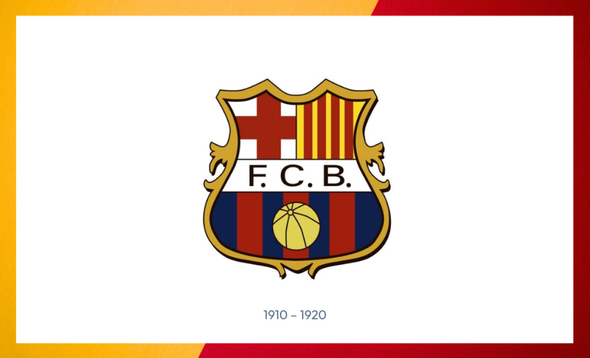
In its earliest days, FC Barcelona adopted the official coat of arms of the city as its emblem. The design featured the Cross of Saint George and the Catalan Senyera within a diamond-shaped shield, topped with a royal crown and surrounded by olive and palm branches.
While visually regal, it lacked any direct association with football, functioning more as a municipal identifier than a team badge. This foundational era set the tone for the club’s deep ties to Catalonia but signaled the need for a unique football crest as the club matured.
Reader Reward: Research from Harvard Business Review highlights that brands involving customers in their identity and experience see significantly deeper engagement and loyalty.
By shifting from passive storytelling to active story-making, where fans co-create and personalize their connection, brands foster stronger emotional bonds and a sense of community.
This participatory approach not only enhances customer retention and advocacy but also drives measurable business growth. As these studies show, empowering customers to participate meaningfully transforms engagement from a metric into a strategic asset that builds lasting brand equity.
1920s–1940s: Visual Refinement for Broader Reach
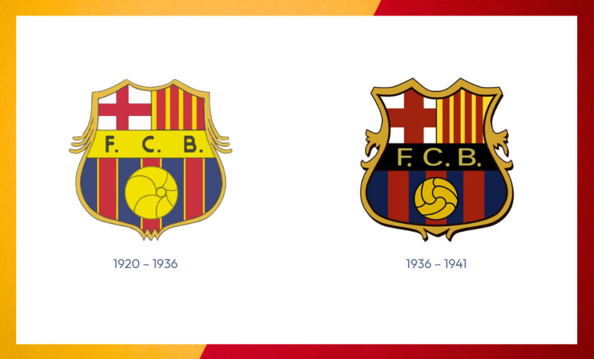
As the club grew in stature, the crest underwent minor stylistic refinements.
Typography was narrowed and borders were given subtle curvature, reflecting Art Nouveau influences common in Catalan design during the era.
These visual updates maintained the essence of Comamala’s composition while adjusting proportions for clarity on emerging media, such as print publications and early broadcast visuals.
1941–1949: Suppression and Symbolism — The “C.F.B.” Era
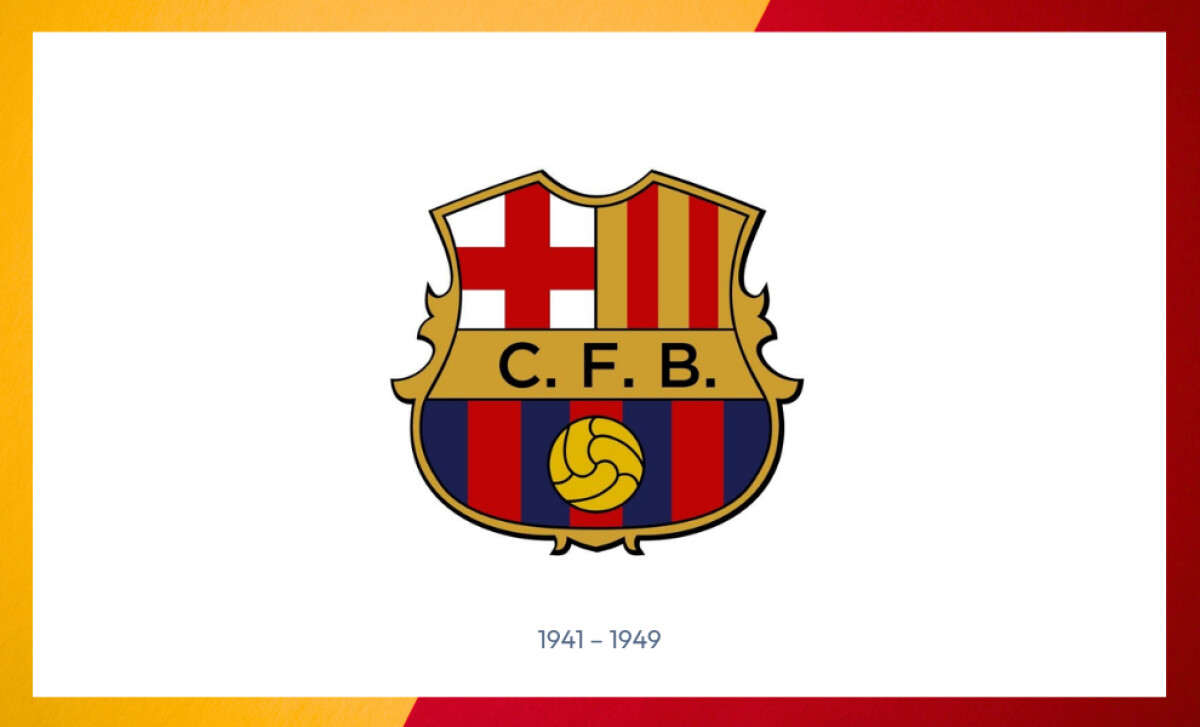
During Francoist Spain, FC Barcelona was forced to Spanishize its name, changing “F.C.B.” to “C.F.B.” on its crest.
Despite this imposed alteration, the club retained the core imagery — the cross, stripes, ball, and shield — preserving its identity visually even under political constraint.
This iteration illustrates a critical aspect of football crest evolution: how logos can carry subversive symbolism and become expressions of cultural resistance.
Reader Reward:Cultural resilience and heritage strengthen brand equity and enable faster recovery after a crisis, aligning with Harvard Business Review’s insights on organizational resilience and strategic advantage.
HBR emphasizes that resilient leadership and adaptive cultures help businesses thrive amid uncertainty and bounce back more effectively from disruptions.
This underscores how heritage and cultural identity foster emotional connection, trust, and adaptability, key drivers of post-crisis brand strength.
1950s–1970s: Simplification for Mass Reproduction
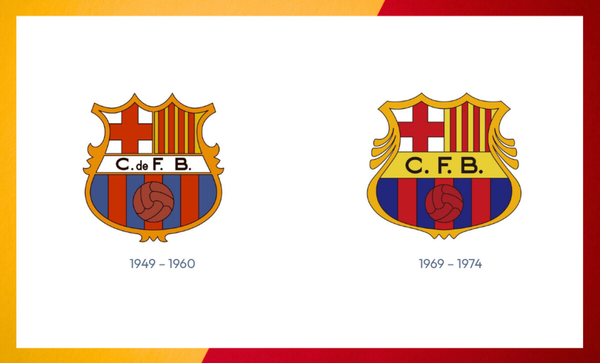
Following the fall of fascist-era constraints, FC Barcelona restored the original “F.C.B.” initials and began simplifying its badge for easier production across printed materials and fan merchandise.
The streamlined crest maintained its traditional elements but removed unnecessary flourishes, aligning with the mid-century design ethos of clarity and function.
This simplification facilitated the crest’s use in stadium signage, team kits, and growing commercial products — a turning point in the club’s sports branding strategy.
1975–2002: A Timeless Classic — The Cruyff Era Crest
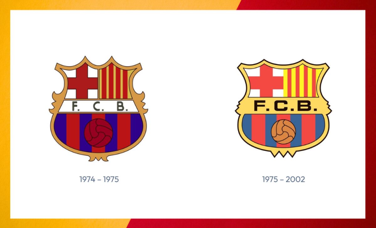
1974 saw a redesign that changed the gold banner back to white, while all other elements retained their original colors. The crest’s shape was updated with pointed peaks at the top, and the wordmark returned to the format “F. C. B.”.
In 1975, the badge was subtly refined for balance and symmetry, becoming the most enduring version to date. The proportions were adjusted for visual harmony, the typography was sharpened, and colors deepened.
This version became synonymous with the “Dream Team” era of Johan Cruyff in the 1990s and was worn by legends like Ronald Koeman, Pep Guardiola, and Rivaldo.
As FC Barcelona expanded globally, this badge came to symbolize excellence and cultural pride, elevating it among the most iconic logos in football history.
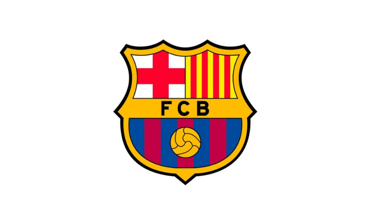
2002–Present: Digital Optimization and Brand Maturity
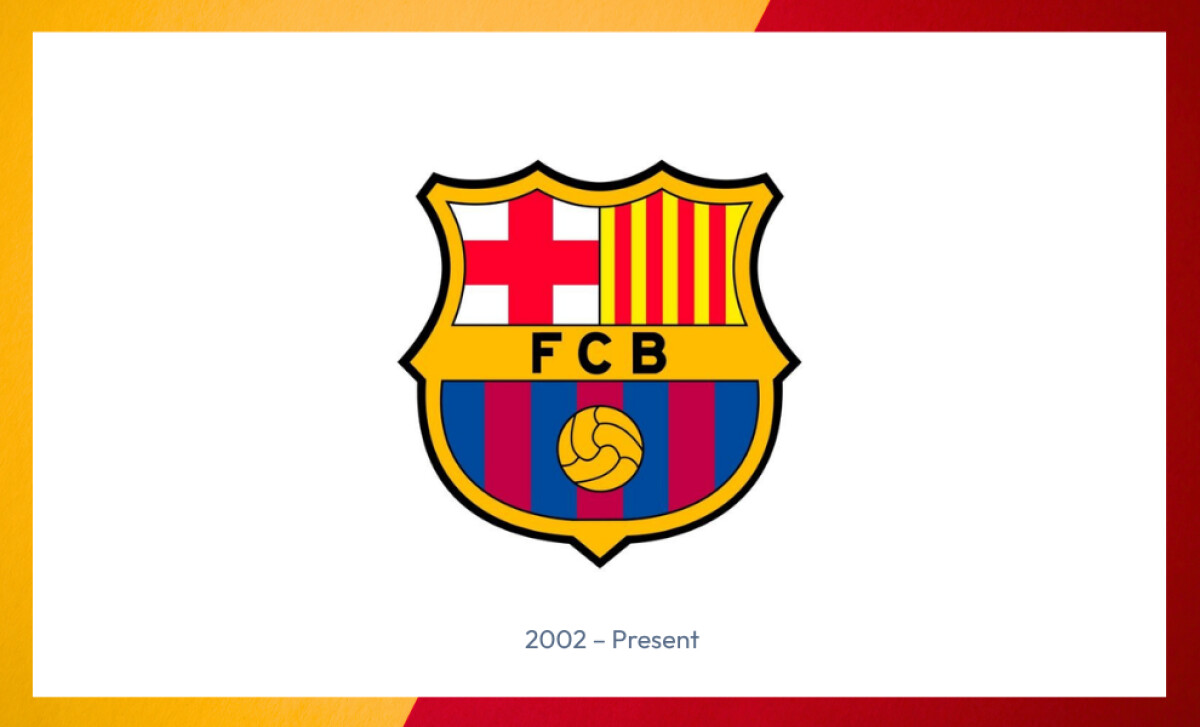
With the rise of the internet and digital media, the 2002 update was a calculated shift toward brand uniformity across platforms. Lines were thickened, colors made more vibrant, and the crest was optimized for legibility on digital screens.
Notably, this version coincided with the club crossing the €1 billion revenuethreshold, underscoring how subtle logo modernization can amplify a club’s visual impact and commercial effectiveness in the digital age.
2018 Unused Redesign
A new version of the crest was unveiled in 2018 with intentions for use, but it was ultimately never adopted for kits.
The proposed design sparked controversy by removing all lettering, including "F.C.B.," and replacing the wide gold banner with a narrower gold line.
Fans voiced concerns about losing traditional identifiers, leading to its shelving despite the logo being deployed in select digital assets.
Avoid the worst by learning from design fails that brands should never repeat.
The Wrap Up: Barça’s Crest Is Brand Equity In Motion
Unlike many global clubs whose logos evolve through agency-led rebranding cycles, FC Barcelona’s crest is deeply member-authored and culturally owned.
Designed in 1910 by player Carles Comamala, it’s not just a visual asset — it’s a living symbol of Catalan identity, democratic sport, and club-member governance.
That community origin is rare in professional sports branding and helps explain why even small proposed changes (like the 2018 minimalist revision) face strong resistance.
Reader Reward: According to Deloitte’s 2025 Football Money League, clubs with high member engagement in brand decisions have stronger fan retention metrics and greater brand resilience during crises.
Final Notes:
- Design for Longevity: Simple, symbolic logos enhance recognition and revenue. Barça’s crest fuels €179 million in annual merchandise sales.
- Dual Strategy Works: Classic badges resonate with fans; modern marks boost digital channels, e-commerce BLM revenue tripled.
- Tangible ROI: No major rebrands since 2018, emphasizing stability, correlates with increasing brand valuation ($5.65B) and commercial success.
Great logos don’t just endure. They drive value. Barça’s visual consistency, digital agility, and cultural respect offer a blueprint for brands: evolve strategically, align visuals to platforms, and measure identity as capital.