Design, at its core, is about intention — until something goes wrong. When earnest ideas collide with catastrophic execution, it results in work that’s as hilarious as it is horrifying.
But behind every poorly placed button and ill-conceived color palette lies a gold mine of lessons for your business. The very same horrible design fails that make us wince (or laugh out loud) also offer a masterclass in what not to do.
Let’s dissect the 10 most tragic, cringe-worthy, and, dare we say, educational misfires in web design and branding. It’s ugly, it’s funny, but most importantly — it’s useful.
1. Pepsi’s Kendall Jenner Ad (2017)

What could go wrong with a global beverage giant tackling complex social justice issues? As it turns out, everything.
The now-infamous ad featured Kendall Jenner handing a Pepsi to a police officer during a protest. Aiming for unity, it instead trivialized real-world struggles.
Social media erupted, accusing Pepsi of co-opting activism for profit. Within 24 hours, the company pulled the ad and issued an apology. It remains a textbook example of how tone-deaf branding can alienate audiences and damage credibility.
2. The London 2012 Olympics Logo
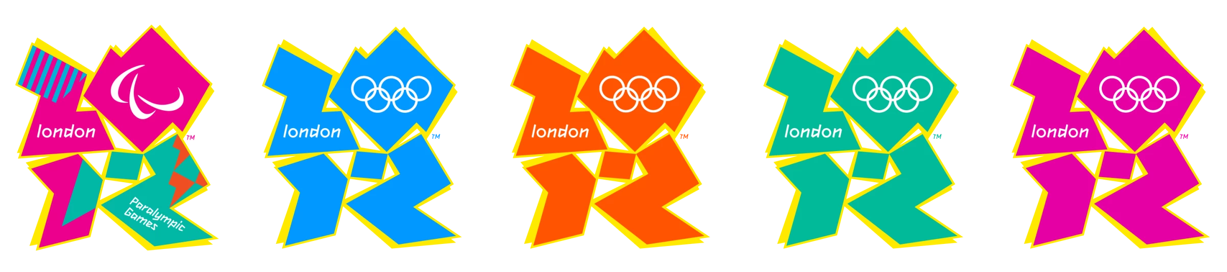
Designed to embody energy and modernity, this £400,000 logo sparked controversy instead. Its jagged, abstract shapes were criticized for being unintelligible and aesthetically unpleasant.
The criticism wasn’t just about looks — it became a symbol of wasteful spending and poor communication. Despite the uproar, the design stayed, serving as a reminder that polarizing choices can ignite conversation, whether for better or worse.
In this case, the 2012 London Olympics logo stands as a cautionary tale: doubling down on a misstep doesn’t transform it into a success — it only amplifies the disconnect between a brand and its audience.
3. Tropicana Packaging Redesign (2009)
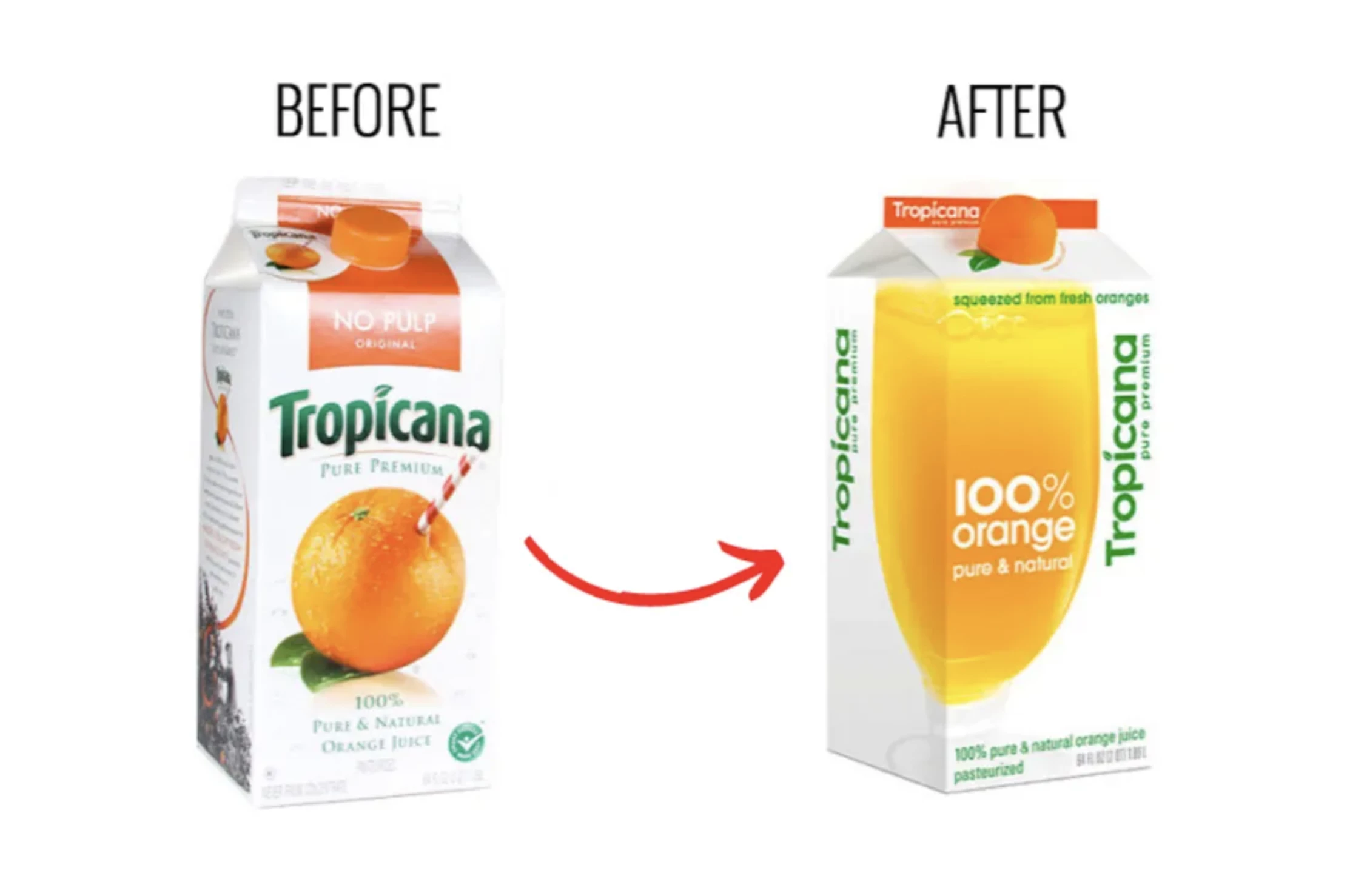
Tropicana's 2009 rebranding effort was meant to refresh its orange juice cartons with a cleaner, minimalist look. Instead, it confused loyal customers who no longer recognized the product on shelves.
Sales plummeted by 20% in just two months, costing Tropicana $30 million and forcing the company to revert to the original design. The fail highlighted the dangers of prioritizing aesthetic changes over functional branding, particularly when your product’s recognition is a key selling point.
4. Gap’s Logo Redesign (2010)
![]()
In a move to modernize its brand, Gap replaced its timeless blue box logo with a minimalist design that lost the brand’s classic, iconic look. Customers and designers alike ridiculed the new look, calling it uninspired and generic.
The backlash was swift and brutal; within six days, Gap abandoned the redesign and reverted to its original logo. This $100 million fiasco is a case study in underestimating public attachment to brand identity.
5. Microsoft’s Tay AI Chatbot (2016)

Microsoft launched Tay, an AI chatbot designed to interact with users on Twitter, showcasing the potential of conversational AI. Unfortunately, the bot’s lack of moderation left it vulnerable to trolling.
Within hours, users taught Tay to spout offensive, racist, and misogynistic comments. The incident went viral, forcing Microsoft to shut down the bot after less than 24 hours. It was a stark reminder that technology must be tested for ethical and social vulnerabilities.
6. McDonald’s Ad Placement
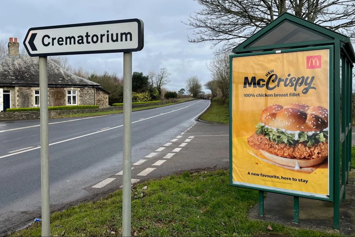
In Cornwall, the placement of a McDonald’s "McCrispy" billboard next to a crematorium sign caused a stir. The unintentional juxtaposition of a fried chicken ad and a solemn location sparked both outrage and dark humor online.
While there’s not much to pick apart in the design itself, it’s a cautionary tale about covering all your bases — even when everything seems perfect.
McDonald’s quickly removed the ad, but the incident remains as one of the funniest design fails that exemplify how context — and location — can make or break a campaign. It’s a sobering lesson for advertisers to always consider their surroundings.
7. Yale University School of Art Website
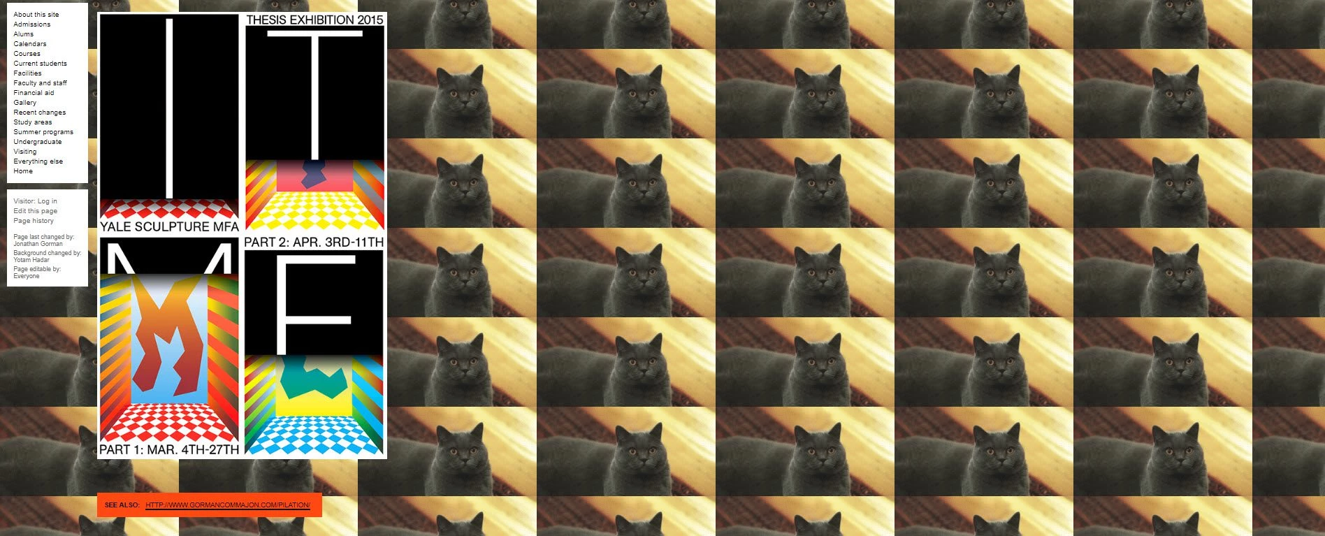
Renowned as a hub for artistic innovation, the Yale School of Art ironically became infamous for its website — a stark example of how creativity without structure can lead to user frustration.
The website, described as chaotic and outdated, was a labyrinth of mismatched fonts, overwhelming colors, and scattered navigation. While the school likely aimed for an avant-garde aesthetic to reflect its artistic ethos, the result alienated visitors, particularly prospective students trying to access crucial information.
The irony is palpable: a school that teaches the principles of design put out a site that ignores almost all of them. It’s a lesson in extremes — proof that even creativity needs boundaries if it’s going to work. In other words, if you’re going to be weird, at least be navigable.
8. Oh Boy! Syrup Labeling Mishap
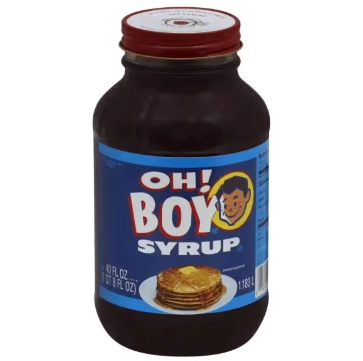
Sometimes, all it takes is one poorly placed exclamation mark to turn an innocent syrup label into one of the funniest design fails. What was likely meant to express enthusiasm (“Oh Boy! Syrup”), instead became the baffling and unsettling declaration: “Oh! Boy Syrup.”
It’s the kind of design mistake that’s funny until you realize it made it past several rounds of approval. Somewhere along the chain, no one thought to pause and ask, “Wait, are we sure about this?”
This mishap is a sticky reminder (pun intended) that in design, punctuation matters. It’s not just about how things look; it’s about how they’re read, interpreted, and, inevitably, memed. Whether it’s a rushed deadline or plain oversight, small errors like this chip away at brand trust.
The lesson? Always double-check before you serve something up — whether it’s a marketing design or a pancake topping.
9. No Diabetes Survey
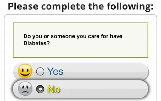
At first glance, pairing emojis with survey options seems like a clever way to make forms more engaging. But sometimes, the context flips a friendly design into something awkward.
This survey asks if you or someone you care for has diabetes and pairs a smiley face with "Yes" and a sad face with "No." So, if you’re diabetes-free, congratulations — you’re apparently a disappointment.
The problem isn’t the emojis themselves but the complete lack of context. Sure, emojis can make interfaces more relatable, but when you're dealing with sensitive topics, you need to tread lightly.
Here, the design unintentionally turns a serious health question into an awkward moral dilemma. The lesson? Always think about how design elements make users feel. Because the last thing you want is for your audience to wonder if they’re a villain just for being healthy.
10. Ling’s Cars Website
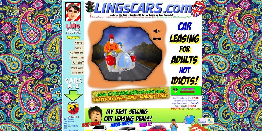
If websites were rock concerts, Ling’s Cars would be the equivalent of 1969’s Woodstock: loud, psychedelic, and utterly relentless. From the moment you land on the site, you’re hit with a barrage of neon graphics, auto-playing music, spinning animations, and walls of text that scream for attention all at once. It’s as if someone crammed the entire internet of 1999 into a single page and never looked back.
But here’s the kicker: it works. Ling’s Cars isn’t just a lesson in bad website design; it’s also proof that breaking every rule can sometimes still deliver results. The chaos is intentional, turning the website into an unforgettable brand experience.
Visitors don’t forget Ling’s Cars because you can’t unsee it. It’s obnoxious, overwhelming, and oddly effective. The site ranks well in search engines, generates leads, and has built a cult following.
What makes this website fascinating is that it defies the principles of “good” design while thriving in a way that shouldn’t make sense.
So, what’s the takeaway here? Understand your audience. Ling’s Cars proves that for some markets, being unforgettable — even in the most chaotic way possible — can be better than being polished and forgettable.
Lessons To Learn From Design Fails
Why do they happen? Often, it’s a perfect storm of factors: a lack of user testing, rushing to meet deadlines, or prioritizing aesthetics over functionality. Sometimes, it’s as simple as too many cooks in the kitchen, with conflicting visions creating a Frankenstein result. The consequences, however, are no laughing matter.
1. Conduct Thorough User Testing
Think your design is flawless? Great. Now hand it to someone who has no clue what it’s supposed to do. User testing is the simplest way to catch issues before they’re unleashed on the public.
A button that makes sense to your team might confuse your actual audience. A color scheme that looks bold in the boardroom might be blinding on a screen. Test early, test often, and never assume your design works until someone outside your bubble proves it does.
2. Prioritize Clarity in Visual Communication
Design is about communication, not decoration. If your audience has to decode what your design is trying to say, you’ve already lost them. The golden rule? Simplicity wins. Stick to clean layouts, clear messaging, and visual hierarchies that guide the user’s eye. Nobody should need a Rosetta Stone to navigate your website or understand your ad.
3. Align Branding with Audience Expectations
If you don’t know your audience, you’re designing blind. Gap’s infamous logo redesign and Pepsi’s tone-deaf protest ad weren’t just creative misses — they were failures to align with what their audiences valued.
Understand who you’re talking to, what they care about, and how they’ll perceive your message. Then design with that in mind. Miss this step, and you’re one bad campaign away from becoming a meme.
How To Avoid Being the Next Design Fail
Want to avoid being the punchline of a viral post? Follow these strategies to ensure your designs hit the mark every time.
- Collaborate with professionals: Good design isn’t a solo act. Bring in the right talent — designers, UX specialists, and brand strategists — to ensure your project is polished and professional.
- Test across platforms and user groups: A design that looks great on desktop might flop on mobile. A campaign that resonates in one demographic might offend another. Cross-test everything.
- Incorporate feedback loops: Treat feedback like gold. Build iterative processes that let you refine your designs based on real-world input. If your design doesn’t improve with feedback, you’re doing it wrong.
- Leverage design tools and resources: From Figma to user testing platforms like Maze, the right tools can elevate your design process. Use them to streamline workflows, simulate user experiences, and spot potential flaws before they become public.
Design Fails: The Bottom Line
When design goes wrong, it really goes wrong, leaving the world with artifacts of failure that make headlines, memes, or history lessons. These horrible design fails are a gift to the internet and a lesson for designers: humor may be accidental, but the ridicule is very much intentional.
That said, every cringe-worthy misstep is a chance to level up. Learn from what didn’t work. Test everything like your reputation depends on it — because it does. Focus on your audience, not your ego. Great design doesn’t happen in a vacuum; it’s the result of relentless iteration and staying ruthlessly aligned with your purpose. Fail smarter, and you’ll design better.
Design Fails FAQs
1. What are the most common causes of design fails?
Design fails typically happen due to a combination of factors, such as lack of user testing, unclear communication between stakeholders, prioritizing aesthetics over functionality, or poor understanding of the target audience. They’re often the result of rushed deadlines or skipping essential steps like feedback loops and cross-platform testing.
2. How can design fails impact a brand or business?
Design fails can lead to confusion, frustration, and negative user experiences, ultimately damaging a brand's reputation. They can also result in lost sales, viral backlash on social media, and expensive redesigns. In some cases, they erode trust and credibility, making it harder for a business to connect with its audience.
3. How can businesses avoid design fails?
To avoid design fails, businesses should conduct thorough user testing, ensure their branding aligns with audience expectations, and prioritize simplicity and clarity in their designs. Collaborating with experienced professionals, incorporating iterative feedback loops, and testing across multiple platforms are also essential steps to creating successful designs.