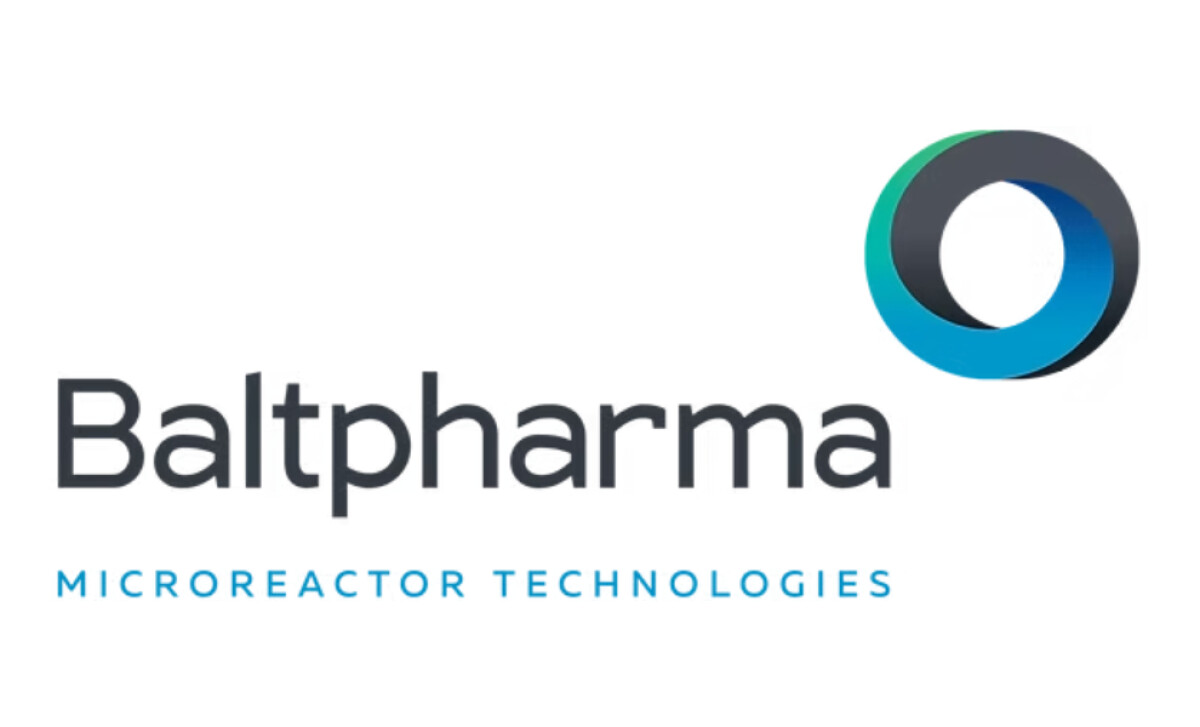
Standout Features:
- Interlinked gradient ring symbol
- Rounded geometric sans-serif font
- Strategic sub-brand typographic accent
The Baltpharma technology logo design needed to be clear and confident. It's a fantastic case study in how to visually represent a complex idea, a critical task as 75% of consumers believe the 'look and feel' of a logo can make or break a company's success.
The three-dimensional illusion of the ring adds depth and a sense of motion. The blue-to-green gradients also add a futuristic polish, communicating progress and advanced engineering.
We like how its font selection communicates scientific credibility with a human touch. The rounded sans-serif and generous spacing offer both clarity and a sense of aesthetic approachability. It avoids feeling cold or overly clinical.
Beneath the main logotype sits the descriptor “MICROREACTOR TECHNOLOGIES.” This is a great example of how to aid brand recognition in a specialized B2B sector.
The added line of text provides critical differentiation. It’s a small but very important detail for a company that needs to be understood quickly by its industry peers.
Kaidesign’s identity for Baltpharma is a compelling convergence of science, strategy, and style. It shows how logos for tech companies can be both conceptually deep and visually simple. This design is a perfect example of that balance.
One of the biggest challenges in tech branding is making a complex idea feel simple, and a great logo can do that with a single, clear image.
That's why brands turn to expert partners, and our team has ranked the best agencies worldwide to make finding them simple.
Visit our Agency Directory for the Top Logo Design Companies, as well as:
Our design experts also recognize the most innovative design projects across the globe. Visit our Awards section to see the best & latest in logo design.


