Standout features:
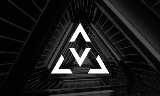
- Creative diamond logo
- Reliable feel
- Shows personality
When it comes to software logos, the Tooploox logo lets go of the expected. Its diamond-shaped design is creative and eye-catching, making it stand out among other software logos.
Using a reliable black-and-white color scheme, the logo gives off an aura of quality and reliability, which is essential for any IT company. The friendly typeface also adds to its professional feel and gives it an edge over other software logos.
Even though the design is quite minimalistic, its creative use of shapes and colors still manages to make a statement. It looks like something that could be quickly identified in any crowd, precisely what Tooploox wants their clients to do with great ease.
In addition, if you look closely, you can see a capital T on the diamond design included in the logo. This is a creative way of showing Tooploox's personality while keeping the design modern and professional.
IT companies need a logo design that looks professional and polished but retains its character, and the Tooploox logo design is an inspiration for achieving that. It is an excellent example of how creativity can be balanced with professionalism.