Standout Features
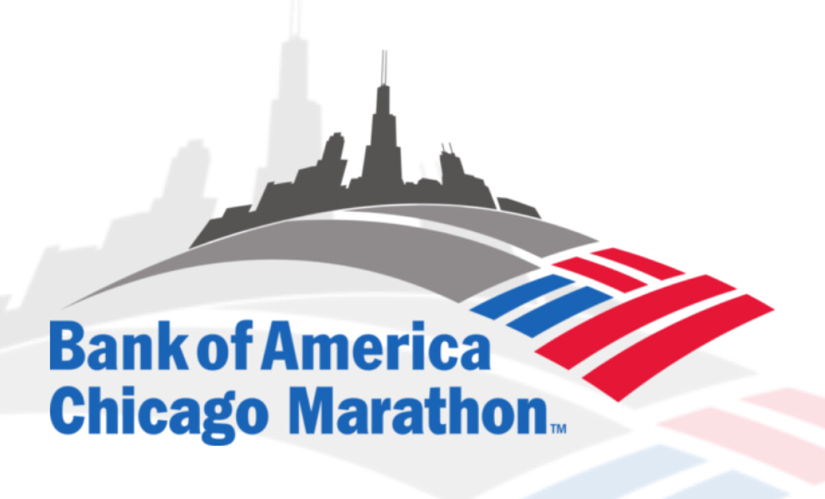
- Stylized city skyline with iconic architectural cues
- American flag-inspired abstract motif
- Gray color palette reflecting formality and infrastructure
The Bank of America Chicago Marathon draws over 45,000 runners from 100+ countries, and its logo reflects that scale with clean, strategic branding. It merges city pride, national symbolism, and sponsor alignment into a cohesive visual mark. The result is a corporate-friendly identity that still carries emotional and cultural weight.
The curved skyline, featuring the Willis Tower, anchors the logo in a recognizable sense of place. Landmark imagery, a study confirms, enhances recall and fosters emotional association, making the race visually tied to Chicago’s identity. It functions as both wayfinding and storytelling, grounding the global event in local architecture.
The grayscale palette reflects stability and professionalism, qualities tied to both the sponsor and the city’s urban infrastructure. Its restraint ensures strong contrast for the red, white, and blue stripes below, allowing the patriotic cue to pop without overwhelming the design. This balance supports both brand neutrality and national pride.
The stylized flag motif adds a sense of motion while grounding the race in national identity, without tipping into cliché. It’s a smart, understated way to balance symbolism with functionality, especially for a race backed by one of the world’s largest financial institutions.
What makes Chicago’s entry unique among marathon logos is its refusal to overperform. It doesn’t rely on mascots or flash. Instead, it builds trust through precision, delivering a visual identity that works just as well on a medal as it does in a shareholder report.


