Houston Astros: Key Points
- Symbolic Logos Fuel Loyalty: Over six decades, the team’s iconic and locally rooted logos have forged deep fan ties and sustained brand momentum.
- Heritage Meets Space Age: Each redesign bridges Houston’s frontier roots with its Space City identity, aligning bold visuals with performance eras and cultural pride.
- Consistency Boosts Brand Value: Ranked among MLB’s top franchises valued at $3 billion, the Astros’ cohesive look and championship success show how strategic brand continuity builds equity over time.
The Houston Astros badge is one of Major League Baseball’s most resilient sports identities. From its frontier origins to its sleek space-age edge, each logo refresh proves that evolving strategically, without losing cultural roots, turns visual heritage into lasting fan connection and real revenue.
The Modern Houston Astros Logo: A Badge Built for Space City
- Bold Monogram Identity: The 2013 redesign introduced a strong serif “H” over a dimensional star to celebrate Houston’s legacy as Space City. That, while ensuring crisp brand recognition across screens and merchandise.
- Bold Colors & Visual Depth: The navy-orange double ring and subtle gray outline keep the team’s classic palette alive, adding depth and contemporary edge. The collegiate “Houston Astros” ring anchors the badge in tradition and unites generations of fans.
1962–1964: Houston Colt .45s – Firearm Identity
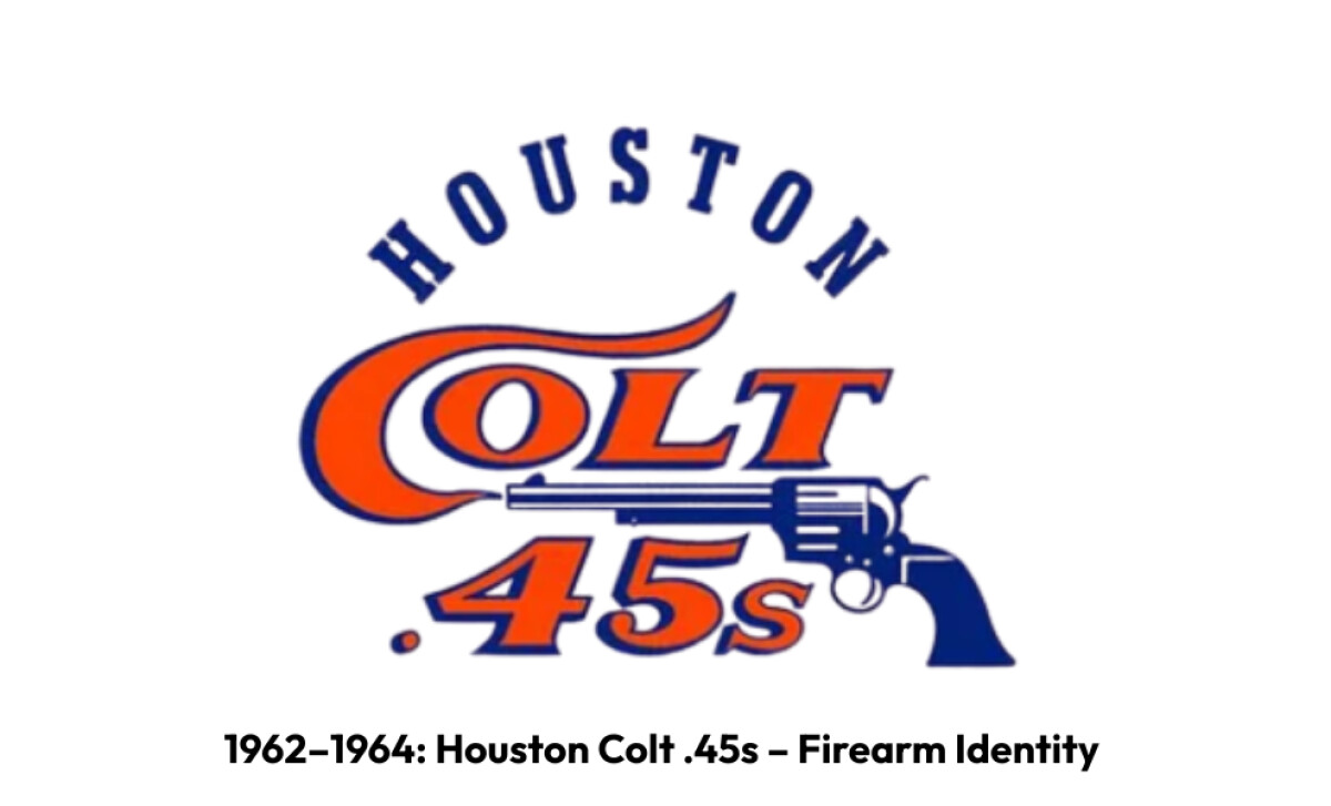
When Major League Baseball arrived in Houston in 1962, the franchise made a statement as the Colt .45s – a name evoking the rugged Texas frontier and the legendary sidearm of the American West.
The original logo featured a navy blue revolver, firing a wisp of orange smoke that cleverly curled into the “C” of “Colts.”
Beyond branding, this striking visual embodied Houston’s independent, gunslinger spirit at a time when the city was staking its claim as a big-league town.
However, the firearm motif soon drew PR crossfire. The team wanted to avoid potential legal conflicts with Colt’s Manufacturing Company, the maker of the iconic pistol. So, they holstered their cowboy branding after just three seasons.
Later on, the team would trade its six-shooter for a futuristic look, blasting off as the Astros: a new identity fit for a city now racing toward the stars.
1965–1974: Original AstroDome Emblem – The Space Shift
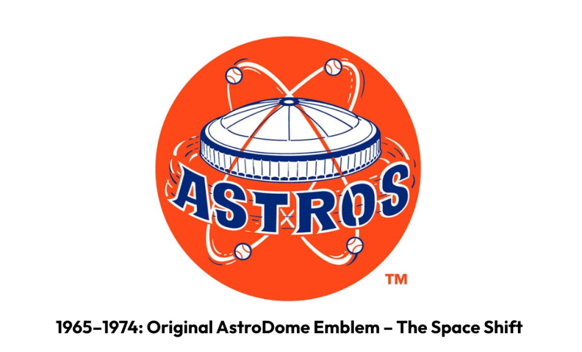
In 1965, the newly minted Houston Astros unveiled a logo that showcased the city’s giant leap from cowboy country to Space City.
At its heart was the Astrodome – baseball’s first-ever domed stadium, a marvel dubbed the “Eighth Wonder of the World” back then. Around the futuristic dome, orbiting baseballs traced paths like satellites around a planet.
Set against a bold orange backdrop that demanded attention, it broadcast Houston’s ambition to the world, aligning the team with NASA’s lunar missions and the optimism of the Space Race.
The look resonated so strongly that it topped classic logo rankings, praised for its mid-century vibe and for giving the team a unique identity light-years ahead of its time.
Reader Reward: According to MLB history, the Astros nickname remains the oldest among Houston’s major pro sports franchises.
Tying the name and emblem directly to Houston’s Space Age and the groundbreaking Astrodome cemented the team’s story in the city’s DNA. It exemplifies how a well-chosen identity and a clear, culturally rooted theme can outlast trends and generations.
1975–1993: Tilted AstroDome – Streamlined Continuity
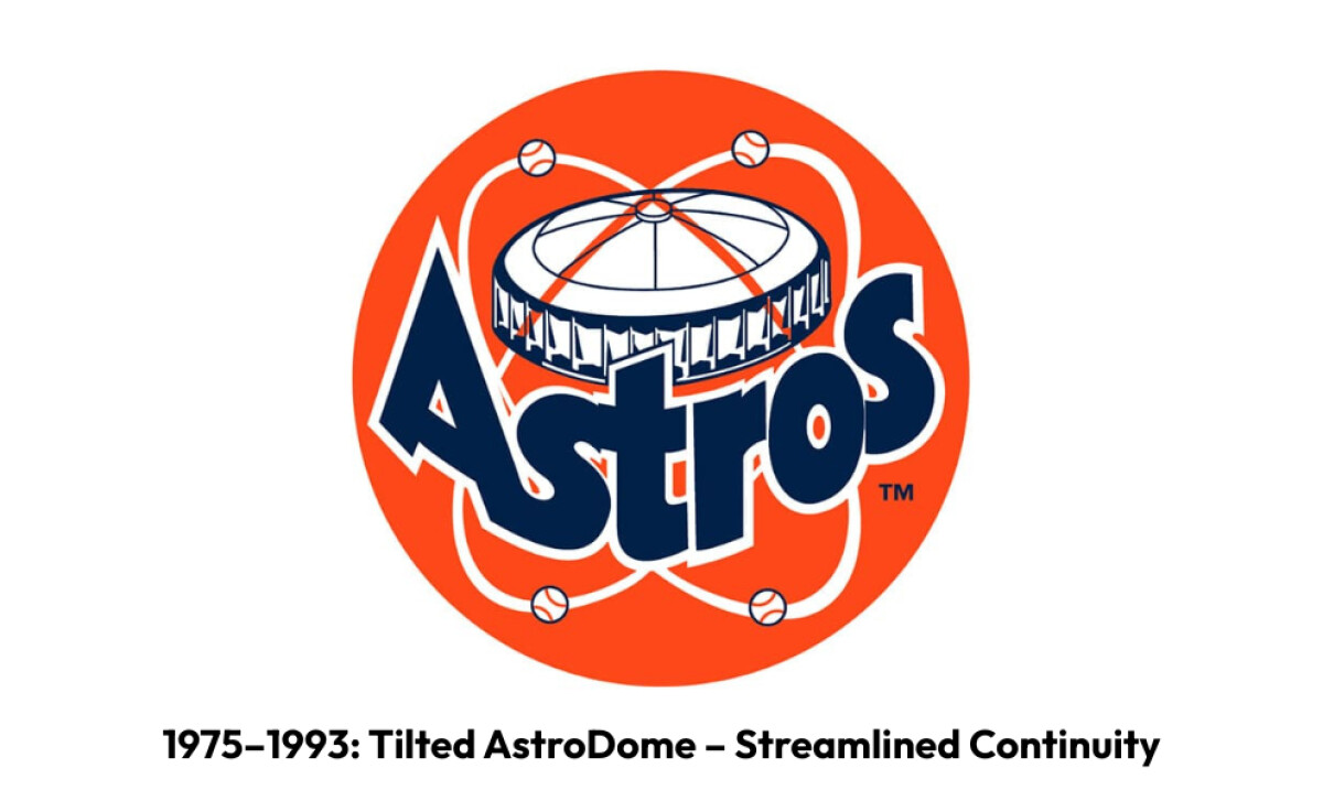
This time, the Astros gave their emblem a subtle but meaningful update that kept the Space City spirit alive.
The iconic Astrodome stayed front and center but took on a dynamic tilt, angled downward to suggest motion and modernity. The orbiting baseballs remained in place, signaling Houston’s deep ties to the ever-present dream of exploration.
Additionally, a bolder wordmark anchored the new look. It gave the franchise a confident, contemporary feel that bridged the optimism of the ‘60s with the energy of the late ‘70s and ‘80s.
For many longtime fans, this streamlined logo is pure nostalgia. It’s a symbol of rainbow jerseys, the Dome’s echoing cheers, and Houston’s unbroken link between baseball and the stars.
1994: Midnight Blue & Gold – Sleek Aggression
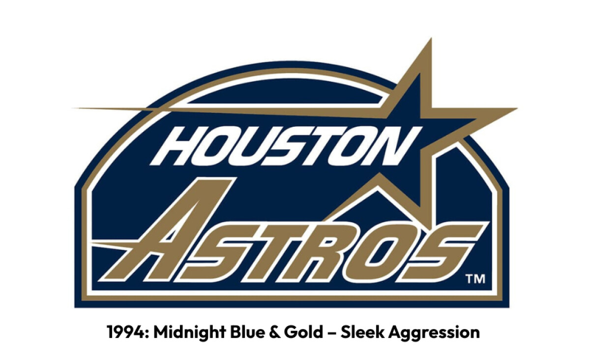
The Houston Astros rocketed into a new era with one of their most dramatic visual overhauls yet.
Gone was the familiar Astrodome imagery. It was replaced by a bold midnight blue and metallic gold palette that felt sharp, sophisticated, and ready for the future.
Learn more about color psychology.
The new logo also featured a sleek italic “Astros” wordmark slicing forward with energy, while a golden shooting star arched dramatically overhead. It symbolized speed, ambition, and a break from tradition.
This iteration arrived alongside fresh ownership and signaled Houston’s intent to redefine itself on and off the field. The design shed its retro vibe for a more streamlined, aggressive brand identity fit for the late ‘90s.
For many fans, this star-streak logo still sparks memories of Biggio, Bagwell, and a club pushing toward a new frontier.
1995–1999: Simplified Star — Clean, Streamlined Identity
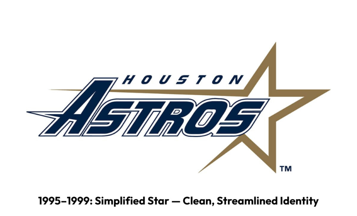
Just a year later, the team stripped away the arch and background to let the design breathe.
The sharp gold star broke free behind a more aggressive wordmark, angled forward for extra motion. The tiny “Houston” above stayed subtle, but the whole look felt faster and lighter.
This was a cleaner step forward that set up the brick-red railroad era to come.
See more examples of well-executed logo rebands.
2000–2012: Railroad‑Inspired Design – Local History Emphasis
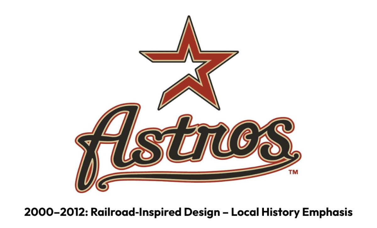
When the Astros moved to their new downtown ballpark, Enron Field (later Minute Maid Park), they leaned into Houston’s rich railroad history for a fresh visual identity.
The new color scheme (brick red, sand, and black) echoed the city’s industrial grit and the old Union Station, which the ballpark famously incorporated into its design.
At the heart of the logo was a vintage open star paired with a flowing scripted “Astros,” evoking classic baseball aesthetics and a sense of hometown pride – exactly what makes a good logo stand out.
This design marked a clear shift toward nostalgia and community. It connected the franchise’s modern ambitions with Houston’s hardworking past.
For many fans, this look is forever tied to the crack of bats under the retractable roof and the whistle of the ballpark’s signature train chugging along the outfield wall.
2013–Present: Return to Navy‑Orange and H‑Star – Cosmic Heritage
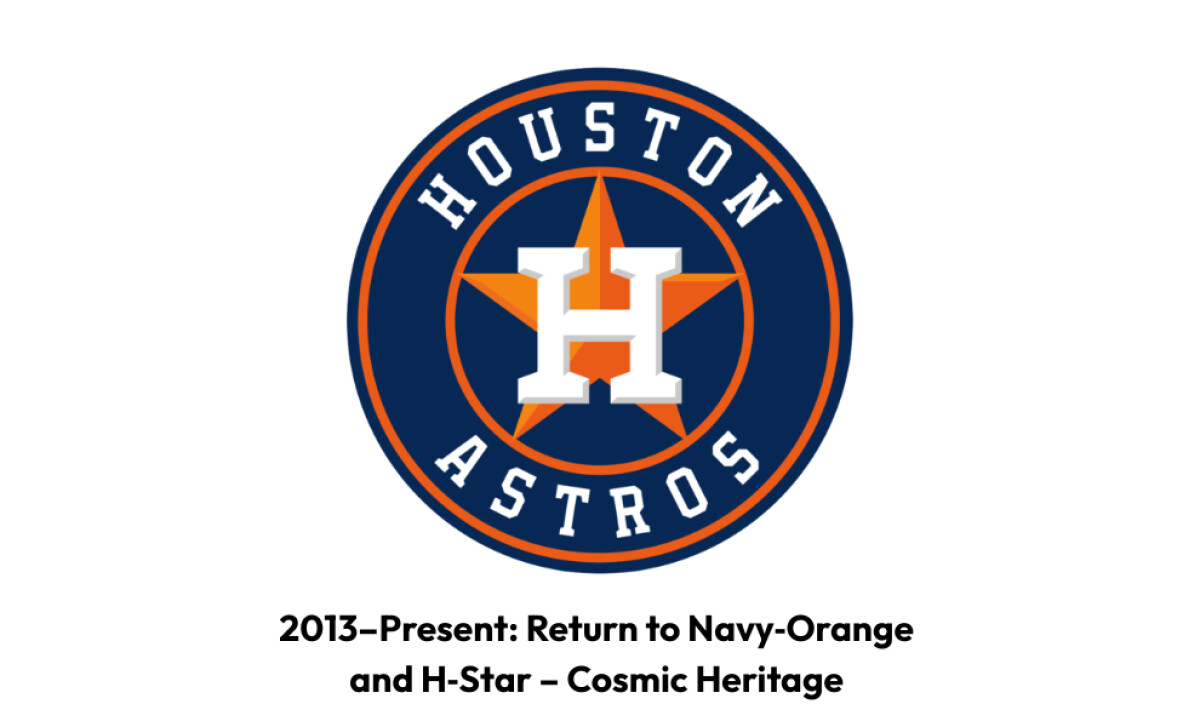
Finally, in 2013, the Astros looked to the past to launch their future. They unveiled a logo that brought back the beloved navy blue and orange palette that fans instantly recognized.
It features a bold serif “H” perched inside a crisp, white star; a timeless symbol of Houston’s cosmic connection and the team’s original spirit.
This fresh yet familiar mark sits inside a classic circular badge with clean typography and subtle piping details. It bridges old-school charm with a sleek, contemporary edge.
The result? A fan-favorite revival that not only re‑ignited local pride but also sparked a huge spike in merch sales!
Plus, it cemented the Astros’ place among MLB’s most popular brands. It’s a great reminder that sometimes, returning to your roots is the smartest move forward.
Reader Reward: According to branding studies, a signature color can boost brand recognition by up to 80%, and the Astros’ iconic navy and orange is a textbook example.
By reviving their original color story, they locked in instant recognition across gears, jerseys, caps, and digital channels.
This smart return to core colors turned a simple badge update into a merchandising powerhouse and a symbol fans proudly wear worldwide. It shows how sticking to a distinct palette can transform a sports logo from just a mark to a magnet for loyalty and revenue.
Wrap Up: The Houston Astros Logo is Brand Legacy in Orbit
Unlike many sports teams that bounce through drastic overhauls, the Astros have evolved their visual identity with a steady hand.
They balanced bold rebrands with deep respect for their city’s story and fan culture.
From their wild west Colt .45s to sleek space-age wordmarks and the iconic H‑star, every shift has tied back to Houston’s identity as both a frontier town and a Space City.
Final Notes:
- Balance Old & New: The H‑star’s classic serif monogram with a clean, modern badge keeps old fans engaged while attracting new generations through digital channels.
- Design for Generations: Each Astros logo era shows how visual symbols connect fans to a specific place and time, fueling loyalty and long-term brand engagements.
- Proven ROI: A solid brand identity since 2013 has aligned with surging team valuation ($3 billion in 2025) and consistent top MLB merchandise sales.
Overall, the Houston Astros’ story shows how blending heritage and innovation creates a brand orbit that stays strong across eras, platforms, and fan bases. Their badge is a living symbol of local pride and modern sports branding strategy working in sync.
Houston’s evolution shows how heritage‑driven design and strategic modernization can fuel long‑term brand equity across generations.
That’s why sports franchises and legacy brands alike need design partners who understand both tradition and transformation.
Want a brand identity that grows with your audience?
Our team ranks agencies worldwide to help you find the perfect creative partner. Visit our Agency Directory to discover top firms in:
You can also explore our Best Sports Logo Designs section to see more award-winning visual identities in sports.