- Home
- Best Designs
- Best Logo Designs
- Shakesphere
- Advertising
- Aerospace
- Agriculture
- Architecture
- Arts & Recreation
- Automotive
- Banking & Finance
- Content & News
- Distribution
- E-Commerce & Retail
- Education
- Engineering
- Entertainment
- Fashion & Beauty
- Food & Beverage
- Government
- Health & Wellness
- Hospitality
- Legal & Insurance
- Luxury
- Manufacturing
- Medical & Pharmacy
- Non-Profit
- Professional Services
- Real Estate
- Sports & Leisure
- Technology
- Travel
Shakesphere
- Logo designed by Landmark Branding
- 3,725
- View Site

Shakesphere Logo Design Is Modern, Intelligent & Multifunctional
Shakesphere is a revolutionary protein shaker for fitness enthusiasts and gym-goers. Its unique capsule design ensures a silky and smooth shake texture that doesn't get stuck in any hollows and crannies. Its logo is a work of Landmark, a design company from the UK. Check out our article on best logo designs by UK agencies.
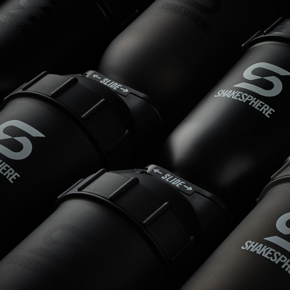
Shakesphere logo design is a simple lettermark “S”, accompanied by the product’s name beneath it. In the design agency’s own words, it is a “clever representation of both the "S" letterform and the unique capsule shape.”
The capsule’s shape is present in the logo’s negative space, formed by the two ends of the letter “S” and their confluence point.
The clever visual trick makes the logo look as if it’s cut diagonally, giving it an on-brand feel of dynamism and energy.
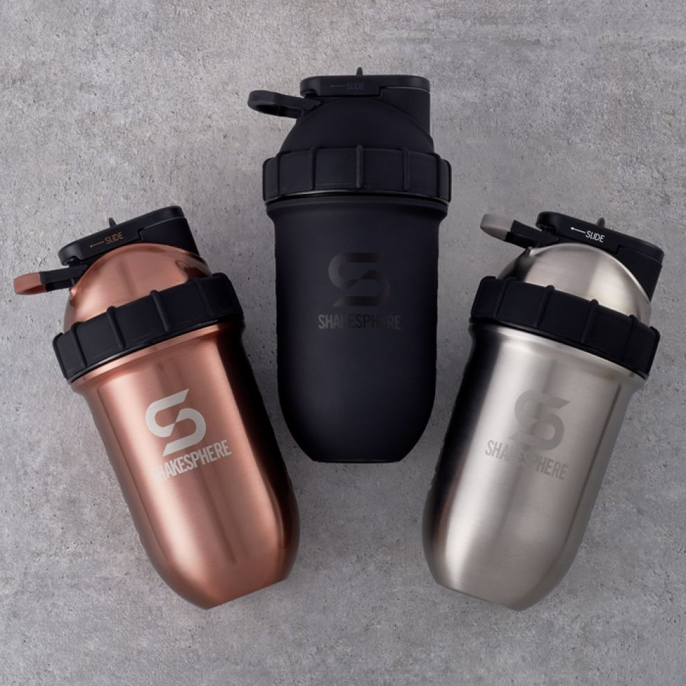
The logo has a decidedly modern look to it and is extremely cohesive across a wide variety of settings and platforms. It looks consistently good on different product surfaces, both matte and glossy and in various colors.

Shakesphere Makes A Logo That Is A “Cut” Above The Rest
Instead of going for a “standard” lettermark that doesn’t distort the letter, Shakesphere logo design opted for a slightly warped version that breaks the letter in two halves.
It is an extremely simple design solution that gives more character to the otherwise quite ordinary logo. Resembling two hooks that hinge on one another, the lettermark consists of a single line that gets misshapen in the middle.
Despite this “deformity”, the “S” in “Shakesphere” is still quite apparent. As previously stated, the diagonal cut only makes it more interesting and distinctive, while keeping in with the swift nature of the fitness world.
Grayscale Hues Lend A Stern Touch To Shakesphere’s Exciting Product
Shakesphere logo comes in several color varieties, but they are all mostly grayscale. Different shades of black and gray, depending on the color of the shaker, are carefully chosen to complement the rest of the product, providing visual consistency among all variants.
The sports & fitness industry is quite diverse when it comes to brand colors and there is no unifying trend or a school of thought that provides the guidelines and benchmarks. However, grayscale logos are still quite rare in this industry which tends to be a bit more casual and playful with their designs.
Shakesphere’s grayscale logo, therefore, introduces a kind of high-brow seriousness that is not typical. A slightly stern and unrelenting look of the capsule stems from its shape, yes, but also from the logo’s overall shape and choice of colors.

Shakesphere’s Effective Use Of Sans Serif Proves That Simple Does It
Even though the lettermark is the main portion of the logo, several Shakesphere logo iterations come with the brand name just under the “S”.
Shakesphere’s name comes in a guise that is radically different from the lettermark. Sporting a very simple, sans serif font, the brand name goes for legibility and readability rather than impressing the viewer with creativity.
The reason for this, at least partly, is that the brand name is rather long and is, of course, a sly play on the name “Shakespeare”. Because of this, it needs to be immediately understandable to anyone who encounters the brand for the first time.
The name is present on the logo on the actual capsule as well, where it is quite diminutive. This is another reason why the design agency went with a clear and readable font instead of something more offbeat.

Shakesphere Logo Design Introduces A Novel Approach To A Conventional Fitness Product
Shakesphere logo design is simplistic, minimal and, to a certain extent, revolutionary because it institutes a whole new mood into the world of recreational sports and healthy living.
Its main part, the lettermark “S”, is decidedly modern and breaks away from any retro leanings set by its industry counterparts.
The brand name uses a very simple and legible font for better brand recognition and user retention. Both the lettermark and the brand name can be used seamlessly across a variety of different media and product surfaces.
Rick Beardsell, Shakesphere CEO, comments on the brand’s success and how a great logo design helped:
“As a globally established brand, spanning cultural and [behavioral] differences the branding is possibly the most important part of our whole business. Without such a strong brand we would not have surpassed 1 million units sold globally. We have worked closely with Landmark throughout and continue to rely [upon] their integral support as we grow.”
Shakesphere logo design managed to ward off the contenders in this very tough competition, which is why we proudly present them our Best Logo Design Award!
- Logo designed by Landmark Branding
- 3,725
- View Site
- Industries:Health & Wellness Sports & Leisure
- Tags:Lettermark


