Tampa Bay: Key Points
- Regional Inspiration: The Tampa Bay Lightning's symbol was inspired by Florida’s frequent lightning storms, grounding the design in local identity.
- Symbolic Lightning Design: The lightning bolt represents qualities essential in hockey: speed, power, and energy.
- Design Consistency: Since 1992, refinements have modernized the look of the Tampa Bay Lightning logo. But the central bolt has remained the same, which has created a lasting and iconic symbol.
Founded in 1992 by Hall of Famers Phil and Tony Esposito, the Tampa Bay Lightning quickly established itself as a formidable presence in the National Hockey League (NHL).
The team’s name pays homage to Tampa’s reputation as the lightning capital of North America, with its emblem reinforcing a strong connection to the region.
Success followed swiftly: the Bolts captured their first Stanley Cup in 2004, made 17 playoff appearances in 33 seasons, and secured back-to-back championships in 2020 and 2021.
The Tampa Bay Lightning’s Bolt of Consistency
- Minimalist Evolution: The 2011 Tampa Bay Lightning logo redesign embraced a minimalist approach while preserving its iconic core: a lightning bolt inside a circular frame.
- Bold and Striking Form: With deep navy tones, strong linework, and a seamless composition, the logo achieves instant recognition across ice, merchandise, and media.
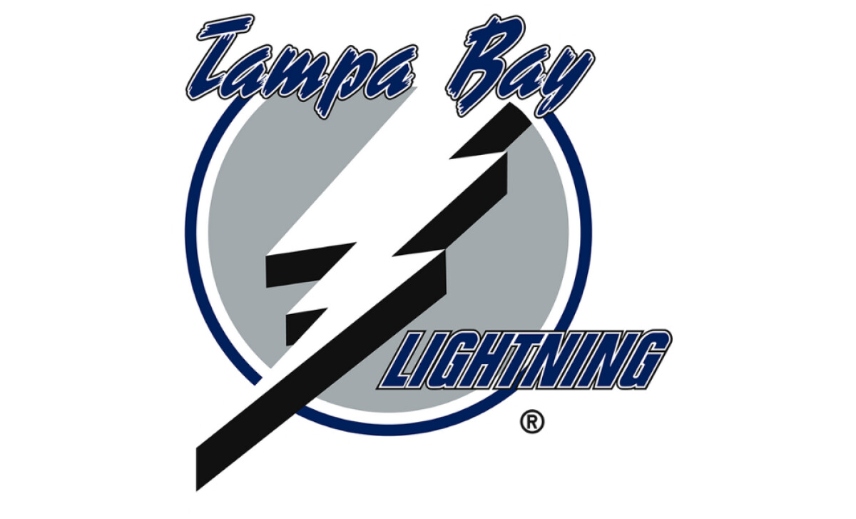
1992-2001: Tampa Bay Lightning and the First Badge
The Lightning’s first badge was built on:
- A solid gray roundel
- Outlined in blue and white
- With a sharp white bolt cutting diagonally across it
This composition set the foundation for every logo that followed. What makes it even more significant is that it was conceptualized by one of the founders himself, Phil Esposito, giving the design an authentic, personal origin.
Reader Reward: A ResearchGate study states that brand authenticity is a key solution to falling customer loyalty. That’s exactly what the Lightning captured from day one: a logo not only designed for the team, but by someone who built it.
The bolt carried a heavy black shadow that added depth and drama, while the wordmark paired a bold, slanted ‘Tampa Bay’ in script with a strong uppercase ‘Lightning.’
It was simple yet charismatic. Not flashy, but memorable.
A logo that symbolized both the team and its city from day one, and one that still carries that meaning decades later.
2001-2007: Tampa Bay Lightning’s Color Shift
It took nearly a decade for the Bolts to update their badge, and even then, the change wasn’t drastic.
The adjustment focused on color: the blue was darkened to give the logo more weight and authority. But what may look like a subtle shift actually spoke volumes.
Dark blue is often tied to power, depth, and elegance, qualities the Lightning wanted to embody. And the timing couldn’t have been more fitting.
During this era, the team captured its first Stanley Cup, cementing itself as a serious force on the ice.
With just a change in color, the logo grew in stature. It projected authority not only as a brand but as a championship contender.
Reader Reward: According to branding research, using a signature color can increase brand recognition by up to 80%. For the Lightning, that subtle shift of deepening the blue helped the logo feel more dominant and memorable during a defining era.
2007-2011: Tampa Bay Typography Take Over
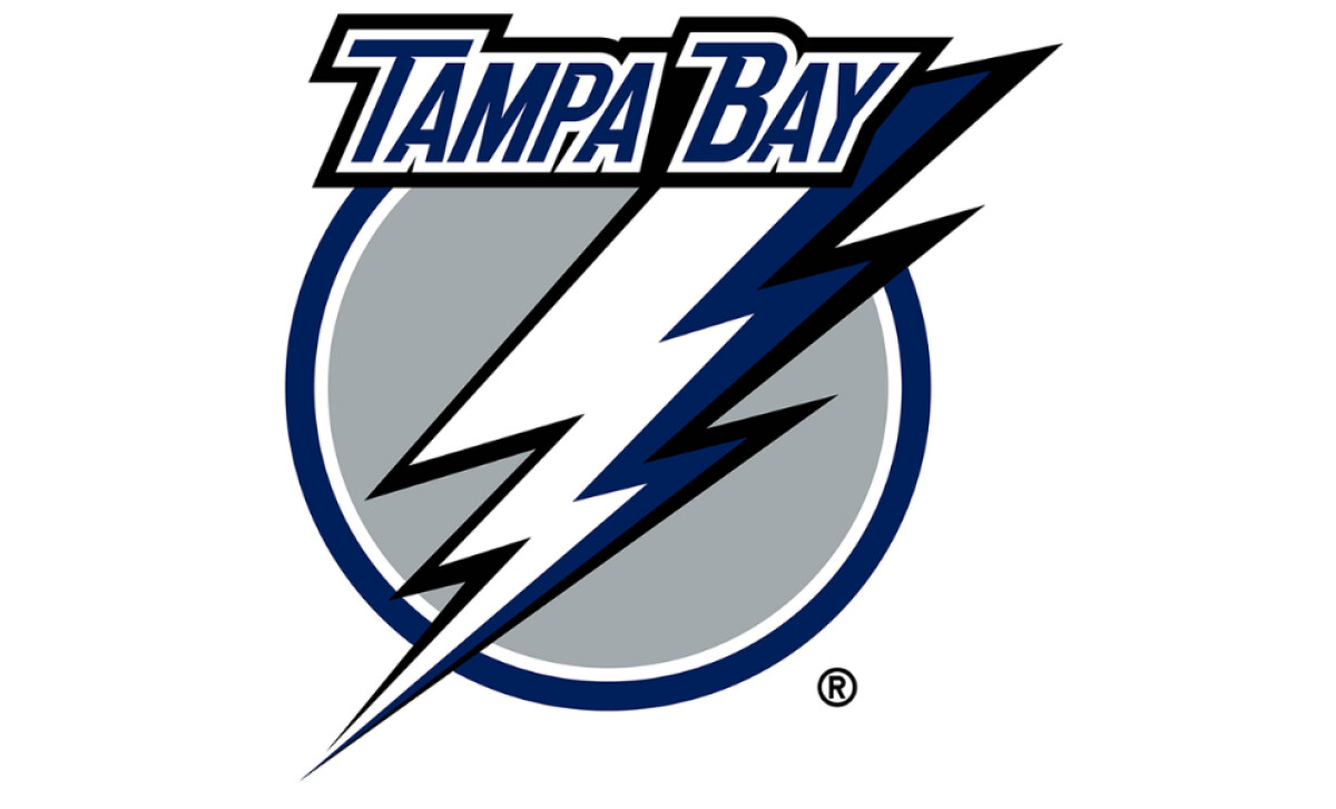
This time, the Lightning went for a significant update.
The script font was dropped in favor of a bold, all-caps sans-serif typeface, which is cleaner, stronger, and far more impactful.
“Tampa Bay” now sat tightly above the roundel, which also gained a deeper shade of blue to complement the bolt.
Speaking of the bolt, the change sharpened its presence using three colors: dark blue, white, and black. This gave the logo more versatility, especially for digital formats.
The result? A fresher, lighter feel that leaned into modern design trends while still honoring the original look.
It was evolution done right: cleaned up for the times, but unmistakably the same.
2011-Present: Tampa Bay Minimalist Approach
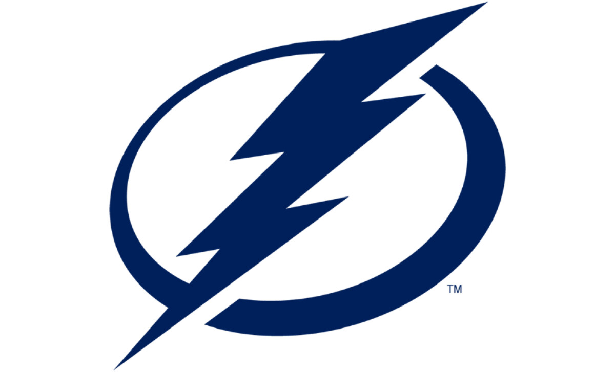
With a new franchise ownership under Jeff Vinik, the Lightning unveiled a refreshed logo that fully embraced the design principle of ‘less is more.'
The wordmarks were removed, leaving only the team’s identifier: a navy-blue lightning bolt cutting through a matching navy circle.
By stripping everything back and retaining just two colors, the logo became more timeless. It became clean, versatile, and effortlessly adaptable across any medium: a dream for many brand owners.
This bold minimalist approach gave the Tampa Bay Lightning a badge that was instantly recognizable and carried the weight of a modern classic. It’s a mark worthy of the team and the city it represents.
But it doesn’t stop there.
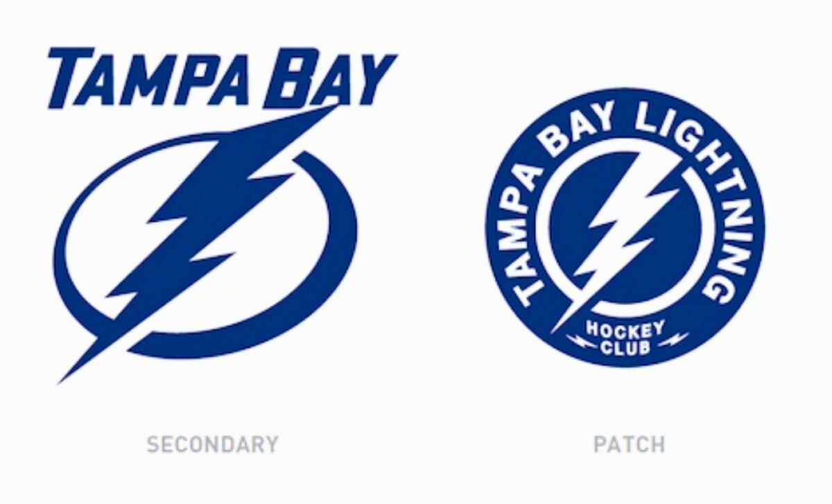
Apart from the primary logo, Tampa Bay also introduced a secondary logo and a uniform patch design. Both are subtle variations of the minimalist mark, but with added wordmarks for clarity.
The secondary logo retains the same bolt and circle, but adds ‘Tampa Bay’ on top.
A small but clever detail: the A in ‘Bay’ lightly touches the lightning bolt, which creates a sense of connection and flow.
The uniform patch, meanwhile, takes the logo into a circular format, enclosing it with the words ‘Tampa Bay Lightning Hockey Club.’
This version works perfectly for jerseys and apparel. It gives players and fans a bold yet refined identifier that stands out both on the ice and off.
Wrap Up: The Tampa Bay Lightning Logo is Built on Strong Identity
The Bolt’s brand logo showcases the power of consistency. Unlike other franchises, the Tampa Bay Lightning is proof that refining one’s identity doesn’t require complete overhauls.
Final Notes:
- Keep the core: Retaining the bolt symbol inside the circle shows how one element can anchor decades of brand evolution.
- Minimalism wins: The 2011 redesign is proof that less can be more.
- Design with legacy: Every logo iteration ties back to Tampa Bay itself being the lightning capital of North America.
From a founder-designed first badge to today’s minimalistic approach, every change has retained the central visual element to stay true to the team's values: speed, energy, and pride.
Even with the subtle color shifts and typographic refinements, the Lighting proved that consistency and reinvention can go hand-in-hand.
The Tampa Bay Lightning logo is a perfect example of how building on strong foundations can spark lasting brand power.
Looking to apply the same approach to your growing market? We can connect you with the right creative partners.
Browse our Agency Directory to find the most capable agency that can help elevate your brand:
And if you’re curious for more inspiration, don’t miss our other features on standout logo designs in sports.

