Team Behind the Design
Logo Design Analysis
In professional services logo design — especially in trades like wallpaper installation — I often look at how structure, form language, and clarity convey trust and craft.
BehangBoosters’ identity uses architectural geometry and purposeful angles to express both technical skill and modern interior-design sensibility.
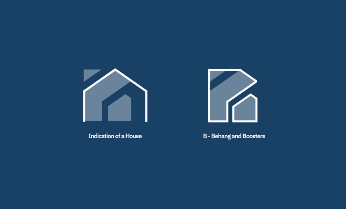
- Concept: The icon fuses a stylized house silhouette with the letter “B” through overlapping planes and cut-out geometry. I like how the structure suggests walls, roof angles, and interior recesses without relying on literal illustration, giving the mark depth while keeping it unmistakably tied to the brand initial.
- Typography: The geometric sans-serif wordmark balances the icon’s angular sharpness with a more approachable tone. I appreciate how its even strokes and open counters maintain readability while softening the mark just enough for a client-facing service entering people’s homes.
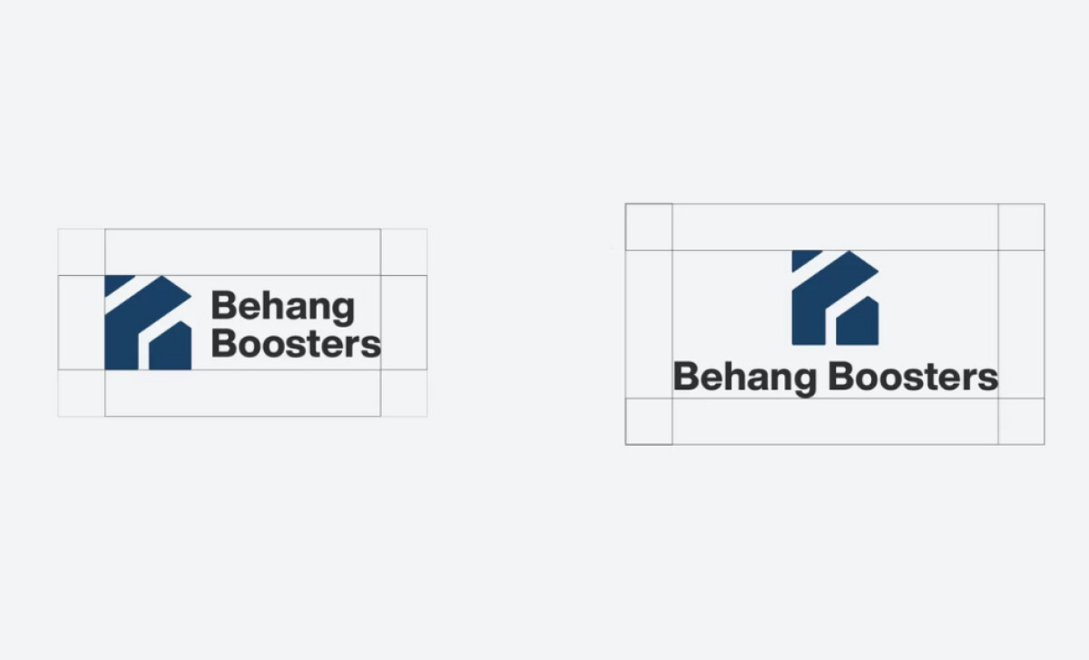
- Scalability: The deep-blue planes, clean negative space, and simplified geometric segments all help the symbol scale effectively across uniforms, vehicles, signage, and digital use. I find the compact proportions particularly useful — they ensure the structure remains legible even when reduced.
- Applications: The deep-blue palette and structured icon work well in monochrome or full color, supporting versatile use across branded assets. This consistency often strengthens brand perception in the professional services space.
What Brands & Agencies Can Learn from BehangBoosters
Here are a few key lessons from this professional services logo design:
1. Let Geometry Communicate Expertise
Structural cues like angled cuts, overlapping planes, and architectural silhouettes can express technical skill without relying on cliché symbols. This helps service brands feel more refined and trustworthy.
2. Balance Precision with Approachability
Pairing a sharp, geometric icon with a softer sans-serif wordmark creates a welcoming tone while maintaining professionalism. This balance is especially valuable for trades that work inside clients’ homes.
3. Build a Palette That Reinforces Reliability
Deep, confident colors such as navy signal craftsmanship, stability, and care. When the palette stays minimal, it strengthens the longevity of the brand and ensures consistent performance across all applications.
About DesignRush Featured Designs
At DesignRush, we spotlight agency projects that push creative boundaries. The designs we feature reflect expert execution and highlight the trends shaping branding today.
Some of these standout projects later earn recognition in the Monthly Design Awards.
Check out more standout work across categories:
- Best Logo Designs
- Best Website Designs
- Best App Designs
- Best Print Designs
- Best Packaging Designs
- Best Video Designs
For a full list of design agencies and related services, see our Agency Directory.