
Most NBA logo histories read like design timelines. The Minnesota Timberwolves logo reads like a mood ring.
Every time the franchise changed its mark, something had just happened, or just stopped happening, to the team.
The wolf got teeth when Kevin Garnett arrived. It got softer when he left. It got rebuilt from scratch when Minnesota tied the NBA record for the longest playoff drought in league history.
Plenty of NBA logo design stories follow a clean arc of modernization. Minnesota's doesn't.
Four logos in 37 years. Each one tells you where the franchise stood when the designer put down the pen.
1989–1996: A Contest, a Check, and "Old Shep"
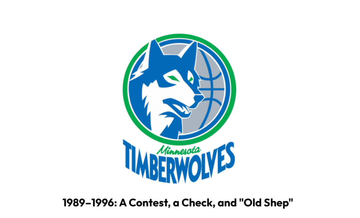
The first Minnesota Timberwolves logo was crowdsourced before crowdsourcing was a word. The team held a public contest, received over 2,600 submissions from as far away as Alaska and Norway, and selected a design by Mark Thompson of Austin, Minnesota.
Original team president Bob Stein described the winning entry as "aggressive, but not sinister", a phrase that fits a team with nothing yet to defend.
The mark was first unveiled on an oversized $20,000 check that the team donated to the United Way on September 17, 1987, two years before Minnesota played a game.
The composition was simple: a gray and blue basketball, outlined in green, served as the backdrop for a calm, observant wolf positioned along its edge. "Minnesota" sat in green cursive.
"Timberwolves" ran tall in sans-serif capitals. Fans later nicknamed the wolf "Old Shep." It was alert, not aggressive. That's what an expansion team with nothing yet to prove should look like.
1996–2008: Garnett Arrives, the Wolf Gets Teeth
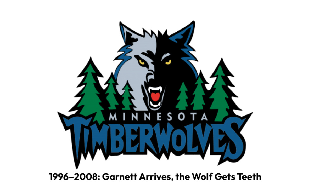
Kevin Garnett was drafted in 1995. By the next season, the logo had teeth.
On May 18, 1996, the Wolves unveiled a new look amid a display of lasers and smoke at the Mall of America's main rotunda.
Designed by L.A.-based Mednick Design Group, the new mark was, in owner Glen Taylor's words, "a step towards being more competitive, more aggressive".
Hiring an outside firm was a signal move. Franchises rarely engage external logo design agencies unless they want the new mark to look unmistakably different from what came before.
The wolf head was snarling, golden-eyed, half-buried in shadow above a forest of pine trees. The wordmark went jagged and elongated. The whole composition was loud, and it had to be.
For the first time, the franchise had something worth shouting about. Minnesota would go on to make eight straight playoff appearances starting in 1997, win the Northwest Division in 2004, and reach the Western Conference Finals that same year with Garnett as league MVP.
The logo and the team were on the same arc.
2008–2017: A Softer Wolf for an Emptier Era
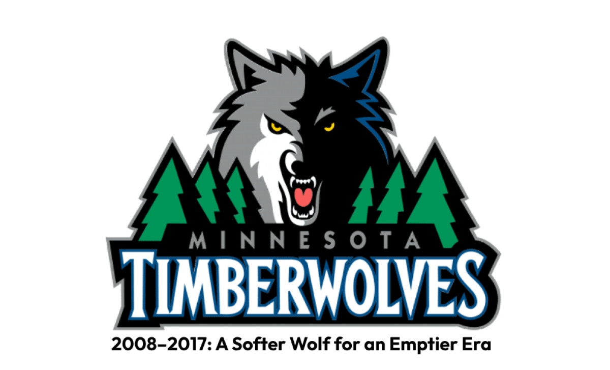
Garnett was traded to Boston in 2007. The franchise entered a rebuild that would last more than a decade. For the team's 20th season, the Wolves unveiled a refined logo designed with assistance from Adidas.
The bones stayed the same, but everything got quieter: lighter greens, a white accent on the wolf's face, cleaner lines, and a bold serif wordmark double-outlined in blue and black.
The team also introduced a new secondary mark, a wolf howling at the moon with a basketball in the background, an explicit callback to the original Shep logo.
Fans liked the howling secondary more than the primary. That detail would matter a decade later.
2017–Present: Rebuilt From Crisis
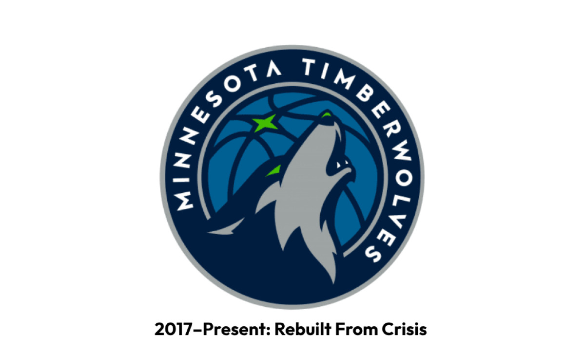
By the time Rodney Richardson of Mississippi-based RARE Design started working on the next logo, the Wolves were in trouble.
The 2016–17 team finished 29th of 30 in attendance with 607,203, and extended the franchise's postseason drought to 13 consecutive seasons, tying the NBA record for the longest playoff absence in league history. Garnett had retired the prior fall.
Richardson spent close to a year talking to season-ticket holders. They kept telling him the same thing: the 1996 and 2008 logos were "too cartoonish" and "didn't represent the area, or who they are as people".
Before drawing anything, Richardson writes a mission statement on a scrap of paper. The brief he wrote for the Wolves: "With fierce determination we will defend, and we will devour. We will be smarter. We will be stronger. We will be together. We will be a Pack."
The decisions that followed are the interesting part. Richardson went with a howl, not a snarl. "The howl is a warning. It marks their territory. It's a communal call to the rest of the pack, a rallying cry."
Research showed that wolves snarl when they're scared or defensive, emotions that don't fit as well in the macho sports world.
The team-color green was renamed "Aurora Green," meant to mimic the greenish hue that can sometimes emanate from the Northern Lights.
The strange "A" in the wordmark, missing its horizontal connector, is a remnant of the runes phase that made it into the final design.
The unveiling on April 11, 2017 was framed as a fresh start. Richardson's logo took second place at SportsLogos.Net's 2017 Creamer Awards.
What's in the Current Minnesota Timberwolves logo
Good logo design makes every element justify its existence. The 2017 mark passes that test.
Every element points somewhere specific:
- Howling wolf: a rallying call, not a defensive snarl.
- Basketball backdrop: a callback to Old Shep's circular roundel.
- Four-pointed star: Minnesota's North Star, lifted from the state flag and rebranded as Aurora Green.
- Palette: Lake Blue, Midnight Blue, Moonlight Grey, Frost White, Aurora Green. Richardson called it "color with a sense of place".
It's a logo built for aspiration. Designed for a team desperate to matter.
What's Coming: The 2026–27 Rumored Rebrand
In late March 2026, leaked merchandise from the NBA Store revealed what looks like a Wolves rebrand for the 2026–27 season.
The reported primary mark combines the Timberwolves' original royal blue and Kelly green color scheme with elements from their recent howling wolf secondary marks.
The pine trees are back. The "MINN" wordmark from a 2020–21 City Edition uniform appears as a secondary. Uniform tracker ProLineMockups reported months earlier that the Wolves, Hawks, and Rockets were all in line for full redesigns.
Owner Alex Rodriguez told reporters last summer that bringing back "some of the history of the KG days" was important. Fan reception so far has been mixed.
The timing is the part to notice. The 2017 logo was designed for a team that needed a reason to exist.
Anthony Edwards has now given the Wolves their biggest moment since Garnett's MVP season. The franchise that desperately wanted to matter now does, and the rebrand rumors are back.
Whether a logo designed in a moment of crisis can hold up when the team finally arrives is the question every brand manager watching this rollout should be asking. The pattern of this franchise's mood ring suggests the answer is already being drawn.