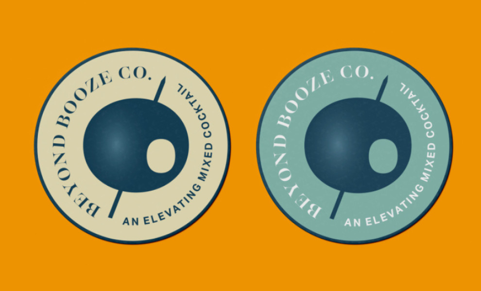
Standout Features:
- Pierced olive emblem
- A mix of serif and sans-serif fonts
- Circular layout
Beyond Booze’s elegant and contemporary logo design features a pierced olive emblem, a mix of serif and sans-serif fonts, and a circular layout.
The central element of Christopher Santoro’s design is the pierced olive emblem, often used in high-end drinks as garnish and thus, evoking a sense of luxury. The upward-pointing toothpick piercing the olive subtly nods to Beyond Booze's tagline, "An Elevating Mixed Cocktail,” and the unique experience offered by their cannabis-infused beverages.
The serif font brings a touch of sophistication and tradition, reflecting the elegance of classic cocktail culture. Meanwhile, the sans-serif font adds a contemporary and confident flair. Additionally, the circular text layout and border symbolize wholeness, creating a welcoming atmosphere for consumers eager to explore something new.
-preview.jpg)
