Standout Features:
- Whimsical typography
- Fun color palette
- Compact and balanced logotype
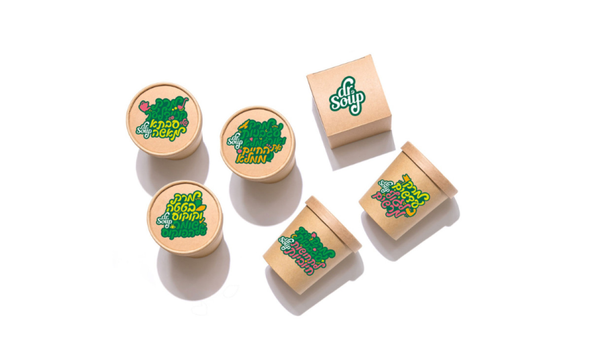
Studio Baram crafted the Dr. Soup logo to visually embody the restaurant's goodness and dedication to healthy living.
It features playful, rounded lettering reminiscent of a hand-drawn script. This whimsical typography injects fun and approachability into the brand identity, setting it apart from more clinical or generic health food brands.
The vibrant color palette creates an inviting and energetic visual identity for the brand. Green symbolizes freshness and health, while yellow conveys warmth and energy. Together, these colors create an inviting look and reinforce the brand's promise of delivering nutritious and flavorful soups.
The versatile logo maintains its impact and clarity across various applications. Whether scaled down for packaging labels or enlarged for signage, its thoughtful distribution of visual weight ensures a consistent and compelling presence. This versatility underscores Studio Baram's commitment to crafting a unique, compact, and cohesive brand identity.


